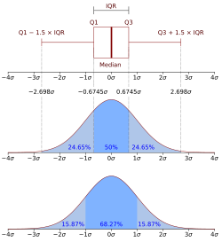
In statistics, quartiles are a type of quantiles which divide the number of data points into four parts, or quarters, of more-or-less equal size. The data must be ordered from smallest to largest to compute quartiles; as such, quartiles are a form of order statistic. The three quartiles, resulting in four data divisions, are as follows:
Along with the minimum and maximum of the data (which are also quartiles), the three quartiles described above provide a five-number summary of the data. This summary is important in statistics because it provides information about both the center and the spread of the data. Knowing the lower and upper quartile provides information on how big the spread is and if the dataset is skewed toward one side. Since quartiles divide the number of data points evenly, the range is generally not the same between adjacent quartiles (i.e. usually (Q3 - Q2) ≠ (Q2 - Q1)). Interquartile range (IQR) is defined as the difference between the 75th and 25th percentiles or Q3 - Q1. While the maximum and minimum also show the spread of the data, the upper and lower quartiles can provide more detailed information on the location of specific data points, the presence of outliers in the data, and the difference in spread between the middle 50% of the data and the outer data points. [2]
Symbol | Names | Definition |
---|---|---|
Q1 |
| Splits off the lowest 25% of data from the highest 75% |
Q2 |
| Cuts data set in half |
Q3 |
| Splits off the highest 25% of data from the lowest 75% |
For discrete distributions, there is no universal agreement on selecting the quartile values. [3]
This rule is employed by the TI-83 calculator boxplot and "1-Var Stats" functions.
The values found by this method are also known as "Tukey's hinges"; [4] see also midhinge.
If we have an ordered dataset , then we can interpolate between data points to find the th empirical quantile if is in the quantile. If we denote the integer part of a number by , then the empirical quantile function is given by,
,
is the last data point in quartile p, and is the first data point in quartile p+1.
measures where the quartile falls between and . If = 0 then the quartile falls exactly on . If = 0.5 then the quartile falls exactly half way between and .
,
where and . [1]
To find the first, second, and third quartiles of the dataset we would evaluate , , and respectively.
Ordered Data Set (of an odd number of data points): 6, 7, 15, 36, 39, 40, 41, 42, 43, 47, 49.
The bold number (40) is the median splitting the data set into two halves with equal number of data points.
Method 1 | Method 2 | Method 3 | Method 4 | |
---|---|---|---|---|
Q1 | 15 | 25.5 | 20.25 | 15 |
Q2 | 40 | 40 | 40 | 40 |
Q3 | 43 | 42.5 | 42.75 | 43 |
Ordered Data Set (of an even number of data points): 7, 15, 36, 39, 40, 41.
The bold numbers (36, 39) are used to calculate the median as their average. As there are an even number of data points, the first three methods all give the same results. (The Method 3 is executed such that the median is not chosen as a new data point and the Method 1 started.)
Method 1 | Method 2 | Method 3 | Method 4 | |
---|---|---|---|---|
Q1 | 15 | 15 | 15 | 13 |
Q2 | 37.5 | 37.5 | 37.5 | 37.5 |
Q3 | 40 | 40 | 40 | 40.25 |
If we define a continuous probability distributions as where is a real valued random variable, its cumulative distribution function (CDF) is given by
. [1]
The CDF gives the probability that the random variable is less than or equal to the value . Therefore, the first quartile is the value of when , the second quartile is when , and the third quartile is when . [5] The values of can be found with the quantile function where for the first quartile, for the second quartile, and for the third quartile. The quantile function is the inverse of the cumulative distribution function if the cumulative distribution function is monotonically increasing because the one-to-one correspondence between the input and output of the cumulative distribution function holds.
There are methods by which to check for outliers in the discipline of statistics and statistical analysis. Outliers could be a result from a shift in the location (mean) or in the scale (variability) of the process of interest. [6] Outliers could also be evidence of a sample population that has a non-normal distribution or of a contaminated population data set. Consequently, as is the basic idea of descriptive statistics, when encountering an outlier, we have to explain this value by further analysis of the cause or origin of the outlier. In cases of extreme observations, which are not an infrequent occurrence, the typical values must be analyzed. The Interquartile Range (IQR), defined as the difference between the upper and lower quartiles (), may be used to characterize the data when there may be extremities that skew the data; the interquartile range is a relatively robust statistic (also sometimes called "resistance") compared to the range and standard deviation. There is also a mathematical method to check for outliers and determining "fences", upper and lower limits from which to check for outliers.
After determining the first (lower) and third (upper) quartiles ( and respectively) and the interquartile range () as outlined above, then fences are calculated using the following formula:
The lower fence is the "lower limit" and the upper fence is the "upper limit" of data, and any data lying outside these defined bounds can be considered an outlier. The fences provide a guideline by which to define an outlier, which may be defined in other ways. The fences define a "range" outside which an outlier exists; a way to picture this is a boundary of a fence. It is common for the lower and upper fences along with the outliers to be represented by a boxplot. For the boxplot shown on the right, only the vertical heights correspond to the visualized data set while horizontal width of the box is irrelevant. Outliers located outside the fences in a boxplot can be marked as any choice of symbol, such as an "x" or "o". The fences are sometimes also referred to as "whiskers" while the entire plot visual is called a "box-and-whisker" plot.
When spotting an outlier in the data set by calculating the interquartile ranges and boxplot features, it might be easy to mistakenly view it as evidence that the population is non-normal or that the sample is contaminated. However, this method should not take place of a hypothesis test for determining normality of the population. The significance of the outliers varies depending on the sample size. If the sample is small, then it is more probable to get interquartile ranges that are unrepresentatively small, leading to narrower fences. Therefore, it would be more likely to find data that are marked as outliers. [7]
Environment | Function | Quartile Method |
---|---|---|
Microsoft Excel | QUARTILE.EXC | Method 4 |
Microsoft Excel | QUARTILE.INC | Method 3 |
TI-8X series calculators | 1-Var Stats | Method 1 |
R | fivenum | Method 2 |
Python | numpy.percentile | Method 3 |
Python | pandas.DataFrame.describe | Method 3 |
The Excel function QUARTILE.INC(array, quart) provides the desired quartile value for a given array of data, using Method 3 from above. The QUARTILE function is a legacy function from Excel 2007 or earlier, giving the same output of the function QUARTILE.INC. In the function, array is the dataset of numbers that is being analyzed and quart is any of the following 5 values depending on which quartile is being calculated. [8]
Quart | Output QUARTILE Value |
---|---|
0 | Minimum value |
1 | Lower Quartile (25th percentile) |
2 | Median |
3 | Upper Quartile (75th percentile) |
4 | Maximum value |
In order to calculate quartiles in Matlab, the function quantile(A,p) can be used. Where A is the vector of data being analyzed and p is the percentage that relates to the quartiles as stated below. [9]
p | Output QUARTILE Value |
---|---|
0 | Minimum value |
0.25 | Lower Quartile (25th percentile) |
0.5 | Median |
0.75 | Upper Quartile (75th percentile) |
1 | Maximum value |
In descriptive statistics, the interquartile range (IQR) is a measure of statistical dispersion, which is the spread of the data. The IQR may also be called the midspread, middle 50%, fourth spread, or H‑spread. It is defined as the difference between the 75th and 25th percentiles of the data. To calculate the IQR, the data set is divided into quartiles, or four rank-ordered even parts via linear interpolation. These quartiles are denoted by Q1 (also called the lower quartile), Q2 (the median), and Q3 (also called the upper quartile). The lower quartile corresponds with the 25th percentile and the upper quartile corresponds with the 75th percentile, so IQR = Q3 − Q1.
In statistics and probability, quantiles are cut points dividing the range of a probability distribution into continuous intervals with equal probabilities, or dividing the observations in a sample in the same way. There is one fewer quantile than the number of groups created. Common quantiles have special names, such as quartiles, deciles, and percentiles. The groups created are termed halves, thirds, quarters, etc., though sometimes the terms for the quantile are used for the groups created, rather than for the cut points.
In probability theory and statistics, skewness is a measure of the asymmetry of the probability distribution of a real-valued random variable about its mean. The skewness value can be positive, zero, negative, or undefined.
The interquartile mean (IQM) is a statistical measure of central tendency based on the truncated mean of the interquartile range. The IQM is very similar to the scoring method used in sports that are evaluated by a panel of judges: discard the lowest and the highest scores; calculate the mean value of the remaining scores.
In descriptive statistics, a box plot or boxplot is a method for demonstrating graphically the locality, spread and skewness groups of numerical data through their quartiles. In addition to the box on a box plot, there can be lines extending from the box indicating variability outside the upper and lower quartiles, thus, the plot is also called the box-and-whisker plot and the box-and-whisker diagram. Outliers that differ significantly from the rest of the dataset may be plotted as individual points beyond the whiskers on the box-plot. Box plots are non-parametric: they display variation in samples of a statistical population without making any assumptions of the underlying statistical distribution. The spacings in each subsection of the box-plot indicate the degree of dispersion (spread) and skewness of the data, which are usually described using the five-number summary. In addition, the box-plot allows one to visually estimate various L-estimators, notably the interquartile range, midhinge, range, mid-range, and trimean. Box plots can be drawn either horizontally or vertically.
The five-number summary is a set of descriptive statistics that provides information about a dataset. It consists of the five most important sample percentiles:
In statistics, a k-thpercentile, also known as percentile score or centile, is a score below which a given percentage k of scores in its frequency distribution falls or a score at or below which a given percentage falls. Percentiles are expressed in the same unit of measurement as the input scores, not in percent; for example, if the scores refer to human weight, the corresponding percentiles will be expressed in kilograms or pounds. In the limit of an infinite sample size, the percentile approximates the percentile function, the inverse of the cumulative distribution function.
This glossary of statistics and probability is a list of definitions of terms and concepts used in the mathematical sciences of statistics and probability, their sub-disciplines, and related fields. For additional related terms, see Glossary of mathematics and Glossary of experimental design.
In statistics, a Q–Q plot (quantile–quantile plot) is a probability plot, a graphical method for comparing two probability distributions by plotting their quantiles against each other. A point (x, y) on the plot corresponds to one of the quantiles of the second distribution (y-coordinate) plotted against the same quantile of the first distribution (x-coordinate). This defines a parametric curve where the parameter is the index of the quantile interval.
The root mean square deviation (RMSD) or root mean square error (RMSE) is either one of two closely related and frequently used measures of the differences between true or predicted values on the one hand and observed values or an estimator on the other.
In probability and statistics, the quantile function outputs the value of a random variable such that its probability is less than or equal to an input probability value. Intuitively, the quantile function associates with a range at and below a probability input the likelihood that a random variable is realized in that range for some probability distribution. It is also called the percentile function, percent-point function, inverse cumulative distribution function or inverse distribution function.
In statistics, the quartile coefficient of dispersion is a descriptive statistic which measures dispersion and is used to make comparisons within and between data sets. Since it is based on quantile information, it is less sensitive to outliers than measures such as the coefficient of variation. As such, it is one of several robust measures of scale.
In statistics, the midhinge is the average of the first and third quartiles and is thus a measure of location. Equivalently, it is the 25% trimmed mid-range or 25% midsummary; it is an L-estimator.
In statistics, an L-estimator is an estimator which is a linear combination of order statistics of the measurements. This can be as little as a single point, as in the median, or as many as all points, as in the mean.
In statistics, a trimmed estimator is an estimator derived from another estimator by excluding some of the extreme values, a process called truncation. This is generally done to obtain a more robust statistic, and the extreme values are considered outliers. Trimmed estimators also often have higher efficiency for mixture distributions, and heavy-tailed distributions than the corresponding untrimmed estimator, at the cost of lower efficiency for other distributions, such as the normal distribution.
A plot is a graphical technique for representing a data set, usually as a graph showing the relationship between two or more variables. The plot can be drawn by hand or by a computer. In the past, sometimes mechanical or electronic plotters were used. Graphs are a visual representation of the relationship between variables, which are very useful for humans who can then quickly derive an understanding which may not have come from lists of values. Given a scale or ruler, graphs can also be used to read off the value of an unknown variable plotted as a function of a known one, but this can also be done with data presented in tabular form. Graphs of functions are used in mathematics, sciences, engineering, technology, finance, and other areas.
In statistics, robust measures of scale are methods that quantify the statistical dispersion in a sample of numerical data while resisting outliers. The most common such robust statistics are the interquartile range (IQR) and the median absolute deviation (MAD). These are contrasted with conventional or non-robust measures of scale, such as sample standard deviation, which are greatly influenced by outliers.
In statistical graphics, the functional boxplot is an informative exploratory tool that has been proposed for visualizing functional data. Analogous to the classical boxplot, the descriptive statistics of a functional boxplot are: the envelope of the 50% central region, the median curve and the maximum non-outlying envelope.
Feature scaling is a method used to normalize the range of independent variables or features of data. In data processing, it is also known as data normalization and is generally performed during the data preprocessing step.
In statistical graphics and scientific visualization, the contour boxplot is an exploratory tool that has been proposed for visualizing ensembles of feature-sets determined by a threshold on some scalar function. Analogous to the classical boxplot and considered an expansion of the concepts defining functional boxplot, the descriptive statistics of a contour boxplot are: the envelope of the 50% central region, the median curve and the maximum non-outlying envelope.