Biostatistics are the development and application of statistical methods to a wide range of topics in biology. It encompasses the design of biological experiments, the collection and analysis of data from those experiments and the interpretation of the results.

A Cartesian coordinate system is a coordinate system that specifies each point uniquely in a plane by a set of numerical coordinates, which are the signed distances to the point from two fixed perpendicular oriented lines, measured in the same unit of length. Each reference line is called a coordinate axis or just axis of the system, and the point where they meet is its origin, at ordered pair (0, 0). The coordinates can also be defined as the positions of the perpendicular projections of the point onto the two axes, expressed as signed distances from the origin.

A chart is a graphical representation of data, in which "the data is represented by symbols, such as bars in a bar chart, lines in a line chart, or slices in a pie chart". A chart can represent tabular numeric data, functions or some kinds of quality structure and provides different info.

In mathematics, the complex plane or z-plane is a geometric representation of the complex numbers established by the real axis and the perpendicular imaginary axis. It can be thought of as a modified Cartesian plane, with the real part of a complex number represented by a displacement along the x-axis, and the imaginary part by a displacement along the y-axis.

A scatter plot is a type of plot or mathematical diagram using Cartesian coordinates to display values for typically two variables for a set of data. If the points are coded (color/shape/size), one additional variable can be displayed. The data are displayed as a collection of points, each having the value of one variable determining the position on the horizontal axis and the value of the other variable determining the position on the vertical axis.
In descriptive statistics and chaos theory, a recurrence plot (RP) is a plot showing, for each moment i in time, the times at which a phase space trajectory visits roughly the same area in the phase space as at time j. In other words, it is a graph of
In geometry and science, a cross section is the non-empty intersection of a solid body in three-dimensional space with a plane, or the analog in higher-dimensional spaces. Cutting an object into slices creates many parallel cross-sections. The boundary of a cross-section in three-dimensional space that is parallel to two of the axes, that is, parallel to the plane determined by these axes, is sometimes referred to as a contour line; for example, if a plane cuts through mountains of a raised-relief map parallel to the ground, the result is a contour line in two-dimensional space showing points on the surface of the mountains of equal elevation.
Powder diffraction is a scientific technique using X-ray, neutron, or electron diffraction on powder or microcrystalline samples for structural characterization of materials. An instrument dedicated to performing such powder measurements is called a powder diffractometer.

In statistics, a Q–Q (quantile-quantile) plot is a probability plot, which is a graphical method for comparing two probability distributions by plotting their quantiles against each other. First, the set of intervals for the quantiles is chosen. A point (x, y) on the plot corresponds to one of the quantiles of the second distribution plotted against the same quantile of the first distribution. Thus the line is a parametric curve with the parameter which is the number of the interval for the quantile.

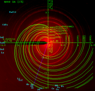
Fiber diffraction is a subarea of scattering, an area in which molecular structure is determined from scattering data. In fiber diffraction the scattering pattern does not change, as the sample is rotated about a unique axis. Such uniaxial symmetry is frequent with filaments or fibers consisting of biological or man-made macromolecules. In crystallography fiber symmetry is an aggravation regarding the determination of crystal structure, because reflexions are smeared and may overlap in the fiber diffraction pattern. Materials science considers fiber symmetry a simplification, because almost the complete obtainable structure information is in a single two-dimensional (2D) diffraction pattern exposed on photographic film or on a 2D detector. 2 instead of 3 co-ordinate directions suffice to describe fiber diffraction.
A line chart or line plot or line graph or curve chart is a type of chart which displays information as a series of data points called 'markers' connected by straight line segments. It is a basic type of chart common in many fields. It is similar to a scatter plot except that the measurement points are ordered and joined with straight line segments. A line chart is often used to visualize a trend in data over intervals of time – a time series – thus the line is often drawn chronologically. In these cases they are known as run charts.
Laboratory quality control is designed to detect, reduce, and correct deficiencies in a laboratory's internal analytical process prior to the release of patient results, in order to improve the quality of the results reported by the laboratory. Quality control is a measure of precision, or how well the measurement system reproduces the same result over time and under varying operating conditions. Laboratory quality control material is usually run at the beginning of each shift, after an instrument is serviced, when reagent lots are changed, after equipment calibration, and whenever patient results seem inappropriate. Quality control material should approximate the same matrix as patient specimens, taking into account properties such as viscosity, turbidity, composition, and color. It should be simple to use, with minimal vial-to-vial variability, because variability could be misinterpreted as systematic error in the method or instrument. It should be stable for long periods of time, and available in large enough quantities for a single batch to last at least one year. Liquid controls are more convenient than lyophilized (freeze-dried) controls because they do not have to be reconstituted, minimizing pipetting error.

A plot is a graphical technique for representing a data set, usually as a graph showing the relationship between two or more variables. The plot can be drawn by hand or by a computer. In the past, sometimes mechanical or electronic plotters were used. Graphs are a visual representation of the relationship between variables, which are very useful for humans who can then quickly derive an understanding which may not have come from lists of values. Given a scale or ruler, graphs can also be used to read off the value of an unknown variable plotted as a function of a known one, but this can also be done with data presented in tabular form. Graphs of functions are used in mathematics, sciences, engineering, technology, finance, and other areas.
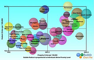
A bubble chart is a type of chart that displays three dimensions of data. Each entity with its triplet of associated data is plotted as a disk that expresses two of the vi values through the disk's xy location and the third through its size. Bubble charts can facilitate the understanding of social, economical, medical, and other scientific relationships.

A Manhattan plot is a type of scatter plot, usually used to display data with a large number of data-points, many of non-zero amplitude, and with a distribution of higher-magnitude values. The plot is commonly used in genome-wide association studies (GWAS) to display significant SNPs.

In statistics, a volcano plot is a type of scatter-plot that is used to quickly identify changes in large data sets composed of replicate data. It plots significance versus fold-change on the y and x axes, respectively. These plots are increasingly common in omic experiments such as genomics, proteomics, and metabolomics where one often has a list of many thousands of replicate data points between two conditions and one wishes to quickly identify the most meaningful changes. A volcano plot combines a measure of statistical significance from a statistical test with the magnitude of the change, enabling quick visual identification of those data-points that display large magnitude changes that are also statistically significant.
The following comparison of Adobe Flex charts provides charts classification, compares Flex chart products for different chart type availability and for different visual features like 3D versions of charts.
The ratio average (RA) plot is an integer-based version of an MA plot for visualizing two-condition count data. Its distinctive arrow-like shape derives from the way it includes condition-unique (0,n) or (n,0) points into the plot via an epsilon factor.
In statistics, a misleading graph, also known as a distorted graph, is a graph that misrepresents data, constituting a misuse of statistics and with the result that an incorrect conclusion may be derived from it.
A fan chart is made of a group of dispersion fan diagrams, which may be positioned according to two categorising dimensions. A dispersion fan diagram is a circular diagram which reports the same information about a dispersion as a box plot: namely median, quartiles, and two extreme values.
