In statistics, a misleading graph, also known as a distorted graph, is a graph that misrepresents data, constituting a misuse of statistics and with the result that an incorrect conclusion may be derived from it.
Graphs may be misleading by being excessively complex or poorly constructed. Even when constructed to display the characteristics of their data accurately, graphs can be subject to different interpretations, or unintended kinds of data can seemingly and ultimately erroneously be derived.[1]
Misleading graphs may be created intentionally to hinder the proper interpretation of data or accidentally due to unfamiliarity with graphing software, misinterpretation of data, or because data cannot be accurately conveyed. Misleading graphs are often used in false advertising. One of the first authors to write about misleading graphs was Darrell Huff, publisher of the 1954 book How to Lie with Statistics.
Data journalist John Burn-Murdoch has suggested that people are more likely to express scepticism towards data communicated within written text than data of similar quality presented as a graphic, arguing that this is partly the result of the teaching of critical thinking focusing on engaging with written works rather than diagrams, resulting in visual literacy being neglected. He has also highlighted the concentration of data scientists in employment by technology companies, which he believes can result in the hampering of the evaluation of their visualisations due to the proprietary and closed nature of much of the data they work with.[2]
The field of data visualization describes ways to present information that avoids creating misleading graphs.
Misleading graph methods
[A misleading graph] is vastly more effective, however, because it contains no adjectives or adverbs to spoil the illusion of objectivity, there's nothing anyone can pin on you.
There are numerous ways in which a misleading graph may be constructed.[4]
Excessive usage
The use of graphs where they are not needed can lead to unnecessary confusion/interpretation.[5] Generally, the more explanation a graph needs, the less the graph itself is needed.[5] Graphs do not always convey information better than tables.[6]
Biased labeling
The use of biased or loaded words in the graph's title, axis labels, or caption may inappropriately prime the reader.[5][7]
Fabricated trends
Similarly, attempting to draw trend lines through uncorrelated data may mislead the reader into believing a trend exists where there is none. This can be both the result of intentionally attempting to mislead the reader or due to the phenomenon of illusory correlation.
Comparing pie charts of different sizes could be misleading as people cannot accurately read the comparative area of circles.[8]
The usage of thin slices, which are hard to discern, may be difficult to interpret.[8]
The usage of percentages as labels on a pie chart can be misleading when the sample size is small.[9]
Making a pie chart 3D or adding a slant will make interpretation difficult due to distorted effect of perspective.[10] Bar-charted pie graphs in which the height of the slices is varied may confuse the reader.[10]
Comparing pie charts
Comparing data on barcharts is generally much easier. In the image below, it is very hard to tell where the blue sector is bigger than the green sector on the piecharts.
Three sets of percentages, plotted as both piecharts and barcharts. Comparing the data on barcharts is generally much easier.
3D Pie chart slice perspective
A perspective(3D) pie chart is used to give the chart a 3D look. Often used for aesthetic reasons, the third dimension does not improve the reading of the data; on the contrary, these plots are difficult to interpret because of the distorted effect of perspective associated with the third dimension. The use of superfluous dimensions not used to display the data of interest is discouraged for charts in general, not only for pie charts.[11] In a 3D pie chart, the slices that are closer to the reader appear to be larger than those in the back due to the angle at which they're presented.[12] This effect makes readers less performant in judging the relative magnitude of each slice when using 3D than 2D [13]
Comparison of pie charts
Misleading pie chart
Regular pie chart
Item C appears to be at least as large as Item A in the misleading pie chart, whereas in actuality, it is less than half as large. Item D looks a lot larger than item B, but they are the same size.
Tables are preferable to graphics for many small data sets. A table is nearly always better than a dumb pie chart; the only thing worse than a pie chart is several of them, for then the viewer is asked to compare quantities located in spatial disarray both within and between pies – Given their low data-density and failure to order numbers along a visual dimension, pie charts should never be used.
Improper scaling of pictograms
Using pictograms in bar graphs should not be scaled uniformly, as this creates a perceptually misleading comparison.[14] The area of the pictogram is interpreted instead of only its height or width.[15] This causes the scaling to make the difference appear to be squared.[15]
Improper scaling of 2D pictogram in a bar graph
Improper scaling
Regular
Comparison
In the improperly scaled pictogram bar graph, the image for B is actually 9 times as large as A.
2D shape scaling comparison
Square
Circle
Triangle
The perceived size increases when scaling.
The effect of improper scaling of pictograms is further exemplified when the pictogram has 3 dimensions, in which case the effect is cubed.[16]
The graph of house sales (left) is misleading. It appears that home sales have grown eightfold in 2001 over the previous year, whereas they have actually grown twofold. Besides, the number of sales is not specified.
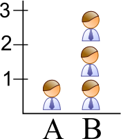
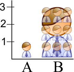
An improperly scaled pictogram may also suggest that the item itself has changed in size.[17]
Misleading
Regular
Assuming the pictures represent equivalent quantities, the misleading graph shows that there are more bananas because the bananas occupy the most area and are furthest to the right.
Confusing use of logarithmic scaling
Logarithmic (or log) scales are a valid means of representing data. But when used without being clearly labeled as log scales or displayed to a reader unfamiliar with them, they can be misleading. Log scales put the data values in terms of a chosen number (often 10) to a particular power. For example, log scales may give a height of 1 for a value of 10 in the data and a height of 6 for a value of 1,000,000 (106) in the data. Log scales and variants are commonly used, for instance, for the volcanic explosivity index, the Richter scale for earthquakes, the magnitude of stars, and the pH of acidic and alkaline solutions. Even in these cases, the log scale can make the data less apparent to the eye. Often the reason for the use of log scales is that the graph's author wishes to display vastly different scales on the same axis. Without log scales, comparing quantities such as 1000 (103) versus 109 (1,000,000,000) becomes visually impractical. A graph with a log scale that was not clearly labeled as such, or a graph with a log scale presented to a viewer who did not know logarithmic scales, would generally result in a representation that made data values look of similar size, in fact, being of widely differing magnitudes. Misuse of a log scale can make vastly different values (such as 10 and 10,000) appear close together (on a base-10 log scale, they would be only 1 and 4). Or it can make small values appear to be negative due to how logarithmic scales represent numbers smaller than the base.
Misuse of log scales may also cause relationships between quantities to appear linear whilst those relationships are exponentials or power laws that rise very rapidly towards higher values. It has been stated, although mainly in a humorous way, that "anything looks linear on a log-log plot with thick marker pen" .[18]
Comparison of linear and logarithmic scales for identical data
Linear scale
Logarithmic scale
Both graphs show an identical exponential function of f(x) = 2x. The graph on the left uses a linear scale, showing clearly an exponential trend. The graph on the right, however uses a logarithmic scale, which generates a straight line. If the graph viewer were not aware of this, the graph would appear to show a linear trend.
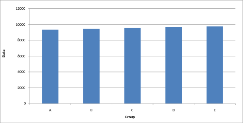
Truncated graph
A truncated graph (also known as a torn graph) has a y axis that does not start at 0. These graphs can create the impression of important change where there is relatively little change.
While truncated graphs can be used to overdraw differences or to save space, their use is often discouraged. Commercial software such as MS Excel will tend to truncate graphs by default if the values are all within a narrow range, as in this example. To show relative differences in values over time, an index chart can be used. Truncated diagrams will always distort the underlying numbers visually. Several studies found that even if people were correctly informed that the y-axis was truncated, they still overestimated the actual differences, often substantially.[19]
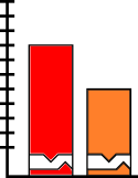
Truncated bar graph
Truncated bar graph
Regular bar graph
These graphs display identical data; however, in the truncated bar graph on the left, the data appear to show significant differences, whereas, in the regular bar graph on the right, these differences are hardly visible.
There are several ways to indicate y-axis breaks:
Indicating a y-axis break
Axis changes
Changing y-axis maximum
Original graph
Smaller maximum
Larger maximum
Changing the y-axis maximum affects how the graph appears. A higher maximum will cause the graph to appear to have less volatility, less growth, and a less steep line than a lower maximum.
Changing ratio of graph dimensions
Original graph
Half-width, twice the height
Twice width, half-height
Changing the ratio of a graph's dimensions will affect how the graph appears.
More egregiously, a graph may use different Y axes for different data sets, which makes the comparison between the sets misleading (the following graph uses a distinct Y axis for the "U.S." only, making it seem as though the U.S. has been overtaken by China in military expenditures, when it actually spends much more):
A graph that uses a distinct Y-axis for one of its many lines
No scale
The scales of a graph are often used to exaggerate or minimize differences.[20][21]
Misleading bar graph with no scale
Less difference
More difference
The lack of a starting value for the y axis makes it unclear whether the graph is truncated. Additionally, the lack of tick marks prevents the reader from determining whether the graph bars are properly scaled. Without a scale, the visual difference between the bars can be easily manipulated.
Misleading line graph with no scale
Volatility
Steady, fast growth
Slow growth
Though all three graphs share the same data, and hence the actual slope of the (x, y) data is the same, the way that the data is plotted can change the visual appearance of the angle made by the line on the graph. This is because each plot has a different scale on its vertical axis. Because the scale is not shown, these graphs can be misleading.
Improper intervals or units
The intervals and units used in a graph may be manipulated to create or mitigate change expression.[12]
Omitting data
Graphs created with omitted data remove information from which to base a conclusion.
Scatter plot with missing categories
Scatter plot with missing categories
Regular scatter plot
In the scatter plot with missing categories on the left, the growth appears to be more linear with less variation.
In financial reports, negative returns or data that do not correlate with a positive outlook may be excluded to create a more favorable visual impression.[citation needed]
3D
The use of a superfluous third dimension, which does not contain information, is strongly discouraged, as it may confuse the reader.[10]
The blue column in the front appears larger than the green column in the back due to perspective, despite having the same value.
When scaling in three dimensions, the effect of the change is cubed.
Complexity
Graphs are designed to allow easier interpretation of statistical data. However, graphs with excessive complexity can obfuscate the data and make interpretation difficult.
Poor construction
Poorly constructed graphs can make data difficult to discern and thus interpret.
Misleading graphs may be used in turn to extrapolate misleading trends.[22]
Measuring distortion
Several methods have been developed to determine whether graphs are distorted and to quantify this distortion.[23][24]
Lie factor
where
A graph with a high lie factor (>1) would exaggerate change in the data it represents, while one with a small lie factor (>0, <1) would obscure change in the data.[25] A perfectly accurate graph would exhibit a lie factor of 1.
Graph discrepancy index
where
The graph discrepancy index, also known as the graph distortion index (GDI), was originally proposed by Paul John Steinbart in 1998. GDI is calculated as a percentage ranging from −100% to positive infinity, with zero percent indicating that the graph has been properly constructed and anything outside the ±5% margin is considered to be distorted.[23] Research into the usage of GDI as a measure of graphics distortion has found it to be inconsistent and discontinuous, making the usage of GDI as a measurement for comparisons difficult.[23]
The data-ink ratio should be relatively high. Otherwise, the chart may have unnecessary graphics.[25]
Data density
The data density should be relatively high, otherwise a table may be better suited for displaying the data.[25]
Usage in finance and corporate reports
Graphs are useful in the summary and interpretation of financial data.[26] Graphs allow trends in large data sets to be seen while also allowing the data to be interpreted by non-specialists.[26][27]
Several published studies have looked at the usage of graphs in corporate reports for different corporations in different countries and have found frequent usage of improper design, selectivity, and measurement distortion within these reports.[28][29][30][31][32][33][34] The presence of misleading graphs in annual reports has led to requests for standards to be set.[35][36][37]
Research has found that readers with poor levels of financial understanding have a greater chance of being misinformed by misleading graphs.[38] Those with financial understanding, such as loan officers, may still be misled.[35]
↑ Siegrist, Michael (1996). "The use or misuse of three-dimensional graphs to represent lower-dimensional data". Behaviour & Information Technology. 15 (2): 96–100. doi:10.1080/014492996120300.
1 2 3 Mather, Dineli R.; Mather, Paul R.; Ramsay, Alan L. (July 2003). "Is the Graph Discrepancy Index (GDI) a Robust Measure?". doi:10.2139/ssrn.556833.
↑ Mather, Dineli; Mather, Paul; Ramsay, Alan (1 June 2005). "An investigation into the measurement of graph distortion in financial reports". Accounting and Business Research. 35 (2): 147–160. doi:10.1080/00014788.2005.9729670. S2CID154136880.
1 2 3 Craven, Tim (November 6, 2000). "LIS 504 - Graphic displays of data". Faculty of Information and Media Studies. London, Ontario: University of Western Ontario. Archived from the original on 24 June 2011. Retrieved 9 July 2012.
↑ Penrose, J. M. (1 April 2008). "Annual Report Graphic Use: A Review of the Literature". Journal of Business Communication. 45 (2): 158–180. doi:10.1177/0021943607313990. S2CID141123410.
↑ Frownfelter-Lohrke, Cynthia; Fulkerson, C. L. (1 July 2001). "The Incidence and Quality of Graphics in Annual Reports: An International Comparison". Journal of Business Communication. 38 (3): 337–357. doi:10.1177/002194360103800308. S2CID167454827.
1 2 Christensen, David S.; Albert Larkin (Spring 1992). "Criteria For High Integrity Graphics". Journal of Managerial Issues. 4 (1). Pittsburg State University: 130–153. JSTOR40603924.
↑ Steinbart, P. (September 1989). "The Auditor's Responsibility for the Accuracy of Graphs in Annual Reports: Some Evidence for the Need for Additional Guidance". Accounting Horizons: 60–70.
Huff, Darrell (1954). How to lie with statistics. pictures by Irving Geis (1sted.). New York: Norton. ISBN0393052648.{{cite book}}: ISBN / Date incompatibility (help)
Durbin CG, Jr (October 2004). "Effective use of tables and figures in abstracts, presentations, and papers". Respiratory Care. 49 (10): 1233–7. PMID15447809.
Bracey, Gerald (2003). "Seeing Through Graphs". Understanding and using education statistics: it's easier than you think. Educational Research Service. ISBN9781931762267.
Harvey, J. Motulsky (June 2009). "The Use and Abuse of Logarithmic Axes"(PDF). GraphPad Software Inc. Archived from the original on 2010-11-23.{{cite web}}: CS1 maint: bot: original URL status unknown (link)
Chandar, N.; Collier, D.; Miranti, P. (15 February 2012). "Graph standardization and management accounting at AT&T during the 1920s". Accounting History. 17 (1): 35–62. doi:10.1177/1032373211424889. S2CID155069927.
Beattie, Vivien; Jones, Michael John (1996). Financial graphs in corporate annual reports: a review of practice in six countries. London: Institute of Chartered Accounants in England and Wales. ISBN9781853557071.
Galliat, Tobias (Summer 2005). "Visualisierung von Informationsräumen"(PDF). Fachhochschule Köln, University of Applied Sciences Cologne. Archived from the original(PDF) on 2006-01-04. Retrieved 9 July 2012.
Louwers, T.; Radtke, R; Pitman, M. (May–June 1999). "Please Pass the Salt: A Look at Creative Reporting in Annual Reports". Today's CPA: 20–23.
Beattie, Vivien; Jones, Michael John (May 2001). "A six-country comparison of the use of graphs in annual reports". The International Journal of Accounting. 36 (2): 195–222. doi:10.1016/S0020-7063(01)00094-2.
Raschke, Robyn L.; Steinbart, Paul John (1 September 2008). "Mitigating the Effects of Misleading Graphs on Decisions by Educating Users about the Principles of Graph Design". Journal of Information Systems. 22 (2): 23–52. doi:10.2308/jis.2008.22.2.23.
This page is based on this Wikipedia article Text is available under the CC BY-SA 4.0 license; additional terms may apply. Images, videos and audio are available under their respective licenses.