Map of the world published in Amsterdam in the 17th century
A map is a symbolic depiction of interrelationships, commonly spatial, between things within a space.[1] A map may be annotated with text and graphics. Like any graphic, a map may be fixed to paper or other durable media, or may be displayed on a transitory medium such as a computer screen. Some maps change interactively[2]. Although maps are commonly used to depict geographic elements, they may represent any space, real or fictional. The subject being mapped may be two-dimensional such as Earth's surface, three-dimensional such as Earth's interior, or from an abstract space of any dimension.
Maps of geographic territory have a very long tradition and have existed from ancient times. The word "map" comes from the medieval Latin: Mappa mundi, wherein mappa meant 'napkin' or 'cloth' and mundi 'of the world'[3]. Thus, "map" became a shortened term referring to a flat representation of Earth's surface.
Maps are a widespread invention, having been found in several societies across the world even before the development of other written communication systems.[5] The earliest surviving maps include cave paintings and etchings on tusk and stone. Later came extensive maps produced in ancient Babylon, Greece and Rome, China, and India. In their simplest forms, maps are two-dimensional constructs. Since the Classical Greek period, however, maps also have been projected onto globes. The Mercator Projection, developed by Flemish geographer Gerardus Mercator, was widely used as the standard for two-dimensional world maps until the late 20th century, when more accurate projections were more widely used. Mercator also was the first to use and popularize the concept of the atlas: a collection of maps.
Geography
Celestial map by the cartographer Frederik de Wit, 17th century.
Cartography or map-making is the study and practice of crafting representations of the Earth upon a flat surface, and one who makes maps is called a cartographer or mapmaker.[6]
Road maps are perhaps the most widely used maps today. They are a subset of navigational maps, which also include aeronautical and nautical charts, railroad network maps, and hiking and bicycling maps. In terms of quantity, the largest number of drawn map sheets is probably made up by local surveys, carried out by municipalities, utilities, tax assessors, emergency services providers, and other local agencies. Many national surveying projects have been carried out by the military, such as the BritishOrdnance Survey: a civilian government agency, internationally renowned for its comprehensively detailed work.
The location information showed by maps may include contour lines, indicating constant values of elevation, temperature, rainfall, etc.[example needed]
Scholars of critical geography , including John Brian Harley, have posited that all maps are charged with rhetorical biases and should therefore be viewed with a level of skepticism.[5] These scholars argue that maps can change or enforce a certain view of a place by changing the viewer's perspective of the world. For example, Americans widely thought that they were insulated from European conflicts by the Atlantic and Pacific Oceans before aviation maps highlighted the closeness between North America and Europe across the North Pole.[7] The social power of maps has given rise to an entire study of how maps can alter human perspectives of the globe.
Orientation
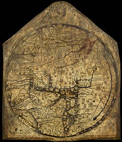
The Hereford Mappa Mundi, Hereford Cathedral, England, c.1300, a classic "T-O" map with Jerusalem at the center, east toward the top, Europe the bottom left and Africa on the right
The orientation of a map is the geographical direction toward the top of the map. In the Middle Ages many Eurasian maps, including the T and O maps, were drawn with east at the top (meaning that the direction "up" on the map is eastward). The word "orient" is derived from Latinoriens, meaning east. The modern cartographic convention is to put north at the top of a map. This convention is only a few hundred years old.[8]
As no direction is inherently "up" on a spheroidal planet, a variety of orientations have been used on maps both historically and in the present day. Different factors may influence the preferred orientation of a map, depending both on its expected use and cultural factors affecting the perception of each direction. For instance, north and west had historically not been placed at the top of maps made in the Northern Hemisphere as these were the directions where the sun disappeared.[8]
Many maps were oriented to place a particularly significant or holy site at the top. Early Islamic maps often placed south at the top because this was the direction of Mecca relative to the map-makers. Similarly, European Christian maps like the T-O map placed east at the top as this was the direction of the Garden of Eden. Early Chinese maps placed north at the top (despite most Chinese compasses pointing south) due to the location of the imperial capital.[8]
Maps of cities bordering a sea are often conventionally oriented with the sea at the top.[citation needed]
Route and channel maps have traditionally been oriented to the road or waterway they describe.[citation needed]
Polar maps of the Arctic or Antarctic regions are conventionally centered on the pole; the direction North would be toward or away from the center of the map, respectively. Typical maps of the Arctic have 0° meridian toward the bottom of the page; maps of the Antarctic have the 0° meridian toward the top of the page.
South-up maps invert the North is up convention by having south at the top. Ancient Africans including in Ancient Egypt used this orientation, as some maps in Brazil do today.[9]
Cartogram of the EU – distorted to show population distributions as of 2008, while the rough shape of the continent is still discernible.
Many maps are drawn to a scale expressed as a ratio, such as 1:10,000, which means that 1 unit of measurement on the map corresponds to 10,000 of that same unit on the ground. The scale statement can be accurate when the region mapped is small enough for the curvature of the Earth to be neglected, such as a city map. Mapping larger regions, where the curvature cannot be ignored, requires projections to map from the curved surface of the Earth to the plane. The impossibility of flattening the sphere to the plane without distortion means that the map cannot have a constant scale. Rather, on most projections, the best that can be attained is an accurate scale along one or two paths on the projection. Because scale differs everywhere, it can only be measured meaningfully as point scale per location. Most maps strive to keep point scale variation within narrow bounds. Although the scale statement is nominal it is usually accurate enough for most purposes unless the map covers a large fraction of the Earth. At the scope of a world map, scale as a single number is practically meaningless throughout most of the map. Instead, it usually refers to the scale along the equator.
Some maps, called cartograms, have the scale deliberately distorted to reflect information other than land area or distance.
Another example of distorted scale is the famous London Underground map. The geographic structure is respected but the tube lines (and the River Thames) are smoothed to clarify the relationships between stations. Near the center of the map, stations are spaced out more than near the edges of the map.
Further inaccuracies may be deliberate. For example, cartographers may simply omit military installations or remove features solely to enhance the clarity of the map. For example, a road map may not show railroads, smaller waterways, or other prominent non-road objects, and even if it does, it may show them less clearly (e.g. dashed or dotted lines/outlines) than the main roads. Known as decluttering, the practice makes the subject matter that the user is interested in easier to read, usually without sacrificing overall accuracy. Software-based maps often allow the user to toggle decluttering between on, off and auto as needed. In auto the degree of decluttering is adjusted as the user changes the scale being displayed.[citation needed]
Geographic maps use a projection to translate the three-dimensional real surface of the geoid to a two-dimensional picture. Projection always distorts the surface. There are many ways to apportion the distortion, and so there are many map projections. Which projection to use depends on the purpose of the map.[10]
The various features shown on a map are represented by conventional signs or symbols. For example, colors can be used to indicate a classification of roads. Those signs are usually explained in a map legend on the margin of the map, or on a separately published characteristic sheet.[11]
Some cartographers prefer to make the map cover practically the entire screen or sheet of paper, leaving no room "outside" the map for information about the map as a whole. These cartographers typically place such information in an otherwise "blank" region "inside" the map—cartouche, map legend, title, compass rose, bar scale, etc. In particular, some maps contain smaller maps inset into otherwise blank areas of the map: for example:
a map at a much smaller scale showing the whole globe and the position of the main map on that globe, or
showing "regions of interest" (such as cities) at a larger scale to show details that would not otherwise fit, or
showing places that do not fit on the main map, such as Alaska and Hawaii on maps of the United States, or the Shetland and Orkney Islands on maps of Britain.
The design and production of maps is a craft that has developed over thousands of years, from clay tablets to geographic information systems. As a form of design, particularly closely related to graphic design, map making incorporates scientific knowledge about how maps are used, integrated with principles of artistic expression, to create an aesthetically attractive product, carries an aura of authority, and functionally serves a particular purpose for an intended audience.
Designing a map involves bringing together a number of elements and making a large number of decisions. The elements of design fall into several broad topics, each of which has its own theory, its own research agenda, and its own best practices. That said, there are synergistic effects between these elements, meaning that the overall design process is not just working on each element one at a time, but an iterative feedback process of adjusting each to achieve the desired gestalt.
Map projections: The foundation of the map is the plane on which it rests (whether paper or screen), but projections are required to flatten the surface of the Earth. All projections distort this surface, but the cartographer can be strategic about how and where distortion occurs.[12] Distortion is argued to be one of the main sources of bias in mapping.[13]
Generalization: All maps must be drawn at a smaller scale than reality, requiring that the information included on a map be a very small sample of the wealth of information about a place. Generalization is the process of adjusting the level of detail in geographic information to be appropriate for the scale and purpose of a map, through procedures such as selection, simplification, and classification.
Symbology: Any map visually represents the location and properties of geographic features using map symbols, graphical depictions composed of several visual variables, such as size, shape, color, and pattern.
Composition: As all of the symbols are brought together, their interactions have major effects on map reading, such as grouping and Visual hierarchy.
Typography or Labeling: Text serves a number of purposes on the map, especially aiding the recognition of features, but labels must be designed and positioned well to be effective.[14]
Layout: The map image must be placed on the page (whether paper, web, or other media), along with related elements, such as the title, legend, additional maps, text, images, and so on. Each of these elements has its own design considerations, as does their integration, which largely follows the principles of Graphic design.
Map type-specific design: Different kinds of maps, especially thematic maps, have their own design needs and best practices.
Map extent: it is the portion of area of a region shown in a map. The limits of a map extent are defined in the coordinate system of the map. In Western culture, map extents usually have a rectangular shape, so they are defined with a minimum and maximum width and height.[15]
General-purpose maps provide many types of information on one map. Most atlas maps, wall maps, and road maps fall into this category. The following are some features that might be shown on general-purpose maps: bodies of water, roads, railway lines, parks, elevations, towns and cities, political boundaries, latitude and longitude, national and provincial parks. These maps give a broad understanding of the location and features of an area. The reader may gain an understanding of the type of landscape, the location of urban places, and the location of major transportation routes all at once.
Maps of the world or large areas are often either "political" or "physical". The most important purpose of the political map is to show territorial borders and administrative regions; the purpose of the physical map is to show features of geography such as mountains, soil type, or land use including infrastructures such as roads, railroads, and buildings.
From the last quarter of the 20th century, the indispensable tool of the cartographer has been the computer. Much of cartography, especially at the data-gathering survey level, has been subsumed by geographic information systems (GIS). The functionality of maps has been greatly advanced by technology simplifying the superimposition of spatially located variables onto existing geographic maps. Having local information such as rainfall level, distribution of wildlife, or demographic data integrated within the map allows more efficient analysis and better decision making. In the pre-electronic age such superimposition of data led Dr. John Snow to identify the location of an outbreak of cholera. Today, it is used by agencies around the world, as diverse as wildlife conservationists and militaries.
Even when GIS is not involved, most cartographers now use a variety of computer graphics programs to generate new maps.
Interactive, computerized maps are commercially available, allowing users to zoom in or zoom out (respectively meaning to increase or decrease the scale), sometimes by replacing one map with another of different scale, centered where possible on the same point. In-car global navigation satellite systems are computerized maps with route planning and advice facilities that monitor the user's position with the help of satellites. From the computer scientist's point of view, zooming in entails one or more of:
replacing the map by a more detailed one
enlarging the same map without enlarging the pixels, hence showing more detail by removing less information compared to the less detailed version
enlarging the same map with the pixels enlarged (replaced by rectangles of pixels); no additional detail is shown, but, depending on the user's vision, possibly more detail can be seen. If a computer display does not show adjacent pixels really separately, but overlapping instead (this does not apply for an LCD, but may apply for a cathode-ray tube), then replacing a pixel by a rectangle of pixels does show more detail. A variation of this method is interpolation.
For example:
Typically (2) applies to a Portable Document Format (PDF) file or other format based on vector graphics. The increase in detail is limited to the information contained in the file: enlargement of a curve may eventually result in a series of standard geometric figures such as straight lines, arcs of circles, or splines.
(2) may apply to text and (3) to the outline of a map feature such as a forest or building.
(1) may apply to the text as needed (displaying labels for more features), while (2) applies to the rest of the image. Text is not necessarily enlarged when zooming in. Similarly, a road represented by a double line may or may not become wider when one zooms in.
The map may also have layers that are partly raster graphics and partly vector graphics. For a single raster graphics image (2) applies until the pixels in the image file correspond to the pixels of the display, thereafter (3) applies.
Climatic
Mean Annual Temperature map of Ohio from Geography of Ohio 1923.
The maps that reflect the territorial distribution of climatic conditions based on the results of long-term observations are called climatic maps.[16] These maps can be compiled both for individual climatic features (temperature, precipitation, humidity) and for combinations of them at the earth's surface and in the upper layers of the atmosphere. Climatic maps show climatic features across a large region and permit values of climatic features to be compared in different parts of the region. When generating the map, spatial interpolation can be used to synthesize values where there are no measurements, under the assumption that conditions change smoothly.
Climatic maps generally apply to individual months and the year as a whole, sometimes to the four seasons, to the growing period, and so forth. On maps compiled from the observations of ground meteorological stations, atmospheric pressure is converted to sea level. Air temperature maps are compiled both from the actual values observed on the surface of the Earth and from values converted to sea level. The pressure field in the free atmosphere is represented either by maps of the distribution of pressure at different standard altitudes—for example, at every kilometer above sea level—or by maps of baric topography on which altitudes (more precisely geopotentials) of the main isobaric surfaces (for example, 900, 800, and 700 millibars) counted off from sea level are plotted. The temperature, humidity, and wind on aero climatic maps may apply either to standard altitudes or to the main isobaric surfaces.
Isolines are drawn on maps of such climatic features as the long-term mean values (of atmospheric pressure, temperature, humidity, total precipitation, and so forth) to connect points with equal values of the feature in question—for example, isobars for pressure, isotherms for temperature, and isohyets for precipitation. Isoamplitudes are drawn on maps of amplitudes (for example, annual amplitudes of air temperature—that is, the differences between the mean temperatures of the warmest and coldest month). Isanomals are drawn on maps of anomalies (for example, deviations of the mean temperature of each place from the mean temperature of the entire latitudinal zone). Isolines of frequency are drawn on maps showing the frequency of a particular phenomenon (for example, the annual number of days with a thunderstorm or snow cover). Isochrones are drawn on maps showing the dates of onset of a given phenomenon (for example, the first frost and appearance or disappearance of the snow cover) or the date of a particular value of a meteorological element in the course of a year (for example, passing of the mean daily air temperature through zero). Isolines of the mean numerical value of wind velocity or isotachs are drawn on wind maps (charts); the wind resultants and directions of prevailing winds are indicated by arrows of different lengths or arrows with different plumes; lines of flow are often drawn. Maps of the zonal and meridional components of wind are frequently compiled for the free atmosphere. Atmospheric pressure and wind are usually combined on climatic maps. Wind roses, curves showing the distribution of other meteorological elements, diagrams of the annual course of elements at individual stations, and the like are also plotted on climatic maps.
Maps of climatic regionalization, that is, division of the earth's surface into climatic zones and regions according to some classification of climates, are a special kind of climatic map.
Climatic maps are often incorporated into climatic atlases of varying geographic ranges (globe, hemispheres, continents, countries, oceans) or included in comprehensive atlases. Besides general climatic maps, applied climatic maps and atlases have great practical value. Aero climatic maps, aero climatic atlases, and agro climatic maps are the most numerous.
Extraterrestrial
Maps exist of the Solar System, and other cosmological features such as star maps. In addition maps of other bodies such as the Moon and other planets are technically not geographical maps. Floor maps are also spatial but not necessarily geospatial.
In a topological map, like this one showing inventory locations, the distances between locations are not important. Only the layout and connectivity between them matters.
Diagrams such as schematic diagrams and Gantt charts and tree maps display logical relationships between items, rather than geographic relationships. Topological in nature, only the connectivity is significant. The London Underground map and similar subway maps around the world are a common example of these maps.
The Great Polish Map of Scotland at Barony Castle, Scotland.
Polish general Stanisław Maczek had once been shown an impressive outdoor map of land and water in the Netherlands demonstrating the working of the waterways (which had been an obstacle to the Polish forces progress in 1944). This had inspired Maczek and his companions to create Great Polish Map of Scotland as a 70-ton permanent three-dimensional reminder of Scotland's hospitality to his compatriots. In 1974, the coastline and relief of Scotland were laid out by Kazimierz Trafas, a Polish student geographer-planner, based on existing Bartholomew Half-Inch map sheets. Engineering infrastructure was put in place to surround it with a sea of water and at the General's request some of the main rivers were even arranged to flow from headwaters pumped into the mountains. The map was finished in 1979, but had to be restored between 2013 and 2017.[17]
Challenger Relief Map of British Columbia
The Challenger Relief Map of British Columbia is a hand-built topographic map of the province, 80 feet by 76 feet. Built by George Challenger and his family from 1947 to 1954, it features all of B.C.'s mountains, lakes, rivers and valleys in exact-scaled topographical detail. Residing in the British Columbia Pavilion at the Pacific National Exhibition (PNE) in Vancouver from 1954 to 1997 it was viewed by millions of visitors. The Guinness Book of Records cites the Challenger Map as the largest of its kind in the world. The map in its entirety occupies 6,080 square feet (1,850 square metres) of space. It was disassembled in 1997; there is a project to restore it in a new location.[18]
Relief map of Guatemala
Mapa en Relieve de Guatemala.
The Relief map of Guatemala was made by Francisco Vela in 1905 and still exists. This map (horizontal scale 1:10,000; vertical scale 1:2,000) measures 1,800 m2, and was created to educate children in the scape of their country.[19]
Some countries required that all published maps represent their national claims regarding border disputes. For example:
Within Russia, Google Maps shows Crimea as part of Russia.[20]
Both the Republic of India and the People's Republic of China require that all maps show areas subject to the Sino-Indian border dispute in their own favor.[21]
In 2010, the People's Republic of China began requiring that all online maps served from within China be hosted there, making them subject to Chinese laws.[22]
In 2017, Turkey banned the terms "Kurdistan" and "Kurdish regions". In 2018, the government had a user-generated map of Kurdistan, which it deemed "terrorist propaganda", removed from Google Maps.[23]
In Pakistan, the Surveying and Mapping (Amendment) Act, 2020 made printing, displaying, or using any unofficial or "incorrect" map of Pakistan a crime punishable by 5 years in jail and a fine of 5 million rupees. It asserts that India is illegally occupying some Pakistani territory along the northern India–Pakistan border.[24]
12Harley, Brian; Woodward, David (1987). Cartography in prehistoric, ancient and medieval Europe and the Mediterranean. Chicago London: The university of Chicago press. ISBN978-0-226-31633-8.
↑"Map". education.nationalgeographic.org. Retrieved 10 May 2024.
↑Schulten, Susan (2002). The geographical imagination in America, 1880-1950 (Paperbacked.). Chicago, Ill. London: University of Chicago Press. ISBN978-0-226-74056-0.
↑Wigen, Kären; Winterer, Caroline (2020). Time in maps: from the Age of Discovery to our digital era. David Rumsey Map Center. Chicago: The University of Chicago Press. ISBN978-0-226-71859-0.
↑Evert, Klaus-Jürgen; Ballard (deceased), Edward B.; Elsworth, David J.; Oquiñena, Icíar, eds. (2010), "833 climatic map [n]", Encyclopedic Dictionary of Landscape and Urban Planning, Berlin, Heidelberg: Springer Berlin Heidelberg, p.136, doi:10.1007/978-3-540-76435-9_1966, ISBN978-3-540-76455-7, retrieved 25 January 2023{{citation}}: CS1 maint: work parameter with ISBN (link)
David Buisseret, ed., Monarchs, Ministers and Maps: The Emergence of Cartography as a Tool of Government in Early Modern Europe. Chicago: University of Chicago Press, 1992, ISBN0-226-07987-2
Denis E. Cosgrove (ed.) Mappings. Reaktion Books, 1999 ISBN1-86189-021-4
Ahn, J. and Freeman, H., "A program for automatic name placement," Proc. AUTO-CARTO 6, Ottawa, 1983. 444–455.
Freeman, H., "Computer Name Placement," ch. 29, in Geographical Information Systems, 1, D.J. Maguire, M.F. Goodchild, and D.W. Rhind, John Wiley, New York, 1991, 449–460.
This page is based on this Wikipedia article Text is available under the CC BY-SA 4.0 license; additional terms may apply. Images, videos and audio are available under their respective licenses.