Hypsometric tints (also called layer tinting, elevation tinting, elevation coloring, or hysometric coloring) are colors placed between contour lines to indicate elevation. These tints are shown as bands of color in a graduated scheme or as a color scheme applied to contour lines themselves; either method is considered a type of Isarithmic map. Hypsometric tinting of maps and globes is often accompanied by a similar method of bathymetric tinting to convey differences in water depth.
In his map of central Italy, c.1503, Leonardo da Vinci introduced the cartographic convention of using colored chalk to indicate changes in elevation.[1][2]
In the 18th century, spot heights were first interpolated to create contour lines. In the late 1820s, Franz von Hauslab[de] was credited for the first colored contour maps using lithography. With the invention of chromolithography, copies of colored maps became more accessible.[3] The Scottish map firm John Bartholomew and Son is credited with popularizing the colored contour line technique, and their color scheme has become conventional: dark greens at low elevations, progressing through yellows and others, to browns and then grays and white at the highest elevations.
At right is "The very earliest rendition of a bathymetric map of an oceanic basin. Matthew Fontaine Maury published this map in 1853 in Explanations and Sailing Directions to Accompany the Wind and Current Charts."[4]
Application
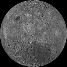
The Moon with hypsometric tints of red for the highest points and purple for the lowest.
There are two primary types of hypsometric tinting: discrete and continuous.
Maps with discrete hypsometric tinting have a distinct, uniform color between each of the contours, which give them a stepped appearance. The historical bathymetric map shown at the right is an example of discrete hypsometric tinting.
In a map with continuous hypsometric tinting, there is a gradual shift from one tint to another, which presents a smoother appearance. This is often accomplished using data from a digital elevation model (DEM). Each pixel in the DEM is assigned a color which corresponds to the exact elevation at that location, so it is more precise than discrete hypsometric tinting.[5] The colorful image of the moon has continuous hypsometric tinting.
A typical color scheme progresses from dark greens for lower elevations, up through yellows/browns and on to grays and white at the highest elevations.[6] In bathymetric tinting, lighter shades of blue represent shallower water such as the continental shelf and darker shades represent deeper regions.
Compare the information available in this image of a slightly different face of the Moon to the WorldWind depiction above.
Similar to false-color imagery, hypsometric tints can be used to make geographic information more accessible, as with this image of lunar topography.
Some cartographers have suggested that hypsometric tints are often used as decoration, rather than for informational purposes:[7]
…the current popularity of hypsometric tints has more to do with production ease and pretty colors than it does with our interest in elevation. … With hypsometric tints, the end result is often a map with pleasing colors that blend softly into one another in an orderly fashion, a design trait that people find attractive, even if they don’t necessarily know or care about elevations.
Related Research Articles
In mathematics, the four color theorem, or the four color map theorem, states that no more than four colors are required to color the regions of any map so that no two adjacent regions have the same color. Adjacent means that two regions share a common boundary curve segment, not merely a corner where three or more regions meet. It was the first major theorem to be proved using a computer. Initially, this proof was not accepted by all mathematicians because the computer-assisted proof was infeasible for a human to check by hand. The proof has gained wide acceptance since then, although some doubters remain.
Brown is a color. It can be considered a composite color, but it is mainly a darker shade of orange. In the CMYK color model used in printing and painting, brown is usually made by combining the colors orange and black. In the RGB color model used to project colors onto television screens and computer monitors, brown combines red and green.
In modern mapping, a topographic map or topographic sheet is a type of map characterized by large-scale detail and quantitative representation of relief features, usually using contour lines, but historically using a variety of methods. Traditional definitions require a topographic map to show both natural and artificial features. A topographic survey is typically based upon a systematic observation and published as a map series, made up of two or more map sheets that combine to form the whole map. A topographic map series uses a common specification that includes the range of cartographic symbols employed, as well as a standard geodetic framework that defines the map projection, coordinate system, ellipsoid and geodetic datum. Official topographic maps also adopt a national grid referencing system.
A digital elevation model (DEM) or digital surface model (DSM) is a 3D computer graphics representation of elevation data to represent terrain or overlaying objects, commonly of a planet, moon, or asteroid. A "global DEM" refers to a discrete global grid. DEMs are used often in geographic information systems (GIS), and are the most common basis for digitally produced relief maps. A digital terrain model (DTM) represents specifically the ground surface while DEM and DSM may represent tree top canopy or building roofs.
Topography is the study of the forms and features of land surfaces. The topography of an area may refer to the land forms and features themselves, or a description or depiction in maps.
A contour line of a function of two variables is a curve along which the function has a constant value, so that the curve joins points of equal value. It is a plane section of the three-dimensional graph of the function parallel to the -plane. More generally, a contour line for a function of two variables is a curve connecting points where the function has the same particular value.
False color refers to a group of color rendering methods used to display images in color which were recorded in the visible or non-visible parts of the electromagnetic spectrum. A false-color image is an image that depicts an object in colors that differ from those a photograph would show. In this image, colors have been assigned to three different wavelengths that our eyes cannot normally see.
The World Atlas is the Soviet and later Russian atlas of the world.
In comics, a colorist is responsible for adding color to black-and-white line art. For most of the 20th century this was done using brushes and dyes which were then used as guides to produce the printing plates. Since the late 20th century it is most often done using digital media, with printing separations produced electronically.
A choropleth map is a type of statistical thematic map that uses pseudocolor, i.e., color corresponding with an aggregate summary of a geographic characteristic within spatial enumeration units, such as population density or per-capita income.
The elevation of a geographic location is its height above or below a fixed reference point, most commonly a reference geoid, a mathematical model of the Earth's sea level as an equipotential gravitational surface . The term elevation is mainly used when referring to points on the Earth's surface, while altitude or geopotential height is used for points above the surface, such as an aircraft in flight or a spacecraft in orbit, and depth is used for points below the surface.
Slate gray is a gray color with a slight azure tinge that is a representation of the average color of the material slate. As a tertiary color, slate is an equal mix of purple and green pigments.
John Bartholomew was a Scottish cartographer.
In color theory, a color scheme is the choice of colors used in various artistic and design contexts. For example, the "Achromatic" use of a white background with black text is an example of a basic and commonly default color scheme in web design.
Film tinting is the process of adding color to black-and-white film, usually by means of soaking the film in dye and staining the film emulsion. The effect is that all of the light shining through is filtered, so that what would be white light becomes light of some color.
In cartography, map coloring is the act of choosing colors as a form of map symbol to be used on a map. In mathematics, map coloring is the act of assigning colors to features of a map such that no two adjacent features have the same color using the minimum number of colors.
Terrain cartography or relief mapping is the depiction of the shape of the surface of the Earth on a map, using one or more of several techniques that have been developed. Terrain or relief is an essential aspect of physical geography, and as such its portrayal presents a central problem in cartographic design, and more recently geographic information systems and geovisualization.
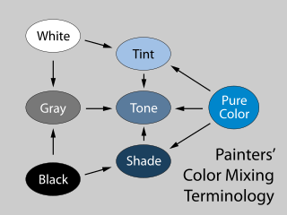
In color theory, a tint is a mixture of a color with white, which increases lightness, while a shade is a mixture with black, which increases darkness. Both processes affect the resulting color mixture's relative saturation. A tone is produced either by mixing a color with gray, or by both tinting and shading. Mixing a color with any neutral color reduces the chroma, or colorfulness, while the hue remains unchanged.
Glass coloring and color marking may be obtained in several ways.
by the addition of coloring ions,
by precipitation of nanometer-sized colloids, Ancient Roman enamelled glass, 1st century, Begram Hoard
by colored inclusions
by light scattering
by dichroic coatings, or
by colored coatings
Ombré is the blending of one color hue to another, usually moving tints and shades from light to dark. It has become a popular feature for hair coloring, nail art, and even baking, in addition to its uses in home decorating and graphic design.
This page is based on this Wikipedia article Text is available under the CC BY-SA 4.0 license; additional terms may apply. Images, videos and audio are available under their respective licenses.