In this map, the city points, highway lines, and the fill colors of the ocean and different countries are all considered map symbols. These symbols show location, convey information, increase aesthetic appeal, and create a gestalt order to the map.
A map symbol or cartographic symbol is a graphical device used to visually represent a real-world feature on a map, working in the same fashion as other forms of symbols. Map symbols may include point markers, lines, regions, continuous fields, or text; these can be designed visually in their shape, size, color, pattern, and other graphic variables to represent a variety of information about each phenomenon being represented.
Map symbols simultaneously serve several purposes:
Declare the existence of geographic phenomena
Show location and extent
Visualize attribute information
Add to (or detract from) the aesthetic appeal of the map, and/or evoke a particular aesthetic reaction (a "look and feel")
Establish an overall gestalt order to make the map more or less useful, including visual hierarchy
Representing spatial phenomena
Symbols are used to represent geographic phenomena, which exist in, and are represented by, a variety of spatial forms. Different kinds of symbols are used to portray different spatial forms.[1] Phenomena can be categorized a number of ways, but two are most relevant to symbology: ontological form and dimensionality. When a symbol is representing a property of the phenomenon as well as its location, the choice of symbol also depends on the nature of that property, usually classified as a Level of measurement.
Ontological form
Geographic phenomena can be categorized into objects, which are recognizable as a unified whole with a relevant boundary and shape; and masses, in which the notion of boundary and wholeness are not relevant to their identity. Features such as buildings, cities, roads, lakes, and countries are geographic objects that are often portrayed on maps using symbols. Mass phenomena include air, water, vegetation, and rock. These are rarely represented directly on maps; instead, map symbols portray their properties, which usually take the form of geographic fields, such as temperature, moisture content, density, and composition.
The number of spatial dimensions needed to represent a phenomenon determine a choice of Geometric primitive; each type of geometric primitive is drawn with a different type of visual symbol.[2]
Dimensions of Map Symbols
Shape
Dimensions
Geometric Primitive
Symbol Elements, Visual Variables
Point
0
Coordinate
Marker (shape, size, color, opacity)
Line/Curve
1
Polyline (linear or curved segments)
Stroke (color, size/weight, opacity, texture)
Planar Region/Field
2
Polygon, Raster
Boundary Stroke
Fill (color, opacity, texture)
Volumetric Region/Field
3
Polygon Mesh, Raster
Surface (color, size/weight, opacity, pattern)
Interior (color, opacity, texture)
The dimensionality of a map symbol representing a feature may or may not be the same as the dimensionality of the feature in the real world; discrepancies are the result of cartographic generalization to simplify features based on purpose and scale. For example, a three-dimensional road is often represented as a one-dimensional line symbol, while two-dimensional cities are frequently represented by zero-dimensional points.[3]
Many map symbols visualize not just the location and shape of a geographic phenomenon, but also one or more of its properties or attributes. Geographers and cartographers usually categorize properties according to the classification system of Stanley Smith Stevens, or some revision thereof, such as that of Chrisman.[4] Different kinds of symbols and visual variables are better at intuitively representing some levels than others, especially when the visual variable portrays the same kind of differences as the represented attribute.[3]
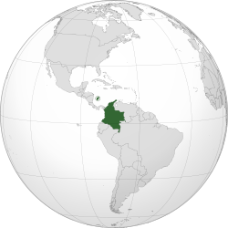
The dark green patch on this map is an ad hoc symbol for the country of Poland.
In cartography, the principles of cognition are important since they explain why certain map symbols work.[5] In the past, mapmakers did not care why the symbols worked. This behaviorist view treats the human brain like a black box. Modern cartographers are curious why certain symbols are the most effective. This should help develop a theoretical basis for how brains recognize symbols and, in turn, provide a platform for creating new symbols.
According to semiotics, specifically the Semiotic theory of Charles Sanders Peirce, map symbols are "read" by map users when they make a connection between the graphic mark on the map (the sign), a general or specific concept (the interpretant), and a particular feature of the real world (the object or referent). Map symbols can thus be categorized by how they suggest this connection:[6][7]
Iconic symbols (also "image", "pictorial", or "replicative") have a similar appearance to the real-world feature, although it is often in a generalized manner; e.g. a tree icon to represent a forest, brown denoting desert, or green denoting vegetation.
Functional symbols (also "representational") directly represent the activity that takes place at the represented feature; e.g. a picture of a skier to represent a ski resort or a tent to represent a campground.
Conceptual symbols directly represent a concept related to the represented feature; e.g. a dollar sign to represent an ATM, or a Star of David to represent a Jewish synagogue.
Conventional symbols (also "associative") do not have any intuitive relationship but are so commonly used that map readers eventually learn to recognize them; e.g. a red line to represent a highway or a Swiss cross to represent a hospital.
Ad hoc symbols (also "abstract") are arbitrary symbols chosen by the cartographer to represent a feature, with no intuitive connection to the interpretant or referent. These can only be interpreted with a legend. An example would be using various colors to represent geologic layers.
A map symbol is created by altering the visual appearance of a feature, whether a point, line, or region; this appearance can be controlled using one or more visual variables. Jacques Bertin, a French cartographer, developed the concept of visual variables in his 1967 book, "Sémiologie Graphique."[8] Bertin identified seven main categories of visual variables: position, size, shape, value, color, orientation, and texture/grain.[9] Since then, cartographers have modified and expanded this set.[10]
National Park standard point symbols, using shape to represent different types of facilities, a nominal variable.
Size, how much space a symbol occupies on a map, most commonly refers to the area of point symbols, and the thickness of line symbols, although the cartogram controls the size of area features proportional to a given variable. Size has been shown to be very effective at conveying quantitative data, and in the visual hierarchy.[11]
Shape is most commonly discussed in the context of point symbols (as the shapes of lines and areas are typically fixed by geographic reality), and is generally only used to differentiate nominal categories.[12] That said, some maps purposefully manipulate the shape of lines and areas, often for purposes of Cartographic generalization, such as in schematic transit maps, although this distortion is rarely used to convey information, only to reduce emphasis on shape and location.
Color Hue is the visual property caused by the blending of various wavelengths of light, which we commonly refer to by color names like "red," "green," or "blue." Maps often use hue to differentiate categories of nominal variables, such as land cover types or geologic layers,[13] or for its psychological connotations, such as red implying heat or danger and blue implying cold or water.
The synergy of Saturation (color vs. gray), value (dark vs. light), and position (centrality) to strongly establish figure-ground and visual hierarchy
Color value or lightness, how light or dark an object appears. Value effectively connotes "more" and "less," an ordinal measure; this makes it a very useful form of symbology in thematic maps, especially choropleth maps. Value also contributes strongly to Visual hierarchy; elements that contrast most with the value of the background tend to stand out most (e.g., black on a white sheet of paper, white on a black computer screen).
Color saturation/intensity is the purity or intensity of a color, created by the degree of variety of light composing it; a single wavelength of light is of the highest saturation, while white, black, or gray has no saturation (being an even mixture of all visible wavelengths). Saturation has been found to be of marginal value in representing property information, but is very effective at establishing figure-ground and visual hierarchy, with bright colors generally standing out more than muted tones or shades of gray.
Orientation, the direction labels and symbols are facing on a map. Although it is not used as often as many of the other visual variables, it can be useful for communicating information about the real-world orientation of features, such as wind direction and the direction in which a spring flows.
Pattern or Texture is the aggregation of large numbers of similar symbols into a composite symbol, such as a forest represented by a random scattering of tree icons. In addition to the visual variables that make up the sub-symbols, there are variables for controlling the pattern as a whole:
Grain or Spacing, the distance between the individual symbols. Typically seen as similar to value, only with a weaker effect.
Arrangement, the pattern of distribution of the sub-symbols, often either random or as a regular grid.
Transparency is used here to indicate overlapping sovereignty claims.
Transparency or Opacity, the mathematical blending of symbols of overlapping features, giving the illusion of underlying symbols being partially visible through overlying symbols. This is a recent addition due to software advancements, and is rarely used to convey specific information, but is used increasingly commonly for aiding the visual hierarchy and increasing aesthetic quality.
Cartographers have also proposed analogous sets of controllable variables for animated maps,[14][2] haptic (touch) maps,[15] and even the use of sound in digital maps.[16]
An important factor in map symbols is the order in which they are ranked according to their relative importance. This is known as intellectual hierarchy. The most important hierarchy is the thematic symbols and type labels that are directly related to the theme. Next comes the title, subtitle, and legend.[1] The map must also contain base information, such as boundaries, roads, and place names. Data source and notes should be on all maps. Lastly, the scale, neat lines, and north arrow are the least important of the hierarchy of the map. From this we see that the symbols are the single most important thing to build a good visual hierarchy that shows proper graphical representation. When producing a map with good visual hierarchy, thematic symbols should be graphically emphasized. A map with a visual hierarchy that is effective attracts the map user's eyes to the symbols with the most important aspects of the map first and to the symbols with the lesser importance later.
Map legend
The legend of the map also contains important information and all of the thematic symbols of the map. Symbols that need no explanations, or do not coincide with the theme of the map, are normally omitted from the map legend. Thematic symbols directly represent the maps theme and should stand out.[17]
See also
Hatching; use of hatching and cross-hatching in cartography
1 2 3 Chrisman, Nicholas R. (1998). "Rethinking Levels of Measurement for Cartography". Cartography and Geographic Information Science. 25 (4): 231–242. doi:10.1559/152304098782383043.
↑ MacEachren, Alan (1995) How Maps Work: Representation, visualization, and design, New York: Guilford Press
↑ Dent, Borden D. (1999). Cartography: thematic map design (5thed.). New York: McGraw-Hill Higher Education. ISBN0697384950.
↑ Jacque Bertin, Sémiologie Graphique. Les diagrammes, les réseaux, les cartes. With Marc Barbut [et al.]. Paris: Gauthier-Villars. (Translation 1983. Semiology of Graphics by William J. Berg.)
↑ Dibiase, David; MacEachren, Alan M.; Krygier, John B.; Reeves, Catherine (1992). "Animation and the Role of Map Design in Scientific Visualization". Cartography and Geographic Information Systems. 19 (4): 201–214. doi:10.1559/152304092783721295.
↑ Krygier, J. B. (1994). Sound and geographic visualization. In Visualization in Modern Cartography. A. M. MacEachren and D. R. F. Taylor (Eds.). Oxford: Pergamon, pp. 149–166
This page is based on this Wikipedia article Text is available under the CC BY-SA 4.0 license; additional terms may apply. Images, videos and audio are available under their respective licenses.