Diagram

Last updated

A diagram is a symbolic representation of information using visualization techniques. Diagrams have been used since prehistoric times on walls of caves, but became more prevalent during the Enlightenment. [1] Sometimes, the technique uses a three-dimensional visualization which is then projected onto a two-dimensional surface. The word graph is sometimes used as a synonym for diagram.

Contents

Overview

The term "diagram" in its commonly used sense can have a general or specific meaning:
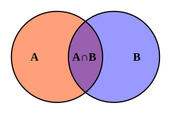
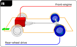
In science the term is used in both ways. For example, Anderson (1997) stated more generally: "diagrams are pictorial, yet abstract, representations of information, and maps, line graphs, bar charts, engineering blueprints, and architects' sketches are all examples of diagrams, whereas photographs and video are not". [2] On the other hand, Lowe (1993) defined diagrams as specifically "abstract graphic portrayals of the subject matter they represent". [3]

In the specific sense diagrams and charts contrast with computer graphics, technical illustrations, infographics, maps, and technical drawings, by showing "abstract rather than literal representations of information". [4] The essence of a diagram can be seen as: [4]

Or in Hall's (1996) words "diagrams are simplified figures, caricatures in a way, intended to convey essential meaning". [5] These simplified figures are often based on a set of rules. The basic shape according to White (1984) can be characterized in terms of "elegance, clarity, ease, pattern, simplicity, and validity". [4] Elegance is basically determined by whether or not the diagram is "the simplest and most fitting solution to a problem". [6]

Diagrammatology

Diagrammatology is the academic study of diagrams. Scholars note that while a diagram may look similar to the thing that it represents, this is not necessary. Rather a diagram may only have structural similarity to what it represents, an idea often attributed to Charles Sanders Peirce. [7] :42 Structural similarity can be defined in terms of a mapping between parts of the diagram and parts of what the diagram represents and the properties of this mapping, such as maintaining relations between these parts and facts about these relations. This is related to the concept of isomorphism, or homomorphism in mathematics. [7] :43

Sometimes certain geometric properties (such as which points are closer) of the diagram can be mapped to properties of the thing that a diagram represents. On the other hand, the representation of an object in a diagram may be overly specific and properties that are true in the diagram may not be true for the object the diagram represents. [7] :48 A diagram may act as a means of cognitive extension allowing reasoning to take place on the diagram based on which constraints are similar. [7] :50

There are at least the following types of diagrams:

Logical

Quantitative

Schematic

Human karyotype with bands and sub-bands (simple).svg
Schematic diagram of the same.

Many of these types of diagrams are commonly generated using diagramming software such as Visio and Gliffy.

Diagrams may also be classified according to use or purpose, for example, explanatory and/or how to diagrams.

Thousands of diagram techniques exist. Some more examples follow:

Specific diagram types

See also

Related Research Articles

<span class="mw-page-title-main">Chart</span> Graphical representation of data

A chart is a graphical representation for data visualization, in which "the data is represented by symbols, such as bars in a bar chart, lines in a line chart, or slices in a pie chart". A chart can represent tabular numeric data, functions or some kinds of quality structure and provides different info.

Graphics are visual images or designs on some surface, such as a wall, canvas, screen, paper, or stone, to inform, illustrate, or entertain. In contemporary usage, it includes a pictorial representation of data, as in design and manufacture, in typesetting and the graphic arts, and in educational and recreational software. Images that are generated by a computer are called computer graphics.

<span class="mw-page-title-main">Scatter plot</span> Plot using the dispersal of scattered dots to show the relationship between variables

A scatter plot, also called a scatterplot, scatter graph, scatter chart, scattergram, or scatter diagram, is a type of plot or mathematical diagram using Cartesian coordinates to display values for typically two variables for a set of data. If the points are coded (color/shape/size), one additional variable can be displayed. The data are displayed as a collection of points, each having the value of one variable determining the position on the horizontal axis and the value of the other variable determining the position on the vertical axis.

<span class="mw-page-title-main">Flowchart</span> Diagram that represents a workflow or process

A flowchart is a type of diagram that represents a workflow or process. A flowchart can also be defined as a diagrammatic representation of an algorithm, a step-by-step approach to solving a task.

<span class="mw-page-title-main">Visualization (graphics)</span> Set of techniques for creating images, diagrams, or animations to communicate a message

Visualization or visualisation is any technique for creating images, diagrams, or animations to communicate a message. Visualization through visual imagery has been an effective way to communicate both abstract and concrete ideas since the dawn of humanity. from history include cave paintings, Egyptian hieroglyphs, Greek geometry, and Leonardo da Vinci's revolutionary methods of technical drawing for engineering and scientific purposes.

<span class="mw-page-title-main">Pie chart</span> Circular statistical graph that illustrates numerical proportion

A pie chart is a circular statistical graphic which is divided into slices to illustrate numerical proportion. In a pie chart, the arc length of each slice is proportional to the quantity it represents. While it is named for its resemblance to a pie which has been sliced, there are variations on the way it can be presented. The earliest known pie chart is generally credited to William Playfair's Statistical Breviary of 1801.

<span class="mw-page-title-main">Infographic</span> Graphic visual representation of information

Infographics are graphic visual representations of information, data, or knowledge intended to present information quickly and clearly. They can improve cognition by using graphics to enhance the human visual system's ability to see patterns and trends. Similar pursuits are information visualization, data visualization, statistical graphics, information design, or information architecture. Infographics have evolved in recent years to be for mass communication, and thus are designed with fewer assumptions about the readers' knowledge base than other types of visualizations. Isotypes are an early example of infographics conveying information quickly and easily to the masses.

<span class="mw-page-title-main">Flow diagram</span> Chart of the interactions in a system

Flow diagram is a collective term for a diagram representing a flow or set of dynamic relationships in a system. The term flow diagram is also used as a synonym for flowchart, and sometimes as a counterpart of the flowchart.

<span class="mw-page-title-main">Data and information visualization</span> Visual representation of data

Data and information visualization is the practice of designing and creating easy-to-communicate and easy-to-understand graphic or visual representations of a large amount of complex quantitative and qualitative data and information with the help of static, dynamic or interactive visual items. Typically based on data and information collected from a certain domain of expertise, these visualizations are intended for a broader audience to help them visually explore and discover, quickly understand, interpret and gain important insights into otherwise difficult-to-identify structures, relationships, correlations, local and global patterns, trends, variations, constancy, clusters, outliers and unusual groupings within data. When intended for the general public to convey a concise version of known, specific information in a clear and engaging manner, it is typically called information graphics.

<span class="mw-page-title-main">Heat map</span> Data visualization technique

A heat map is a 2-dimensional data visualization technique that represents the magnitude of individual values within a dataset as a color. The variation in color may be by hue or intensity.

<span class="mw-page-title-main">Diagrammatic reasoning</span>

Diagrammatic reasoning is reasoning by means of visual representations. The study of diagrammatic reasoning is about the understanding of concepts and ideas, visualized with the use of diagrams and imagery instead of by linguistic or algebraic means.

<span class="mw-page-title-main">Graphic communication</span> Communication using graphic elements

Graphic communication as the name suggests is communication using graphic elements. These elements include symbols such as glyphs and icons, images such as drawings and photographs, and can include the passive contributions of substrate, colour and surroundings. It is the process of creating, producing, and distributing material incorporating words and images to convey data, concepts, and emotions.

Statistical graphics, also known as statistical graphical techniques, are graphics used in the field of statistics for data visualization.

<span class="mw-page-title-main">Visual analytics</span>

Visual analytics is an outgrowth of the fields of information visualization and scientific visualization that focuses on analytical reasoning facilitated by interactive visual interfaces.

A Cluster diagram or clustering diagram is a general type of diagram, which represents some kind of cluster. A cluster in general is a group or bunch of several discrete items that are close to each other.

<span class="mw-page-title-main">Plot (graphics)</span> Graphical technique for data sets

A plot is a graphical technique for representing a data set, usually as a graph showing the relationship between two or more variables. The plot can be drawn by hand or by a computer. In the past, sometimes mechanical or electronic plotters were used. Graphs are a visual representation of the relationship between variables, which are very useful for humans who can then quickly derive an understanding which may not have come from lists of values. Given a scale or ruler, graphs can also be used to read off the value of an unknown variable plotted as a function of a known one, but this can also be done with data presented in tabular form. Graphs of functions are used in mathematics, sciences, engineering, technology, finance, and other areas.

<span class="mw-page-title-main">Bubble chart</span> Type of chart

A bubble chart is a type of chart that displays three dimensions of data. Each entity with its triplet (v1, v2, v3) of associated data is plotted as a disk that expresses two of the vi values through the disk's xy location and the third through its size. Bubble charts can facilitate the understanding of social, economical, medical, and other scientific relationships.

<span class="mw-page-title-main">Motion chart</span>

A motion chart is a dynamic bubble chart which allows efficient and interactive exploration and visualization of longitudinal multivariate data. Motion charts provide mechanisms for mapping ordinal, nominal and quantitative variables onto time, 2D coordinate axes, size, colors, glyphs and appearance characteristics, which facilitate the interactive display of multidimensional and temporal data.

Graph literacy is the ability to understand information that presented graphically, which are including general knowledge about how to extract information and make inferences from different graphical formats. Although related, graph literacy is distinct from other forms of literacy in the sense that it relates more specifically to one's ability to obtain meaning from information presented graphically. It can include the storage of mental representations in long-term memory, knowledge about the properties of different types of formats, and procedures to interpret them. However, similar to other types of literacy, higher graph literacy is associated with higher education levels and suggests that developing the skills required to interpret graphical information requires knowledge that is acquired through formal education and experience.

References

  1. Eddy, Matthew Daniel (2021). "Diagrams". In Blair, Ann; Duguid, Paul; Goeing, Anja-Silvia; Grafton, Anthony (eds.). Information: A Historical Companion. Princeton, NJ: Princeton University Press. pp. 397–401. doi:10.2307/j.ctv1pdrrbs.42. ISBN   9780691179544. JSTOR   j.ctv1pdrrbs.42. OCLC   1202730160. S2CID   240873019.
  2. Michael Anderson (1997). "Introduction to Diagrammatic Reasoning", at cs.hartford.edu. Retrieved 21 July 2008.
  3. Lowe, Richard K. (1993). "Diagrammatic information: techniques for exploring its mental representation and processing". Information Design Journal. 7 (1): 3–18. doi:10.1075/idj.7.1.01low.
  4. 1 2 3 Brasseur, Lee E. (2003). Visualizing technical information: a cultural critique. Amityville, N.Y: Baywood Pub. ISBN   0-89503-240-6.
  5. Bert S. Hall (1996). "The Didactic and the Elegant: Some Thoughts on Scientific and Technological Illustrations in the Middle Ages and Renaissance". in: B. Braigie (ed.) Picturing knowledge: historical and philosophical problems concerning the use of art in science. Toronto: University of Toronto Press. p.9
  6. White, Jan V. (1984). Using charts and graphs: 1000 ideas for visual persuasion . New York: Bowker. ISBN   0-8352-1894-5.
  7. 1 2 3 4 Pombo, Olga; Gerner, Alexander, eds. (2010). Studies in Diagrammatology and Diagram Praxis. London: College Publications. ISBN   978-1-84890-007-3. OCLC   648770148.

Further reading