Edward Tufte

Last updated

Edward Tufte
Edward Tufte - cropped.jpg
Tufte (age 73) during his one-day course in Dallas, May 21, 2015
Born (1942-03-14) March 14, 1942 (age 82) [1]
Kansas City, Missouri
OccupationProfessor, statistician, writer, sculptor
NationalityAmerican
Education Stanford University (BS, MS)
Yale University (PhD)
Notable works
  • The Visual Display of Quantitative Information
  • Beautiful Evidence
Scientific career
Thesis The Civil Rights Movement and Its Opposition  (1968)
Doctoral advisor Robert Dahl
Website
edwardtufte.com OOjs UI icon edit-ltr-progressive.svg

Edward Rolf Tufte ( /ˈtʌfti/ ; [2] born March 14, 1942), [1] sometimes known as "ET", [3] is an American statistician and professor emeritus of political science, statistics, and computer science at Yale University. [4] He is noted for his writings on information design and as a pioneer in the field of data visualization. [5]

Contents

Early life and education

Edward Rolf Tufte was born in 1942 in Kansas City, Missouri, to Virginia Tufte (1918–2020) and Edward E. Tufte (1912–1999). He grew up in Beverly Hills, California, where his father was a longtime city official. He graduated from the public Beverly Hills High School. [6]

Tufte received a BS and a MS in statistics from Stanford University, and a Doctor of Philosophy in political science from Yale University. [7] His dissertation was completed in 1968 and titled The Civil Rights Movement and Its Opposition. [8]

Career

Tufte was hired in 1967 by the Woodrow Wilson School of Princeton University as a lecturer in politics and public affairs, where he steadily moved up to the rank of full Professor.[ when? ] He taught courses there in political economy and data analysis while publishing three quantitatively inclined political science books.

In 1975, while at Princeton, Tufte was asked to teach a statistics course to a group of journalists who were visiting the school to study economics. He developed a set of readings and lectures on statistical graphics, which he further developed in joint seminars he taught with renowned statistician John Tukey, a pioneer in the field of information design. These course materials became the foundation for Tufte's first book on information design, The Visual Display of Quantitative Information. [9] [10]

In 1977, Tufte left Princeton University for Yale University, where he accepted an appointment as Professor of Political Science, Statistics, and Computer Science, as well as a Senior Critic at the Yale School of Art. [11]

After negotiations with major publishers failed, Tufte decided to self-publish the book The Visual Display of Quantitative Information in 1982, working closely with graphic designer Howard Gralla. Tufte financed the work by taking out a second mortgage on his home. The book quickly became a commercial success and secured Tufte's transition from political scientist to information expert. [9]

In 1999, after 22 years of service at Yale University, his professorship at Yale were made Emeritus. [11]

On March 5, 2010, President Barack Obama appointed Tufte to the American Recovery and Reinvestment Act's Recovery Independent Advisory Panel "to provide transparency in the use of Recovery-related funds". [7]

Infographic work

Tufte is an expert in the presentation of infographics such as charts and diagrams, and is a fellow of the American Statistical Association. He has held fellowships from the Guggenheim Foundation and the Center for Advanced Study in the Behavioral Sciences.

Information design

Tufte described Charles Joseph Minard's 1869 graphic of Napoleonic France's invasion of Russia as what "may well be the best statistical graphic ever drawn", noting that it captures six variables in two dimensions. Minard.png
Tufte described Charles Joseph Minard's 1869 graphic of Napoleonic France's invasion of Russia as what "may well be the best statistical graphic ever drawn", noting that it captures six variables in two dimensions.

Tufte's writing is important in such fields as information design and visual literacy, which deal with the visual communication of information. He coined the word chartjunk to refer to useless, non-informative, or information-obscuring elements of quantitative information displays. Tufte's other key concepts include what he calls the lie factor, the data-ink ratio, and the data density of a graphic. [13]

Tufte uses the term "data-ink ratio" to argue against using excessive decoration in visual displays of quantitative information. [14] In Visual Display, Tufte explains, "Sometimes decoration can help editorialize about the substance of the graphic. But it is wrong to distort the data measures—the ink locating values of numbers—in order to make an editorial comment or fit a decorative scheme." [15]

Tufte encourages the use of data-rich illustrations that present all available data. When such illustrations are examined closely, every data point has a value, but when they are looked at more generally, only trends and patterns can be observed. Tufte suggests these macro/micro readings be presented in the space of an eye-span, in the high resolution format of the printed page, and at the unhurried pace of the viewer's leisure.[ citation needed ]

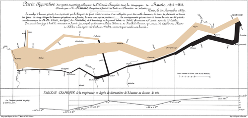
Tufte uses several historical examples to make his case. These include John Snow's cholera outbreak map, Charles Joseph Minard's Carte Figurative, early space debris plots, Galileo Galilei's Sidereus Nuncius , and Maya Lin's Vietnam Veterans Memorial. For instance, the listing of the names of deceased soldiers on the black granite of Lin's sculptural memorial is shown to be more powerful as a chronological list rather than as an alphabetical one. The sacrifice each fallen individual has made is thus highlighted within the overall time scope of the war. [16] In Sidereus Nuncius, Galileo presents the nightly observations of the moons of Jupiter in relation to the body itself, interwoven with the two-month narrative record. [17]

Criticism of PowerPoint

Tufte has criticized the way Microsoft PowerPoint is typically used. In his essay "The Cognitive Style of PowerPoint", Tufte criticizes many aspects of the software:[ citation needed ]

Tufte cites the way PowerPoint was used by NASA engineers in the events leading to the Space Shuttle Columbia disaster as an example of PowerPoint's many problems. The software style is designed to persuade rather than to inform people of technical details. Tufte's analysis of a NASA PowerPoint slide is included in the Columbia Accident Investigation Board’s report -- including an engineering detail buried in small type on a crowded slide with six bullet points, that if presented in a regular engineering white paper, might have been noticed and the disaster prevented. [18] [19]

Instead, Tufte argues that the most effective way of presenting information in a technical setting, such as an academic seminar or a meeting of industry experts, is by distributing a brief written report that can be read by all participants in the first 5 to 10 minutes of the meeting. Tufte believes that this is the most efficient method of transferring knowledge from the presenter to the audience and then the rest of the meeting is devoted to discussion and debate. [18]

Small multiple

One method Tufte encourages to allow quick visual comparison of multiple series is the small multiple, a chart with many series shown on a single pair of axes that can often be easier to read when displayed as several separate pairs of axes placed next to each other. He suggests this is particularly helpful when the series are measured on quite different vertical (y-axis) scales, but over the same range on the horizontal x-axis (usually time).[ citation needed ]

Sparkline

Earliest known implementation of sparklines, around January 1998 by interaction designer Peter Zelchenko for programmer Michael Medved and the QuoteTracker application (sold to TD Ameritrade). Screenshot of Sparklines in Medved QuoteTracker, 1998.png
Earliest known implementation of sparklines, around January 1998 by interaction designer Peter Zelchenko for programmer Michael Medved and the QuoteTracker application (sold to TD Ameritrade).

Sparklines are a condensed way to present trends and variation, associated with a measurement such as average temperature or stock market activity, often embedded directly in the text; for example: The Dow Jones index for February 7, 2006 Sparkline dowjones new.svg . [20] [21] These are often used as elements of a small multiple with several lines used together. Tufte explains the sparkline as a kind of "word" that conveys rich information without breaking the flow of a sentence or paragraph made of other "words" both visual and conventional. To date, the earliest known implementation of sparklines was conceived by interaction designer Peter Zelchenko and implemented by programmer Mike Medved in early 1998.[ citation needed ] [22]

Sculpture

Beyond his academic endeavors over the years, Tufte has created sculptures, often large outdoor ones made of metal or stone, [6] that were first primarily exhibited on his own rural Connecticut property. In 2009–10, some of these artworks were exhibited at the Aldrich Contemporary Art Museum in Ridgefield, Connecticut, in the one-man show Edward Tufte: Seeing Around. [23]

Hogpen Hill Farms

Hogpen Hill Farms, the 234- acre (95- hectare ) Tufte sculpture garden in Woodbury, Connecticut, is open to the public on summer weekends. [24]

ET Modern

In 2010, Edward Tufte opened a gallery, ET Modern, in New York City's Chelsea Art District" [3] at 11th Avenue and 20th Street. [25] The gallery closed in 2013. [26]

Bibliography

Works on political economy

  • Brody, Richard A.; Tufte, Edward R. (March 1964). "Constituent-Congressional Communication on Fallout Shelters: The Congressional Polls". Journal of Communication. 14 (1): 34–39. doi:10.1111/j.1460-2466.1964.tb02345.x.
  • Ekman, Paul; Tufte, Edward R.; Archibald, Kathleen; Brody, Richard A (June 1966). "Coping with Cuba: Divergent Policy Preferences of State Political Leaders". The Journal of Conflict Resolution. 10 (2): 180–97. doi:10.1177/002200276601000203. S2CID   154210702.
  • Tufte, Edward R. (1968), The Civil Rights Movement and Its Opposition (PhD thesis).
  • (July 1969). "Improving Data Analysis in Political Science". World Politics. 21 (4). Cambridge University Press: 641–54. doi:10.2307/2009670. JSTOR   2009670. S2CID   153793854.
  • ; Reed, John Shelton (Winter 1969–1970). "A Note of Caution in Using Variables That Have Common Elements". The Public Opinion Quarterly. 33 (4): 622–6. doi:10.1086/267756.
  • ; Kish, Ed L. (1970). Some statistical problems in research design. The Quantitative Analysis of Social Problems. Reading, MA: Addison–Wesley.
  • Edward R. Tufte reviewed work: Palumbo, Dennis J. (September 1970). "Statistics in Political and Behavioral Science". Journal of the American Statistical Association. 65 (331): 1414–5. doi:10.2307/2284317. JSTOR   2284317.
  • ; Dahl, Robert (1973), Size & Democracy: The Politics of the smaller European democracies , Stanford, CA, US: Stanford University Press, ISBN   0-8047-0834-7 .
  • (June 1973). "The Relationship between Seats and Votes in Two-Party Systems". The American Political Science Review. 67 (2): 540–54. doi:10.2307/1958782. JSTOR   1958782. S2CID   33920492.
  • (1974), The Political Manipulation of the Economy: Influence of the Electoral Cycle on Macroeconomic Performance and Policy (unpublished manuscript), Department of Politics, Princeton University.
  • (1974), Data Analysis for Politics and Policy , Prentice Hall College Div, ISBN   0-13-197525-0 .
  • Lemieux, Peter H.; Kort, Fred; Pfotenhauer, David; Stewart, Philip R; Burnham, Walter Dean; Tufte, Edward R. (March 1974). "Communications". The American Political Science Review. 68 (1): 202–13. doi:10.1017/S0003055400235478. S2CID   251095897.
  • Tufte, Edward R. (June 1974). "Electoral Reform: An Introduction". Policy Studies Journal. 2 (4): 240–2. doi:10.1111/j.1541-0072.1974.tb00406.x.
  • ; Sun, Richard A (1974). "Are there Bellwether Electoral Districts?". Public Opin Q. 39 (1): 1–18. doi:10.1086/268196.
  • (November 1975). "Electronic Calculators and Data Analysis: A Consumer's Report on the SR-51, HP-21, HP-55, and HP-65". American Journal of Political Science. 19 (4): 783–94. doi:10.2307/2110727. JSTOR   2110727.
  • (1977). "Improving Data Display". Dept. Of Statistics. University of Chicago.
  • (March 1977). "Political Statistics for the United States: Observations on Some Major Data Sources". The American Political Science Review. 71 (1): 305–14. doi:10.2307/1956972. JSTOR   1956972. S2CID   144587924.
  • (1978), Political Control of the Economy, Princeton, NJ: Princeton University Press, ISBN   0-691-07594-8 .
  • (January 1979). "Political Parties, Social Class, and Economic Policy Preferences". Government and Opposition. 14 (1): 18–36. doi:10.1111/j.1477-7053.1979.tb00240.x. S2CID   153921242.
  • Edward R. Tufte reviewed work: Shultz, George P.; Dam, Kenneth W. (June 1979). "Economic Policy Beyond the Headlines". The American Political Science Review. 73 (2): 605. doi:10.2307/1954949. JSTOR   1954949. S2CID   146954589.
  • Edward R. Tufte reviewed work: Cohen, Jacob; Cohen, Patricia (December 1979). "Applied Multiple Regression/Correlation Analysis for the Behavioral Sciences". Journal of the American Statistical Association. 74 (368): 935. doi:10.2307/2286442. JSTOR   2286442.
  • Hoffman, David; Matisse, Henri; Tufte, Edward R (1987). "The computer-aided discovery of new embedded minimal surfaces". The Mathematical Intelligencer. 9 (3): 8–21. doi:10.1007/BF03023947. S2CID   121320768.
  • Edward R. Tufte reviewed work: Rose, Richard; Peters, Guy (June 1980). "Can Government Go Bankrupt?". The American Political Science Review. 74 (2): 567–8. doi:10.2307/1960736. JSTOR   1960736. S2CID   144477006.
  • (1985). Evidence Selection in Statistical Studies of Political Economy: The Distribution of Published Statistics (unpublished manuscript)..
  • (November 1987). "Dynamic Graphics for Data Analysis: Comment". Statistical Science. 2 (4): 389–92. doi: 10.1214/ss/1177013109 .
  • (November 1988). "A Conversation with Cuthbert Daniel". Statistical Science. 3 (4): 413–24. doi: 10.1214/ss/1177012760 .

Works of analytic design

Exhibitions

Related Research Articles

<span class="mw-page-title-main">Information design</span> Communication and graphic design

Information design is the practice of presenting information in a way that fosters an efficient and effective understanding of the information. The term has come to be used for a specific area of graphic design related to displaying information effectively, rather than just attractively or for artistic expression. Information design is closely related to the field of data visualization and is often taught as part of graphic design courses. The broad applications of information design along with its close connections to other fields of design and communication practices have created some overlap in the definitions of communication design, data visualization, and information architecture.

Information art, which is also known as informatism or data art, is an art form that is inspired by and principally incorporates data, computer science, information technology, artificial intelligence, and related data-driven fields. The information revolution has resulted in over-abundant data that are critical in a wide range of areas, from the Internet to healthcare systems. Related to conceptual art, electronic art and new media art, informatism considers this new technological, economical, and cultural paradigm shift, such that artworks may provide social commentaries, synthesize multiple disciplines, and develop new aesthetics. Realization of information art often take, although not necessarily, interdisciplinary and multidisciplinary approaches incorporating visual, audio, data analysis, performance, and others. Furthermore, physical and virtual installations involving informatism often provide human-computer interaction that generate artistic contents based on the processing of large amounts of data.

A small multiple is a series of similar graphs or charts using the same scale and axes, allowing them to be easily compared. It uses multiple views to show different partitions of a dataset. The term was popularized by Edward Tufte.

<span class="mw-page-title-main">Visualization (graphics)</span> Set of techniques for creating images, diagrams, or animations to communicate a message

Visualization, also known as Graphics Visualization, is any technique for creating images, diagrams, or animations to communicate a message. Visualization through visual imagery has been an effective way to communicate both abstract and concrete ideas since the dawn of humanity. from history include cave paintings, Egyptian hieroglyphs, Greek geometry, and Leonardo da Vinci's revolutionary methods of technical drawing for engineering purposes that actively involve scientific requirements.

<span class="mw-page-title-main">Pie chart</span> Circular statistical graph that illustrates numerical proportion

A pie chart is a circular statistical graphic which is divided into slices to illustrate numerical proportion. In a pie chart, the arc length of each slice is proportional to the quantity it represents. While it is named for its resemblance to a pie which has been sliced, there are variations on the way it can be presented. The earliest known pie chart is generally credited to William Playfair's Statistical Breviary of 1801.

<span class="mw-page-title-main">Chartjunk</span> Term for unnecessary visual elements in charts

Chartjunk consists of all visual elements in charts and graphs that are not necessary to comprehend the information represented on the graph, or that distract the viewer from this information.

<span class="mw-page-title-main">Infographic</span> Graphic visual representation of information

Infographic are graphic visual representations of information, data, or knowledge intended to present information quickly and clearly. They can improve cognition by using graphics to enhance the human visual system's ability to see patterns and trends. Similar pursuits are information visualization, data visualization, statistical graphics, information design, or information architecture. Infographics have evolved in recent years to be for mass communication, and thus are designed with fewer assumptions about the readers' knowledge base than other types of visualizations. Isotypes are an early example of infographics conveying information quickly and easily to the masses.

A sparkline is a very small line chart, typically drawn without axes or coordinates. It presents the general shape of a variation in some measurement, such as temperature or stock market price, in a simple and highly condensed way. Whereas a typical chart is designed to professionally show as much data as possible, and is set off from the flow of text, sparklines are intended to be succinct, memorable, and located where they are discussed. Sparklines are small enough to be embedded in text, or several sparklines may be grouped together as elements of a small multiple.

Statistical literacy is the ability to understand and reason with statistics and data. The abilities to understand and reason with data, or arguments that use data, are necessary for citizens to understand material presented in publications such as newspapers, television, and the Internet. However, scientists also need to develop statistical literacy so that they can both produce rigorous and reproducible research and consume it. Numeracy is an element of being statistically literate and in some models of statistical literacy, or for some populations, it is a prerequisite skill. Being statistically literate is sometimes taken to include having the abilities to both critically evaluate statistical material and appreciate the relevance of statistically-based approaches to all aspects of life in general or to the evaluating, design, and/or production of scientific work.

<span class="mw-page-title-main">Data and information visualization</span> Visual representation of data

Data and information visualization is the practice of designing and creating easy-to-communicate and easy-to-understand graphic or visual representations of a large amount of complex quantitative and qualitative data and information with the help of static, dynamic or interactive visual items. Typically based on data and information collected from a certain domain of expertise, these visualizations are intended for a broader audience to help them visually explore and discover, quickly understand, interpret and gain important insights into otherwise difficult-to-identify structures, relationships, correlations, local and global patterns, trends, variations, constancy, clusters, outliers and unusual groupings within data. When intended for the general public to convey a concise version of known, specific information in a clear and engaging manner, it is typically called information graphics.

<span class="mw-page-title-main">Charles Joseph Minard</span> French civil engineer (1781–1870)

Charles Joseph Minard was a French civil engineer recognized for his significant contribution in the field of information graphics in civil engineering and statistics. Minard was, among other things, noted for his representation of numerical data on geographic maps, especially his flow maps.

<span class="mw-page-title-main">Chernoff face</span> Human-face shaped display of data

Chernoff faces, invented by applied mathematician, statistician and physicist Herman Chernoff in 1973, display multivariate data in the shape of a human face. The individual parts, such as eyes, ears, mouth and nose represent values of the variables by their shape, size, placement and orientation. The idea behind using faces is that humans easily recognize faces and notice small changes without difficulty. Chernoff faces handle each variable differently. Because the features of the faces vary in perceived importance, the way in which variables are mapped to the features should be carefully chosen.

<span class="mw-page-title-main">Anscombe's quartet</span> Four data sets with the same descriptive statistics, yet very different distributions

Anscombe's quartet comprises four datasets that have nearly identical simple descriptive statistics, yet have very different distributions and appear very different when graphed. Each dataset consists of eleven (xy) points. They were constructed in 1973 by the statistician Francis Anscombe to demonstrate both the importance of graphing data when analyzing it, and the effect of outliers and other influential observations on statistical properties. He described the article as being intended to counter the impression among statisticians that "numerical calculations are exact, but graphs are rough".

Statistical graphics, also known as statistical graphical techniques, are graphics used in the field of statistics for data visualization.

Virginia James Tufte was a writer and distinguished emerita professor of English at the University of Southern California. Her special fields were Milton, Renaissance poetry, and the history and grammar of English.

<span class="mw-page-title-main">Misleading graph</span> Graph that misrepresents data

In statistics, a misleading graph, also known as a distorted graph, is a graph that misrepresents data, constituting a misuse of statistics and with the result that an incorrect conclusion may be derived from it.

<span class="mw-page-title-main">Howard G. Funkhouser</span> American mathematician and historian (1898–1984)

Howard Gray Funkhouser was an American mathematician, historian and associate professor of mathematics at the Washington and Lee University, and later at the Phillips Exeter Academy, particularly known for his early work on the history of graphical methods.

<span class="mw-page-title-main">Graphical perception</span>

Graphical perception is the human capacity for visually interpreting information on graphs and charts. Both quantitative and qualitative information can be said to be encoded into the image, and the human capacity to interpret it is sometimes called decoding. The importance of human graphical perception, what we discern easily versus what our brains have more difficulty decoding, is fundamental to good statistical graphics design, where clarity, transparency, accuracy and precision in data display and interpretation are essential for understanding the translation of data in a graph to clarify and interpret the science.

<span class="mw-page-title-main">Horizon chart</span> Visual representation of data

A horizon chart or horizon graph is a 2-dimensional data visualization displaying a quantitative data over a continuous interval, most commonly a time period. The horizon chart is valuable for enabling readers to identify trends and extreme values within large datasets. Similar to sparklines and ridgeline plot, horizon chart may not be the most suitable visualization for precisely pinpointing specific values. Instead, its strength lies in providing an overview and highlighting patterns and outliers in the data.

The Datasaurus dozen comprises thirteen data sets that have nearly identical simple descriptive statistics to two decimal places, yet have very different distributions and appear very different when graphed. It was inspired by the smaller Anscombe's quartet that was created in 1973.

References

  1. 1 2 "Edward Tufte". Art Directors Club. 2004. Archived from the original on April 28, 2021. Retrieved March 27, 2018.
  2. Tufte, Edward. "Pronunciation of "Tufte"?" . Retrieved December 12, 2016.
  3. 1 2 The Many Faces (And Sculptures) of Edward Tufte, NPR, June 5, 2010, retrieved June 6, 2010.
  4. Edward Tufte, Yale University: Political Science webpage.
  5. Yaffa, Joshua. "The Information Sage". Washington Monthly. Archived from the original on May 15, 2011. Retrieved May 24, 2011.
  6. 1 2 Reynolds, Christopher. "ART; Onward means going upward; Edward Tufte has spent his career fighting the visually dull and flat. Even his sculpture is a leap.", Los Angeles Times , November 14, 2002. Accessed April 23, 2008. "[Edward Tufte], who shares 20 acres (81,000 m2) in Cheshire, Conn., with his wife, graphic design professor Inge Druckrey, and three golden retrievers, is a 1960 graduate of Beverly Hills High School."
  7. 1 2 President Obama Announces More Key Administration Posts, White House Office of the Press Secretary, March 5, 2010.
  8. "THE CIVIL RIGHTS MOVEMENT AND ITS OPPOSITION - ProQuest". ProQuest. Retrieved September 11, 2024.
  9. 1 2 Zachry, Mark; Thralls, Charlotte (2004), "An interview with Edward R. Tufte" (PDF), Technical Communication Quarterly, 13 (4): 447–462, doi:10.1207/s15427625tcq1304_5, S2CID   144937435 .
  10. Tufte 2001.
  11. 1 2 Tufte, Edward (December 1, 2014), Resume, Edward R. Tufte (PDF), retrieved December 4, 2023
  12. Corbett, John. "Charles Joseph Minard: Mapping Napoleon's March, 1861". Center for Spatially Integrated Social Science. Archived from the original on June 19, 2003. (CSISS website has moved; use archive link for article)
  13. Mulrow, EJ (2002). "The Visual Display of Quantitative Information". Technometrics . 44 (4): 400. doi:10.1198/tech.2002.s78. S2CID   30430506.
  14. Kosslyn, Stephen Michael (2006). Graph design for the eye and mind. Oxford University Press. p. 126. ISBN   978-0-19-531184-6.
  15. Tufte 2001, p. 59.
  16. Tufte 2001b, pp. 43–44.
  17. (2006), Beautiful Evidence, Cheshire, CT: Graphics Press, Bibcode:2006beev.book.....T, ISBN   0-9613921-7-7
  18. 1 2 "PowerPoint Does Rocket Science--and Better Techniques for Technical Reports". Edward Tufte. Archived from the original on September 18, 2024. Retrieved September 21, 2024.
  19. Report (PDF), vol. 1, Columbia Accident Investigation Board, August 2003, p. 15, archived from the original (PDF) on July 24, 2011, retrieved August 11, 2008.
  20. Oppenheimer, Diego. "Sparklines in Excel". The Microsoft Office Blog. Microsoft. Retrieved March 20, 2011.
  21. Rimlinger, Fabrice. "Project Summary". Sparklines for Microsoft Excel. SourceForge. Retrieved March 20, 2011.
  22. Tufte, Edward. "Microsoft patent claim for "sparklines in the grid"".
  23. "Edward Tufte: Seeing Around". Aldrich Contemporary Art Museum. Archived from the original on May 19, 2011. Retrieved June 3, 2012.
  24. "Hogpen Hill Farms: ET'S Landscape Sculpture Farm" . Retrieved June 4, 2023.
  25. Tufte, Edward Rolf, ET Modern gallery opening (announcement), retrieved June 30, 2010.
  26. "Edward Tufte's Twitter feed". Twitter. Retrieved July 12, 2014.
Awards
Preceded by ACM SIGDOC Rigo Award
1992
Succeeded by