Eadweard Muybridge was an English photographer known for his pioneering work in photographic studies of motion, and early work in motion-picture projection. He adopted the first name "Eadweard" as the original Anglo-Saxon form of "Edward", and the surname "Muybridge", believing it to be similarly archaic. A noted photographer in the 19th century American West, he photographed Yosemite, San Francisco, the newly acquired Alaskan Territory, subjects involved in the Modoc War, and lighthouses on the West Coast. He also made his early "moving" picture studies in California.

A chart is a graphical representation for data visualization, in which "the data is represented by symbols, such as bars in a bar chart, lines in a line chart, or slices in a pie chart". A chart can represent tabular numeric data, functions or some kinds of quality structure and provides different info.

Information design is the practice of presenting information in a way that fosters an efficient and effective understanding of the information. The term has come to be used for a specific area of graphic design related to displaying information effectively, rather than just attractively or for artistic expression. Information design is closely related to the field of data visualization and is often taught as part of graphic design courses. The broad applications of information design along with its close connections to other fields of design and communication practices have created some overlap in the definitions of communication design, data visualization, and information architecture.

Edward Rolf Tufte, sometimes known as "ET", is an American statistician and professor emeritus of political science, statistics, and computer science at Yale University. He is noted for his writings on information design and as a pioneer in the field of data visualization.

A bar chart or bar graph is a chart or graph that presents categorical data with rectangular bars with heights or lengths proportional to the values that they represent. The bars can be plotted vertically or horizontally. A vertical bar chart is sometimes called a column chart.

A pie chart is a circular statistical graphic which is divided into slices to illustrate numerical proportion. In a pie chart, the arc length of each slice is proportional to the quantity it represents. While it is named for its resemblance to a pie which has been sliced, there are variations on the way it can be presented. The earliest known pie chart is generally credited to William Playfair's Statistical Breviary of 1801.

Chartjunk consists of all visual elements in charts and graphs that are not necessary to comprehend the information represented on the graph, or that distract the viewer from this information.

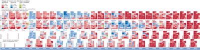
Infographics are graphic visual representations of information, data, or knowledge intended to present information quickly and clearly. They can improve cognition by using graphics to enhance the human visual system's ability to see patterns and trends. Similar pursuits are information visualization, data visualization, statistical graphics, information design, or information architecture. Infographics have evolved in recent years to be for mass communication, and thus are designed with fewer assumptions about the readers' knowledge base than other types of visualizations. Isotypes are an early example of infographics conveying information quickly and easily to the masses.
Data and information visualization is the practice of designing and creating easy-to-communicate and easy-to-understand graphic or visual representations of a large amount of complex quantitative and qualitative data and information with the help of static, dynamic or interactive visual items. Typically based on data and information collected from a certain domain of expertise, these visualizations are intended for a broader audience to help them visually explore and discover, quickly understand, interpret and gain important insights into otherwise difficult-to-identify structures, relationships, correlations, local and global patterns, trends, variations, constancy, clusters, outliers and unusual groupings within data. When intended for the general public to convey a concise version of known, specific information in a clear and engaging manner, it is typically called information graphics.

Chernoff faces, invented by applied mathematician, statistician and physicist Herman Chernoff in 1973, display multivariate data in the shape of a human face. The individual parts, such as eyes, ears, mouth and nose represent values of the variables by their shape, size, placement and orientation. The idea behind using faces is that humans easily recognize faces and notice small changes without difficulty. Chernoff faces handle each variable differently. Because the features of the faces vary in perceived importance, the way in which variables are mapped to the features should be carefully chosen.
A thematic map is a type of map that portrays the geographic pattern of a particular subject matter (theme) in a geographic area. This usually involves the use of map symbols to visualize selected properties of geographic features that are not naturally visible, such as temperature, language, or population. In this, they contrast with general reference maps, which focus on the location of a diverse set of physical features, such as rivers, roads, and buildings. Alternative names have been suggested for this class, such as special-subject or special-purpose maps, statistical maps, or distribution maps, but these have generally fallen out of common usage. Thematic mapping is closely allied with the field of Geovisualization.

A bivariate map or multivariate map is a type of thematic map that displays two or more variables on a single map by combining different sets of symbols. Each of the variables is represented using a standard thematic map technique, such as choropleth, cartogram, or proportional symbols. They may be the same type or different types, and they may be on separate layers of the map, or they may be combined into a single multivariate symbol.
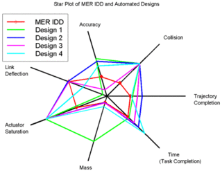
A radar chart is a graphical method of displaying multivariate data in the form of a two-dimensional chart of three or more quantitative variables represented on axes starting from the same point. The relative position and angle of the axes is typically uninformative, but various heuristics, such as algorithms that plot data as the maximal total area, can be applied to sort the variables (axes) into relative positions that reveal distinct correlations, trade-offs, and a multitude of other comparative measures.
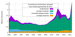
An area chart or area graph displays graphically quantitative data. It is based on the line chart. The area between axis and line are commonly emphasized with colors, textures and hatchings. Commonly one compares two or more quantities with an area chart.
Statistical graphics, also known as statistical graphical techniques, are graphics used in the field of statistics for data visualization.

A plot is a graphical technique for representing a data set, usually as a graph showing the relationship between two or more variables. The plot can be drawn by hand or by a computer. In the past, sometimes mechanical or electronic plotters were used. Graphs are a visual representation of the relationship between variables, which are very useful for humans who can then quickly derive an understanding which may not have come from lists of values. Given a scale or ruler, graphs can also be used to read off the value of an unknown variable plotted as a function of a known one, but this can also be done with data presented in tabular form. Graphs of functions are used in mathematics, sciences, engineering, technology, finance, and other areas.
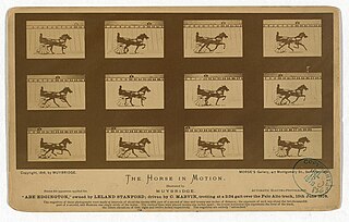
The Horse in Motion is a series of cabinet cards by Eadweard Muybridge, including six cards that each show a sequential series of six to twelve "automatic electro-photographs" depicting the movement of a horse. Muybridge shot the photographs in June 1878. An additional card reprinted the single image of the horse "Occident" trotting at high speed, which had previously been published by Muybridge in 1877.

A motion chart is a dynamic bubble chart which allows efficient and interactive exploration and visualization of longitudinal multivariate data. Motion charts provide mechanisms for mapping ordinal, nominal and quantitative variables onto time, 2D coordinate axes, size, colors, glyphs and appearance characteristics, which facilitate the interactive display of multidimensional and temporal data.

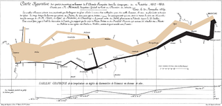
In statistics, a misleading graph, also known as a distorted graph, is a graph that misrepresents data, constituting a misuse of statistics and with the result that an incorrect conclusion may be derived from it.

Animal Locomotion: An Electro-photographic Investigation of Consecutive Phases of Animal Movements is a series of scientific photographs by Eadweard Muybridge made in 1884 and 1885 at the University of Pennsylvania, to study motion in animals. Published in July 9, 1887, the chronophotographic series comprised 781 collotype plates, each containing up to 36 pictures of the different phases of a specific motion of one subject.