Chart

Last updated
A pie chart showing the composition of the 38th Parliament of Canada. Composition of 38th Parliament.png
A pie chart showing the composition of the 38th Parliament of Canada.

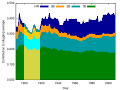
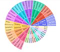
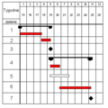
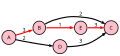
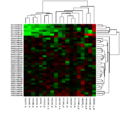
A chart (sometimes known as a graph) is a graphical representation for data visualization, in which "the data is represented by symbols, such as bars in a bar chart, lines in a line chart, or slices in a pie chart". [1] A chart can represent tabular numeric data, functions or some kinds of quality structure and provides different info.

Contents

The term "chart" as a graphical representation of data has multiple meanings:

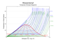
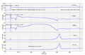
Charts are often used to ease understanding of large quantities of data and the relationships between parts of the data. Charts can usually be read more quickly than the raw data. They are used in a wide variety of fields, and can be created by hand (often on graph paper) or by computer using a charting application. Certain types of charts are more useful for presenting a given data set than others. For example, data that presents percentages in different groups (such as "satisfied, not satisfied, unsure") are often displayed in a pie chart, but maybe more easily understood when presented in a horizontal bar chart. [2] On the other hand, data that represents numbers that change over a period of time (such as "annual revenue from 1990 to 2000") might be best shown as a line chart.

Features

A chart can take a large variety of forms. However, there are common features that provide the chart with its ability to extract meaning from data.

Typically the data in a chart is represented graphically since humans can infer meaning from pictures more quickly than from text. Thus, the text is generally used only to annotate the data.

One of the most important uses of text in a graph is the title. A graph's title usually appears above the main graphic and provides a succinct description of what the data in the graph refers to.

Dimensions in the data are often displayed on axes . If a horizontal and a vertical axis are used, they are usually referred to as the x-axis and y-axis. Each axis will have a scale, denoted by periodic graduations and usually accompanied by numerical or categorical indications. Each axis will typically also have a label displayed outside or beside it, briefly describing the dimension represented. If the scale is numerical, the label will often be suffixed with the unit of that scale in parentheses. For example, "Distance traveled (m)" is a typical x-axis label and would mean that the distance traveled, in units of meters, is related to the horizontal position of the data within the chart.

Within the graph, a grid of lines may appear to aid in the visual alignment of data. The grid can be enhanced by visually emphasizing the lines at regular or significant graduations. The emphasized lines are then called major gridlines, and the remainder is minor grid lines.

A chart's data can appear in all manner of formats and may include individual textual labels describing the datum associated with the indicated position in the chart. The data may appear as dots or shapes, connected or unconnected, and in any combination of colors and patterns. In addition, inferences or points of interest can be overlaid directly on the graph to further aid information extraction.

When the data appearing in a chart contains multiple variables, the chart may include a legend (also known as a key). A legend contains a list of the variables appearing in the chart and an example of their appearance. This information allows the data from each variable to be identified in the chart.

Types

Common charts

Four of the most common charts are:

This gallery shows:

Other common charts are:

Less-common charts

Examples of less common charts are:

This gallery shows:

Field-specific charts

Some types of charts have specific uses in a certain field

This gallery shows:

Other examples:

Well-known named charts

Some of the better-known named charts are:

Some specific charts have become well known by effectively explaining a phenomenon or idea.

Other charts

There are dozens of other types of charts. Here are some of them:

One more example: Bernal chart

Common plots

Chart software

While charts can be drawn by hand, computer software is often used to automatically produce a chart based on entered data. For examples of commonly used software tools, see List of charting software.

See also

Related Research Articles

<span class="mw-page-title-main">Phase diagram</span> Chart used to show conditions at which physical phases of a substance occur

A phase diagram in physical chemistry, engineering, mineralogy, and materials science is a type of chart used to show conditions at which thermodynamically distinct phases occur and coexist at equilibrium.

<span class="mw-page-title-main">Graph paper</span> Writing paper with a grid

Graph paper, coordinate paper, grid paper, or squared paper is writing paper that is printed with fine lines making up a regular grid. The lines are often used as guides for plotting graphs of functions or experimental data and drawing curves. It is commonly found in mathematics and engineering education settings and in laboratory notebooks. Graph paper is available either as loose leaf paper or bound in notebooks.

<span class="mw-page-title-main">Bar chart</span> Type of chart

A bar chart or bar graph is a chart or graph that presents categorical data with rectangular bars with heights or lengths proportional to the values that they represent. The bars can be plotted vertically or horizontally. A vertical bar chart is sometimes called a column chart.

<span class="mw-page-title-main">Scatter plot</span> Plot using the dispersal of scattered dots to show the relationship between variables

A scatter plot, also called a scatterplot, scatter graph, scatter chart, scattergram, or scatter diagram, is a type of plot or mathematical diagram using Cartesian coordinates to display values for typically two variables for a set of data. If the points are coded (color/shape/size), one additional variable can be displayed. The data are displayed as a collection of points, each having the value of one variable determining the position on the horizontal axis and the value of the other variable determining the position on the vertical axis.

A small multiple is a series of similar graphs or charts using the same scale and axes, allowing them to be easily compared. It uses multiple views to show different partitions of a dataset. The term was popularized by Edward Tufte.

A diagram is a symbolic representation of information using visualization techniques. Diagrams have been used since prehistoric times on walls of caves, but became more prevalent during the Enlightenment. Sometimes, the technique uses a three-dimensional visualization which is then projected onto a two-dimensional surface. The word graph is sometimes used as a synonym for diagram.

<span class="mw-page-title-main">Pie chart</span> Circular statistical graph that illustrates numerical proportion

A pie chart is a circular statistical graphic which is divided into slices to illustrate numerical proportion. In a pie chart, the arc length of each slice is proportional to the quantity it represents. While it is named for its resemblance to a pie which has been sliced, there are variations on the way it can be presented. The earliest known pie chart is generally credited to William Playfair's Statistical Breviary of 1801.

<span class="mw-page-title-main">Infographic</span> Graphic visual representation of information

Infographics are graphic visual representations of information, data, or knowledge intended to present information quickly and clearly. They can improve cognition by using graphics to enhance the human visual system's ability to see patterns and trends. Similar pursuits are information visualization, data visualization, statistical graphics, information design, or information architecture. Infographics have evolved in recent years to be for mass communication, and thus are designed with fewer assumptions about the readers' knowledge base than other types of visualizations. Isotypes are an early example of infographics conveying information quickly and easily to the masses.

<span class="mw-page-title-main">William Playfair</span> British polymath (1759–1823)

William Playfair, a Scottish engineer and political economist, served as a secret agent on behalf of Great Britain during its war with France. The founder of graphical methods of statistics, Playfair invented several types of diagrams: in 1786 the line, area and bar chart of economic data, and in 1801 the pie chart and circle graph, used to show part-whole relations. As a secret agent, Playfair reported on the French Revolution and organized a clandestine counterfeiting operation in 1793 to collapse the French currency.

<span class="mw-page-title-main">Ternary plot</span> Barycentric plot on three variables

A ternary plot, ternary graph, triangle plot, simplex plot, or Gibbs triangle is a barycentric plot on three variables which sum to a constant. It graphically depicts the ratios of the three variables as positions in an equilateral triangle. It is used in physical chemistry, petrology, mineralogy, metallurgy, and other physical sciences to show the compositions of systems composed of three species. In population genetics, a triangle plot of genotype frequencies is called a de Finetti diagram. In game theory, it is often called a simplex plot. Ternary plots are tools for analyzing compositional data in the three-dimensional case.

<span class="mw-page-title-main">Data and information visualization</span> Visual representation of data

Data and information visualization is the practice of designing and creating easy-to-communicate and easy-to-understand graphic or visual representations of a large amount of complex quantitative and qualitative data and information with the help of static, dynamic or interactive visual items. Typically based on data and information collected from a certain domain of expertise, these visualizations are intended for a broader audience to help them visually explore and discover, quickly understand, interpret and gain important insights into otherwise difficult-to-identify structures, relationships, correlations, local and global patterns, trends, variations, constancy, clusters, outliers and unusual groupings within data. When intended for the general public to convey a concise version of known, specific information in a clear and engaging manner, it is typically called information graphics.

<span class="mw-page-title-main">Line chart</span> Chart type

A line chart or line graph, also known as curve chart, is a type of chart which displays information as a series of data points called 'markers' connected by straight line segments. It is a basic type of chart common in many fields. It is similar to a scatter plot except that the measurement points are ordered and joined with straight line segments. A line chart is often used to visualize a trend in data over intervals of time – a time series – thus the line is often drawn chronologically. In these cases they are known as run charts.

<span class="mw-page-title-main">Radar chart</span> Type of chart

A radar chart is a graphical method of displaying multivariate data in the form of a two-dimensional chart of three or more quantitative variables represented on axes starting from the same point. The relative position and angle of the axes is typically uninformative, but various heuristics, such as algorithms that plot data as the maximal total area, can be applied to sort the variables (axes) into relative positions that reveal distinct correlations, trade-offs, and a multitude of other comparative measures.

A dot chart or dot plot is a statistical chart consisting of data points plotted on a fairly simple scale, typically using filled in circles. There are two common, yet very different, versions of the dot chart. The first has been used in hand-drawn graphs to depict distributions going back to 1884. The other version is described by William S. Cleveland as an alternative to the bar chart, in which dots are used to depict the quantitative values associated with categorical variables.

<span class="mw-page-title-main">Area chart</span> Type of chart

An area chart or area graph displays graphically quantitative data. It is based on the line chart. The area between axis and line are commonly emphasized with colors, textures and hatchings. Commonly one compares two or more quantities with an area chart.

<span class="mw-page-title-main">Plot (graphics)</span> Graphical technique for data sets

A plot is a graphical technique for representing a data set, usually as a graph showing the relationship between two or more variables. The plot can be drawn by hand or by a computer. In the past, sometimes mechanical or electronic plotters were used. Graphs are a visual representation of the relationship between variables, which are very useful for humans who can then quickly derive an understanding which may not have come from lists of values. Given a scale or ruler, graphs can also be used to read off the value of an unknown variable plotted as a function of a known one, but this can also be done with data presented in tabular form. Graphs of functions are used in mathematics, sciences, engineering, technology, finance, and other areas.

<span class="mw-page-title-main">Bubble chart</span> Type of chart

A bubble chart is a type of chart that displays three dimensions of data. Each entity with its triplet (v1, v2, v3) of associated data is plotted as a disk that expresses two of the vi values through the disk's xy location and the third through its size. Bubble charts can facilitate the understanding of social, economical, medical, and other scientific relationships.

<span class="mw-page-title-main">Misleading graph</span> Graph that misrepresents data

In statistics, a misleading graph, also known as a distorted graph, is a graph that misrepresents data, constituting a misuse of statistics and with the result that an incorrect conclusion may be derived from it.

<span class="mw-page-title-main">Howard G. Funkhouser</span> American mathematician and historian (1898–1984)

Howard Gray Funkhouser was an American mathematician, historian and associate professor of mathematics at the Washington and Lee University, and later at the Phillips Exeter Academy, particularly known for his early work on the history of graphical methods.

References

  1. Cary Jensen, Loy Anderson (1992). Harvard graphics 3: the complete reference. Osborne McGraw-Hill ISBN   0-07-881749-8 p.413
  2. Howard Wainer (1997) Visual revelations: graphical tales of fate and Deception from Napoleon Bonaparte to Ross Perot, Lawrence Erlbaum Associates, Inc. ISBN   0-8058-3878-3 p.87-90.
  3. Pearson, K. (1895). "Contributions to the Mathematical Theory of Evolution. II. Skew Variation in Homogeneous Material". Philosophical Transactions of the Royal Society A: Mathematical, Physical and Engineering Sciences. 186: 343–414. Bibcode:1895RSPTA.186..343P. doi: 10.1098/rsta.1895.0010 .
  4. "First Ever Bar Charts Created in 14th Century". AnyChart. 2 June 2015. Retrieved 9 February 2016.
  5. "History of Pie Charts". JPowered. Archived from the original on 15 January 2016. Retrieved 9 February 2016.
  6. Michael Friendly (2008). "Milestones in the history of thematic cartography, statistical graphics, and data visualization" (PDF). pp. 13–14.

Further reading