A chart is a graphical representation of data, in which "the data is represented by symbols, such as bars in a bar chart, lines in a line chart, or slices in a pie chart". A chart can represent tabular numeric data, functions or some kinds of quality structure and provides different info.

A bar chart or bar graph is a chart or graph that presents categorical data with rectangular bars with heights or lengths proportional to the values that they represent. The bars can be plotted vertically or horizontally. A vertical bar chart is sometimes called a column chart.

A scatter plot is a type of plot or mathematical diagram using Cartesian coordinates to display values for typically two variables for a set of data. If the points are coded (color/shape/size), one additional variable can be displayed. The data are displayed as a collection of points, each having the value of one variable determining the position on the horizontal axis and the value of the other variable determining the position on the vertical axis.
A small multiple is a series of similar graphs or charts using the same scale and axes, allowing them to be easily compared. It uses multiple views to show different partitions of a dataset. The term was popularized by Edward Tufte.

A pie chart is a circular statistical graphic, which is divided into slices to illustrate numerical proportion. In a pie chart, the arc length of each slice, is proportional to the quantity it represents. While it is named for its resemblance to a pie which has been sliced, there are variations on the way it can be presented. The earliest known pie chart is generally credited to William Playfair's Statistical Breviary of 1801.

Infographics are graphic visual representations of information, data, or knowledge intended to present information quickly and clearly. They can improve cognition by utilizing graphics to enhance the human visual system's ability to see patterns and trends. Similar pursuits are information visualization, data visualization, statistical graphics, information design, or information architecture. Infographics have evolved in recent years to be for mass communication, and thus are designed with fewer assumptions about the readers' knowledge base than other types of visualizations. Isotypes are an early example of infographics conveying information quickly and easily to the masses.

William Playfair, a Scottish engineer and political economist, served as a secret agent on behalf of Great Britain during its war with France. The founder of graphical methods of statistics, Playfair invented several types of diagrams: in 1786 the line, area and bar chart of economic data, and in 1801 the pie chart and circle graph, used to show part-whole relations. As secret agent, Playfair reported on the French Revolution and organized a clandestine counterfeiting operation in 1793 to collapse the French currency.

Data visualization is an interdisciplinary field that deals with the graphic representation of data. It is a particularly efficient way of communicating when the data is numerous as for example a Time Series. From an academic point of view, this representation can be considered as a mapping between the original data and graphic elements. The mapping determines how the attributes of these elements vary according to the data. In this light, a bar chart is a mapping of the length of a bar to a magnitude of a variable. Since the graphic design of the mapping can adversely affect the readability of a chart, mapping is a core competency of Data visualization. Data visualization has its roots in the field of Statistics and is therefore generally considered a branch of Descriptive Statistics. However, because both design skills and statistical and computing skills are required to visualize effectively, it is argued by some authors that it is both an Art and a Science.

Origin is a proprietary computer program for interactive scientific graphing and data analysis. It is produced by OriginLab Corporation, and runs on Microsoft Windows. It has inspired several platform-independent open-source clones and alternatives like LabPlot and SciDAVis.

A run chart, also known as a run-sequence plot is a graph that displays observed data in a time sequence. Often, the data displayed represent some aspect of the output or performance of a manufacturing or other business process. It is therefore a form of line chart.
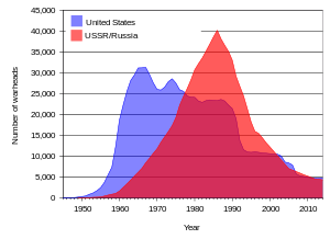
A line chart or line plot or line graph or curve chart is a type of chart which displays information as a series of data points called 'markers' connected by straight line segments. It is a basic type of chart common in many fields. It is similar to a scatter plot except that the measurement points are ordered and joined with straight line segments. A line chart is often used to visualize a trend in data over intervals of time – a time series – thus the line is often drawn chronologically. In these cases they are known as run charts.
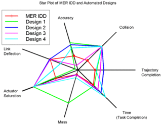
A radar chart is a graphical method of displaying multivariate data in the form of a two-dimensional chart of three or more quantitative variables represented on axes starting from the same point. The relative position and angle of the axes is typically uninformative, but various heuristics, such as algorithms that plot data as the maximal total area, can be applied to sort the variables (axes) into relative positions that reveal distinct correlations, trade-offs, and a multitude of other comparative measures.
A dot chart or dot plot is a statistical chart consisting of data points plotted on a fairly simple scale, typically using filled in circles. There are two common, yet very different, versions of the dot chart. The first has been used in hand-drawn graphs to depict distributions going back to 1884. The other version is described by William S. Cleveland as an alternative to the bar chart, in which dots are used to depict the quantitative values associated with categorical variables.
Statistical graphics, also known as graphical techniques, are graphics in the field of statistics used to visualize quantitative data.

A plot is a graphical technique for representing a data set, usually as a graph showing the relationship between two or more variables. The plot can be drawn by hand or by a computer. In the past, sometimes mechanical or electronic plotters were used. Graphs are a visual representation of the relationship between variables, which are very useful for humans who can then quickly derive an understanding which may not have come from lists of values. Given a scale or ruler, graphs can also be used to read off the value of an unknown variable plotted as a function of a known one, but this can also be done with data presented in tabular form. Graphs of functions are used in mathematics, sciences, engineering, technology, finance, and other areas.

WinFIG is a proprietary shareware vector graphics editor application. The file format and rendering are as close to Xfig as possible, but the program takes advantage of Windows features like clipboard, printer preview, multiple documents etc.

A meteogram, also known as a meteorogram, is a graphical presentation of one or more meteorological variables with respect to time, whether observed or forecast, for a particular location. Where forecast data is used, the meteogram will typically be generated directly from a weather forecasting model based on the longitude, latitude and elevation of the location, but it can also be corrected by a meteorologist. Where a meteogram is used to display historical weather observations, this will typically be for a specific weather station.
The following comparison of Adobe Flex charts provides charts classification, compares Flex chart products for different chart type availability and for different visual features like 3D versions of charts.
QDA Miner is a mixed methods and qualitative data analysis software developed by Provalis Research. The program was designed to assist researchers in managing, coding and analyzing qualitative data.

Howard Gray Funkhouser was an American mathematician, historian and Associate Professor of Mathematics at the Washington and Lee University and later at the Phillips Exeter Academy, particularly known for his early work on the history of graphical methods.
 Interest of the National Debt from the Revolution (Playfair, 1786)
 Exports and imports to and from Denmark & Norway from 1700 to 1780 (Playfair, 1786)