An early (2018) warming stripes graphic published by its designer, climatologist Ed Hawkins. The progression from blue (cooler) to red (warmer) stripes portrays global warming from 1850 (left side of graphic) through the date of the graphic (right side).
Warming stripes (sometimes referred to as climate stripes,[3][4][5][Note 1]climate timelines[6] or stripe graphics[7]) are data visualization graphics that use a series of coloured stripes chronologically ordered to visually portray long-term temperature trends.[2][Note 2] Warming stripes reflect a "minimalist"[2][5] style, conceived to use colour alone to avoid technical distractions to intuitively convey global warming trends to non-scientists.[8][9]
British climatologist Ed Hawkins originated the concept of visualizing historical temperature data in 2018.[1] The data visualization technique was soon extended to involve animation,[10] and to visualize diverse quantities such as sea level rise[11] predictive climate data,[12] progression of ocean depths,[13]aviation's greenhouse gas emissions,[14]biodiversity loss,[15]soil moisture changes[16] and fine particulate matter concentrations.[17] The graphic has been used to visually juxtapose temperature trends with other data—such as atmospheric CO2 concentration,[18] global glacier retreat,[19] and precipitation.[4]
In less technical contexts, the graphic has been embraced by climate activists, used as cover images of books and magazines, used in fashion design, and projected onto natural landmarks.[20][21] It has been used on athletic team uniforms, music festival stages, and public infrastructure.[20][21]
Background, publication and content
Conventional graphic versus warming stripes graphic
This conventional graphic includes date ranges, explanatory legends, and technical terminology that warming stripes avoid.
This composite of a conventional line chart superimposed on a warming stripe graphic illustrates year-by-year correlation of data points and coloured stripes.[22]
"I wanted to communicate temperature changes in a way that was simple and intuitive, removing all the distractions of standard climate graphics so that the long-term trends and variations in temperature are crystal clear. Our visual system will do the interpretation of the stripes without us even thinking about it."[8][9]
In 2018, Hawkins chose from the ColorBrewer colour palette originally designed for distinguishing areas in maps.[23] 2023 was so warm that an additional, darker shade of red was required.[24]
Like warming stripes, color field abstract artworks[25] are said to "strip out outside information and distractions and use color alone to immediately convey meaning".[8]
Separately, by 10 June 2017, Ellie Highwood, also a climate scientist at the University of Reading, had completed[29] a crocheted "global warming blanket"[20] that was inspired by "temperature blankets" representing temperature trends in respective localities.[30] Hawkins provided Highwood with a more user friendly colour scale to avoid the muted colour differences present in Highwood's blanket.[30] Independently, in November 2015, University of Georgiaestuarine scientist Joan Sheldon made a "globally warm scarf" having 400 blue, red and purple rows, but could not contact Hawkins until 2022.[31] Both Highwood and Sheldon credit as their original inspirations, "sky blankets" and "sky scarves" which are based on daily sky colours.[32]
On 22 May 2018, Hawkins published[33] graphics constituting a chronologically ordered series of blue and red vertical stripes that he called warming stripes.[9] Hawkins, a lead author for the IPCC6th Assessment Report, received the Royal Society's 2018 Kavli Medal, in part "for actively communicating climate science and its various implications with broad audiences".[34]
As described in a BBC article, in the month the big meteorological agencies release their annual climate assessments, Hawkins experimented with different ways of rendering the global data and "chanced upon the coloured stripes idea".[35] When he tried out a banner at the Hay Festival, according to the article, Hawkins "knew he'd struck a chord".[35] The National Centre for Atmospheric Science (UK), with which Hawkins is affiliated, states that the stripes "paint a picture of our changing climate in a compelling way. Hawkins swapped out numerical data points for colours which we intuitively react to".[6]
Others have called Hawkins's warming stripes "climate stripes"[3][4] or "climate timelines".[6]
Warming stripe graphics are reminiscent of colour field painting, a style prominent in the mid 20th century, which strips out all distractions and uses only colour to convey meaning.[8] A warming stripes graphic in a 2025 Museum of Modern Art exhibit has been compared to a painting by Morris Louis–one of the earliest proponents of the colour field monument.[36][37] Colour field pioneer Barnett Newman said he was "creating images whose reality is self-evident", an ethos that Hawkins is said to have applied to the problem of climate change.[8]
Collaborating with Berkeley Earth scientist Robert Rohde,[38] on 17 June 2019[2] Hawkins published for public use, a large set of warming stripes on ShowYourStripes.info.[39] Individualized warming stripe graphics were published for the globe, for most countries, as well as for certain smaller regions such as states in the US or parts of the UK,[40] since different parts of the world are warming more quickly than others.[41]
Data sources and data visualization
Effect of geographic selection: Warming stripes for the Northern[42] and Southern[43] Hemispheres show how different, but same-size, regions compare. Greater recent temperature anomalies in the North display as stripes that are off the red scale.[Note 3]
Effect of geographic size: Warming stripes for the entire globe[44] and for the Caribbean Islands region.[45] For geographical and statistical reasons, larger year-to-year variations are expected for smaller regions (bottom graphic).[27][46][Note 3]
Effect of each colour's temperature range: one dataset,[47] but with different temperature range per colour (colour scales shown on left side). In the top graphic (with 0.10°C per colour), recent temperatures exceed the red scale; the bottom graphic (0.15°C per colour) avoids this clipping.[Note 3]
Effect of reference period (baseline): One dataset,[47] with averages over three "reference periods" (horizontal purple bars) determining blue/red boundaries.[48] The earliest, lowest-temp baseline (top) causes recent temperatures to exceed the red scale; later baselines avoid this clipping.[Note 3]
Effect of choosing a baseline independent of any time period's average value: This stripe graphic of global average sea level change has a baseline that is less than all data values, producing a graphic having shades of only a single colour.[11]
Warming stripe graphics are defined with various parameters, including:[33]
source of dataset (meteorological organization)
geographical scope of measurement (global, country, state, etc.)
time period (year range, for horizontal "axis")
temperature range (range of anomaly (deviation) about a reference or baseline temperature)
colour scale (assignment of colours to represent respective ranges of temperature anomaly),
temperature boundaries (temperature above which a stripe is red and below which is blue, usually determined by an average annual temperature over a "reference period" or "baseline" of usually 30 years).[48]
Hawkins' original graphics[Note 4] use the eight most saturated blues and reds from the ColorBrewer 9-class single hue palettes, which optimize colour palettes for maps and are noted for their colourblind-friendliness.[23] Hawkins said the specific colour choice was an aesthetic decision ("I think they look just right"), also selecting baseline periods to ensure equally dark shades of blue and red for aesthetic balance.[23] Hawkins chose the 1971-2000 average as a boundary between reds and blues because the average global temperature in that reference period represented the mid-point in the warming to date.[23]
A Republik analysis said that "this graphic explains everything in the blink of an eye", attributing its effect mainly to the chosen colors, which "have a magical effect on our brain, (letting) us recognize connections before we have even actively thought about them".[49] The analysis concluded that colors other than blue and red "don't convey the same urgency as (Hawkins') original graphic, in which the colors were used in the classic way: blue=cold, red=warm."[49]
ShowYourStripes.info cites dataset sources Berkeley Earth, NOAA, UK Met Office, MeteoSwiss, DWD (Germany),[40] specifically explaining that the data for most countries comes from the Berkeley Earth temperature dataset, except that for the US, UK, Switzerland & Germany the data comes from respective national meteorological agencies.[48]
For each country-level #ShowYourStripes graphic (Hawkins, June 2019), the average temperature in the 1971–2000 reference period is set as the boundary between blue (cooler) and red (warmer) colours, the colour scale varying +/- 2.6 standard deviations of the annual average temperatures between 1901 and 2000.[48][50] Hawkins noted in 2019 that the graphic for the Arctic "broke the colour scale" since it is warming more than twice as fast as the global average.[50] He later reported that the 2023 global average was so extreme that a new, darker shade of red was required.[24][51]
For statistical and geographic reasons, it is expected that graphics for small areas will show more year-to-year variation than those for large regions.[27] Year-to-year changes reflected in graphics for localities result from weather variability, whereas global warming over centuries reflects climate change.[46]
The NOAA website warns that the graphics "shouldn't be used to compare the rate of change at one location to another", explaining that "the highest and lowest values on the colour scale may be different at different locations".[4] Further, a certain colour in one graphic will not necessarily correspond to the same temperature in other graphics.[52][23]
A climate change denier generated a warming stripes graphic that misleadingly affixed Northern Hemisphere readings over one period to global readings over another period, and omitted readings for the most recent thirteen years, with some of the data being 29-year-smoothed—to give the false impression that recent warming is routine.[53] Calling the graphic "imposter warming stripes", meteorologist Jeff Berardelli described it in January 2020 as "a mishmash of data riddled with gaps and inconsistencies" with an apparent objective to confuse the public.[53]
Applications and influence
Comparing multiple datasets
A conventional line graph comparing several highly correlated temperature datasets
A "stacked" warming stripes graphic comparing essentially the same highly correlated temperature datasets as the line graph
A "stacked" warming stripe graphic compares temperature datasets for various layers of Earth's atmosphere and oceans.[54][55]
After Hawkins' first publication of warming stripe graphics in May 2018, broadcast meteorologists in multiple countries began to show stripe-decorated neckties, necklaces, pins and coffee mugs on-air, reflecting a growing acceptance of climate science among meteorologists and a willingness to communicate it to audiences.[59] In 2019, the United States House Select Committee on the Climate Crisis used warming stripes in its committee logo, showing horizontally oriented stripes behind a silhouette of the United States Capitol,[56] and three US Senators wore warming stripe lapel pins at the 2020 State of the Union Address.[60]
On 17 June 2019,[2] Hawkins initiated a social media campaign with hashtag #ShowYourStripes that encourages people to download their regions' graphics from ShowYourStripes.info, and to post them.[39] The campaign was backed by U.N. Climate Change, the World Meteorological Organization and the Intergovernmental Panel on Climate Change.[61] Called "a new symbol for the climate emergency" by French magazine L'EDN,[62] the graphics have been embraced by climate activists, used as cover images of books and magazines, used in fashion design, projected onto natural landmarks, and used on athletic team uniforms, music festival stages, and public infrastructure.[20]
Remarking that "infiltrating popular culture is a means of triggering a change of attitude that will lead to mass action",[62] Hawkins surmised that making the graphics available for free has made them used more widely.[85] Hawkins further said that any merchandise-related profits are donated to charity.[85]
Through a campaign led by nonprofit Climate Central using hashtag #MetsUnite, more than 100 TV meteorologists—the scientists most laymen interact with more than any other[86]—featured warming stripes[39] and used the graphics to focus audience attention during broadcasts on summer solstices beginning in 2018[86][87] with the "Stripes for the Solstice" effort.[88]
On 24 June 2019, Hawkins tweeted that nearly a million stripe graphics had been downloaded by visitors from more than 180 countries[87] in the course of their first week.[89]
In 2018, the German Weather Service's meteorological training journal Promet showed a warming stripes graphic on the cover of the issue titled "Climate Communication".[90] By September 2019, the Met Office, the UK's national weather service, was using both a climate spiral and a warming stripe graphic on its "What is climate change?" webpage.[91] Concurrently, the cover of the 21–27 September 2019 issue of The Economist, dedicated to "The climate issue," showed a warming stripe graphic,[62][92][93] as did the cover of The Guardian on the morning of the 20 September 2019 climate strikes.[93] The environmental initiative Scientists for Future (2019) included warming stripes in its logo.[94] The Science Information Service (Germany) noted in December 2019 that warming stripes were a "frequently used motif" in demonstrations by the School strike for the climate and Scientists for Future, and were also on the roof of the German Maritime Museum in Bremerhaven.[95] Also in December 2019, Voilà Information Design said that warming stripes "have replaced the polar bear on a melting iceberg as the icon of the climate crisis".[23]
On 18 January 2020, a 20-metre-wide artistic light-show installation of warming stripes was opened at the Gendarmenmarkt in Berlin, with the Berlin-Brandenburg Academy of Sciences building being illuminated in the same way.[96] The cover of the "Climate Issue" (fall 2020) of the Space Science and Engineering Center's Through the Atmosphere journal was a warming stripes graphic,[97] and in June 2021 the WMO used warming stripes to "show climate change is here and now" in its statement that "2021 is a make-or-break year for climate action".[61] The November 2021 UN Climate Change Conference (COP26) exhibited an immersive "climate canopy" sculpture consisting of hanging, blue and red color-coded, vertical lighted bars with fabric fringes.[98]
On 27 September 2019, the Fachhochschule (University of Applied Science) Potsdam announced that warming stripes graphics had won in the science category of an international competition recognising innovative and understandable visualisations of climate change,[66] the jury stating that the graphics make an "impact through their innovative, minimalist design".[5]
In April 2022, textiles from haute couture fashion designer Lucy Tammam with warming stripes won the Best Customer Engagement Campaign title in the Sustainable Fashion 2022 awards by Drapers fashion magazine.[100]
In May 2024, Hawkins received the Royal Geographical Society's Geographical Engagement Award for his work in developing warming stripes.[103]
In 2025, the warming stripes graphic was included in Pirouette: Turning Points in Design, an exhibition of "widely recognized design icons" at the Museum of Modern Art highlighting design as an agent of change and "pivotal moments in design history."[104]
Extensions of warming stripes
A warming stripes colour scheme is applied to a conventional bar chart to visually emphasize changes in temperature. Taller bars are more intensely coloured.
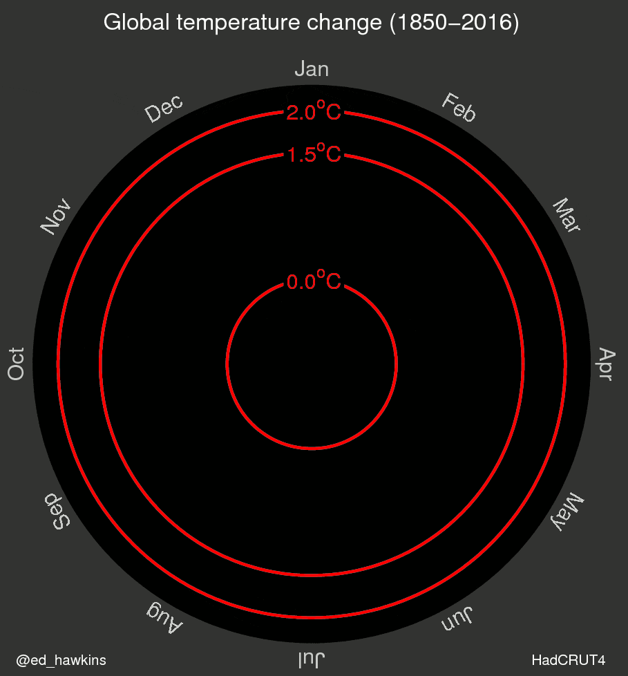
Average global temperature change is depicted with chronologically ordered, concentric coloured rings.[18]
In 2018, University of Reading post-doctoral research assistant Emanuele Bevacqua juxtaposed vertical-stripe graphics for CO2 concentration and for average global temperature (August), and "circular warming stripes" depicting average global temperature with concentric coloured rings (November).[18]
Bifurcated graphic of two futures.
In March 2019, German engineer Alexander Radtke extended Hawkins' historical graphics to show predictions of future warming through the year 2200, a graphic that one commentator described as making the future "a lot more visceral".[12] Radtke bifurcated the graphic to show diverging predictions for different degrees of human action in reducing greenhouse gas emissions.[12]
On or before 30 May 2019, UK-based software engineer Kevin Pluck designed animated warming stripes that portray the unfolding of the temperature increase, allowing viewers to experience the change from an earlier stable climate to recent rapid warming.[10]
Comprehensive "stack" of 196 warming stripes for respective countries grouped by continent.[105]
This "stack", technically a heat map, organizes temperatures by month (horizontally) and year (vertically).[106]
By June 2019, Hawkins vertically stacked hundreds of warming stripe graphics from corresponding world locations and grouped them by continent to form a comprehensive, composite graphic, "Temperature Changes Around the World (1901–2018)".[35][41]
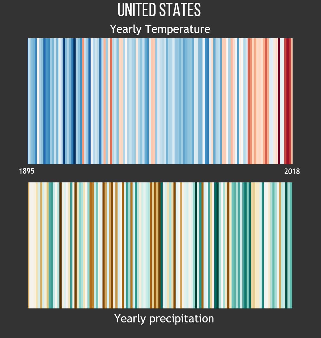
On 1 July 2019, Durham University geography research fellow Richard Selwyn Jones published a Global Glacier Change graphic, modeled after and credited as being inspired by Hawkins' #ShowYourStripes graphics, allowing global warming and global glacier retreat to be visually juxtaposed.[19] Jones followed on 8 July 2019 with a stripe graphic portraying global sea level change using only shades of blue.[11] Separately, NOAA displayed a graphic juxtaposing annual temperatures and precipitation,[4] researchers from the Netherlands used stripe graphics to represent progression of ocean depths,[13] and the Institute of Physics used applied the graphic to represent aviation emission's percentage contribution to global warming.[14]
In August 2024, a collaboration among several universities and the UK Met Office published location-specific Air Quality Stripes having blue, yellow, orange, red and black stripes representing fine particulate matter (PM2.5) concentrations over time.[17]
Critical response
Some warned that warming stripes of individual countries or states, taken out of context, could advance the idea that global temperatures are not rising,[39] though research meteorologist J. Marshall Shepherd said that "geographic variations in the graphics offer an outstanding science communication opportunity".[107] Meteorologist and #MetsUnite coordinator Jeff Berardelli said that "local stripe visuals help us tell a nuanced story—the climate is not changing uniformly everywhere".[108]
Others say the charts should include axes or legends,[39] though the website FAQ page explains the graphics were "specifically designed to be as simple as possible, and to start conversations... (to) fill a gap and enable communication with minimal scientific knowledge required to understand their meaning".[48]J. Marshall Shepherd, former president of the American Meteorological Society, lauded Hawkins' approach, writing that "it is important not to miss the bigger picture. Science communication to the public has to be different"[107] and commending Hawkins for his "innovative" approach and "outstanding science communication" effort.[39]
In The Washington Post, Matthew Cappucci wrote that the "simple graphics ... leave a striking visual impression" and are "an easily accessible way to convey an alarming trend", adding that "warming tendencies are plain as day".[3]Greenpeace spokesman Graham Thompson remarked that the graphics are "like a really well-designed logo while still being an accurate representation of very important data".[89]
CBS News contributor Jeff Berardelli noted that the graphics "aren't based on future projections or model assumptions" in the context of stating that "science is not left or right. It's simply factual."[3]
A September 2019 editorial in The Economist hypothesized that "to represent this span of human history (1850–2018) as a set of simple stripes may seem reductive"—noting those years "saw world wars, technological innovation, trade on an unprecedented scale and a staggering creation of wealth"—but concluded that "those complex histories and the simplifying stripes share a common cause," namely, fossil fuel combustion.[92]
Informally, warming stripes have been said to resemble "tie-dyedbar codes"[3] and a "work of art in a gallery".[109]
Writer Mark Feeney remarked that "seen in strictly visual terms, the graphic is quite pleasing to look at. It could be a Morris Louis painting. Understood conceptually, it’s alarming to contemplate."[37]
Similar graphics
The lobby of the MIT Museum has a sculpture made from thousands of feet of plastic twine, with each strand representing Earth's temperature going back to the ice age.[110] Blue and green strands reflect cooler climates than the reds and oranges.[110] The current temperature is represented by a single yellow piece of twine, and the sculpture then spreads out into a broad web representing possible futures with reds and blues.[110]
↑In his "Climate stripes for the UK"Climate Lab Book entry (17 September 2018), Ed Hawkins implicitly applied the generic term "climate stripes" to both temperature and rainfall graphics, reserving the more specific term "warming stripes" to the temperature graphic.
↑More precisely: a warming stripes graphic generally portrays temperature anomalies, which are deviations below or above a chosen reference or baseline temperature.
1234Typically, warming stripe graphics portray temperature anomalies—usually, deviations from an average temperature over a chosen reference period (baseline)—and not absolute temperatures. Also, different graphics' colours may cover different-size temperature ranges (e.g., 0.10°C per colour vs. 0.15°C per colour). Accordingly, a particular colour in one graphic does not necessarily represent the same absolute temperature or temperature anomaly as the same colour in another graphic.
↑In this Wikipedia article, some figures do not follow Hawkins' exact colour choice, as those figures were generated before the nature of Hawkins' chosen colour palette was widely publicized.
123"Visualisierungswettbewerb "Vis for Future" – das sind die Gewinner*innen"[Visualization Competition "Vis for Future" - these are the winners]. Fachhochschule Potsdam (University of Applied Sciences, Potsdam) (in German). 2019-09-27. Archived from the original on 2019-09-27. [Whether global or local - the climatic stripes have managed to make an impact through their innovative, minimalist design and convey a message that is still urgent.]
12Collaboration among the University of Leeds (School of Earth and Environment), the University of Edinburgh (EPCC), the UK Met Office and North Carolina State University. (August 2024). "Air Quality Stripes". AirQualityStripes.info. Archived from the original on 2024-08-15.{{cite web}}: CS1 maint: multiple names: authors list (link)
↑"Climate at a Glance / Global Time Series". ncdc.noaa.gov. NOAA (National Centers for Environmental Information; National Climatic Data Center). December 2018. Archived from the original on 2019-07-26. Retrieved 2019-07-26. Choose 12-Month timescale, December 1880–2019, Northern Hemisphere, Land and Ocean, Plot.
↑"Climate at a Glance / Global Time Series". ncdc.noaa.gov. NOAA (National Centers for Environmental Information; National Climatic Data Center). December 2018. Archived from the original on 2019-07-26. Retrieved 2019-07-26. Choose 12-Month timescale, December 1880–2019, Southern Hemisphere, Land and Ocean, Plot.
↑"Climate at a Glance / Global Time Series". ncdc.noaa.gov. NOAA (National Centers for Environmental Information; National Climatic Data Center). December 2018. Archived from the original on 2019-07-26. Retrieved 2019-07-27. Choose 12-Month timescale, December 1880–2019, Global, Land and Ocean, Plot.
↑"Climate at a Glance / Global Time Series". ncdc.noaa.gov. NOAA (National Centers for Environmental Information; National Climatic Data Center). December 2018. Archived from the original on 2019-07-27. Retrieved 2019-07-27. Choose 12-Month timescale, December 1880–2019, Caribbean Islands, Land and Ocean, Plot.
12"Warming Stripes: Global". sos.noaa.gov. NOAA (Science on a Sphere). 2019-02-07. Archived from the original on 2019-07-29. Retrieved 2019-07-29.
12"Land + Ocean (1850 – Recent) / Monthly Global Average Temperature (annual summary)". berkeleyearth.lbl.gov. Berkeley Earth. 2019. Archived from the original on 2019-06-29. Retrieved 2019-07-04. Data is based an average of "Annual Anomaly" from under "Land + Ocean anomaly using air temperature above sea ice" and from under "Land + Ocean using water temperature below sea ice", and adjusted to have a reference period (baseline) of 1961–1990 for comparison purposes.
12Schmid, Simon (2019-04-08). "Die schönste Klimagrafik der Welt"[The most beautiful climate graphic in the world]. Republik.ch (in German). Archived from the original on 2020-09-19.
↑Hawkins, Ed; Williams, Richard G.; Young, Paul J.; Berardelli, Jeff; Burgess, Samantha N.; Highwood, Ellie; Randel, William; Roussenov, Vassil; Smith, Doug; Placky, Bernadette Woods (2025-05-01). "Warming Stripes Spark Climate Conversations: From the Ocean to the Stratosphere". Bulletin of the American Meteorological Society. 6 (5): E964–E970. Bibcode:2025BAMS..106E.964H. doi:10.1175/BAMS-D-24-0212.1.
↑Hawkins, Ed (2019-09-12). "Atmospheric temperature trends". Climate Lab Book. Archived from the original on 2019-09-12. (Higher-altitude cooling differences attributed to ozone depletion and greenhouse gas increases; spikes occurred with volcanic eruptions of 1982–1983 (El Chichón) and 1991–1992 (Pinatubo).)
↑"What is climate change? / How fast is the temperature rising?". Met Office. United Kingdom. September 2019. Archived from the original on 2019-09-27. Climate spiral does not appear in full in archive for some reason; it's before the caption that includes "... The temperature increases as you move away from the centre of the circle."
This page is based on this Wikipedia article Text is available under the CC BY-SA 4.0 license; additional terms may apply. Images, videos and audio are available under their respective licenses.


