Q

Last updated

Q
Q q
Latin letter Q.svg
Usage
Writing system Latin script
Type Alphabetic and logographic
Language of origin Greek language
Latin language
Sound values(Table)
/ˈkjuː/
In  Unicode U+0051, U+0071
Alphabetical position17
History
Development
Q
Q
Time periodUnknown to present
Descendants  Ƣ
  Ɋ
 
  Ԛ
Sisters Φ
Ф
ק
ق
ܩ


𐎖

Փ փ
Ֆ ֆ
Other
Associated graphs q(x)
Writing directionLeft-to-right
This article contains phonetic transcriptions in the International Phonetic Alphabet (IPA).For an introductory guide on IPA symbols, see Help:IPA.For the distinction between [ ], / / and  , see IPA § Brackets and transcription delimiters.

Q, or q, is the seventeenth letter of the Latin alphabet, used in the modern English alphabet, the alphabets of other western European languages and others worldwide. Its name in English is pronounced /ˈkj/ , most commonly spelled cue, but also kew, kue, and que. [1]

Contents

History

Egyptian hieroglyph
wḏ
Phoenician
Qoph
Western Greek
Koppa
Etruscan
Q
Latin
Q
Q
PhoenicianQ-01.svg Greek Koppa normal.svg EtruscanQ-01.svg Capitalis monumentalis Q.SVG

The Semitic sound value of Qôp was /q/ (voiceless uvular stop), and the form of the letter could have been based on the eye of a needle, a knot, or even a monkey with its tail hanging down. [2] [3] [4] /q/ is a sound common to Semitic languages, but not found in many European languages. [lower-alpha 1] In common with other glyphs derived from the Proto-Sinaitic script, the letter has been suggested to have its roots in Egyptian hieroglyphs. [5] [6]

In an early form of Ancient Greek, qoppa (Ϙ) probably came to represent several labialized velar stops, among them /kʷ/ and /kʷʰ/. [7] As a result of later sound shifts, these sounds in Greek changed to /p/ and /pʰ/ respectively. [8] Therefore, qoppa was transformed into two letters: qoppa, which stood for the number 90, [9] and phi (Φ), which stood for the aspirated sound /pʰ/ that came to be pronounced /f/ in Modern Greek. [10] [11]

The Etruscans used Q in conjunction with V to represent /kʷ/, and this usage was copied by the Romans with the rest of their alphabet. [4] In the earliest Latin inscriptions, the letters C, K and Q were all used to represent the two sounds /k/ and /ɡ/, which were not differentiated in writing. Of these, Q was used before a rounded vowel (e.g. EQO 'ego'), K before /a/ (e.g. KALENDIS 'calendis'), and C elsewhere. [12] Later, the use of C (and its variant G) replaced most usages of K and Q: Q survived only to represent /k/ when immediately followed by a /w/ sound. [13]

In Turkey between 1928 and 2013 the use of the letter Q, alongside X and W, was banned from official government documents, such as street signs and brochures. The letter forms part of the Kurdish alphabet but is not present in Turkish. [14]

Typographic variants

The five most common typographic presentations of the capital letter Q Q typographic styles.svg
The five most common typographic presentations of the capital letter Q
A long-tailed Q as drawn by French typographer Geoffroy Tory in his 1529 book, Champfleury Champfleury letter Q illustration Geoffroy Tory (1529).png
A long-tailed Q as drawn by French typographer Geoffroy Tory in his 1529 book, Champfleury
The printed long-tailed Q was inspired by ancient Roman square capitals: this long-tailed Q, used here in the Latin word "POPVLVSQVE", was carved into Trajan's column c. AD 113. Base columna trajana.jpg
The printed long-tailed Q was inspired by ancient Roman square capitals: this long-tailed Q, used here in the Latin word "POPVLVSQVE", was carved into Trajan's column c. AD 113.
A short trilingual text showing the proper use of the long- and short-tailed Q. The short-tailed Q is only used when the word is shorter than the tail; the long-tailed Q is even used in all-capitals text. Short tailed Q vs long tailed Q text example.svg
A short trilingual text showing the proper use of the long- and short-tailed Q. The short-tailed Q is only used when the word is shorter than the tail; the long-tailed Q is even used in all-capitals text.

Uppercase "Q"

Depending on the typeface used to typeset the letter Q, the letter's tail may either bisect its bowl as in Helvetica, [16] meet the bowl as in Univers, or lie completely outside the bowl as in PT Sans. In writing block letters, bisecting tails are the fastest to write, as they require less precision. All three styles are considered equally valid, with most serif typefaces having a Q with a tail that meets the circle, while sans-serif typefaces are more equally split between those with bisecting tails and those without. [17] Typefaces with a disconnected Q tail, while uncommon, have existed since at least 1529. [18] A common method among type designers to create the shape of the Q is by simply adding a tail to the letter O. [17] [19] [20]

Old-style serif fonts, such as Garamond, may contain two uppercase Qs: one with a short tail to be used in short words, and another with a long tail to be used in long words. [18] Some early metal type fonts included up to 3 different Qs: a short-tailed Q, a long-tailed Q, and a long-tailed Q-u ligature. [15] This print tradition was alive and well until the 19th century, when long-tailed Qs fell out of favor; even recreations of classic typefaces such as Caslon began being distributed with only short Q tails. [21] [15] American typographer D. B. Updike, who was known to disapprove of the long-tailed Q, celebrated their demise in his 1922 book Printing Types, claiming that Renaissance printers made their Q tails longer and longer simply to "outdo each other". [15] Latin-language words, which are much more likely than English words to contain "Q" as their first letter, have also been cited as the reason for their existence. [15] The long-tailed Q had fallen out of use with the advent of early digital typography, as many early digital fonts could not choose different glyphs based on the word that the glyph was in, but it has seen something of a comeback with the advent of OpenType fonts and LaTeX, both of which can automatically typeset the long-tailed Q when it is called for and the short-tailed Q when it is not. [22] [23]

Owing to the allowable variation between letters Q; [17] [24] as &, Q is often cited as a letter that gives type designers a greater opportunity at self-expression. [4] Identifont is an automatic typeface identification service that identifies typefaces by asking questions about their appearance and later asks about the Q tail if the "sans-serif" option is chosen. [25] In the Identifont database, the distribution of Q tails is: [26]

Q tail type Serif Sans-serif
Bisecting14612719
Meets bowl33634521
Outside bowl271397
"2" shape ()304428
Inside bowl129220
Total55288285
Q tails (serif) pie chart.svg
Q tails (sans-serif) pie chart.svg

Some type designers prefer one "Q" design over another: Adrian Frutiger, famous for the airport typeface that bears his name, remarked that most of his typefaces feature a Q tail that meets the bowl and then extends horizontally. [20] Frutiger considered such Qs to make for more "harmonious" and "gentle" typefaces. [20] "Q" often makes the list of their favorite letters; for example, Sophie Elinor Brown, designer of Strato, [27] has listed "Q" as being her favorite letter. [28] [29]

Lowercase "q"

A comparison of the glyphs of <q>  and <g>  Q and g comparison.svg
A comparison of the glyphs of q and g

The lowercase "q" is usually seen as a lowercase "o" or "c" with a descender (i.e., downward vertical tail) extending from the right side of the bowl, with or without a swash (i.e., flourish), or even a reversed lowercase p. The "q"'s descender is usually typed without a swash due to the major style difference typically seen between the descenders of the "g" (a loop) and "q" (vertical). When handwritten, or as part of a handwriting font, the descender of the "q" sometimes finishes with a rightward swash to distinguish it from the letter "g" (or, particularly in mathematics, from the digit "9").

Use in writing systems

Pronunciation of q by language
OrthographyPhonemes
Afar /ʕ/
Albanian //
Azeri /ɡ/
Standard Chinese (Pinyin)/t͡ɕʰ/
Dogrib [ clarification needed ]/ɣ/
English [ k w ]
Fijian /ᵑɡ/
French / k y /
Galician / k w /
German / k w /
Hadza /!/
Indonesian / k w /
Italian / k w /
Ket (UNA)/q/~//, /ɢ/
K'iche //
Kiowa //
Kurdish /q/
Maltese /ʔ/
Menominee /ʔ/
Mi'kmaq /x/
Mohegan-Pequot //
Nuxalk //
Portuguese /k/
Sasak /ʔ/
Somali /q/~/ɢ/
Sotho /!kʼ/
Spanish / k w /
Swedish / k w /
Uzbek /q/
Vietnamese / k w /
Võro /ʔ/
Wolof //
Xhosa /!/
Zulu /!/

English

In English, the digraph qu most often denotes the cluster /kw/ ; however, in borrowings from French, it represents /k/ , as in 'plaque'. See the list of English words containing Q not followed by U. Q is the second least frequently used letter in the English language (after Z), with a frequency of just 0.1% in words. Q has the fourth fewest English words where it is the first letter, after X, Z, and Y.

Other languages

In most European languages written in the Latin script, such as Romance and Germanic languages, q appears almost exclusively in the digraph qu. In French, Occitan, Catalan, and Portuguese, qu represents /k/ or /kw/; in Spanish, it represents /k/. qu replaces c for /k/ before front vowels i and e, since in those languages c represents a fricative or affricate before front vowels. In Italian, qu represents [kw] (where [w] is the semivowel allophone of /u/). In Albanian, Q represents /c/, as in Shqip.

It is not considered to be part of the Cornish (Standard Written Form), Estonian, Icelandic, Irish, Latvian, Lithuanian, Polish, Serbo-Croatian, Scottish Gaelic, Slovenian, Turkish, or Welsh alphabets.

q has a wide variety of other pronunciations in some European languages and in non-European languages that have adopted the Latin alphabet.

Other systems

The International Phonetic Alphabet uses q for the voiceless uvular stop.

Other uses

Ancestors and siblings in other alphabets

Derived signs, symbols and abbreviations

Other representations

Computing

Character information
PreviewQq
Unicode nameLATIN CAPITAL LETTER QLATIN SMALL LETTER QFULLWIDTH LATIN CAPITAL LETTER QFULLWIDTH LATIN SMALL LETTER Q
Encodingsdecimalhexdechexdechexdechex
Unicode 81U+0051113U+007165329U+FF3165361U+FF51
UTF-8 815111371239 188 177EF BC B1239 189 145EF BD 91
Numeric character reference &#81;&#x51;&#113;&#x71;&#65329;&#xFF31;&#65361;&#xFF51;
EBCDIC family216D815298
ASCII [lower-alpha 2] 815111371

Other

See also

Notes

  1. See references at Voiceless uvular stop#Occurrence
  2. Also for encodings based on ASCII, including the DOS, Windows, ISO-8859 and Macintosh families of encodings.

Related Research Articles

<span class="mw-page-title-main">G</span> 7th letter of the Latin alphabet

G, or g, is the seventh letter of the Latin alphabet, used in the modern English alphabet, the alphabets of other western European languages, and others worldwide. Its name in English is gee, plural gees.

<span class="mw-page-title-main">Typography</span> Art of arranging type

Typography is the art and technique of arranging type to make written language legible, readable and appealing when displayed. The arrangement of type involves selecting typefaces, point sizes, line lengths, line spacing, letter spacing, and spaces between pairs of letters. The term typography is also applied to the style, arrangement, and appearance of the letters, numbers, and symbols created by the process. Type design is a closely related craft, sometimes considered part of typography; most typographers do not design typefaces, and some type designers do not consider themselves typographers. Typography also may be used as an ornamental and decorative device, unrelated to the communication of information.

<span class="mw-page-title-main">Palatino</span> Serif typeface

Palatino is an old-style serif typeface designed by Hermann Zapf, initially released in 1949 by the Stempel foundry and later by other companies, most notably the Mergenthaler Linotype Company.

<span class="mw-page-title-main">Sans-serif</span> Typeface classification for letterforms without serifs

In typography and lettering, a sans-serif, sans serif, gothic, or simply sans letterform is one that does not have extending features called "serifs" at the end of strokes. Sans-serif typefaces tend to have less stroke width variation than serif typefaces. They are often used to convey simplicity and modernity or minimalism. For the purposes of type classification, sans-serif designs are usually divided into these major groups: § Grotesque, § Neo-grotesque, § Geometric, § Humanist, and § Other or mixed.

In typography, a serif is a small line or stroke regularly attached to the end of a larger stroke in a letter or symbol within a particular font or family of fonts. A typeface or "font family" making use of serifs is called a serif typeface, and a typeface that does not include them is sans-serif. Some typography sources refer to sans-serif typefaces as "grotesque" or "Gothic" and serif typefaces as "roman".

<span class="mw-page-title-main">Typeface</span> Set of characters that share common design features

A typeface is a design of letters, numbers and other symbols, to be used in printing or for electronic display. Most typefaces include variations in size, weight, slope, width, and so on. Each of these variations of the typeface is a font.

<span class="mw-page-title-main">Emphasis (typography)</span> Typographical distinction

In typography, emphasis is the strengthening of words in a text with a font in a different style from the rest of the text, to highlight them. It is the equivalent of prosody stress in speech.

<span class="mw-page-title-main">Gill Sans</span> Humanist sans-serif typeface family

Gill Sans is a humanist sans-serif typeface designed by Eric Gill and released by the British branch of Monotype from 1928 onwards.

<span class="mw-page-title-main">Ligature (writing)</span> Glyph combining two or more letterforms

In writing and typography, a ligature occurs where two or more graphemes or letters are joined to form a single glyph. Examples are the characters ⟨æ⟩ and ⟨œ⟩ used in English and French, in which the letters ⟨a⟩ and ⟨e⟩ are joined for the first ligature and the letters ⟨o⟩ and ⟨e⟩ are joined for the second ligature. For stylistic and legibility reasons, ⟨f⟩ and ⟨i⟩ are often merged to create ⟨fi⟩ ; the same is true of ⟨s⟩ and ⟨t⟩ to create ⟨st⟩. The common ampersand, ⟨&⟩, developed from a ligature in which the handwritten Latin letters ⟨e⟩ and ⟨t⟩ were combined.

<span class="mw-page-title-main">Letter case</span> Uppercase or lowercase

Letter case is the distinction between the letters that are in larger uppercase or capitals and smaller lowercase in the written representation of certain languages. The writing systems that distinguish between the upper- and lowercase have two parallel sets of letters: each in the majuscule set has a counterpart in the minuscule set. Some counterpart letters have the same shape, and differ only in size, but for others the shapes are different. The two case variants are alternative representations of the same letter: they have the same name and pronunciation and are typically treated identically when sorting in alphabetical order.

<span class="mw-page-title-main">Allograph</span> Distinct shapes of a written symbol

In graphemics and typography, the term allograph is used of a glyph that is a design variant of a letter or other grapheme, such as a letter, a number, an ideograph, a punctuation mark or other typographic symbol. In graphemics, an obvious example in English is the distinction between uppercase and lowercase letters. Allographs can vary greatly, without affecting the underlying identity of the grapheme. Even if the word "cat" is rendered as "cAt", it remains recognizable as the sequence of the three graphemes ⟨c⟩, ⟨a⟩, ⟨t⟩.

<span class="mw-page-title-main">Lettering</span> The art of drawing letters

Lettering is an act or result of artfully drawing letters, instead of writing them simply. Lettering is considered an art form, where each letter in a phrase or quote acts as an illustration. Each letter is created with attention to detail and has a unique role within a composition. Lettering is created as an image, with letters that are meant to be used in a unique configuration. Lettering words do not always translate into alphabets that can later be used in a typeface, since they are created with a specific word in mind.

<span class="mw-page-title-main">Counter (typography)</span> Enclosed area of a letter or symbol

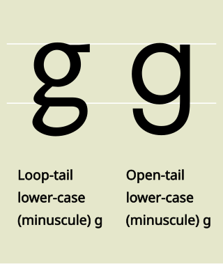
In typography, a counter is the area of a letter that is entirely or partially enclosed by a letter form or a symbol. The stroke that creates such a space is known as a "bowl". Latin letters containing closed counters include A, B, D, O, P, Q, R, a, b, d, e, g, o, p, and q. Latin letters containing open counters include c, f, h, s etc. The digits 0, 4, 6, 8, and 9 also have counters. An aperture is the opening between an open counter and the outside of the letter.

Gaelic type is a family of Insular script typefaces devised for printing Early Modern Irish. It was widely used from the 16th century until the mid-18th century in Scotland and the mid-20th century in Ireland, but is now rarely used. Sometimes, all Gaelic typefaces are called Celtic or uncial although most Gaelic types are not uncials. The "Anglo-Saxon" types of the 17th century are included in this category because both the Anglo-Saxon types and the Gaelic/Irish types derive from the insular manuscript hand.

<span class="mw-page-title-main">Akzidenz-Grotesk</span> Grotesque sans-serif typeface

Akzidenz-Grotesk is a sans-serif typeface family originally released by the Berthold Type Foundry of Berlin. "Akzidenz" indicates its intended use as a typeface for commercial print runs such as publicity, tickets and forms, as opposed to fine printing, and "grotesque" was a standard name for sans-serif typefaces at the time.

<span class="mw-page-title-main">L</span> 12th letter of the Latin alphabet

L, or l, is the twelfth letter of the Latin alphabet, used in the modern English alphabet, the alphabets of other western European languages and others worldwide. Its name in English is el, plural els.

<span class="mw-page-title-main">History of the Latin script</span> Evolution of the Roman alphabet

The Latin script is the most widely used alphabetic writing system in the world. It is the standard script of the English language and is often referred to simply as "the alphabet" in English. It is a true alphabet which originated in the 7th century BC in Italy and has changed continually over the last 2,500 years. It has roots in the Semitic alphabet and its offshoot alphabets, the Phoenician, Greek, and Etruscan. The phonetic values of some letters changed, some letters were lost and gained, and several writing styles ("hands") developed. Two such styles, the minuscule and majuscule hands, were combined into one script with alternate forms for the lower and upper case letters. Modern uppercase letters differ only slightly from their classical counterparts, and there are few regional variants.

<span class="mw-page-title-main">Bauhaus (typeface)</span> Geometric sans-serif typeface

The Bauhaus typeface design is based on Herbert Bayer's 1925 experimental Universal typeface and the Bauhaus aesthetic overall.

<span class="mw-page-title-main">Typeface anatomy</span> Graphic components of typeface letters


Typeface anatomy describes the graphic elements that make up letters in a typeface.

Typefaces are born from the struggle between rules and results. Squeezing a square about 1% helps it look more like a square; to appear the same height as a square, a circle must be measurably taller. The two strokes in an X aren't the same thickness, nor are their parallel edges actually parallel; the vertical stems of a lowercase alphabet are thinner than those of its capitals; the ascender on a d isn't the same length as the descender on a p, and so on. For the rational mind, type design can be a maddening game of drawing things differently in order to make them appear the same.

References

  1. "Q", Oxford English Dictionary, 2nd edition (1989).
    Merriam-Webster's Third New International Dictionary of the English Language, Unabridged (1993) lists "cue" and "kue" as current. James Joyce used "kew"; it and "que" remain in use.
  2. Travers Wood, Henry Craven Ord Lanchester, A Hebrew Grammar, 1913, p. 7. A. B. Davidson, Hebrew Primer and Grammar, 2000, p. 4 Archived 2017-02-04 at the Wayback Machine . The meaning is doubtful. "Eye of a needle" has been suggested, and also "knot" Harvard Studies in Classical Philology vol. 45.
  3. Isaac Taylor, History of the Alphabet: Semitic Alphabets, Part 1, 2003: "The old explanation, which has again been revived by Halévy, is that it denotes an 'ape,' the character Q being taken to represent an ape with its tail hanging down. It may also be referred to a Talmudic root which would signify an 'aperture' of some kind, as the 'eye of a needle,' ... Lenormant adopts the more usual explanation that the word means a 'knot'.
  4. 1 2 3 Haley, Allan. "The Letter Q". Fonts.com. Monotype Imaging Corporation. Archived from the original on February 3, 2017. Retrieved February 3, 2017.
  5. Samuel, Stehman Haldeman (1851). Elements of Latin Pronunciation: For the Use of Students in Language, Law, Medicine, Zoology, Botany, and the Sciences Generally in which Latin Words are Used. J.B. Lippincott. p. 56. Archived from the original on August 16, 2021. Retrieved November 19, 2020.
  6. Hamilton, Gordon James (2006). The Origins of the West Semitic Alphabet in Egyptian Scripts. Catholic Biblical Association of America. ISBN   9780915170401. Archived from the original on February 21, 2022. Retrieved September 16, 2020.
  7. Woodard, Roger G. (March 24, 2014). The Textualization of the Greek Alphabet. Cambridge University Press. p. 303. ISBN   9781107729308. Archived from the original on February 21, 2022. Retrieved November 19, 2020.
  8. Noyer, Rolf. "Principal Sound Changes from PIE to Greek" (PDF). University of Pennsylvania Department of Linguistics. Archived (PDF) from the original on February 4, 2017. Retrieved February 3, 2017.
  9. Boeree, C. George. "The Origin of the Alphabet". Shippensburg University. Shippensburg University of Pennsylvania. Archived from the original on December 4, 2016. Retrieved February 3, 2017.
  10. Arvaniti, Amalia (1999). "Standard Modern Greek" (PDF). Journal of the International Phonetic Association . 2 (29): 167–172. doi:10.1017/S0025100300006538. S2CID   145606058. Archived from the original on March 3, 2016.{{cite journal}}: CS1 maint: bot: original URL status unknown (link)
  11. Miller, D. Gary (September 6, 1994). Ancient Scripts and Phonological Knowledge. John Benjamins Publishing. pp. 54–56. ISBN   9789027276711. Archived from the original on August 18, 2021. Retrieved November 19, 2020.
  12. Bispham, Edward (March 1, 2010). Edinburgh Companion to Ancient Greece and Rome. Edinburgh University Press. p. 482. ISBN   9780748627141. Archived from the original on February 21, 2022. Retrieved November 19, 2020.
  13. Sihler, Andrew L. (1995), New Comparative Grammar of Greek and Latin (illustrated ed.), New York: Oxford University Press, p. 21, ISBN   0-19-508345-8, archived from the original on November 9, 2016, retrieved December 24, 2015
  14. "Ban on Kurdish letters to be lifted with democracy package - Turkey News". Hürriyet Daily News. September 27, 2013. Archived from the original on January 17, 2022. Retrieved January 17, 2022.
  15. 1 2 3 4 5 Updike, Daniel Berkeley (1922). Printing types, their history, forms, and use; a study in survivals. Cambridge, Massachusetts: Harvard University Press. ISBN   1584560568 via Internet Archive.
  16. Ambrose, Gavin; Harris, Paul (August 31, 2011). The Fundamentals of Typography: Second Edition. A & C Black. p. 24. ISBN   9782940411764. Archived from the original on August 19, 2021. Retrieved November 19, 2020. ...the bisecting tail of the Helvetica 'Q'.
  17. 1 2 3 Willen, Bruce; Strals, Nolen (September 23, 2009). Lettering & Type: Creating Letters and Designing Typefaces. Princeton Architectural Press. p. 110. ISBN   9781568987651. Archived from the original on August 15, 2021. Retrieved November 19, 2020. The bowl of the Q is typically similar to the bowl of the O, although not always identical. The style and design of the Q's tail is often a distinctive feature of a typeface.
  18. 1 2 Vervliet, Hendrik D. L. (January 1, 2008). The Palaeotypography of the French Renaissance: Selected Papers on Sixteenth-century Typefaces. BRILL. pp. 58 (a) 54 (b). ISBN   978-9004169821. Archived from the original on February 21, 2022. Retrieved November 19, 2020.
  19. Rabinowitz, Tova (January 1, 2015). Exploring Typography. Cengage Learning. p. 264. ISBN   9781305464810. Archived from the original on February 21, 2022. Retrieved November 19, 2020.
  20. 1 2 3 Osterer, Heidrun; Stamm, Philipp (May 8, 2014). Adrian Frutiger – Typefaces: The Complete Works. Walter de Gruyter. pp. 97 (a) 183 (b) 219 (c). ISBN   9783038212607. Archived from the original on February 21, 2022. Retrieved November 19, 2020.
  21. Loxley, Simon (March 31, 2006). Type: The Secret History of Letters. I.B.Tauris. ISBN   9780857730176. Archived from the original on February 21, 2022. Retrieved November 19, 2020. The uppercase roman Q...has a very long tail, but this has been modified and reduced on versions produced in the following centuries.
  22. Fischer, Ulrike (November 2, 2014). "How to force a long-tailed Q in EB Garamond". TeX Stack Exchange. Archived from the original on February 4, 2017. Retrieved February 3, 2017.
  23. "What are "Stylistic Sets?"". Typography.com. Hoefler & Co. Archived from the original on February 4, 2017. Retrieved February 3, 2017.
  24. Bosler, Denise (May 16, 2012). Mastering Type: The Essential Guide to Typography for Print and Web Design. F+W Media, Inc. p. 31. ISBN   978-1440313714. Letters that contain truly individual parts [are] S, ... Q...[ permanent dead link ]
  25. "2: Q Shape". Identifont. Archived from the original on February 3, 2017. Retrieved February 1, 2017.
  26. "3: $ style". Identifont. Archived from the original on February 3, 2017. Retrieved February 2, 2017. To get the numbers in the table, click Question 1 (serif or sans-serif?) or Question 2 (Q shape) and change the value. They appear under X possible fonts.
  27. Hughes, Kerrie (September 2, 2014). "Font of the day: Strato". Creative Bloq. Bath, Somerset: Future plc . Retrieved August 25, 2022.
  28. Heller, Stephen (January 7, 2016). "We asked 15 typographers to describe their favorite letterforms. Here's what they told us". WIRED. Archived from the original on February 3, 2017. Retrieved February 3, 2017.
  29. Phillips, Nicole Arnett (January 27, 2016). "Wired asked 15 Typographers to introduce us to their favorite glyphs". Typograph.Her. Archived from the original on February 3, 2017. Retrieved February 3, 2017.
  30. Gordon, Arthur E. (1983). Illustrated Introduction to Latin Epigraphy . University of California Press. pp.  44. ISBN   9780520038981 . Retrieved October 3, 2015. roman numerals.
  31. Barmeier, Severin (October 10, 2015), L2/15-241: Proposal to encode Latin small capital letter Q (PDF), archived (PDF) from the original on June 14, 2019, retrieved June 19, 2018
  32. Miller, Kirk; Cornelius, Craig (September 25, 2020). "L2/20-251: Unicode request for modifier Latin capital letters" (PDF).
  33. Miller, Kirk; Ashby, Michael (November 8, 2020). "L2/20-252R: Unicode request for IPA modifier-letters (a), pulmonic" (PDF).
  34. Everson, Michael; Baker, Peter; Emiliano, António; Grammel, Florian; Haugen, Odd Einar; Luft, Diana; Pedro, Susana; Schumacher, Gerd; Stötzner, Andreas (January 30, 2006). "L2/06-027: Proposal to add Medievalist characters to the UCS" (PDF). Archived (PDF) from the original on September 19, 2018. Retrieved March 24, 2018.