This is a list of script typefaces. This list details standard script typefaces and computer fonts used in classical typesetting and printing.
Typeface name | Example 1 | Example 2 | Example 3 |
---|---|---|---|
American Scribe | ![]() | ||
AMS Euler Designer: Hermann Zapf, Donald Knuth | ![]() | ![]() | |
Apple Chancery Designer: Kris Holmes | ![]() | ||
Brush Script Designer: Robert E. Smith | ![]() | ![]() | ![]() |
Cézanne Designer: Michael Want, Richard Kegler | ![]() | ![]() | |
Coronet Designer: R. Hunter Middleton | ![]() | ![]() | ![]() |
Declaration Script | ![]() | ||
Declare | | ||
Edwardian Script Designer: Ed Benguiat | ![]() | | ![]() |
FIG Script Designer: Eric Olson | ![]() | ![]() | |
French Script | ![]() | ![]() | |
Gravura Designer: Phill Grimshaw | ![]() | ||
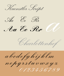
Kuenstler Script Designer: Hans Bohn | ![]() | ![]() | |
Lucida Calligraphy Designer: Charles Bigelow, Kris Holmes | ![]() | ![]() | ![]() |
Monotype Corsiva Designer: Tricia Saunders | ![]() | ![]() | ![]() |
Snell Roundhand Designer: Matthew Carter | ![]() | ||
Zapf Chancery Designer: Hermann Zapf | ![]() | ![]() | |
Zapfino Designer: Hermann Zapf | ![]() | ![]() | ![]() |
Typeface name | Example 1 | Example 2 | Example 3 |
---|---|---|---|
Alexa Designer: Steve Matteson | ![]() | ![]() | |
Andy Designer: Steve Matteson | ![]() | ![]() | ![]() |
Ashley Script Designer: Ashley Havinden | ![]() | ![]() | |
Balloon Designer: Max R. Kaufmann | ![]() | ![]() | |
Blackadder | ![]() | ![]() | |
Caflisch Script Designer: Robert Slimbach | ![]() | ![]() | |
Chalkboard | ![]() | ![]() | ![]() |
Comic Sans MS Designer: Vincent Connare | ![]() | ![]() | ![]() |
Dom Casual Designer: Peter Dom | ![]() | ![]() | ![]() |
Eyadish | ![]() | ||
Freestyle Script Designer: Martin Wait | ![]() | ![]() | |
Kaufmann Designer: Max R. Kaufmann | ![]() | ![]() | |
Kristen Designer: George Ryan | ![]() | ![]() | |
Lobster Designer: Pablo Impallari | ![]() | ||
Lucida Handwriting Designer: Charles Bigelow, Kris Holmes | ![]() | ![]() | ![]() |
Mistral Designer: Roger Excoffon | ![]() | ![]() | ![]() |
Papyrus Designer: Chris Costello | ![]() | ![]() | |
Pristina | ![]() | ![]() | |
Rage | ![]() | ![]() | |
Segoe Script Designer: Carl Crossgrove | ![]() | ||
Viner Hand | ![]() | ![]() | |
Wiesbaden Swing Designer: Rosemarie Kloos-Rau | ![]() |
![]() |
In typography and lettering, a sans-serif, sans serif, gothic, or simply sans letterform is one that does not have extending features called "serifs" at the end of strokes. Sans-serif typefaces tend to have less stroke width variation than serif typefaces. They are often used to convey simplicity and modernity or minimalism. For the purposes of type classification, sans-serif designs are usually divided into these major groups: § Grotesque and § Neo-grotesque, § Geometric, § Humanist and § Other or mixed.
In typography, a serif is a small line or stroke regularly attached to the end of a larger stroke in a letter or symbol within a particular font or family of fonts. A typeface or "font family" making use of serifs is called a serif typeface, and a typeface that does not include them is sans-serif. Some typography sources refer to sans-serif typefaces as "grotesque" or "Gothic" and serif typefaces as "roman".
A typeface is a design of letters, numbers and other symbols, to be used in printing or for electronic display. Most typefaces include variations in size, weight, slope, width, and so on. Each of these variations of the typeface is a font.
Antiqua is a style of typeface used to mimic styles of handwriting or calligraphy common during the 15th and 16th centuries. Letters are designed to flow, and strokes connect together in a continuous fashion; in this way it is often contrasted with Fraktur-style typefaces where the individual strokes are broken apart. The two typefaces were used alongside each other in the germanophone world, with the Antiqua–Fraktur dispute often dividing along ideological or political lines. After the mid-20th century, Fraktur fell out of favor and Antiqua-based typefaces became the official standard in Germany.
Ming or Song is a category of typefaces used to display Chinese characters, which are used in the Chinese, Japanese and Korean languages. They are currently the most common style of type in print for Chinese and Japanese. For Japanese text, they are commonly called Mincho typefaces.
Lucida is an extended family of related typefaces designed by Charles Bigelow and Kris Holmes and released from 1984 onwards. The family is intended to be extremely legible when printed at small size or displayed on a low-resolution display – hence the name, from 'lucid'.
Roboto is a neo-grotesque sans-serif typeface family developed by Google as the system font for its mobile operating system Android, and released in 2011 for Android 4.0 "Ice Cream Sandwich".
Oblique type is a form of type that slants slightly to the right, used for the same purposes as italic type. Unlike italic type, however, it does not use different glyph shapes; it uses the same glyphs as roman type, except slanted. Oblique and italic type are technical terms to distinguish between the two ways of creating slanted font styles; oblique designs may be labelled italic by companies selling fonts or by computer programs. Oblique designs may also be called slanted or sloped roman styles. Oblique fonts, as supplied by a font designer, may be simply slanted, but this is often not the case: many have slight corrections made to them to give curves more consistent widths, so they retain the proportions of counters and the thick-and-thin quality of strokes from the regular design.
Century Gothic is a digital sans-serif typeface in the geometric style, released by Monotype Imaging in 1990. It is a redrawn version of Monotype's own Twentieth Century, a copy of Bauer's Futura, to match the widths of ITC Avant Garde Gothic. It is an exclusively digital typeface that has never been manufactured as metal type.
In metal typesetting, a font is a particular size, weight and style of a typeface. Each font is a matched set of type, with a piece for each glyph. A typeface consists of various fonts that share an overall design.
Linux Libertine is a digital typeface created by the Libertine Open Fonts Project, which aims to create free and open alternatives to proprietary typefaces such as Times New Roman. It was developed with the free font editor FontForge and is licensed under the GNU General Public License and the SIL Open Font License.
In typography, the Vox-ATypI classification makes it possible to classify typefaces into general classes. Devised by Maximilien Vox in 1954, it was adopted in 1962 by the Association Typographique Internationale (ATypI) and in 1967 as a British Standard, as British Standards Classification of Typefaces, which is a very basic interpretation and adaptation/modification of the earlier Vox-ATypI classification.
A font catalog or font catalogue, also called a type specimen book, is a collection of specimen of typefaces offering sample use of the fonts for the included typefaces, originally in the form of a printed book. The definition has also been applied to websites offering a specimen collection similar to what a printed catalog provides.
Noto is a font family comprising over 100 individual computer fonts, which are together designed to cover all the scripts encoded in the Unicode standard. As of October 2016, Noto fonts cover all 93 scripts defined in Unicode version 6.1, although fewer than 30,000 of the nearly 75,000 CJK unified ideographs in version 6.0 are covered. In total, Noto fonts cover over 77,000 characters, which is around half of the 149,186 characters defined in Unicode 15.0.
A display typeface is a typeface that is intended for use in display type at large sizes for titles, headings, pull quotes, and other eye-catching elements, rather than for extended passages of body text.