Wiesbaden Swing

Last updated
Wiesbaden Swing
Wiesbaden Swing Headline.svg
Category Script typeface
Designer(s) Rosemarie Kloos-Rau
Commissioned by Linotype
Date released1992

Wiesbaden Swing is a script typeface, created by the German communication designer Rosemarie Kloos-Rau. Since the 1992 release by Linotype, several character sets have been published, including dingbats.

Contents

History

Rosemarie Kloos-Rau in front of the handwritten original of the font in the New Town Hall, Wiesbaden, 2022 Rosemarie Kloos-Rau Wiesbaden Swing im Rathaus Wiesbaden 2022.jpg
Rosemarie Kloos-Rau in front of the handwritten original of the font in the New Town Hall, Wiesbaden, 2022

Rosemarie Kloos-Rau is a calligrapher and typographer and was awarded in 1983 with the Rudo Spemann award. [1] Until the 1990s, she worked as an illustrator [2] and published together with Michael Rau the book Script Types in 1993. [3] In 1992, she published the typeface Wiesbaden Swing for Linotype, named after Wiesbaden, the German regional capital of Hesse, where Kloos-Rau lives in the suburb of Biebrich. [4] In 1997, Alexei Chekulayev created a version with cyrillic characters, and in 1999 a bold font style was published. Also, Dingbats are available. [5] [6]

In 2010, the graphical prototype of the typeface was incorporated into the Berlin Collection on Calligraphy in the archive of Academy of Arts, Berlin. [4] [7] To mark the 30th anniversary, in January 2022 the exhibition "Wiesbaden Swing: A Typeface Dances Around the World" was shown at the New Town Hall in Wiesbaden. [8]

Style

Following the German DIN standard 16518, Wiesbaden Swing is considered a script typeface [9] or handwritten roman type. [10] The typeface is rounded, [11] but the characters are not connected. [12] The author states that the typeface allows for a "fresh and unconventional" handling of the typography. [13]

Usage

Products using Wiesbaden Swing Wiesbaden Swing Ausstellung Rathaus Wiesbaden 2022.jpg
Products using Wiesbaden Swing

The typeface is used for headlines, slogans and mark designations, and as a celebration font, [14] for example on greeting cards. It is frequently used in the food sector, [15] examples are Maggi soup tureen, Lieken Weberli, Zentis jam, Alnatura tea und coffee, Duplo of Kinder Chocolate and Milka. [16] [17] The typeface is advertised as one of the "famous Linotype fonts from the last decade". [18]

Related Research Articles

<span class="mw-page-title-main">Palatino</span> Serif typeface

Palatino is the name of an old-style serif typeface designed by Hermann Zapf, initially released in 1949 by the Stempel foundry and later by other companies, most notably the Mergenthaler Linotype Company.

<span class="mw-page-title-main">Optima</span> 1958 typeface by Hermann Zapf

Optima is a humanist sans-serif typeface designed by Hermann Zapf and released by the D. Stempel AG foundry, Frankfurt, West Germany in 1958.

<span class="mw-page-title-main">Hermann Zapf</span> German type designer and calligrapher (1918–2015)

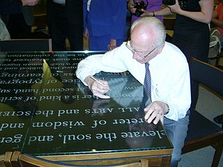
Hermann Zapf was a German type designer and calligrapher who lived in Darmstadt, Germany. He was married to the calligrapher and typeface designer Gudrun Zapf-von Hesse. Typefaces he designed include Palatino, Optima, and Zapfino. He is considered one of the greatest type designers of all time.

<span class="mw-page-title-main">Times New Roman</span> Serif typeface

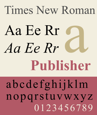
Times New Roman is a serif typeface. It was commissioned by the British newspaper The Times in 1931 and conceived by Stanley Morison, the artistic adviser to the British branch of the printing equipment company Monotype, in collaboration with Victor Lardent, a lettering artist in The Times's advertising department. It has become one of the most popular typefaces of all time and is installed on most personal computers.

<span class="mw-page-title-main">Typeface</span> Set of characters that share common design features

A typeface is a design of letters, numbers and other symbols, to be used in printing or for electronic display. Most typefaces include variations in size, weight, slope, width, and so on. Each of these variations of the typeface is a font.

<span class="mw-page-title-main">Helvetica</span> Neo-grotesque sans-serif typeface

Helvetica, also known by its original name Neue Haas Grotesk, is a widely used sans-serif typeface developed in 1957 by Swiss typeface designer Max Miedinger and Eduard Hoffmann.

<span class="mw-page-title-main">Matthew Carter</span> British type designer (born 1937)

Matthew Carter is a British type designer. A 2005 New Yorker profile described him as 'the most widely read man in the world' by considering the amount of text set in his commonly used typefaces.

<span class="mw-page-title-main">Frutiger (typeface)</span> Typeface designed by Adrian Frutiger

Frutiger is a series of typefaces named after its Swiss designer, Adrian Frutiger. Frutiger is a humanist sans-serif typeface, intended to be clear and highly legible at a distance or at small text sizes. A popular design worldwide, type designer Steve Matteson described its structure as "the best choice for legibility in pretty much any situation" at small text sizes, while Erik Spiekermann named it as "the best general typeface ever".

<span class="mw-page-title-main">Arial</span> Neo-grotesque sans-serif typeface

Arial is a sans-serif typeface and set of computer fonts in the neo-grotesque style. Fonts from the Arial family are included with all versions of Microsoft Windows after Windows 3.1, as well as in other Microsoft programs, Apple's macOS, and many PostScript 3 printers.

<span class="mw-page-title-main">Univers</span> Sans-serif typeface family

Univers is a large sans-serif typeface family designed by Adrian Frutiger and released by his employer Deberny & Peignot in 1957. Classified as a neo-grotesque sans-serif, one based on the model of nineteenth-century German typefaces such as Akzidenz-Grotesk, it was notable for its availability from the moment of its launch in a comprehensive range of weights and widths. The original marketing for Univers deliberately referenced the periodic table to emphasise its scope.

<span class="mw-page-title-main">Adrian Frutiger</span> Swiss typeface designer (1928–2015)

Adrian Johann Frutiger was a Swiss typeface designer who influenced the direction of type design in the second half of the 20th century. His career spanned the hot metal, phototypesetting and digital typesetting eras. Until his death, he lived in Bremgarten bei Bern.

<span class="mw-page-title-main">Dingbat</span> Typographic symbol class

In typography, a dingbat is an ornament, specifically, a glyph used in typesetting, often employed to create box frames, or as a dinkus. Some of the dingbat symbols have been used as signature marks or used in bookbinding to order sections.

<span class="mw-page-title-main">Zapfino</span> Typeface

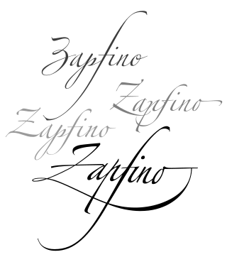
Zapfino is a calligraphic typeface designed for Linotype by typeface designer Hermann Zapf in 1998. It is based on an alphabet Zapf originally penned in 1944. As a font, it makes extensive use of ligatures and character variations.

<span class="mw-page-title-main">Zapf Dingbats</span> Dingbat typeface

ITC Zapf Dingbats is one of the more common dingbat typefaces. It was designed by the typographer Hermann Zapf in 1978 and licensed by International Typeface Corporation.

<span class="mw-page-title-main">Font</span> Particular size, weight and style of a typeface

In metal typesetting, a font is a particular size, weight and style of a typeface. Each font is a matched set of type, with a piece for each glyph. A typeface consists of various fonts that share an overall design.

<span class="mw-page-title-main">Bookman (typeface)</span> 1869 serif typeface

Bookman, or Bookman Old Style, is a serif typeface. A wide, legible design that is slightly bolder than most body text faces, Bookman has been used for both display typography, for trade printing such as advertising, and less commonly for body text. In advertising use it is particularly associated with the graphic design of the 1960s and 1970s, when revivals of it were very popular. It is also used as the official font of Indonesian laws since 2011.

<span class="mw-page-title-main">Akzidenz-Grotesk</span> Sans-serif typeface family by the Berthold Type Foundry of Berlin

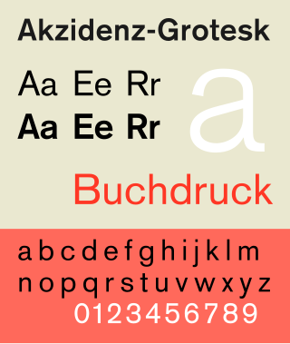
Akzidenz-Grotesk is a sans-serif typeface family originally released by the Berthold Type Foundry of Berlin. "Akzidenz" indicates its intended use as a typeface for commercial print runs such as publicity, tickets and forms, as opposed to fine printing, and "grotesque" was a standard name for sans-serif typefaces at the time.

<span class="mw-page-title-main">DIN 1451</span> Sans-serif font, used on German traffic signs

DIN 1451 is a sans-serif typeface that is widely used for traffic, administrative and technical applications.

Apple's Macintosh computer supports a wide variety of fonts. This support was one of the features that initially distinguished it from other systems.

References

  1. Rudo-Spemann-Preis, pages of the city of Offenbach am Main. Accessed February 1, 2015.
  2. Examples: Mein kunterbuntes Pianobuch or Mein kunterbuntes Liederbuch, both written by Margret Birkenfeld.
  3. Michael Rau, Rosemarie Kloos-Rau (1993), Script Types, München: Bruckmann, ISBN   3-7654-2572-9
  4. 1 2 Wiesbaden Swing. In: Wiesbadener Tagblatt, April 24, 2010, accessed February 1, 2015.
  5. Wiesbaden Swing Dingbats, linotype.com, accessed February 1, 2015.
  6. Linotype (2010), Typeface Catalog, Linotype GmbH, p. 499, ISBN   978-3-9810319-7-3
  7. Rosemarie Kloos-Rau, Berliner Sammlung Kalligraphie, accessed February 1, 2015.
  8. Volker Milch: „Ich wollte eine Hommage an die Stadt“. Wiesbadener Kurier , January 5, 2022, p. 14. Online as Wiesbaden Swing: „Eine Schrift tanzt um die Welt“.
  9. Script Fonts, linotype.com, accessed February 1, 2015.
  10. Tonwert-Atlas digital (PDF; 4,7 MB), page 31.
  11. Fonts in Focus No. 9, page 11, accessed at issuu.com, February 1, 2015.
  12. Kate Clair, Cynthia Busic-Snyder: A Typographic Workbook: A Primer to History, Techniques, and Artistry. John Wiley & Sons, 2012. ISBN   978-1-11-839988-0. Page 174.
  13. Rosemarie Kloos-Rau, designers.linotype.com, accessed February 1, 2015.
  14. Celebration Fonts, linotype.com, accessed February 1, 2015.
  15. Tomate und Schrift vereint. In: Wiesbadener Tagblatt, December 9, 2010, accessed February 1, 2015.
  16. Verpackung/Bedruckung, accessed February 1, 2015.
  17. Type-Design and Examples, rau-design.de, accessed February 1, 2015.
  18. Famous Linotype fonts from the last decade, accessed February 1, 2015.