Ed Benguiat | |
---|---|
![]() Benguiat in 2008 | |
Born | Ephram Edward Benguiat October 27, 1927 Brooklyn, New York, U.S. |
Died | October 15, 2020 92) | (aged
Nationality | American |
Occupation(s) | Graphic designer, type designer |
Spouse | Elisa Benguiat |
Ephram Edward Benguiat ( /ˈbɛnɡæt/ ; October 27, 1927 –October 15, 2020) was an American type designer and lettering artist. He designed over 600 typefaces, including Tiffany, Bookman, Panache, Souvenir, Edwardian Script, and the eponymous Benguiat and Benguiat Gothic.
He was also known for his designs or redesigns of the logotypes for Esquire , The New York Times , Playboy , McCall’s , Reader’s Digest , Photography, Look , Sports Illustrated , The Star-Ledger , The San Diego Tribune , AT&T, A&E, Coke, Estée Lauder, Ford, and others. [1] Other notable examples of Benguiat’s work are the logotypes for the original Planet of the Apes film, Super Fly and The Guns of Navarone, and the typeface for the opening credits for Stranger Things .
Benguiat was born in Brooklyn, New York, on October 27, 1927, to Rose Nahum and Jack Benguiat. His mother was a driver with the Red Cross, and his father was a display director in the department store chain Bloomingdale's. He was exposed to design elements as early as nine, with access to his father's design tools. [2] [3]
Although he was not old enough to enlist for the armed forces during World War II, he enlisted using a forged birth certificate and served in the Air Corps. He was stationed in Italy as a radio operator, and later performed photo reconnaissance. [2] [3]
Benguiat started out his career as a jazz percussionist playing in bands with the likes of Stan Kenton and Woody Herman. In an interview, he stated of his chosen career as a designer: "I’m really a musician, a jazz percussionist. One day I went to the musician’s union to pay dues and I saw all these old people who were playing bar mitzvahs and Greek weddings. It occurred to me that one day that’s going to be me, so I decided to become an illustrator." [4] [5]
He started his design career by working, in his words, as a "cleavage retoucher" during the restrictive period after World War II, when the Hays Code imposed restrictions on nudity in motion pictures. His role involved airbrushing and other techniques to do away with nudity in published works. [3] He went on to study graphical design, calligraphy, and typography at the Workshop School of Advertising Art under the Russian-American graphical artist and calligrapher Paul Standard. [6]
He was hired as a designer by Esquire magazine in 1953 and subsequently went on to join Photo Lettering Inc. as a design director in 1962. It was here that he worked on utilizing photo technology for commercial typography and lettering. [7] [8] He helped set up the International Typeface Corporation (ITC) in 1970, as an independent licensing company and served as a vice president. [3]
Over his career, he was one of the most prolific lettering artists, crafting over 600 typeface designs including Tiffany, ITC Bookman, Panache, Souvenir, Edwardian Script, and the eponymous Benguiat and Benguiat Gothic. [3] His Benguiat family was considered synonymous with Stephen King's works in the 1980s, and used in the logo and opening credits of Stranger Things . It was also used for the main credits in Star Trek Generations and Star Trek: First Contact . [9]
He was also known for his designs or redesigns of the logotypes for Esquire , The New York Times , Playboy , McCall’s , Reader’s Digest , Photography, Look , Sports Illustrated , The Star-Ledger , The San Diego Tribune , AT&T, A&E, Coke, Estée Lauder, Ford, and others. [1] Other notable examples of Benguiat’s work are the logotypes for the original Planet of the Apes film, Super Fly and The Guns of Navarone . [3] [10] His "Benguiat Caslon" was used in the logo of Foxy Brown. [11]
Benguiat's design aesthetic included dramatic display typefaces, tight spacing, also known as "tight but not touching" or "sexy spacing", [12] [13] and the very high x-heights popular in design in the 1970s, sometimes with flamboyant swashes, all features which were common in ITC's typefaces. [14] [15] [11] [16] These styles are also seen in the design of Herb Lubalin, another of ITC's co-founders. Gene Gable commented "You could easily say that ITC designs put a face on the ’70s and ’80s...You couldn’t open a magazine or pass a billboard in the ’70s without seeing [them]." [17]
Benguiat was a teacher at the School of Visual Arts, in New York, starting in 1961 and serving for over 50 years. [18] [3] He was inducted into the Art Directors Hall of Fame in 2000. [19]
Benguiat was married to Elisa (née Halperin) Benguiat for 38 years until his death. He died on October 15, 2020, twelve days before his 93rd birthday, at his home in Cliffside Park, New Jersey. [3]
He was an avid hobby pilot and was a member of a flying club called 'The Flying Birdmen'. [20] [6]
Most of Benguiat's published work was released through International Typeface Corporation. This includes ITC Barcelona, ITC Benguiat, ITC Benguiat Gothic, ITC Bookman, ITC Caslon No. 224, ITC Century Handtooled, ITC Edwardian Script, ITC Modern No. 216, ITC Panache, ITC Souvenir, ITC Tiffany. In addition, there were collaboration releases including ITC Avant Garde (condensed styles only), ITC Bauhaus (with Victor Caruso), ITC Cheltenham Handtooled (with Tony Stan), ITC Korinna (with Victor Caruso), ITC Lubalin Graph (with Herb Lubalin). [21]
The Ed Benguiat Font Collection is a casual font family designed by Benguiat and released by House Industries. The collection includes a series of whimsical icons, dubbed "bengbats". Unlike Benguiat's earlier, pre-computer work, the family uses extensive OpenType programming to replicate the feel of custom lettering or manual phototypesetting, similar to classic film posters and record sleeves. Some of the fonts in this collection included Ed Brush, Ed Gothic, Ed Interlock, Ed Roman, Ed Script, PL Benguiat Frisky. [22] [23] [11]
In typography and lettering, a sans-serif, sans serif, gothic, or simply sans letterform is one that does not have extending features called "serifs" at the end of strokes. Sans-serif typefaces tend to have less stroke width variation than serif typefaces. They are often used to convey simplicity and modernity or minimalism. For the purposes of type classification, sans-serif designs are usually divided into these major groups: § Grotesque and § Neo-grotesque, § Geometric, § Humanist and § Other or mixed.
A typeface is a design of letters, numbers and other symbols, to be used in printing or for electronic display. Most typefaces include variations in size, weight, slope, width, and so on. Each of these variations of the typeface is a font.
Matthew Carter is a British type designer. A 2005 New Yorker profile described him as 'the most widely read man in the world' by considering the amount of text set in his commonly used typefaces.
Frederic William Goudy was an American printer, artist and type designer whose typefaces include Copperplate Gothic, Goudy Old Style and Kennerley. He was one of the most prolific of American type designers and his self-named type continues to be one of the most popular in America.
Caslon is the name given to serif typefaces designed by William Caslon I (c. 1692–1766) in London, or inspired by his work.
Bookman, or Bookman Old Style, is a serif typeface. A wide, legible design that is slightly bolder than most body text faces, Bookman has been used for both display typography, for trade printing such as advertising, and less commonly for body text. In advertising use it is particularly associated with the graphic design of the 1960s and 1970s, when revivals of it were very popular. It is also used as the official font of Indonesian laws since 2011.
Doyald Young was an American typeface designer and teacher who specialized in the design of logotypes, corporate alphabets, lettering and typefaces.
The International Typeface Corporation (ITC) was a type manufacturer founded in New York in 1970 by Aaron Burns, Herb Lubalin and Edward Rondthaler. The company was one of the world's first type foundries to have no history in the production of metal type. It is now a wholly owned brand or subsidiary of Monotype Imaging.
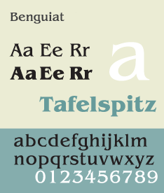
ITC Benguiat is a decorative serif typeface designed by Ed Benguiat and released by the International Typeface Corporation (ITC) in 1977. The face is loosely based upon typefaces of the Art Nouveau period but is not considered an academic revival. The face follows ITC's design formulary of an extremely high x-height, combined with multiple widths and weights.
ITC Avant Garde Gothic is a geometric sans serif font family based on the logo font used in the Avant Garde magazine. Herb Lubalin devised the logo concept and its companion headline typeface, and then he and Tom Carnase, a partner in Lubalin's design firm, worked together to transform the idea into a full-fledged typeface.
The Bauhaus typeface design is based on Herbert Bayer's 1925 experimental Universal typeface and the Bauhaus aesthetic overall.
Sol Hess was an American typeface designer. After a three-year scholarship course at Pennsylvania Museum School of Industrial Design, he began at Lanston Monotype in 1902, rising to typographic manager in 1922. He was a close friend and collaborator with Monotype art director Frederic Goudy, succeeding him in that position in 1940. Hess was particularly adept at expanding type faces into whole families, allowing him to complete 85 faces for Monotype, making him America's fourth most prolific type designer. While he was with Monotype, Hess worked on commissions for many prominent users of type, including, Crowell-Collier, Sears Roebuck, Montgomery Ward, Yale University Press, World Publishing Company, and Curtis Publishing for whom he re-designed the typography of their Saturday Evening Post.
Les Usherwood was born in England, studied in Kent and started his career as a lettering artist. He moved to Toronto, Ontario, Canada in 1957 and worked for various companies until he started Typsettra with David Thomason in 1968. The company supplied typographic layouts, headline and text typesetting, mechanicals, custom lettering and notably typeface design.
A reverse-contrast or reverse-stress letterform is a design in which the stress is reversed from the norm: a typeface or custom lettering where the horizontal lines are the thickest. This is the reverse of the vertical lines being the same width or thicker than horizontals, which is normal in Latin-alphabet writing and especially printing. The result is a dramatic effect, in which the letters seem to have been printed the wrong way round. The style invented in the early nineteenth century as attention-grabbing novelty display designs. Modern font designer Peter Biľak, who has created a design in the genre, has described them as "a dirty trick to create freakish letterforms that stood out."
A display typeface is a typeface that is intended for use in display type at large sizes for titles, headings, pull quotes, and other eye-catching elements, rather than for extended passages of body text.
Colin Brignall is an English type designer and photographer. In addition to designing typefaces himself, he has worked as a type director and typographic consultant to Letraset and the International Typeface Corporation (ITC), selecting and overseeing other designers' typefaces.
Antonio "Tony" DiSpigna is an American type designer and graphic designer.
{{cite web}}
: CS1 maint: bot: original URL status unknown (link){{cite book}}
: CS1 maint: multiple names: authors list (link)