This list of samples of serif typefaces details standard serif fonts used in printing, classical typesetting and printing.
Typeface name | Example 1 | Example 2 | Example 3 |
---|---|---|---|
Adobe Jenson Designer: Robert Slimbach Class: Old style | |||
Albertus Designer: Berthold Wolpe Class: Glyphic | |||
Aldus Designer: Hermann Zapf Class: Old style | |||
Alexandria Designer: Hank Gillette Class: Slab serif Sub-class: Geometric | |||
American Typewriter Designer: Joel Kaden & Tony Stan Class: Old style | |||
Amiri Designer: Dr. Khaled Hosny Class: Naskh Arabic | |||
Archer Designer: Tobias Frere-Jones & Jonathan Hoefler Class: Slab serif | |||
Arno Designer: Robert Slimbach Class: Old style | |||
Aster Designer: Francesco Simoncini Class: Modern | |||
Athelas Designer: Veronika Burian, Jose Scaglione | |||
Baskerville Designer: John Baskerville Class: Transitional | |||
Bauer Bodoni Designer: Heinrich Jost Class: Modern | |||
Bell Designer: Richard Austin Class: Modern | |||
Bembo Designer: Stanley Morison Class: Old style | |||
Benguiat Designer: Ed Benguiat Class: Decorative | |||
Bernhard Modern Designer: Lucian Bernhard Class: Old style | |||
Bodoni Designer: Giambattista Bodoni Class: Modern | |||
Bookman Designer: Alexander Phemister Class: Old style | |||
Bookerly Class: Other | |||
Bulmer Designer: William Martin Class: Transitional | |||
Caledonia Designer: William Addison Dwiggins Class: Transitional | |||
Calisto Designer: Ron Carpenter Class: Old style | |||
Cambria Designer: Jelle Bosma Class: Other | |||
Caslon Designer: William Caslon Class: Old style | |||
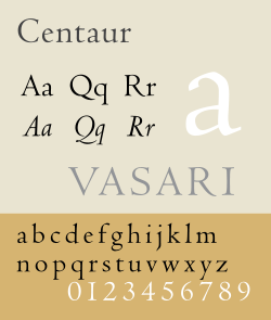
Centaur Designer: Bruce Rogers Class: Old style | |||
Century Schoolbook Designer: Morris Fuller Benton Class: Modern | |||
Chaparral Designer: Carol Twombly Class: Slab serif Sub-class: Humanist | |||
Bitstream Charter Designer: Matthew Carter Class: Transitional, Slab serif | |||
Cheltenham Designer: Bertram Goodhue & Ingalls Kimball Class: Old style | |||
City Designer: Georg Trump Class: Slab serif | |||
Clarendon Designer: Robert Besley Class: Slab serif | |||
Cochin Designer: Georges Peignot, Matthew Carter Class: Transitional | |||
Computer Modern Designer: Donald Knuth Class: Modern | |||
Constantia Designer: John Hudson Class: Other | |||
Constructium Designer: Rebecca Bettencourt Class: Other | |||
Copperplate Gothic Designer: Frederic Goudy Class: Wedge serif | |||
DejaVu Serif Class: Other | |||
Didot Class: Modern | |||
Droid Serif Designer: Steve Matteson Class: Other | |||
Emerson Designer: Joseph Blumenthal Class: Old style | |||
FF Scala Designer: Martin Majoor Class: Old style | |||
Footlight Designer: Ong Chong Wah | |||
Friz Quadrata Designer: Ernst Friz & Victor Caruso Class: Decorative | |||
ITC Galliard Designer: Matthew Carter Class: Old style | |||
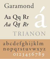
Garamond Designer: Claude Garamond & Jean Jannon Class: Old style | |||
Gentium Designer: Victor Gaultney Class: Other | |||
Georgia Designer: Matthew Carter Class: Transitional | |||
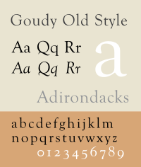
Goudy Old Style Designer: Frederic Goudy Class: Old style | |||
Granjon Designer: George Wallace Jones Class: Old style | |||
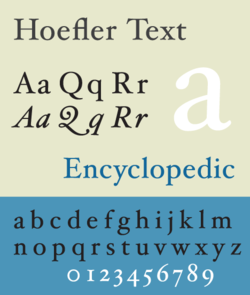
Hoefler Text Designer: Jonathan Hoefler Class: Old style | |||
Iowan Old Style Designer: John Downer Class: Old style | |||
Janson Designer: Chauncey H. Griffith Class: Old style | |||
Joanna Designer: Eric Gill Class: Transitional | |||
Junicode Designer: Peter S. Baker Class: Old style | |||
Korinna Designer: Ed Benguiat & Vic Caruso Class: Decorative | |||
Liberation Serif Designer: Steve Matteson Class: Other | |||
Linux Libertine Designer: Philipp H. Poll Class: Transitional | |||
Literata Designer: Google & TypeTogether Class: Scotch, Old style | |||
Literaturnaya Designer: Anatolii Shchukin Class: Transitional | |||
ITC Lubalin Graph Designer: Herb Lubalin Class: Slab serif | |||
Lucida Bright Designer: Charles Bigelow & Kris Holmes Class: Other | |||
Minion Designer: Robert Slimbach Class: Old style | |||
Mrs Eaves Designer: Zuzana Licko Class: Transitional | |||
MS Serif Designer: Microsoft | |||
New York Designer: Susan Kare, Charles Bigelow, and Kris Holmes Class: Transitional | |||
Nilland Designer: Manfred Klein Class: Slab serif | |||
Palatino Designer: Hermann Zapf Class: Old style | |||
Perpetua Designer: Eric Gill Class: Transitional | |||
Plantin Designer: Christophe Plantin Class: Old style | |||
IBM Plex Serif Designer: Mike Abbink Class: Transitional, Scotch | |||
Rawlinson Roadway Designer: James Montalbano Class: Old style | |||
Requiem Designer: Jonathan Hoefler Class: Old style | |||
Roboto Slab Designer: Christian Robertson Class: Slab serif | |||
Rockwell Class: Slab serif | |||
Rotis Designer: Otl Aicher Class: Other | |||
Sabon Designer: Jan Tschichold Class: Old style | |||
Serifa Designer: Adrian Frutiger Class: Slab serif | |||
Source Serif Pro Designer: Frank Grießhammer Class: Transitional | |||
Souvenir Designer: Morris Fuller Benton | |||
Theano Didot Designer: Alexey Kryukov Class: Modern | |||
Times New Roman Designer: Stanley Morison Class: Transitional | |||
Trajan Designer: Carol Twombly Class: Old Style | |||
Trinité Designer: Georg Trump Class: Humanist serif | |||
Trump Mediaeval Designer: Bram de Does Class: Old Style | |||
Utopia Designer: Robert Slimbach Class: Didone | |||
Windsor Designer: Eleisha Pechey Class: Old style | |||
Zilla Slab Class: Slab serif |
Typography is the art and technique of arranging type to make written language legible, readable and appealing when displayed. The arrangement of type involves selecting typefaces, point sizes, line lengths, line spacing, letter spacing, and spaces between pairs of letters. The term typography is also applied to the style, arrangement, and appearance of the letters, numbers, and symbols created by the process. Type design is a closely related craft, sometimes considered part of typography; most typographers do not design typefaces, and some type designers do not consider themselves typographers. Typography also may be used as an ornamental and decorative device, unrelated to the communication of information.
Times New Roman is a serif typeface. It was commissioned by the British newspaper The Times in 1931 and conceived by Stanley Morison, the artistic adviser to the British branch of the printing equipment company Monotype, in collaboration with Victor Lardent, a lettering artist in The Times's advertising department. It has become one of the most popular typefaces of all time and is installed on most personal computers.
In typography and lettering, a sans-serif, sans serif, gothic, or simply sans letterform is one that does not have extending features called "serifs" at the end of strokes. Sans-serif typefaces tend to have less stroke width variation than serif typefaces. They are often used to convey simplicity and modernity or minimalism. For the purposes of type classification, sans-serif designs are usually divided into these major groups: § Grotesque and § Neo-grotesque, § Geometric, § Humanist and § Other or mixed.
In typography, a serif is a small line or stroke regularly attached to the end of a larger stroke in a letter or symbol within a particular font or family of fonts. A typeface or "font family" making use of serifs is called a serif typeface, and a typeface that does not include them is sans-serif. Some typography sources refer to sans-serif typefaces as "grotesque" or "Gothic" and serif typefaces as "roman".
A typeface is a design of letters, numbers and other symbols, to be used in printing or for electronic display. Most typefaces include variations in size, weight, slope, width, and so on. Each of these variations of the typeface is a font.
Adrian Johann Frutiger was a Swiss typeface designer who influenced the direction of type design in the second half of the 20th century. His career spanned the hot metal, phototypesetting and digital typesetting eras. Until his death, he lived in Bremgarten bei Bern.
In the East Asian writing system, gothic typefaces are a type style characterized by strokes of even thickness and lack of decorations akin to sans serif styles in Western typography. It is the second most commonly used style in East Asian typography, after Ming.
Johnston is a sans-serif typeface designed by and named after Edward Johnston. The typeface was commissioned in 1913 by Frank Pick, commercial manager of the Underground Electric Railways Company of London, as part of his plan to strengthen the company's corporate identity. Johnston was originally created for printing, but it rapidly became used for the enamel station signs of the Underground system as well.
Oblique type is a form of type that slants slightly to the right, used for the same purposes as italic type. Unlike italic type, however, it does not use different glyph shapes; it uses the same glyphs as roman type, except slanted. Oblique and italic type are technical terms to distinguish between the two ways of creating slanted font styles; oblique designs may be labelled italic by companies selling fonts or by computer programs. Oblique designs may also be called slanted or sloped roman styles. Oblique fonts, as supplied by a font designer, may be simply slanted, but this is often not the case: many have slight corrections made to them to give curves more consistent widths, so they retain the proportions of counters and the thick-and-thin quality of strokes from the regular design.
Didone is a genre of serif typeface that emerged in the late 18th century and was the standard style of general-purpose printing during the 19th century. It is characterized by:
In metal typesetting, a font is a particular size, weight and style of a typeface. Each font is a matched set of type, with a piece for each glyph. A typeface consists of various fonts that share an overall design.
Bookman, or Bookman Old Style, is a serif typeface. A wide, legible design that is slightly bolder than most body text faces, Bookman has been used for both display typography, for trade printing such as advertising, and less commonly for body text. In advertising use it is particularly associated with the graphic design of the 1960s and 1970s, when revivals of it were very popular. It is also used as the official font of Indonesian laws since 2011.
Clarendon is the name of a slab serif typeface that was released in 1845 by Thorowgood and Co. of London, a letter foundry often known as the Fann Street Foundry. The original Clarendon design is credited to Robert Besley, a partner in the foundry, and was originally engraved by punchcutter Benjamin Fox, who may also have contributed to its design. Many copies, adaptations and revivals have been released, becoming almost an entire genre of type design.
A swash is a typographical flourish, such as an exaggerated serif, terminal, tail, entry stroke, etc., on a glyph. The use of swash characters dates back to at least the 16th century, as they can be seen in Ludovico Vicentino degli Arrighi's La Operina, which is dated 1522. As with italic type in general, they were inspired by the conventions of period handwriting. Arrighi's designs influenced designers in Italy and particularly in France.
Modern typographers view typography as a craft with a very long history tracing its origins back to the first punches and dies used to make seals and coinage currency in ancient times. The basic elements of typography are at least as old as civilization and the earliest writing systems—a series of key developments that were eventually drawn together into one systematic craft. While woodblock printing and movable type had precedents in East Asia, typography in the Western world developed after the invention of the printing press by Johannes Gutenberg in the mid-15th century. The initial spread of printing throughout Germany and Italy led to the enduring legacy and continued use of blackletter, roman, and italic types.
Joanna is a serif typeface designed by Eric Gill (1882–1940) from 1930 to 1931 that was named for one of his daughters. Gill chose Joanna for setting An Essay on Typography, a book by Gill on his thoughts on typography, typesetting and page design. He described it as "a book face free from all fancy business".
Bitstream Charter is a serif typeface designed by Matthew Carter in 1987 for Bitstream Inc. Charter is based on Pierre-Simon Fournier’s characters, originating from the 18th century. Classified by Bitstream as a transitional-serif typeface, it also has features of a slab-serif typeface and is often classified as such.
University of California Old Style is a serif typeface designed by Frederic Goudy and created for the University of California Press from 1936–8. It is one of Goudy's most popular serif typefaces. It is also known as Berkeley Old Style and Californian.