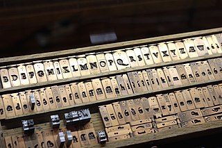
Typesetting is the composition of text by means of arranging physical type in mechanical systems or glyphs in digital systems representing characters. Stored types are retrieved and ordered according to a language's orthography for visual display. Typesetting requires one or more fonts. One significant effect of typesetting was that authorship of works could be spotted more easily, making it difficult for copiers who have not gained permission.

Stationery refers to commercially manufactured writing materials, including cut paper, envelopes, writing implements, continuous form paper, and other office supplies. Stationery includes materials to be written on by hand or by equipment such as computer printers.

The Yellow Book was a British quarterly literary periodical that was published in London from 1894 to 1897. It was published at The Bodley Head Publishing House by Elkin Mathews and John Lane, and later by John Lane alone, and edited by the American Henry Harland. The periodical was priced at 5 shillings and lent its name to the "Yellow Nineties", referring to the decade of its operation.

Letterpress printing is a technique of relief printing. Using a printing press, the process allows many copies to be produced by repeated direct impression of an inked, raised surface against sheets or a continuous roll of paper. A worker composes and locks movable type into the "bed" or "chase" of a press, inks it, and presses paper against it to transfer the ink from the type, which creates an impression on the paper.

In the manufacture of metal type used in letterpress printing, a matrix is the mould used to cast a letter, known as a sort. Matrices for printing types were made of copper.

American Type Founders (ATF) was a business trust created in 1892 by the merger of 23 type foundries, representing about 85% of all type manufactured in the United States. The new company, consisting of a consolidation of firms from throughout the United States, was incorporated in New Jersey.

A wedding invitation is a letter asking the recipient to attend a wedding. It is typically written in the formal, third-person language and mailed five to eight weeks before the wedding date.

Copperplate Gothic is a typeface designed by Frederic W. Goudy and released by American Type Founders (ATF) in 1901.

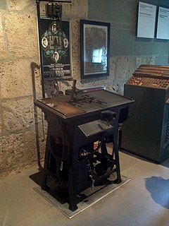
A Ludlow Typograph is a hot metal typesetting system used in letterpress printing. The device casts bars, or slugs of type, out of type metal primarily consisting of lead. These slugs are used for the actual printing, and then are melted down and recycled on the spot. It was used to print large-type material such as newspaper headlines or posters.
The Rampant Lions Press was a fine letterpress printing firm in Britain, operating from 1924 to 2008. The firm was founded by Will Carter, publishing its first book in 1936, and was continued by his son, Sebastian Carter, from 1966.

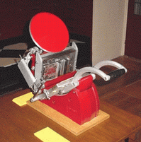
Adana Printing Machines were manufactured from 1922 to 1999 in Twickenham, England. Although most of the printing presses produced by Adana were aimed at hobby printers, they were frequently put to commercial use. Adanas are still to be found throughout the world in the hands of colleges, enthusiasts and professional printers. Caslon Limited manufactured machines after a takeover of the company in 1987.

OCR-B is a monospace font developed in 1968 by Adrian Frutiger for Monotype by following the European Computer Manufacturer's Association standard. Its function was to facilitate the optical character recognition operations by specific electronic devices, originally for financial and bank-oriented uses. It was accepted as the world standard in 1973. It follows the ISO 1073-2:1976 (E) standard, refined in 1979. It includes all ASCII symbols, and other symbols needed in the bank environment. It is widely used for the human readable digits in UPC/EAN barcodes. It is also used for machine-readable passports. It shares that purpose with OCR-A, but it is easier for the human eye and brain to read and it has a less technical look than OCR-A.

Print design, a subset of graphic design, is a form of visual communication used to convey information to an audience through intentional aesthetic design printed on a tangible surface, designed to be printed on paper, as opposed to presented on a digital platform. A design can be considered print design if its final form was created through an imprint made by the impact of a stamp, seal, or dye on the surface of the paper.

Danny Flynn, is a D&AD award-winning designer and printer, specialising in limited edition book design and illustration, and letterpress and screen-printing. His work in design, typography and printing led to him working in post-production design for the opening title sequence of the Hollywood film Gladiator.

J.G. Schelter & Giesecke was a German type foundry and manufacturer of printing presses started 1819 in Leipzig by punchcutter Johann Schelter and typefounder Christian Friedrich Giesecke (1793-1850). The foundry was nationalized in 1946 by the new German Democratic Republic, forming VEB Typoart, Dresden.
William Hamilton Page (1829–1909) was a type designer and owner of William Page & Company, a leading manufacturer of wood type for letterpress printing.

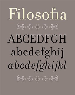
Filosofia is a serif typeface designed by Zuzana Licko and released by Emigre Fonts in 1996. It is a revival of Italian type designer Giambattista Bodoni's late eighteenth century typeface, Bodoni.

In letterpress printing, wood type is movable type made out of wood.


