
Palatino is the name of an old-style serif typeface designed by Hermann Zapf, initially released in 1949 by the Stempel foundry and later by other companies, most notably the Mergenthaler Linotype Company.

Times New Roman is a serif typeface designed for use in body text. It was commissioned by the British newspaper The Times in 1931 and conceived by Stanley Morison, the artistic advisor to the British branch of the printing equipment company Monotype, in collaboration with Victor Lardent, a lettering artist in the Times' advertising department. Although no longer used by The Times, Times New Roman is still very common in book and general printing. It has become one of the most popular and influential typefaces in history and a standard typeface on desktop computers.

Frutiger is a series of typefaces named after its Swiss designer, Adrian Frutiger. Frutiger is a humanist sans-serif typeface, intended to be clear and highly legible at a distance or at small text sizes. A very popular design worldwide, type designer Steve Matteson described its structure as "the best choice for legibility in pretty much any situation" at small text sizes, while Erik Spiekermann named it as "the best general typeface ever".
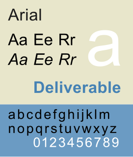
Arial, sometimes marketed or displayed in software as Arial MT, is a sans-serif typeface and set of computer fonts. Fonts from the Arial family are packaged with all versions of Microsoft Windows from Windows 3.1 onwards, some other Microsoft software applications, Apple Mac OS X and many PostScript 3 computer printers. The typeface was designed in 1982 by Robin Nicholas and Patricia Saunders, for Monotype Typography. It was created to be metrically identical to the popular typeface Helvetica, with all character widths identical, so that a document designed in Helvetica could be displayed and printed correctly without having to pay for a Helvetica license.
In digital typography, the TrueType font Arial Unicode MS is an extended version of the font Arial. Compared to Arial, it includes higher line height, omits kerning pairs and adds enough glyphs to cover a large subset of Unicode 2.1—thus supporting most Microsoft code pages, but also requiring much more storage space. It also adds Ideographic layout tables, but unlike Arial, it mandates no smoothing in the 14–18 point range, and contains Roman (upright) glyphs only; there is no oblique (italic) version. Arial Unicode MS is normally distributed with Microsoft Office, but it is also bundled with Mac OS X v10.5 and later. It may also be purchased separately from Ascender Corporation, who licenses the font from Microsoft.

Eras is a humanist sans-serif typeface designed by Albert Boton and Albert Hollenstein, and released by the International Typeface Corporation (ITC) in 1976. Eras is licensed by the Linotype type foundry.
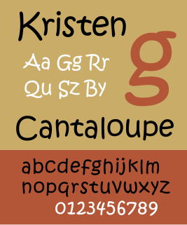
ITC Kristen is a casual script typeface consisting of two weights designed by George Ryan for the International Typeface Corporation (ITC). It was inspired by a handwritten menu at a Cambridge, Massachusetts restaurant, and has an asymmetric structure suggesting a child's handwriting.
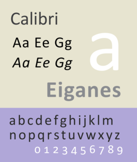
Calibri is a sans-serif typeface family designed by Luc(as) de Groot in 2002–2004 and released to the general public in 2007, with Microsoft Office 2007 and Windows Vista. In Office 2007, it replaced Times New Roman as the default typeface in Word and replaced Arial as the default in PowerPoint, Excel, Outlook, and WordPad. De Groot described its subtly rounded design as having "a warm and soft character".
Segoe is a typeface, or family of fonts, that is best known for its use by Microsoft. The company uses Segoe in its online and printed marketing materials, including recent logos for a number of products. Additionally, the Segoe UI font sub-family is used by numerous Microsoft applications, and may be installed by applications. It was adopted as Microsoft's default operating system font beginning with Windows Vista, and is also used on outlook.com, Microsoft's web-based email service. In August 2012, Microsoft unveiled its new corporate logo typeset in Segoe, replacing the logo it had used for the previous 25 years.

Bembo is a serif typeface created by the British branch of the Monotype Corporation in 1928-9 and most commonly used for body text. It is a member of the "old-style" of serif fonts, with its regular or roman style based on a design cut around 1495 by Francesco Griffo for Venetian printer Aldus Manutius, sometimes generically called the "Aldine roman". Bembo is named for Manutius's first publication with it, a small 1496 book by the poet and cleric Pietro Bembo. The italic is based on work by Giovanni Antonio Tagliente, a calligrapher who worked as a printer in the 1520s, after the time of Manutius and Griffo.

Bookman or Bookman Old Style, is a serif typeface. A wide, legible design that is slightly bolder than most body text faces, Bookman has been used for both display typography and for printing at small sizes such as in trade printing, and less commonly for body text. In advertising use it is particularly associated with the graphic design of the 1960s and 1970s, when revivals of it were very popular.

Goudy Old Style is an old-style serif typeface originally created by Frederic W. Goudy for American Type Founders (ATF) in 1915.

Sabon is an old-style serif typeface designed by the German-born typographer and designer Jan Tschichold (1902–1974) in the period 1964–1967. It was released jointly by the Linotype, Monotype, and Stempel type foundries in 1967. The design of the roman is based on types by Claude Garamond, particularly a specimen printed by the Frankfurt printer Konrad Berner. Berner had married the widow of a fellow printer Jacques Sabon, the source of the face's name, who had bought some of Garamond's type after his death. The italics are based on types designed by a contemporary of Garamond's, Robert Granjon. It is effectively a Garamond revival, though a different name was chosen as many other modern typefaces already carry this name.
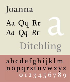
Joanna is a serif typeface designed by Eric Gill (1882–1940) in the period 1930–31, and named for one of his daughters. Gill chose Joanna for setting An Essay on Typography, a book by Gill on his thoughts on typography, typesetting, and page design. He described it as "a book face free from all fancy business."

News Gothic is a realist sans-serif typeface dated to 1908 designed by Morris Fuller Benton, and released by his employer American Type Founders (ATF). News Gothic is similar in proportion and structure to Franklin Gothic, also designed by Benton, but lighter.

Twentieth Century is a geometric sans-serif typeface designed by Sol Hess for Lanston Monotype in 1937. It was created as a competitor to the successful Futura typeface for Monotype's hot metal typesetting system. Like Futura it has a single-story 'ɑ' and a straight 'j' with no bend.
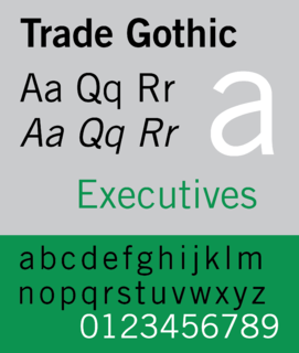
Trade Gothic is a sans-serif typeface first designed in 1948 by Jackson Burke (1908–1975), who continued to work on further style-weight combinations until 1960 while he was director of type development for Linotype in the USA. The family includes three weights and three widths.

Imprint is a serif typeface created by Monotype, commonly used for body text. Originally called Imprint Old Face, it is a sturdy, amiable design with a large x-height, Caslon-like but with more regularity in its letterforms. It was commissioned by the London publishers of The Imprint, a short-lived printing trade periodical published during 1913.

Metro is a sans-serif typeface family created by William Addison Dwiggins and released by the American Mergenthaler Linotype Company from 1929 onwards.

Freestyle Script is an informal display script typeface that was designed by Colin Brignall in 1969 and Martin Wait in 1981, by Letraset. Freestyle Script is famously used for commercials in 1980's, birthday cards, decorative, logos and many others. The bold version was designed in 1986. The publishers of this font are Adobe, ITC, Monotype Imaging, Elsner+Flake, Esselte Corporation, Scangraphic Type, Linotype, Image Club, and Letraset. This font has few versions, namely Regular, Bold, LT, Plain, LET, EF, SH Reg Alt, and SB Reg Alt. Freestyle Script font supports up to 78 different languages for cursive (plain) and 33 different languages for other styles. The Cyrillic version of Freestyle Script was created in 1993, consisting of the glyphs in Latin supplement. The font has been included in MyFonts since 2000.


