Plantin (typeface)

Last updated
Plantin
Plantin font sample.png
Category Serif
Classification Old style serif
Designer(s) Robert Granjon
Frank Hinman Pierpont
Fritz Stelzer
Foundry Monotype
Date created1913

Plantin is an old-style serif typeface. It was created in 1913 by the British Monotype Corporation for their hot metal typesetting system and is named after the sixteenth-century printer Christophe Plantin. [1] It is loosely based on a Gros Cicero roman type cut in the 16th century by Robert Granjon held in the collection of the Plantin–Moretus Museum, Antwerp. [2]

Contents

The intention behind the design of Plantin was to create a font with thicker letterforms than were often used at the time: early printing on absorbent book paper led to ink spread, but by 1913 innovations in smoothing and coated paper had led to reduced ink spread and made old types often look skeletal on paper. [3] Monotype engineering manager Frank Hinman Pierpont visited the Plantin-Moretus Museum, where he acquired a printed specimen of historic types. [4]

Plantin was one of the first Monotype Corporation revivals that was not simply a copy of a typeface already popular in British printing; it has proved popular since its release and has been digitised. Monotype followed it with revivals of many other classic typefaces in the 1920s and 30s. [1] Plantin would later also be used as one of the main models for the creation of Times New Roman in the 1930s. [5] The Plantin family includes regular, light and bold weights, along with corresponding italics.

Inspiration

Steel punches, the masters used to stamp matrices used to cast metal type, at the Plantin-Moretus Museum. Its unique collection of original sixteenth-century matrices and punches inspired the Plantin design. Plantin-Moretus punches 1.jpg
Steel punches, the masters used to stamp matrices used to cast metal type, at the Plantin-Moretus Museum. Its unique collection of original sixteenth-century matrices and punches inspired the Plantin design.
The Plantin-Moretus Museum in Antwerp, a visit to which provided source material for Plantin's design. Antwerp Belgium Museum-Plantin-Moretus-05.jpg
The Plantin-Moretus Museum in Antwerp, a visit to which provided source material for Plantin's design.

At the time Plantin was released, Monotype's hot metal typesetting system, which cast new type for each printing job, was developing a reputation for practicality in trade and mass-market printing, but the designs offered by Monotype were relatively basic choices, such as a "modern" face, an "old style" and a Clarendon. [1]

James Moran and John Dreyfus suggested that an inspiration for the design may have been a c. 1910 family from the Shanks foundry known as "Plantin Old Style", advertised as highly legible. [6] This was actually a bold design based on Caslon, with no connection to Christophe Plantin or Granjon, but Dreyfus suggests it may have prompted Monotype to research Christophe Plantin and the collection of the Plantin-Moretus Museum. [7]

The Plantin-Moretus Museum was created in 1876 from Plantin's collection which had been preserved and added to by his successors in business. It is notable as the world's largest collection of sixteenth century typefaces. [8] Although Plantin commissioned types from Granjon, according to Hendrik Vervliet the specific type Pierpont's design was based on began to be used by the Plantin-Moretus Press only in the 18th century, after Plantin had died and his press had been inherited by the Moretus family. [9] (It has been reported that Plantin did use the long letters of the type as replacement letters to cast a type by Garamond shorter height, but Vervliet suggests that these may have been a set of slightly different characters cut by Granjon separately. [9] [3] [4] [10] )

Plantin was designed and engraved into metal at the Monotype factory in Salfords, Surrey, which was led by Pierpont and draughtsman Fritz Stelzer. Both were recruits to Monotype from the German printing industry.

The choice to revive a French Renaissance design was unusual for the time, since most British fine printers of the period preferred either Caslon or revivals of the fifteenth-century style of Nicolas Jenson (recognisable from the tilted 'e'), following the lead of William Morris's Golden Type, both of which Monotype would also develop revivals of. [1] However, other revivals of Aldine/French renaissance typefaces followed from several hot metal typesetting companies in the following decades, including Monotype's own Poliphilus, Bembo and Garamond, Linotype's Granjon and Estienne and others, becoming very popular in book printing for body text.

Design

Miller & Richard's Old Style, a delicate reinterpretation of pre nineteenth-century printing styles that became popular in the late nineteenth century. While offering a version of it as one of their first faces, Monotype in creating Plantin aimed to offer a more solid design that would print clearly. Old Style.jpg
Miller & Richard's Old Style, a delicate reinterpretation of pre nineteenth-century printing styles that became popular in the late nineteenth century. While offering a version of it as one of their first faces, Monotype in creating Plantin aimed to offer a more solid design that would print clearly.

The design for Plantin preserved the large x-height of Granjon's designs, but shortened the ascenders and descenders and enlarged the counters of the lowercase 'a' and 'e'. [4] Not all the letters were Granjon's: the letters 'J', 'U' and 'W', not used in French in the sixteenth century, were not his, and a different 'a' in an eighteenth-century style had been substituted into the font by the time the specimen sheet was printed. [9] [11] [12] [13]

The 1742 specimen of Claude Lamesle (notable for its printing quality) provides a specimen of the Granjon type in its original state. [14] [9] Mosley has close-up images of some characters of the face. [12] [lower-alpha 1]

Reception and usage

A sample image of Plantin created by Fontshop, showing infant styles and the condensed "News" and "Headline" styles sold for newspapers. Plantin Fontshop.gif
A sample image of Plantin created by Fontshop, showing infant styles and the condensed "News" and "Headline" styles sold for newspapers.

With its relatively robust, solid design compared to the Didone and "Modernised Old Style" faces popular in the early twentieth century (which Monotype already had made versions of), Plantin proved popular and was often particularly used by trade and newspaper printers using poor-quality paper in the metal type period and beyond. Monotype's advertising emphasised its popularity with advertisers, highlighting its use in the "Mrs Rawlins" series of adverts for washing starch. [16] [17] [18] [19] As the basic font is relatively dark on the page, Monotype offered a 'light' version as well as a bold, which Hugh Williamson describes as "particularly suitable for bookwork." [20]

During the interwar period the face was adopted and popularized by Francis Meynell's Pelican Press and by C. W. Hobson's Cloister press, and also used occasionally by Cambridge University Press. [4] A custom version, "Nonesuch Plantin" was also cut for Meynell's Nonesuch Press, one of the first fine printers to use Monotype machines, with extended ascenders and descenders on the lower-case. [21] Type designer Walter Tracy noted that this changed the type's appearance to a surprising extent: "it look[s] not only more refined but as if it derived from another period: Fournier's, say [in the eighteenth century], not Granjon's." [22] It was appropriately used by the Bodley Head to print Meynell's autobiography. [23] Monotype also created a condensed version, News Plantin, for The Observer in the late 1970s. [24] [1] An infant variety of the typeface called Plantin Infant also exists, [25] with single-story versions of the letters 'a' and 'g' and a 'y' with two straight sides.

The font was used as the signature font for ABC News from 1978 until 1999. In more recent usage, the magazine Monocle is set entirely in Plantin and Helvetica. [26] The body text of all Magic: The Gathering cards is also set in Plantin.

Designs inspired by Plantin

A comparison between Times New Roman and three typefaces originally considered as a basis for the Times project: Perpetua, Baskerville, and Plantin. Times is most based on Plantin, but with taller letters and its appearance "modernised" by adding eighteenth- and nineteenth-century influences similar to Baskerville and Perpetua, in particular enhancing the stroke contrast. Times ancestors.png
A comparison between Times New Roman and three typefaces originally considered as a basis for the Times project: Perpetua, Baskerville, and Plantin. Times is most based on Plantin, but with taller letters and its appearance "modernised" by adding eighteenth- and nineteenth-century influences similar to Baskerville and Perpetua, in particular enhancing the stroke contrast.

Plantin was the basis for the general layout of Monotype's most successful typeface of all, Times New Roman. [27] [28] Times is similar to Plantin but "sharpened" or "modernised", with increased contrast (particularly resembling designs from the eighteenth and nineteenth century) and greater "sparkle". [29] [30] [31] Allan Haley commented that Times New Roman "looks like Plantin on a diet." [32]

As the Plantin design is in the public domain, adaptations and unofficial digitisations (including simple knock-offs) have been released. Galaxie Copernicus by Chester Jenkins and Kris Sowersby is a reinterpretation of Plantin. [33] [34] Sowersby followed it with a newspaper typeface, Tiempos, influenced by Times New Roman [35] [36] and later, in mid-2023, released a digital revival of the metal Plantin 110 cut itself—rather than a reinterpretation—called Martina Plantijn. [37] Fabric Serif by Sindre Bremnes and Frode Helland of Monokrom Type Foundry is another reinterpretation. [38] [39] Other similar designs include Musee by DSType [40] and Erato by Hoftype. [41] In 2024 The Economist adopted a new typeface Economist Serif designed by Henrik Kubel and based on Plantin. [42]

Aldine 721 is Bitstream's version of Plantin [43] [44] and Francisco Serial is a version by Softmaker. [45]

Related Research Articles

<span class="mw-page-title-main">Times New Roman</span> Serif typeface

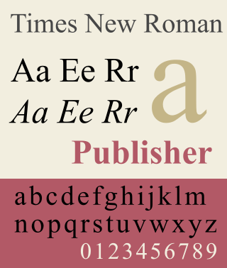
Times New Roman is a serif typeface. It was commissioned by the British newspaper The Times in 1931 and conceived by Stanley Morison, the artistic adviser to the British branch of the printing equipment company Monotype, in collaboration with Victor Lardent, a lettering artist in The Times's advertising department. It has become one of the most popular typefaces of all time and is installed on most personal computers.

In typography, a serif is a small line or stroke regularly attached to the end of a larger stroke in a letter or symbol within a particular font or family of fonts. A typeface or "font family" making use of serifs is called a serif typeface, and a typeface that does not include them is sans-serif. Some typography sources refer to sans-serif typefaces as "grotesque" or "Gothic", and serif typefaces as "roman".

<span class="mw-page-title-main">Garamond</span> Typeface family

Garamond is a group of many serif typefaces, named for sixteenth-century Parisian engraver Claude Garamond, generally spelled as Garamont in his lifetime. Garamond-style typefaces are popular and particularly often used for book printing and body text.

<span class="mw-page-title-main">Matthew Carter</span> British type designer (born 1937)

Matthew Carter is a British type designer. A 2005 New Yorker profile described him as 'the most widely read man in the world' by considering the amount of text set in his commonly used typefaces.
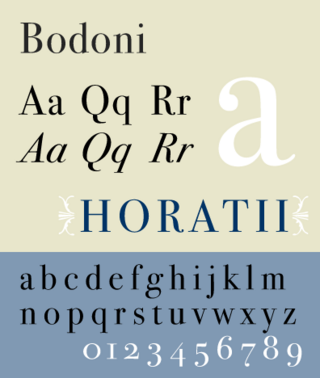
<span class="mw-page-title-main">Italic type</span> Font style characterised by cursive typeface and slanted design

In typography, italic type is a cursive font based on a stylised form of calligraphic handwriting. Along with blackletter and roman type, it served as one of the major typefaces in the history of Western typography.

<span class="mw-page-title-main">Caslon</span> Typeface with serifs

Caslon is the name given to serif typefaces designed by William Caslon I (c. 1692–1766) in London, or inspired by his work.

<span class="mw-page-title-main">Bembo</span> Serif typeface in 1495 Venetian style

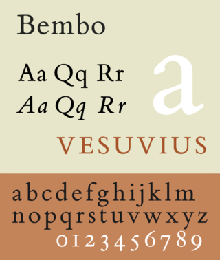
Bembo is a serif typeface created by the British branch of the Monotype Corporation in 1928–1929 and most commonly used for body text. It is a member of the "old-style" of serif fonts, with its regular or roman style based on a design cut around 1495 by Francesco Griffo for Venetian printer Aldus Manutius, sometimes generically called the "Aldine roman". Bembo is named for Manutius's first publication with it, a small 1496 book by the poet and cleric Pietro Bembo. The italic is based on work by Giovanni Antonio Tagliente, a calligrapher who worked as a printer in the 1520s, after the time of Manutius and Griffo.

<span class="mw-page-title-main">Claude Garamond</span> French publisher and type designer

Claude Garamont, known commonly as Claude Garamond, was a French type designer, publisher and punch-cutter based in Paris. Garamond worked as an engraver of punches, the masters used to stamp matrices, the moulds used to cast metal type. He worked in the tradition now called old-style serif design, which produced letters with a relatively organic structure resembling handwriting with a pen but with a slightly more structured and upright design. Considered one of the leading type designers of all time, he is recognised to this day for the elegance of his typefaces. Many old-style serif typefaces are collectively known as Garamond, named after the designer.

<span class="mw-page-title-main">Bookman (typeface)</span> 1869 serif typeface

Bookman, or Bookman Old Style, is a serif typeface. A wide, legible design that is slightly bolder than most body text faces, Bookman has been used for both display typography, for trade printing such as advertising, and less commonly for body text. In advertising use it is particularly associated with the graphic design of the 1960s and 1970s, when revivals of it were very popular. It is also used as the official font of Indonesian laws since 2011.

<span class="mw-page-title-main">Bell (typeface)</span> Serif typeface

Bell is the name given to a serif typeface designed and cut in 1788 by the punchcutter Richard Austin for the British Letter Foundry, operated by publisher John Bell, and revived several times since.

<span class="mw-page-title-main">Robert Granjon</span> French type designer and printer

Robert Granjon was a French punchcutter, a designer and creator of metal type, and printer. He worked in Paris, Lyon, Antwerp, and Rome. He is best known for having introduced the typeface style Civilité, for his many italic types and his fleuron designs, although he worked across all genres of typeface and alphabet across his long career.

<i>Grecs du roi</i> Greek typeface by Claude Garamond

Les Grecs du roi are a celebrated and influential Greek alphabet typeface in the Greek minuscule style which was cut by the French punchcutter Claude Garamond between 1541 and 1550. Arthur Tilley calls the books printed from them "among the most finished specimens of typography that exist".

<span class="mw-page-title-main">Imprint (typeface)</span> Serif typeface

Imprint is a serif typeface created by Monotype, commonly used for body text. Originally called Imprint Old Face, it is a sturdy, amiable design with a large x-height, Caslon-like but with more regularity in its letterforms. It was commissioned by the London publishers of The Imprint, a short-lived printing trade periodical published during 1913.

<span class="mw-page-title-main">Galliard (typeface)</span> Serif typeface

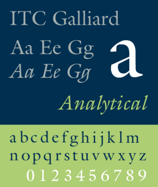
ITC Galliard is the name of a serif typeface designed by Matthew Carter and issued in 1978 by the Mergenthaler Linotype Company.

<span class="mw-page-title-main">Reverse-contrast typefaces</span> Kind of typeface or custom lettering

A reverse-contrast or reverse-stress letterform is a design in which the stress is reversed from the norm: a typeface or custom lettering where the horizontal lines are the thickest. This is the reverse of the vertical lines being the same width or thicker than horizontals, which is normal in Latin-alphabet writing and especially printing. The result is a dramatic effect, in which the letters seem to have been printed the wrong way round. The style invented in the early nineteenth century as attention-grabbing novelty display designs. Modern font designer Peter Biľak, who has created a design in the genre, has described them as "a dirty trick to create freakish letterforms that stood out."

<span class="mw-page-title-main">Solus (typeface)</span> Serif typeface designed by Eric Gill

Solus is a serif typeface that was designed by English sculptor and stonemason Eric Gill for the British Monotype Corporation and released in 1929.

<span class="mw-page-title-main">Old Style (Miller & Richard)</span>

Old Style or Modernised Old Style was the name given to a series of serif typefaces cut from the mid-nineteenth century and sold by the type foundry Miller & Richard, of Edinburgh in Scotland. It was a standard typeface in Britain for literary and prestigious printing in the second half of the nineteenth century and the early twentieth century, with many derivatives and copies released.

<span class="mw-page-title-main">Christoffel van Dijck</span> Dutch type designer

Christoffel van Dijck was a German-born Dutch punchcutter and typefounder, who cut punches and operated a foundry for casting metal type. Van Dijck's type was widely used at a time when Amsterdam had become a major centre of world printing.

<span class="mw-page-title-main">Hendrik van den Keere</span> 16th-century punchcutter

Hendrik van den Keere was a punchcutter, or cutter of punches to make metal type, who lived in Ghent in modern Belgium.

<span class="mw-page-title-main">John A. Lane</span> American writer and historian

John A. Lane is an American writer and historian of printing living in the Netherlands. Lane received the 2003 Fellowship of the American Printing History Association and is particularly known for his writing on Dutch printing history and figures including Nicolaes Briot, Christoffel van Dijck and Miklós Kis.

References

  1. A better-quality digitisation of the whole specimen is available but it does not include this leaf. [15]
  1. 1 2 3 4 5 Slinn, Judy; Carter, Sebastian; Southall, Richard. History of the Monotype Corporation. pp. 202–3 etc.
  2. Schuster, Brigitte (2010). "Monotype Plantin: A Digital Revival by Brigitte Schuster" (PDF). Royal Academy of Art, The Hague (M.A. thesis). Retrieved 23 May 2014.
  3. 1 2 Carter, Sebastian (1995), Twentieth Century Type Designers, W. W. Norton & Company, pp. 28–29.
  4. 1 2 3 4 Morison, Stanley (7 June 1973). A Tally of Types . CUP Archive. pp.  22–24. ISBN   978-0-521-09786-4.
  5. Meggs, Philip B.; Carter, Rob (1993), "29. Plantin", Typographic Specimens: The Great Typefaces, John Wiley and Sons, pp. 302–311, ISBN   978-0-471-28429-1 .
  6. "Plantin Old Style : typeface synopsis issued by P M Shanks & Co Ltd., typefounders, London, c1910 (image: Mike Ashworth)". 16 April 2019. Retrieved 2022-12-02.
  7. Dreyfus, John (1995). Into Print: Selected Writings on Printing History, Typography and Book Production (1st hardcover ed.). Boston: David R. Godine. pp. 116–124. ISBN   9781567920451.
  8. Mosley, James. "The materials of typefounding". Type Foundry. Retrieved 14 August 2015.
  9. 1 2 3 4 Hendrik D. L. Vervliet (2008). The Palaeotypography of the French Renaissance: Selected Papers on Sixteenth-century Typefaces. BRILL. pp. 226–7. ISBN   978-90-04-16982-1.
  10. Mann, Meredith. "Where Did Times New Roman Come From?". New York Public Library . Retrieved 2 February 2016.
  11. Mosley, James (2003). "Reviving the Classics: Matthew Carter and the Interpretation of Historical Models". In Mosley, James; Re, Margaret; Drucker, Johanna; Carter, Matthew (eds.). Typographically Speaking: The Art of Matthew Carter. Princeton Architectural Press. pp. 31–34. ISBN   9781568984278. Plantin was a recreation of one of the old types held at the Plantin-Moretus Museum in Antwerp, of which a specimen, printed in 1905, had been acquired by Pierpont on a visit. The type from which the specimen was printed was not only centuries old and worn almost beyond use, but it was contaminated with wrong-font letters (notably the letter 'a') and the italic did not even belong to the roman. The revival, derived by Monotype from an indirect and confused original, is as sound a piece of type-making as was ever created in the 20th century…behind the foggy image of the roman type lies the...'Gros Cicero' Roman of Robert Granjon, acquired by the Plantin printing office after the death of its founder.
  12. 1 2 Mosley, James. "Comments on Typophile thread". Typophile (archived). Archived from the original on 2011-10-13. Retrieved 16 December 2016. The consensus appears to be that not only the wrong-fount a in the cases at Antwerp but also the italic that Monotype adapted for their Plantin (which can be seen on that first page of the 1905 specimen) may be the work of Johann Michael Schmidt (died 1750), also known as J. M. Smit or Smid.
  13. Lane, John A. (1995). "Arent Corsz Hogenacker (ca. 1579-1636): an account of his typefoundry and a note on his types Part two: the types". Quaerendo . 25 (3): 163. doi:10.1163/157006995X00017. Most of these sixteenth-century types were originally cut without the letters J, U, and W, which were added in the seventeenth century.
  14. Lamesle, Claude (1742). Épreuves générales des caracteres. p. 55.
  15. Lamesle, Claude (1742). Épreuves générales des caracteres.
  16. "Monotype (advert)". Modern Publicity: 187. 1930. Retrieved 15 March 2017.
  17. Warde, Beatrice (1932). "Twenty Years of Advertising Typography". Advertiser's Weekly: 130. Retrieved 15 March 2017.
  18. Hackney, Fiona Anne Seaton. ""They Opened Up a Whole New World": Feminine Modernity and the Feminine Imagination in Women's Magazines, 1919-1939" (PDF). Goldsmith's College (PhD thesis). Retrieved 15 March 2017.
  19. Lucy Lethbridge (14 March 2013). Servants: A Downstairs View of Twentieth-century Britain. A&C Black. pp. 187–8. ISBN   978-1-4088-3407-7.
  20. Williamson, Hugh (1956). Methods of Book Design. Oxford University Press. p. 81.
  21. Steeves, Andrew (14 April 2011). "Poetry Books for the Trala". Gaspereau Press. Retrieved 12 March 2017.
  22. Tracy, Walter. Letters of Credit. pp. 50–1.
  23. Joseph Rosenblum (1995). A Bibliographic History of the Book: An Annotated Guide to the Literature. Scarecrow Press. pp. 407–8. ISBN   978-0-8108-3009-7.
  24. Luna, Paul (1986). "Small Print". Designer. The first national to install a Lasercomp, it overcame the lack of suitable text faces by commissioning its own, a slightly condensed version of Plantin.
  25. "Plantin Infant Font" . Retrieved 14 January 2022.
  26. Coles, Stephen (February 13, 2009). "In Use: Plantin for Monocle". The FontFeed. FSI FontShop International . Retrieved 2009-12-23.
  27. Rhatigan, Dan. "Time and Times again". Monotype. Retrieved 28 July 2015.
  28. Hutt, Allen (1970). "Times Roman: a re-assessment". Journal of Typographic Research. 4 (3): 259–270. Retrieved 5 March 2017.
  29. Lawson, Alexander (1990). Anatomy of a Typeface. New York: David R. Godine. pp. 270–294. ISBN   9780879233334 . Retrieved 6 March 2016.
  30. Morison, Stanley. "Changing the Times". Eye. Retrieved 28 July 2015.
  31. Allan Haley (15 September 1992). Typographic Milestones. John Wiley & Sons. p. 106. ISBN   978-0-471-28894-7.
  32. Haley, Allen (1990). ABC's of type. Watson-Guptill Publications. p.  86. ISBN   9780823000531.
  33. Heck, Bethany (11 August 2017). "Galaxie Copernicus review". Font Review Journal. Retrieved 13 September 2019.
  34. "Village: Galaxie Copernicus about" . Retrieved 14 January 2022.
  35. Sowersby, Kris. "Tiempos Design Information". Klim Type Foundry. Retrieved 21 January 2019.
  36. Thomson, Mark; Sowersby, Kris. "Reputations: Kris Sowersby". Eye. Retrieved 12 September 2019.
  37. Sowersby, Kris. "Martina Plantijn Design Information". Klim Type Foundry. Retrieved 29 December 2023.
  38. "Fabric Serif in use - Fonts In Use" . Retrieved 14 January 2022.
  39. "Monokrom Skriftforlag" . Retrieved 14 January 2022.
  40. "Musee" . Retrieved 14 January 2022.
  41. "Erato Font" . Retrieved 14 January 2022.
  42. "Why has The Economist changed its typeface?". The Economist. 2024-02-07. ISSN   0013-0613 . Retrieved 2024-03-24.
  43. "Aldine 721 in use" . Retrieved 14 January 2022.
  44. "Aldine 721 Font" . Retrieved 14 January 2022.
  45. "Francisco Serial Font" . Retrieved 14 January 2022.