
Palatino is an old-style serif typeface designed by Hermann Zapf, initially released in 1949 by the Stempel foundry and later by other companies, most notably the Mergenthaler Linotype Company.

Optima is a humanist sans-serif typeface designed by Hermann Zapf and released by the D. Stempel AG foundry, Frankfurt, West Germany in 1958.
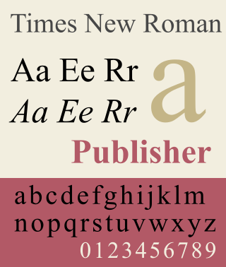
Times New Roman is a serif typeface. It was commissioned by the British newspaper The Times in 1931 and conceived by Stanley Morison, the artistic adviser to the British branch of the printing equipment company Monotype, in collaboration with Victor Lardent, a lettering artist in The Times's advertising department. It has become one of the most popular typefaces of all time and is installed on most personal computers.

Helvetica, also known by its original name Neue Haas Grotesk, is a widely-used sans-serif typeface developed in 1957 by Swiss typeface designer Max Miedinger and Eduard Hoffmann.

Garamond is a group of many serif typefaces, named for sixteenth-century Parisian engraver Claude Garamond, generally spelled as Garamont in his lifetime. Garamond-style typefaces are popular and particularly often used for book printing and body text.

Matthew Carter is a British type designer. A 2005 New Yorker profile described him as 'the most widely read man in the world' by considering the amount of text set in his commonly used typefaces.

Frutiger is a series of typefaces named after its Swiss designer, Adrian Frutiger. Frutiger is a humanist sans-serif typeface, intended to be clear and highly legible at a distance or at small text sizes. A popular design worldwide, type designer Steve Matteson described its structure as "the best choice for legibility in pretty much any situation" at small text sizes, while Erik Spiekermann named it as "the best general typeface ever".

Arial is a sans-serif typeface in the neo-grotesque style. Fonts from the Arial family are included with all versions of Microsoft Windows after Windows 3.1, as well as in other Microsoft programs, Apple's macOS, and many PostScript 3 printers. In Office 2007, Arial was replaced by Calibri as the default typeface in PowerPoint, Excel, and Outlook.

Gill Sans is a humanist sans-serif typeface designed by Eric Gill and released by the British branch of Monotype from 1928 onwards.

Adrian Johann Frutiger was a Swiss typeface designer who influenced the direction of type design in the second half of the 20th century. His career spanned the hot metal, phototypesetting and digital typesetting eras. Until his death, he lived in Bremgarten bei Bern.

Monotype Imaging Holdings Inc., founded as Lanston Monotype Machine Company in 1887 in Philadelphia by Tolbert Lanston, is an American company that specializes in digital typesetting and typeface design for use with consumer electronics devices. Based in Woburn, Massachusetts, the company has been responsible for many developments in printing technology—in particular the Monotype machine, which was a fully mechanical hot metal typesetter, that produced texts automatically, all single type. Monotype was involved in the design and production of many typefaces in the 20th century. Monotype developed many of the most widely used typeface designs, including Times New Roman, Gill Sans, Arial, Bembo and Albertus.
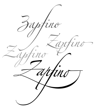
Zapfino is a calligraphic typeface designed for Linotype by typeface designer Hermann Zapf in 1998. It is based on an alphabet Zapf originally penned in 1944. As a font, it makes extensive use of ligatures and character variations.

Andalé Mono is a monospaced sans-serif typeface designed by Steve Matteson for terminal emulation and software development environments, originally for the Taligent project by Apple Inc. and IBM. Andalé Mono has a sibling called Andalé Sans.

Cambria is a transitional serif typeface commissioned by Microsoft and distributed with Windows and Office. It was designed by Dutch typeface designer Jelle Bosma in 2004, with input from Steve Matteson and Robin Nicholas. It is intended as a serif font that is suitable for body text, that is very readable printed small or displayed on a low-resolution screen and has even spacing and proportions.
The Type Directors Club (TDC) is an international organization devoted to typography and type design, founded in 1946 in New York City. TDC believes that type drives culture, and that culture drives type—and is dedicated to cataloging, showcasing, and exhibiting typography worldwide.
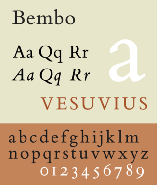
Bembo is a serif typeface created by the British branch of the Monotype Corporation in 1928–1929 and most commonly used for body text. It is a member of the "old-style" of serif fonts, with its regular or roman style based on a design cut around 1495 by Francesco Griffo for Venetian printer Aldus Manutius, sometimes generically called the "Aldine roman". Bembo is named for Manutius's first publication with it, a small 1496 book by the poet and cleric Pietro Bembo. The italic is based on work by Giovanni Antonio Tagliente, a calligrapher who worked as a printer in the 1520s, after the time of Manutius and Griffo.

Joanna is a serif typeface designed by Eric Gill (1882–1940) from 1930 to 1931 that was named for one of his daughters. Gill chose Joanna for setting An Essay on Typography, a book by Gill on his thoughts on typography, typesetting and page design. He described it as "a book face free from all fancy business".
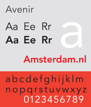
Avenir is a geometric sans-serif typeface designed by Adrian Frutiger in 1987 and released in 1988 by Linotype GmbH.

Metro is a sans-serif typeface family created by William Addison Dwiggins and released by the American Mergenthaler Linotype Company from 1929 onwards.
Akira Kobayashi is a Japanese font designer living in Germany. As type director for Monotype, he oversees typeface design and reprints of classic typefaces such as Optima. He has also served as a judge in several international typeface contests. He previously worked at 写研 (Shaken), and later designed the European characters for Hiragino Mincho and AXIS Font. He is a leading person in designing Western typefaces in Japan, and has co-developed fonts with Hermann Zapf and Adrian Frutiger. Kobayashi grew up in Japan and has written a Japanese-language book about Western fonts, titled "西文字体".
