Walbaum (typeface)

Last updated
Walbaum's roman and Fraktur type, in modern digitisations Walbaum (2).png
Walbaum's roman and Fraktur type, in modern digitisations

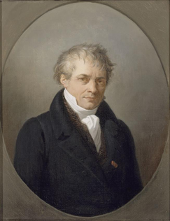
Walbaum is the name given to serif typefaces in the "Didone" or modern style that are, or revive the work of early nineteenth-century punchcutter Justus Erich Walbaum (1768 – 1837), based in Goslar and then in Weimar. [1] [2] [3] [4]

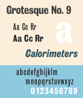
In typography, a serif is a small line or stroke regularly attached to the end of a larger stroke in a letter or symbol within a particular font or family of fonts. A typeface or "font family" making use of serifs is called a serif typeface, and a typeface that does not include them is a sans-serif one. Some typography sources refer to sans-serif typefaces as "grotesque" or "Gothic", and serif typefaces as "roman".

Didone (typography)

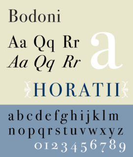
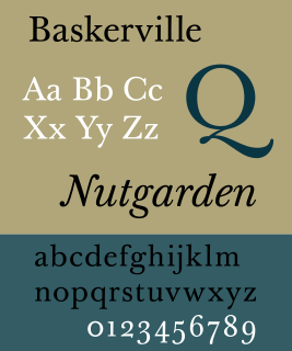
Didone is a genre of serif typeface that emerged in the late 18th century and was the standard style of general-purpose printing during the nineteenth. It is characterized by:

Punchcutting

Punchcutting is a craft used in traditional typography to cut letter punches in steel as the first stage of making metal type. Steel punches in the shape of the letter would be used to stamp matrices into copper, which were locked into a mould shape to cast type. Cutting punches and casting type was the first step of traditional typesetting. The cutting of letter punches was a highly skilled craft requiring much patience and practice. Often the designer of the type would not be personally involved in the cutting.

Walbaum-style typefaces are "rational" in design, with minimal serifs and strong contrast between thin horizontal and thick vertical strokes, following the work of typefounders such as Firmin Didot and Giambattista Bodoni. [5] [6] [7] They are often used in publishing and remain very popular in Germany. Walbaum also designed fraktur blackletter typefaces, which (while not stylistically related) similarly have a structured and precise design. [8] [9] Walbaum sold the materials of his foundry to Brockhaus, who in turn sold them to the Berthold Type Foundry.

Firmin Didot French businessman

Firmin Didot was a French printer, engraver, and type founder.

Giambattista Bodoni Italian typographer, type-designer, compositor, printer and publisher in Parma

Giambattista Bodoni was an Italian typographer, type-designer, compositor, printer and publisher in Parma.

Fraktur Typeface

Fraktur is a calligraphic hand of the Latin alphabet and any of several blackletter typefaces derived from this hand. The blackletter lines are broken up; that is, their forms contain many angles when compared to the smooth curves of the Antiqua (common) typefaces modeled after antique Roman square capitals and Carolingian minuscule. From this, Fraktur is sometimes contrasted with the "Latin alphabet" in northern European texts, which is sometimes called the "German alphabet", simply being a typeface of the Latin alphabet. Similarly, the term "Fraktur" or "Gothic" is sometimes applied to all of the blackletter typefaces.

In the twentieth century, Walbaum's type regained popularity through its sale by Berthold and copies were made by several companies. Digital revivals exist from František Štorm (in a release with optical sizes), Monotype (a 1933 version created for its hot metal typesetting system, and a separate digital version released in 2018), Berthold, Linotype and others. [10] [11] [12] [13]

František Štorm Czech typographer

František "Franta" Štorm is a Czech musician, photographer, typographer, writer, teacher, artist, illustrator and record producer, famous for being the vocalist and a founding member of the black metal band Master's Hammer.

Monotype Imaging typographic corporation

Monotype Imaging Holdings, Inc. is a Delaware corporation based in Woburn, Massachusetts. It specialises in digital typesetting and typeface design as well as text and imaging solutions for use with consumer electronics devices. Monotype Imaging Holdings and its predecessors and subsidiaries have been responsible for many developments in printing technology—in particular the Monotype machine, which was the first fully mechanical typesetter, and the Linotype machine—and the design and production of typefaces in the 19th and 20th centuries. Monotype developed many of the most widely used typeface designs, including Times New Roman, Gill Sans, Arial, Bembo and Albertus.

Hot metal typesetting

In printing and typography, hot metal typesetting is a technology for typesetting text in letterpress printing. This method injects molten type metal into a mold that has the shape of one or more glyphs. The resulting sorts or slugs are later used to press ink onto paper. Normally the typecasting machine would be controlled by a keyboard or by a paper tape.

Related Research Articles

Garamond typeface family

Garamond is a group of many old-style serif typefaces, named for sixteenth-century Parisian engraver Claude Garamond. Garamond-style typefaces are popular and often used, particularly for printing body text and books.

Matthew Carter English typographer

Matthew Carter is a British type designer. A 2005 New Yorker profile described him as 'the most widely read man in the world' by considering the amount of text set in his commonly used fonts.

Bodoni typeface

Bodoni is the name given to the serif typefaces first designed by Giambattista Bodoni (1740–1813) in the late eighteenth century and frequently revived since. Bodoni's typefaces are classified as Didone or modern. Bodoni followed the ideas of John Baskerville, as found in the printing type Baskerville—increased stroke contrast reflecting developing printing technology and a more vertical axis—but he took them to a more extreme conclusion. Bodoni had a long career and his designs changed and varied, ending with a typeface of a slightly condensed underlying structure with flat, unbracketed serifs, extreme contrast between thick and thin strokes, and an overall geometric construction.

Rockwell (typeface) typeface

Rockwell is a slab serif typeface designed by the Monotype Corporation and released in 1934. The project was supervised by Monotype's engineering manager Frank Hinman Pierpont. This typeface is distinguished by a serif at the apex of the uppercase A, while the lowercase a has two storeys. Because of its monoweighted stroke, Rockwell is used primarily for display or at small sizes rather than as a body text. Rockwell is based on an earlier, more condensed slab serif design cast by the Inland Type Foundry called Litho Antique.

Franklin Gothic typeface

Franklin Gothic and its related faces are a large family of realist sans-serif typefaces developed by the type foundry American Type Founders (ATF) and credited to its head designer Morris Fuller Benton. “Gothic” was a contemporary term meaning sans-serif.

Bembo typeface

Bembo is a serif typeface created by the British branch of the Monotype Corporation in 1928-9 and most commonly used for body text. It is a member of the "old-style" of serif fonts, with its regular or roman style based on a design cut around 1495 by Francesco Griffo for Venetian printer Aldus Manutius, sometimes generically called the "Aldine roman". Bembo is named for Manutius's first publication with it, a small 1496 book by the poet and cleric Pietro Bembo. The italic is based on work by Giovanni Antonio Tagliente, a calligrapher who worked as a printer in the 1520s, after the time of Manutius and Griffo.

Bookman (typeface) typeface

Bookman or Bookman Old Style, is a serif typeface. A wide, legible design that is slightly bolder than most body text faces, Bookman has been used for both display typography and for printing at small sizes such as in trade printing, and less commonly for body text. In advertising use it is particularly associated with the graphic design of the 1960s and 1970s, when revivals of it were very popular.

Akzidenz-Grotesk typeface

Akzidenz-Grotesk is a sans-serif typeface family originally released by the Berthold Type Foundry of Berlin. Akzidenz means 'commercial' and indicates its intended use as a typeface for trade printing such as publicity, tickets and forms, as opposed to book or fine printing.

Clarendon (typeface) typeface

Clarendon is the name of a slab-serif typeface that was released in 1845 by Thorowgood and Co. of London, a letter foundry often known as the Fann Street Foundry. The original Clarendon design is credited to Robert Besley, a partner in the foundry, and was originally engraved by punchcutter Benjamin Fox, who may also have contributed to its design. Many copies, adaptations and revivals have been released, becoming almost an entire genre of type design.

Janson typeface

Janson is the name given to a set of old-style serif typefaces from the Dutch Baroque period, and modern revivals from the twentieth century. Janson is a crisp, relatively high-contrast serif design, most popular for body text.

Baskerville Transitional serif typeface designed in the 1750s

Baskerville is a serif typeface designed in the 1750s by John Baskerville (1706–1775) in Birmingham, England, and cut into metal by punchcutter John Handy. Baskerville is classified as a transitional typeface, intended as a refinement of what are now called old-style typefaces of the period, especially those of his most eminent contemporary, William Caslon.

Goudy Old Style typeface

Goudy Old Style is an old-style serif typeface originally created by Frederic W. Goudy for American Type Founders (ATF) in 1915.

News Gothic realist sans-serif typeface

News Gothic is a realist sans-serif typeface dated to 1908 designed by Morris Fuller Benton, and released by his employer American Type Founders (ATF). News Gothic is similar in proportion and structure to Franklin Gothic, also designed by Benton, but lighter.

Centaur (typeface) typeface

Centaur is a serif typeface by book and typeface designer Bruce Rogers, based on the Renaissance-period printing of Nicolas Jenson around 1470. He used it for his design of the Oxford Lectern Bible. It was given widespread release by the British branch of Monotype, paired with an italic designed by calligrapher Frederic Warde and based on the slightly later work of calligrapher and printer Ludovico Vicentino degli Arrighi. The italic has sometimes been named separately as the "Arrighi" italic.

Century type family

Century is a family of serif type faces particularly intended for body text. The family originates from a first design, Century Roman cut by American Type Founders designer Linn Boyd Benton in 1894 for master printer Theodore Low De Vinne, for use in The Century Magazine. ATF rapidly expanded it into a very large family, first by Linn Boyd and later by his son Morris.

Kennerley Old Style typeface

Kennerley Old Style is a serif typeface designed by Frederic Goudy. Kennerley is an "old-style" serif design, loosely influenced by Italian and Dutch printing traditions of the Renaissance and early modern period. It was named for New York publisher Mitchell Kennerley, who advanced Goudy money to complete the design. While Goudy had already designed 18 other typefaces, it was one of Goudy's most successful early designs in his own style. The regular or roman style was designed in 1911, the italic in 1918; bold styles followed in 1924.

Justus Erich Walbaum German type designer

Justus Erich Walbaum was a prominent German typefounder and punchcutter of the late 18th and early 19th centuries.

Fournier is the name commonly applied to typefaces which are based on the typefaces of Parisian typefounder Pierre-Simon Fournier around the 1740s. Created in the Rococo style and influenced by the Romain du Roi typefaces commissioned by the French government in the previous century, Fournier's typefaces showed an advanced delicacy above what was previously common.

Grotesque (Stephenson Blake typefaces)

The Stephenson Blake Grotesque fonts are a series of sans-serif fonts created by printing company Stephenson Blake of Sheffield mostly around the end of the nineteenth century.

References

  1. Neil Macmillan (2006). An A-Z of Type Designers. Yale University Press. p. 180. ISBN   0-300-11151-7.
  2. Christina Killius (1999). Die Antiqua-Fraktur Debatte um 1800 und ihre historische Herleitung. Otto Harrassowitz Verlag. pp. 274–281. ISBN   978-3-447-03614-6.
  3. Alexander Waldow (1884). Illustrierte Encyklopädie der graphischen Künste und der verwandten Zweige. A. Waldow. p. 839.
  4. Paul Shaw (2017). Revival Type: Digital Typefaces Inspired by the Past. Yale University Press. pp. 116–7. ISBN   978-0-300-21929-6.
  5. Shaw, Paul. "Flawed Typefaces". Print magazine. Retrieved 30 June 2015.
  6. Bruchmann, Karl G (1959). "Walbaum's early years in Goslar and Weimar". Monotype Recorder. 41 (4): 6–11.
  7. "The Modern roman in Germany". Bulletin of the Printing Historical Society (17): 219–220. 1986.
  8. Yannis Haralambous; P. Scott Horne (28 November 2007). Fonts & Encodings. "O'Reilly Media, Inc.". pp. 393–5. ISBN   978-0-596-10242-5.
  9. Julien Chazal (1 September 2013). Calligraphy: A Complete Guide. Stackpole Books. pp. 102–5. ISBN   978-0-8117-1294-1.
  10. "Walbaum 2010 Pro™ - Webfont & Desktop font « MyFonts".
  11. "Berthold Walbaum® Book BQ - Desktop font « MyFonts".
  12. "Walbaum™ - Webfont & Desktop font « MyFonts".
  13. Nix, Charles; Crossgrove, Carl; Villanueva, Juan. "Walbaum MT (2018)". MyFonts . Monotype Imaging . Retrieved 21 June 2018.