Category | Serif |
---|---|
Classification | Old-style, Venetian |
Designer(s) | Bruce Rogers Frederic Warde Nicolas Jenson Ludovico Vicentino degli Arrighi |
Foundry | Monotype Corporation |
Date created | 1914 |
Date released | 1929 |
Also known as | Metropolitan |
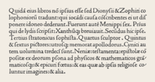
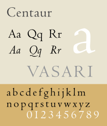
Centaur is a serif typeface by book and typeface designer Bruce Rogers, based on the Renaissance-period printing of Nicolas Jenson around 1470. [1] He used it for his design of the Oxford Lectern Bible. It was given widespread release by the British branch of Monotype, paired with an italic designed by calligrapher Frederic Warde and based on the slightly later work of calligrapher and printer Ludovico Vicentino degli Arrighi. The italic has sometimes been named separately as the "Arrighi" italic.
Centaur is an elegant and quite slender design, lighter on the page than Jenson's work and most other revivals, an effect possibly amplified in the digital release compared to the metal type. [1] It has been popular in fine book printing and is often used both for printing body text and especially titles and headings. [2] One of its most notable uses has been in the designs of Penguin Books, who have regularly used it for titling. [3]
Rogers' primary influence was Nicholas Jenson's 1470 Eusebius, considered the model for the modern upright printing of the Roman alphabet, which Rogers studied through enlarged photographs. [4] [lower-alpha 1] Centaur also shows the influence of types cut by Francesco Griffo in 1495 for a small book titled De Aetna written by Pietro Bembo. The typeface is classified as belonging to the humanist style of old-style designs, based on the predominant influence of Jenson's work. The style is also called Venetian for the city Jenson worked in during his career as a printer. In the late nineteenth century, Jenson's work had become a popular model for William Morris and then other fine printers of the Arts and Crafts movement. Morris commissioned a revival font copying Jenson's work, and several other revivals and imitations of Morris' work had followed by 1914. [5]
Italic typefaces did not exist in Jenson's time, and so the inspiration for Centaur's italic comes from thirty years later, in the calligraphy and printing of Ludovico Vicentino degli Arrighi. [6] Arrighi was a Rome-based calligrapher who made the transition to working in printing, releasing a writing manual, La operina…, and other printed works. [7] [8] [lower-alpha 2] These used an italic font presumably based on his calligraphy. [11] It inspired later French italic types from 1528 onwards. [12] [13] [lower-alpha 3]
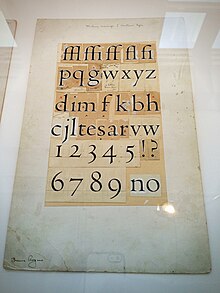
Rogers' revival was originally drawn as titling capitals in 1914 for the Metropolitan Museum of Art. [4] [14] Rogers later expanded it, adding lower case, for his 1915 limited edition of Maurice de Guérin's The Centaur.
For the original release, matrices were cut by Robert Wiebking and the type was privately cast by American Type Founders. [15] Some years later, the Monotype Corporation commissioned Rogers to release it for the general market. Rogers did not feel able to create a matching italic, and asked the calligrapher Frederic Warde if he could pair Centaur with a design Warde had created based upon Ludovico Arrighi’s 1520 chancery face, made in 1926 for the Officina Bodoni. [16] Warde's design had the separate name Arrighi, which appears in some earlier specimens. [4] [17]
The completed family was released for general use in 1929, with a first showing in Monotype's specimen booklet The Trained Printer and the Amateur by Alfred W. Pollard. [18] [19] [20] Monotype described it as a 'long-descender type of great distinction', emphasising its feeling of not having been restricted to allow tighter linespacing, as other types often had been in the hot metal period. [21] Monotype has sold the design with bold and bold italic designs (their invention, since bold type did not exist until long after Jenson's and Arrighi's work), and swash italic alternate characters. [22]
Centaur shows some of the irregularities of early type compared to later designs. The dots of the i and j are very visibly shifted to the right, a feature of Jenson's original design. The horizontal stroke of the 'e' is slanted, not exactly horizontal as came to be the norm in print. [23] On the other hand, while based on study of Jenson's work, Centaur is a deliberately loose imitation, more slender (especially in the serifs) than Jenson's original. It also modernises Jenson's two-way serifs on the top of the 'M' in favour of one-way serifs. [5] In addition, the italic capitals slope in the modern tradition, which was established after Arrighi's time in the later 16th century. [24] Monotype advisor and historian of printing Stanley Morison, who was influential in Monotype's series of revival designs of the 1920s and 30s, described Centaur in his book A Tally of Types as "a freehand emphasis of the calligraphic basis of the original" and its modernisation "a concession to contemporary sense". [18] Sebastian Carter calls it "an imaginative recreation". [5]
Centaur has been digitised, both by Monotype in collaboration with Adobe, and by LTC, who assumed the rights to many Lanston (American) Monotype typefaces, under the name of Metropolitan. The revivals have slightly different features; Monotype’s having a bold and bold italic and swash caps and LTC’s having a more complex, less smooth digitisation with many italic alternates and complementary ornaments. [25] [26]
At least two open-source digital typefaces, Museum (by Raph Levien) [27] and Coelacanth, [28] are based on Centaur.
Other Monotype fonts of the hot metal period inspired by Renaissance printing included the very popular Bembo (with a roman based on a slightly later font used by Aldus Manutius), Lutetia by Jan van Krimpen (a more personal design, as opposed to a direct revival) and the post-war Dante.
Among other Venetian revivals, Adobe Jenson is a notable and extremely complete digital revival from 1996 with features such as optical size fonts for different text sizes. William Morris's Golden Type began revivals of the Jenson style in 1892 with a more solid structure (no matching italic was created for it); other Jenson interpretations included the Doves Type while ATF's Satanick was a direct imitation of it. American Type Founders' Cloister Old Style was created by its design team led by Morris Fuller Benton around 1915, during the same period as Centaur. [5] [29] [30] Ludlow created another release with italic under the direction of Ernst F. Detterer and Robert Hunter Middleton in the 1920s. [31] American Type Founders also issued a very eccentric Jenson revival inspired by the work of Morris which is little-known today. [32] Tobias Frere-Jones created a revival in 1994 named Hightower Text that is bundled with some Microsoft software, adding his own italic design. [33]
Outside its common uses, Centaur is also used for the wordmark of John Varvatos and in the children's book Crispin: The Cross of Lead , set in the Middle Ages. [34] [35]
Palatino is the name of an old-style serif typeface designed by Hermann Zapf, initially released in 1949 by the Stempel foundry and later by other companies, most notably the Mergenthaler Linotype Company.
Garamond is a group of many serif typefaces, named for sixteenth-century Parisian engraver Claude Garamond, generally spelled as Garamont in his lifetime. Garamond-style typefaces are popular and particularly often used for book printing and body text.
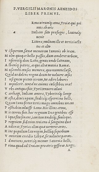
In typography, italic type is a cursive font based on a stylised form of calligraphic handwriting. Along with blackletter and roman type, it served as one of the major typefaces in the history of Western typography.
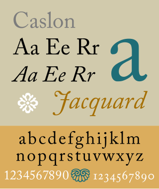
Caslon is the name given to serif typefaces designed by William Caslon I (c. 1692–1766) in London, or inspired by his work.
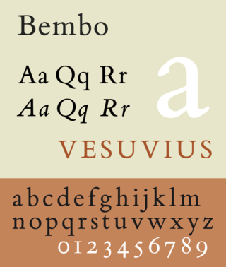
Bembo is a serif typeface created by the British branch of the Monotype Corporation in 1928–1929 and most commonly used for body text. It is a member of the "old-style" of serif fonts, with its regular or roman style based on a design cut around 1495 by Francesco Griffo for Venetian printer Aldus Manutius, sometimes generically called the "Aldine roman". Bembo is named for Manutius's first publication with it, a small 1496 book by the poet and cleric Pietro Bembo. The italic is based on work by Giovanni Antonio Tagliente, a calligrapher who worked as a printer in the 1520s, after the time of Manutius and Griffo.
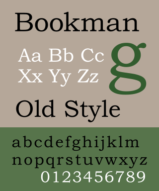
Bookman, or Bookman Old Style, is a serif typeface. A wide, legible design that is slightly bolder than most body text faces, Bookman has been used for both display typography, for trade printing such as advertising, and less commonly for body text. In advertising use it is particularly associated with the graphic design of the 1960s and 1970s, when revivals of it were very popular.
Baskerville is a serif typeface designed in the 1750s by John Baskerville (1706–1775) in Birmingham, England, and cut into metal by punchcutter John Handy. Baskerville is classified as a transitional typeface, intended as a refinement of what are now called old-style typefaces of the period, especially those of his most eminent contemporary, William Caslon.
Frederic Warde was a book designer, editor, and typography designer. One of the great book designers of the twentieth century, Will Ransom described him as "a curious blend of romantic idealism and meticulous practicality." In describing his own work, Warde stated, "The innermost soul of any literary creation can never be seen in all its clarity and truth until one views it through the medium of the printed page, in which there must be absolutely nothing to divide the attention, interrupt the thought, or to offend one's sense of form."
Adobe Jenson is an old-style serif typeface drawn for Adobe Systems by its chief type designer Robert Slimbach. Its Roman styles are based on a text face cut by Nicolas Jenson in Venice around 1470, and its italics are based on those created by Ludovico Vicentino degli Arrighi fifty years later.
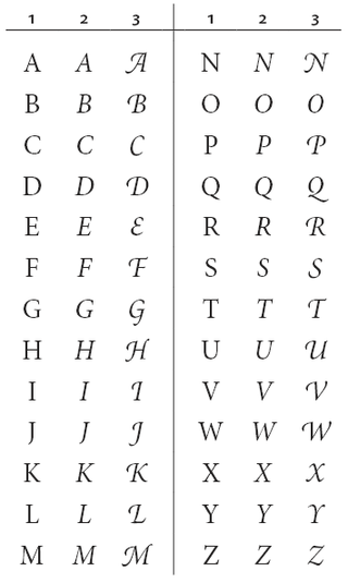
A swash is a typographical flourish, such as an exaggerated serif, terminal, tail, entry stroke, etc., on a glyph. The use of swash characters dates back to at least the 16th century, as they can be seen in Ludovico Vicentino degli Arrighi's La Operina, which is dated 1522. As with italic type in general, they were inspired by the conventions of period handwriting. Arrighi's designs influenced designers in Italy and particularly in France.
Goudy Old Style is an old-style serif typeface originally created by Frederic W. Goudy for American Type Founders (ATF) in 1915.
Modern typographers view typography as a craft with a very long history tracing its origins back to the first punches and dies used to make seals and coinage currency in ancient times. The basic elements of typography are at least as old as civilization and the earliest writing systems—a series of key developments that were eventually drawn together into one systematic craft. While woodblock printing and movable type had precedents in East Asia, typography in the Western world developed after the invention of the printing press by Johannes Gutenberg in the mid-15th century. The initial spread of printing throughout Germany and Italy led to the enduring legacy and continued use of blackletter, roman, and italic types.
Joanna is a serif typeface designed by Eric Gill (1882–1940) from 1930 to 1931 that was named for one of his daughters. Gill chose Joanna for setting An Essay on Typography, a book by Gill on his thoughts on typography, typesetting and page design. He described it as "a book face free from all fancy business".
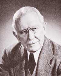
Bruce Rogers was an American typographer and type designer, acclaimed by some as among the greatest book designers of the twentieth century. Rogers was known for his "allusive" typography, rejecting modernism, seldom using asymmetrical arrangements, rarely using sans serif type faces, often favoring faces such as Bell, Caslon, his own Montaigne, a Jensonian precursor to his masterpiece of type design Centaur. His books can fetch high sums at auction.
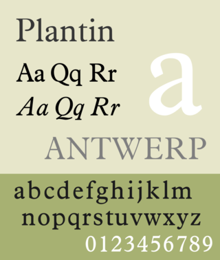
Plantin is an old-style serif typeface. It was created in 1913 by the British Monotype Corporation for their hot metal typesetting system and is named after the sixteenth-century printer Christophe Plantin. It is loosely based on a Gros Cicero roman type cut in the 16th century by Robert Granjon held in the collection of the Plantin–Moretus Museum, Antwerp.
University of California Old Style is a serif typeface designed by Frederic Goudy and created for the University of California Press from 1936–8. It is one of Goudy's most popular serif typefaces. It is also known as Berkeley Old Style and Californian.
Deepdene is a serif typeface designed by Frederic Goudy from 1927–1933. It belongs to the "old-style" of serif font design, with low contrast between strokes and an oblique axis. However, Deepdene has crisp serifs and a nearly upright italic, with much less of a slant than is normal for this style.
Cloister is a serif typeface that was designed by Morris Fuller Benton and published by American Type Founders from around 1913. It is loosely based on the printing of Nicolas Jenson in Venice in the 1470s, in what is now called the "old style" of serif fonts. American Type Founders presented it as an attractive but highly usable serif typeface, suitable both for body text and display use.
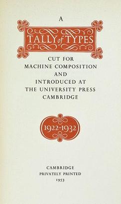
A Tally of Types is a book on typography authored by the type designer Stanley Morison. It was first published in 1953, and showcases significant typeface designs produced during Morison's tenure at the Lanston Monotype Corporation for their hot-metal typesetting machines during the 1920s and 1930s in England.
Bruce Rogers:
Professional digitisations:
Amateur projects: