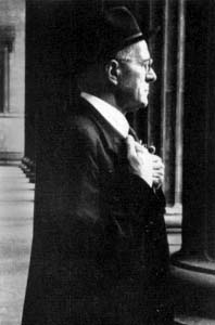
Stanley Arthur Morison[1] (6 May 1889 – 11 October 1967) was a British typographer, printing executive and historian of printing.[2][3][4] Largely self-educated, he promoted higher standards in printing and an awareness of the best printing and typefaces of the past.[5][6][7]
From the 1920s Morison became an influential adviser to the British Monotype Corporation, advising them on type design. His strong aesthetic sense was a force within the company, which starting shortly before his joining became increasingly known for commissioning popular, historically influenced designs that revived some of the best typefaces of the past, with particular attention to the middle period of printing from the Renaissance to the late eighteenth century, and creating and licensing several new type designs that would become popular.[8][9][10][11] Original typefaces commissioned under Morison's involvement included Times New Roman, Gill Sans and Perpetua, while revivals of older designs included Bembo, Ehrhardt and Bell.[12] Times New Roman, the development of which Morison led to the point that he felt he could consider it his own design, has become one of the most used typefaces of all time. Becoming closely connected to The Times newspaper as an advisor on printing, he became part of its management and the editor of the Times Literary Supplement after the war, and late in life joined the editorial board of Encyclopædia Britannica.[13]
Early life and career
Stanley Morison was born on 6 May 1889, at Wanstead, Essex, but spent most of his childhood and early adult years (1896–1912) in London at the family home in Fairfax Road, Harringay.[14] He was self-taught, having left school after his father abandoned his family.[15]
In 1913 Morison became an editorial assistant on The Imprint magazine.
On the imposition of conscription in 1916 during First World War, he was a conscientious objector, and was imprisoned.[note 1] Like his friend Eric Gill, Morison was a convert to Catholicism, distancing him from many of his later colleagues.[17][18] Morison married Mabel Williamson, a teacher, in 1916; the marriage was an unhappy one and Morison rapidly separated from his wife.
In 1918 he became design supervisor at the Pelican Press, which published material critical of the war. He moved on to a similar position at the Cloister Press.[19] In 1922, he was a founder-member of the Fleuron Society dedicated to typographic matters (a fleuron being a typographic flower or ornament). He edited the society's journal, The Fleuron, from 1925 to 1930. The quality of the publication's artwork and printing was considered exceptional. From 1923 to 1925, he was also a staff editor/writer for the Penrose Annual, a graphic arts journal.[19]
With the Monotype Corporation
From 1923 to 1967, Morison was a typographic consultant for the Monotype Corporation. In the 1920s and 1930s, his work at Monotype included research and adaptation of historical typefaces, including the revival of the Bembo and Bell types. He pioneered the great expansion of the company's range of typefaces, and hugely influenced the field of typography to the present day.[19][20] At Monotype, Morison obtained rights to typefaces by leading artists of the time including Bruce Rogers, Jan van Krimpen and Berthold Wolpe.[21] Aesthetically, Morison disliked the excessive historicity of Victorian romantic fine printing, with its interest in reviving blackletter and the appearance of medieval manuscripts, but preferred a more restrained style of printing that nonetheless also rejected the harshly industrial appearance of the "batteries of bold, bad faces" of the nineteenth century.[22][4]
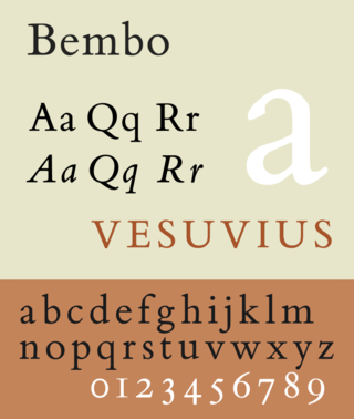
In 1927, the British Monotype Corporation hired Beatrice Warde – quickly named the company's Publicity Manager – and has been credited with spreading Morison's typographic influences through her own writings.[23] Morison and Warde helped edit Monotype's newsletter, the Monotype Recorder, which promoted Monotype equipment and provided tips for users, showcased examples of high-quality printing and included articles on printing history, several by Morison's collaborator Alfred F. Johnson, a curator at the British Museum.[24] Through Daniel Berkeley Updike, the leading figure in American printing of the time with whom he carried an extensive correspondence, he became aware of an obscure late-eighteenth century type known as Bell in the archives of Sheffield type foundry Stephenson Blake, and arranged for Monotype to license and recreate it.[25][26][27][28] While not all his projects at Monotype were successful and his position was insecure at the start of his tenure, his commission of Gill Sans and even more so Times New Roman both proved extremely financially successful for Monotype.[29] Both remain among the most-used typefaces of all time.
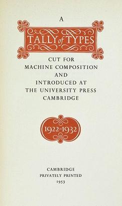
Morison became friends with Brooke Crutchley, printer to the University of Cambridge, one of Monotype's best customers, and his archives went to Cambridge after his death.[30] Late in life, for Crutchley he wrote the book A Tally of Types, an assessment of the typefaces created by Monotype that were used in Cambridge.[31] Despite its limited scope and some oversights, it is considered one of the landmark books on twentieth-century printing.[29]
As a writer for the Fleuron he was known for promoting the radical idea that italics in book printing were too disruptive to the flow of text, and should be phased out.[32][33] While this influenced some contemporary type designers such as van Krimpen and Dwiggins at Linotype, Morison rapidly came to concede that the idea was misguided, and late in life commented that Times New Roman included an italic that "owed more to Didot than dogma."[34][35]
Morison wrote prolifically on the history of printing. Philip Gaskell however cautioned that "his books and papers were always stimulating, and frequently sound in their general conclusions, but at the same time he was inaccurate".[36]
Times New Roman
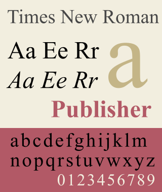
Morison was also typographical consultant to The Times newspaper from 1929 to 1960; and in 1931, having criticised the paper for the poor quality of its printing, he was commissioned by the newspaper to produce a new, easy-to-read typeface for the publication.[37][38][39]Times New Roman, the typeface which Morison developed with graphic artist Victor Lardent, was first used by the newspaper in 1932 and was issued commercially by Monotype in 1933.[40][22] Morison edited the History of the Times from 1935 to 1952, and was editor of The Times Literary Supplement between 1945 and 1948.
On Type Faces, Examples of the use of type for the printing of books: with an introductory essay & notes by Stanley Morison, The Medici Society of Seven, Grafton St, London, & The Fleuron, Westminster, 1923
Four centuries of Fine Printing; Two Hundred and Seventy-two Examples of the Work of Presses Established Between 1465 and 1924, 1924
Type Designs of the Past and Present, 1926
English newspaper: Some account of the physical development of journals printed in London between 1622 & the present day, 1932
↑ Some in the printing industry continued to find Morison's decision to avoid serving disreputable for many years. The printer Christopher Sandford wrote to the wood-engraver John O'Connor, then serving in the RAF, in 1946, "do wear uniform at the Double Crown Club dinner [in memory of Eric Ravilious, who had died during the war]—I like to show that my collaborators have been serving their country. Francis Meynell and Stanley Morison were conscientious objectors in the 1914–18 war when of military age and I shall never forgive them that."[16]
1 2 Lawson, Alexander S. "Stanley Morison: Significant Historian (obituary)". The Alexander S. Lawson Archive. Archived from the original on 27 May 2016. Retrieved 14 May 2016. During the 20th century two typographic historians have achieved notable stature and will be long remembered. The first of these, Daniel Berkeley Updike of Boston, died in 1940. The second, Stanley Morison, died at his home in London on October 11, 1967. He was 78 years of age... During the 1920s when there was slight interest in the production of new "book" types, the Monotype firm—with Morison's guidance—embarked upon a program of classic type revivals which resulted in the cutting of such faces as Garamond, Bembo, Poliphilus, Baskerville, Bell, and Fournier. These types remain in demand and are among the best of the historic revivals.
↑ Stanley Morison, Nicolas Barker, Macmillan, 1972
↑ Poole, Stephen (January 1982). "Stanley Morison: Catholic and Man of Letters". The Heythrop Journal. 23 (1): 51–55. doi:10.1111/j.1468-2265.1982.tb00629.x.
1 2 3 Carter, H. G.; rev. David McKitterick (2004). Morison, Stanley Arthur (1889–1967). Vol.Oxford Dictionary of National Biography. Oxford University Press.
↑ James Moran, Stanley Morison, His typographical achievement, 1971, Lund Humphries London, SBN 85331 300 8
James Moran, Stanley Morison: His Typographic Achievement
Nicolas Barker, Stanley Morison (authorised biography) (Note: Barker had to write the biography rapidly, resulting in a release with numerous misprints and errors, listed in an errata section of the Times Literary Supplement shortly afterwards.[1])
Further reading
Mark Argetsinger, A Legacy of Letters, An Assessment of Stanley Morison's Monotype 'Programme of Typographical Design' with specimens ... (2008) [limited edition]
↑ Ovink, G.W. (1 January 1973). "Two Books on Stanley Morison". Quaerendo. 3 (3): 226–242. doi:10.1163/157006973X00237.
Related Research Articles
Times New Roman is a serif typeface. It was commissioned by the British newspaper The Times in 1931 and conceived by Stanley Morison, the artistic adviser to the British branch of the printing equipment company Monotype, in collaboration with Victor Lardent, a lettering artist in The Times's advertising department. It has become one of the most popular typefaces of all time and is installed on most personal computers.
In typography, italic type is a cursive font based on a stylised form of calligraphic handwriting. Along with blackletter and roman type, it served as one of the major typefaces in the history of Western typography.
Gill Sans is a humanist sans-serif typeface designed by Eric Gill and released by the British branch of Monotype from 1928 onwards.
Monotype Imaging Holdings Inc., founded as Lanston Monotype Machine Company in 1887 in Philadelphia by Tolbert Lanston, is an American company that specializes in digital typesetting and typeface design for use with consumer electronics devices. Based in Woburn, Massachusetts, the company has been responsible for many developments in printing technology—in particular the Monotype machine, which was a fully mechanical hot metal typesetter, that produced texts automatically, all single type. Monotype was involved in the design and production of many typefaces in the 20th century. Monotype developed many of the most widely used typeface designs, including Times New Roman, Gill Sans, Arial, Bembo and Albertus.
Bembo is a serif typeface created by the British branch of the Monotype Corporation in 1928–1929 and most commonly used for body text. It is a member of the "old-style" of serif fonts, with its regular or roman style based on a design cut around 1495 by Francesco Griffo for Venetian printer Aldus Manutius, sometimes generically called the "Aldine roman". Bembo is named for Manutius's first publication with it, a small 1496 book by the poet and cleric Pietro Bembo. The italic is based on work by Giovanni Antonio Tagliente, a calligrapher who worked as a printer in the 1520s, after the time of Manutius and Griffo.
Didone is a genre of serif typeface that emerged in the late 18th century and was the standard style of general-purpose printing during the 19th century. It is characterized by:
Janson is the name given to a set of old-style serif typefaces from the Dutch Baroque period, and modern revivals from the twentieth century. Janson is a crisp, relatively high-contrast serif design, most popular for body text.
Beatrice Lamberton Warde was a twentieth-century writer and scholar of typography. As a marketing manager for the British Monotype Corporation, she was influential in the development of printing tastes in Britain and elsewhere in the mid-twentieth century and was recognized at the time as "[o]ne of the few women typographers in the world". Her writing advocated higher standards in printing, and championed intelligent use of historic typefaces from the past, which Monotype specialised in reviving, and the work of contemporary typeface designers.
Perpetua is a serif typeface that was designed by the English sculptor and stonemason Eric Gill for the British Monotype Corporation. Perpetua was commissioned at the request of Stanley Morison, an influential historian of printing and adviser to Monotype around 1925, when Gill's reputation as a leading artist-craftsman was high. Perpetua was intended as a crisp, contemporary design that did not follow any specific historic model, with a structure influenced by Gill's experience of carving lettering for monuments and memorials. Perpetua is commonly used for covers and headings and also sometimes for body text and has been particularly popular in fine book printing. Perpetua was released with characters for the Greek alphabet and a matching set of titling capitals for headings.
Centaur is a serif typeface by book and typeface designer Bruce Rogers, based on the Renaissance-period printing of Nicolas Jenson around 1470. He used it for his design of the Oxford Lectern Bible. It was given widespread release by the British branch of Monotype, paired with an italic designed by calligrapher Frederic Warde and based on the slightly later work of calligrapher and printer Ludovico Vicentino degli Arrighi. The italic has sometimes been named separately as the "Arrighi" italic.
Jan van Krimpen was a Dutch typographer, book designer and type designer. He worked for the printing house Koninklijke Joh. Enschedé. He also worked with Monotype in England, who issued or reissued many of his designs outside the Netherlands.
The Fleuron was a British journal of typography and book arts published in seven volumes from 1923 to 1930. A fleuron is a floral ornament used by typographers.
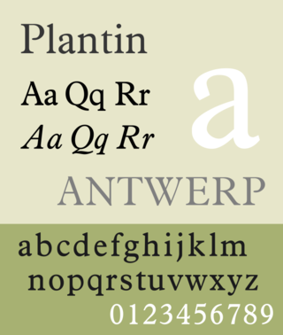
Plantin is an old-style serif typeface. It was created in 1913 by the British Monotype Corporation for their hot metal typesetting system and is named after the sixteenth-century printer Christophe Plantin. It is loosely based on a Gros Cicero roman type cut in the 16th century by Robert Granjon held in the collection of the Plantin–Moretus Museum, Antwerp.
Martin Majoor is a Dutch type designer and graphic designer. As of 2006, he had worked since 1997 in both Arnhem, Netherlands, and Warsaw, Poland.
Robert Granjon was a French punchcutter, a designer and creator of metal type, and printer. He worked in Paris, Lyon, Antwerp, and Rome. He is best known for having introduced the typeface style Civilité, for his many italic types and his fleuron designs, although he worked across all genres of typeface and alphabet across his long career.
Imprint is a serif typeface created by Monotype, commonly used for body text. Originally called Imprint Old Face, it is a sturdy, amiable design with a large x-height, Caslon-like but with more regularity in its letterforms. It was commissioned by the London publishers of The Imprint, a short-lived printing trade periodical published during 1913.
Ehrhardt is an old-style serif typeface released by the British branch of the Monotype Corporation in 1938. Ehrhardt is a modern adaptation of printing types of "stout Dutch character" from the Dutch Baroque tradition sold by the Ehrhardt foundry in Leipzig. These were cut by the Hungarian-Transylvanian pastor and punchcutter Miklós (Nicholas) Tótfalusi Kis while in Amsterdam in the period from 1680 to 1689.
A Tally of Types is a book on typography authored by the type designer Stanley Morison. It was first published in 1953, and showcases significant typeface designs produced during Morison's tenure at the Lanston Monotype Corporation for their hot-metal typesetting machines during the 1920s and 1930s in England.
Old Style or Modernised Old Style was the name given to a series of serif typefaces cut from the mid-nineteenth century and sold by the type foundry Miller & Richard, of Edinburgh in Scotland. It was a standard typeface in Britain for literary and prestigious printing in the second half of the nineteenth century and the early twentieth century, with many derivatives and copies released.
Frank Hinman Pierpont was an American engineer and typeface designer. He worked primarily in England for the Monotype Corporation of Britain.
This page is based on this Wikipedia article Text is available under the CC BY-SA 4.0 license; additional terms may apply. Images, videos and audio are available under their respective licenses.


