
Times New Roman is a serif typeface. It was commissioned by the British newspaper The Times in 1931 and conceived by Stanley Morison, the artistic adviser to the British branch of the printing equipment company Monotype, in collaboration with Victor Lardent, a lettering artist in The Times's advertising department. It has become one of the most popular typefaces of all time and is installed on most desktop computers.

Garamond is a group of many serif typefaces, named for sixteenth-century Parisian engraver Claude Garamond, generally spelled as Garamont in his lifetime. Garamond-style typefaces are popular and particularly often used for book printing and body text.

In typography, italic type is a cursive font based on a stylised form of calligraphic handwriting. Owing to the influence from calligraphy, italics normally slant slightly to the right. Italics are a way to emphasise key points in a printed text, to identify many types of creative works, to cite foreign words or phrases, or, when quoting a speaker, a way to show which words they stressed. One manual of English usage described italics as "the print equivalent of underlining"; in other words, underscore in a manuscript directs a typesetter to use italic.
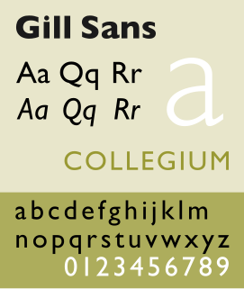
Gill Sans is a humanist sans-serif typeface designed by Eric Gill and released by the British branch of Monotype from 1928 onwards.

Monotype Imaging Holdings Inc., founded as Lanston Monotype Machine Company in 1887 in Philadelphia by Tolbert Lanston, is an American company that specializes in digital typesetting and typeface design for use with consumer electronics devices. Incorporated in Delaware and headquartered in Woburn, Massachusetts, the company has been responsible for many developments in printing technology—in particular the Monotype machine, which was a fully mechanical hotmetal typesetter, that produced texts automatically, all single type. Monotype was involved in the design and production of many typefaces in the 20th century. Monotype developed many of the most widely used typeface designs, including Times New Roman, Gill Sans, Arial, Bembo and Albertus.

Stanley Arthur Morison was an influential British typographer, printing executive and historian of printing. Largely self-educated, he promoted higher standards in printing and an awareness of the best printing and typefaces of the past.

George Holbrook Jackson was a British journalist, writer and publisher. He was recognised as one of the leading bibliophiles of his time.

Pierre-Simon Fournier was a French mid-18th century punch-cutter, typefounder and typographic theoretician. He was both a collector and originator of types. Fournier's contributions to printing were his creation of initials and ornaments, his design of letters, and his standardization of type sizes. He worked in the rococo form, and designed typefaces including Fournier and Narcissus. He was known for incorporating ‘decorative typographic ornaments’ into his typefaces. Fournier's main accomplishment is that he ‘created a standardized measuring system that would revolutionize the typography industry forever’.

Bembo is a serif typeface created by the British branch of the Monotype Corporation in 1928–1929 and most commonly used for body text. It is a member of the "old-style" of serif fonts, with its regular or roman style based on a design cut around 1495 by Francesco Griffo for Venetian printer Aldus Manutius, sometimes generically called the "Aldine roman". Bembo is named for Manutius's first publication with it, a small 1496 book by the poet and cleric Pietro Bembo. The italic is based on work by Giovanni Antonio Tagliente, a calligrapher who worked as a printer in the 1520s, after the time of Manutius and Griffo.

Beatrice Lamberton Warde was a twentieth-century writer and scholar of typography. As a marketing manager for the British Monotype Corporation, she was influential in the development of printing tastes in Britain and elsewhere in the mid-twentieth century and was recognized at the time as "[o]ne of the few women typographers in the world". Her writing advocated higher standards in printing, and championed intelligent use of historic typefaces from the past, which Monotype specialised in reviving, and the work of contemporary typeface designers.
Frederic Warde was a book designer, editor, and typography designer. One of the great book designers of the twentieth century, Will Ransom described him as "a curious blend of romantic idealism and meticulous practicality." In describing his own work, Warde stated, "The innermost soul of any literary creation can never be seen in all its clarity and truth until one views it through the medium of the printed page, in which there must be absolutely nothing to divide the attention, interrupt the thought, or to offend one's sense of form."

Perpetua is a serif typeface that was designed by English sculptor and stonemason Eric Gill for the British Monotype Corporation. Perpetua was commissioned at the request of Stanley Morison, an influential historian of printing and adviser to Monotype around 1925, at a time when Gill's reputation as a leading artist-craftsman was high. Perpetua was intended as a crisp, contemporary design not following any specific historic model, with a structure influenced by Gill's experience of carving lettering for monuments and memorials. Perpetua is commonly used for covers and headings and also sometimes for body text; it has been particularly popular in fine book printing. Perpetua was released with characters for the Greek alphabet and a matching set of titling capitals for headings.
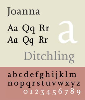
Joanna is a serif typeface designed by Eric Gill (1882–1940) in the period 1930–31, and named for one of his daughters. Gill chose Joanna for setting An Essay on Typography, a book by Gill on his thoughts on typography, typesetting, and page design. He described it as "a book face free from all fancy business".

Plantin is an old-style serif typeface named after the sixteenth-century printer Christophe Plantin. It was created in 1913 by the British Monotype Corporation for their hot metal typesetting system and is loosely based on a Gros Cicero face cut in the 16th century by Robert Granjon held in the collection of the Plantin-Moretus Museum of Antwerp.

Imprint is a serif typeface created by Monotype, commonly used for body text. Originally called Imprint Old Face, it is a sturdy, amiable design with a large x-height, Caslon-like but with more regularity in its letterforms. It was commissioned by the London publishers of The Imprint, a short-lived printing trade periodical published during 1913.
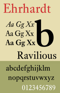
Ehrhardt is an old-style serif typeface released by the British branch of the Monotype Corporation in 1938. Ehrhardt is a modern adaptation of printing types of "stout Dutch character" from the Dutch Baroque tradition sold by the Ehrhardt foundry in Leipzig. These were cut by the Hungarian-Transylvanian pastor and punchcutter Miklós (Nicholas) Tótfalusi Kis while in Amsterdam in the period from 1680 to 1689.
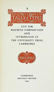
A Tally of Types is a book on typography authored by the type designer Stanley Morison. It was first published in 1953, and showcases significant typeface designs produced during Morison's tenure at the Lanston Monotype Corporation for their hot-metal typesetting machines during the 1920s and 1930s in England.
Jean Jannon was a French Protestant printer, type designer, punchcutter and typefounder active in Sedan in the seventeenth century. He was a reasonably prolific printer by contemporary standards, printing several hundred books.
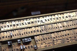
Frank Hinman Pierpont was an American engineer and typeface designer. He worked primarily in England for the Monotype Corporation of Britain.
Signature: A Quadrimestrial of Typography and the Graphic Arts was a British magazine of typography and the graphic arts. Published and edited by Oliver Simon, it was subsidised and printed by the Curwen Press, of which Simon was a director. It appeared in fifteen volumes from 1935 to 1940, and eighteen volumes from 1946 to 1954 as a new series.