A Tally of Types

Last updated
ATallyOfTypes.jpg
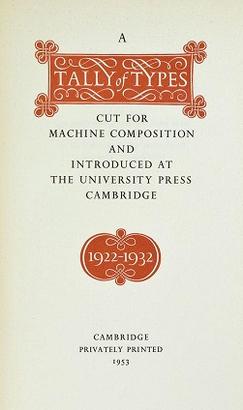
Title page of the first edition
Author Stanley Morison
CountryEngland
Subject Typography
Published1953
ISBN 9780521097864 (1973 reprint)

A Tally of Types [1] is a book on typography authored by the type designer Stanley Morison. [2] It was first published in 1953, and showcases significant typeface designs produced during Morison's tenure at the Lanston Monotype Corporation for their hot-metal typesetting machines during the 1920s and 1930s in England. [3]

Contents

According to Brooke Crutchley, [4] University Printer at the Cambridge University Press, the book "first appeared in 1953, when it was issued as a Christmas keepsake to 'friends of the University Printer in printing and publishing'"; only 450 copies were printed and distributed of this original edition.

The author, a scholarly British pioneer historian and typographer, was the driving force behind Monotype's dynamic typographic programme [5] of research and revival of representative historical typographic models. The book was compiled and written at Crutchley's request.

A Tally of Types, now republished many times, has proven to be an important source of information on typography. In the 1973 edition, three appendices were added, describing typeface designs developed since the original printing. A recent edition includes an introduction by digital-typography pioneer Mike Parker. [6] A Tally of Types holds a critical account, in Morison's erudite style, of the typeface designs cut under his watchful eye during typography's most influential typeface revival project, turning his detailed insight into the inner workings of early 20th century type design into an enduring record of the practice of typography.

Typeface designs discussed

Appendices added in the 1973 edition

Further reading

Related Research Articles

Times New Roman Canonical serif font

Times New Roman is a serif typeface. It was commissioned by the British newspaper The Times in 1931 and conceived by Stanley Morison, the artistic adviser to the British branch of the printing equipment company Monotype, in collaboration with Victor Lardent, a lettering artist in The Times's advertising department. It has become one of the most popular typefaces of all time and is installed on most desktop computers.

In typography, a serif is a small line or stroke regularly attached to the end of a larger stroke in a letter or symbol within a particular font or family of fonts. A typeface or "font family" making use of serifs is called a serif typeface, and a typeface that does not include them is sans-serif. Some typography sources refer to sans-serif typefaces as "grotesque" or "Gothic", and serif typefaces as "roman".

Garamond Typeface family

Garamond is a group of many serif typefaces, named for sixteenth-century Parisian engraver Claude Garamond, generally spelled as Garamont in his lifetime. Garamond-style typefaces are popular and particularly often used for book printing and body text.

Italic type Font style characterised by cursive typeface and slanted design

In typography, italic type is a cursive font based on a stylised form of calligraphic handwriting. Owing to the influence from calligraphy, italics normally slant slightly to the right. Italics are a way to emphasise key points in a printed text, to identify many types of creative works, to cite foreign words or phrases, or, when quoting a speaker, a way to show which words they stressed. One manual of English usage described italics as "the print equivalent of underlining"; in other words, underscore in a manuscript directs a typesetter to use italic.

Antiqua (typeface class)

Antiqua is a style of typeface used to mimic styles of handwriting or calligraphy common during the 15th and 16th centuries. Letters are designed to flow and strokes connect together in a continuous fashion; in this way it is often contrasted with Fraktur-style typefaces where the individual strokes are broken apart. The two typefaces were used alongside each other in the germanophone world, with the Antiqua–Fraktur dispute often dividing along ideological or political lines. After the mid-20th century, Fraktur fell out of favor and Antiqua-based typefaces became the official standard.

Stanley Morison British typographer (1889–1967)

Stanley Arthur Morison was an influential British typographer, printing executive and historian of printing. Largely self-educated, he promoted higher standards in printing and an awareness of the best printing and typefaces of the past.

Roman type

In Latin script typography, roman is one of the three main kinds of historical type, alongside blackletter and italic. Roman type was modelled from a European scribal manuscript style of the 15th century, based on the pairing of inscriptional capitals used in ancient Rome with Carolingian minuscules developed in the Holy Roman Empire.

Oblique type is a form of type that slants slightly to the right, used for the same purposes as italic type. Unlike italic type, however, it does not use different glyph shapes; it uses the same glyphs as roman type, except slanted. Oblique and italic type are technical terms to distinguish between the two ways of creating slanted font styles; oblique designs may be labelled italic by companies selling fonts or by computer programs. Oblique designs may also be called slanted or sloped roman styles. Oblique fonts, as supplied by a font designer, may be simply slanted, but this is often not the case: many have slight corrections made to them to give curves more consistent widths, so they retain the proportions of counters and the thick-and-thin quality of strokes from the regular design.

Bembo Serif typeface

Bembo is a serif typeface created by the British branch of the Monotype Corporation in 1928–1929 and most commonly used for body text. It is a member of the "old-style" of serif fonts, with its regular or roman style based on a design cut around 1495 by Francesco Griffo for Venetian printer Aldus Manutius, sometimes generically called the "Aldine roman". Bembo is named for Manutius's first publication with it, a small 1496 book by the poet and cleric Pietro Bembo. The italic is based on work by Giovanni Antonio Tagliente, a calligrapher who worked as a printer in the 1520s, after the time of Manutius and Griffo.

Francesco Griffo (1450–1518), also called Francesco da Bologna, was a fifteenth-century Italian punchcutter. He worked for Aldus Manutius, designing the printer's more important humanist typefaces, including the first italic type. He cut Roman, Greek, Hebrew and first italic type. Aldus gives Griffo credit in the introduction of the Virgil of 1501. However, as Manutius had achieved a monopoly on italic printing and Greek publishing with the permission of the Venetian government, he had a falling-out with Griffo. Griffo then went to work for Gershom Soncino, whose family were Hebrew printers. It was with Soncino that Griffo's second italic type was cut in 1503. In 1516 he returned to Bologna where he began print publishing. In 1518 Griffo was charged with the murder of his son-in-law, who had been beaten to death with an iron bar. This is his last appearance in the historical record. He is presumed to have been executed.

Beatrice Warde

Beatrice Lamberton Warde was a twentieth century writer and scholar of typography. As a marketing manager for the British Monotype Corporation, she was influential in the development of printing tastes in Britain and elsewhere in the mid-twentieth century and was recognized at the time as "[o]ne of the few women typographers in the world". Her writing advocated higher standards in printing, and championed intelligent use of historic typefaces from the past, which Monotype specialised in reviving, and the work of contemporary typeface designers.

History of Western typography Aspect of history

Modern typographers view typography as a craft with a very long history tracing its origins back to the first punches and dies used to make seals and coinage currency in ancient times. The basic elements of typography are at least as old as civilization and the earliest writing systems—a series of key developments that were eventually drawn together into one systematic craft. While woodblock printing and movable type had precedents in East Asia, typography in the Western world developed after the invention of the printing press by Johannes Gutenberg in the mid-15th century. The initial spread of printing throughout Germany and Italy led to the enduring legacy and continued use of blackletter, Roman and italic types.

Centaur (typeface)

Centaur is a serif typeface by book and typeface designer Bruce Rogers, based on the Renaissance-period printing of Nicolas Jenson around 1470. He used it for his design of the Oxford Lectern Bible. It was given widespread release by the British branch of Monotype, paired with an italic designed by calligrapher Frederic Warde and based on the slightly later work of calligrapher and printer Ludovico Vicentino degli Arrighi. The italic has sometimes been named separately as the "Arrighi" italic.

Jan van Krimpen was a Dutch typographer, book designer and type designer. He worked for the printing house Koninklijke Joh. Enschedé. He also worked with Monotype in England, who issued or reissued many of his designs outside the Netherlands.

Plantin (typeface) Typeface

Plantin is an old-style serif typeface named after the sixteenth-century printer Christophe Plantin. It was created in 1913 by the British Monotype Corporation for their hot metal typesetting system and is loosely based on a Gros Cicero face cut in the 16th century by Robert Granjon held in the collection of the Plantin-Moretus Museum of Antwerp.

Yale (typeface)

Yale is an old style serif typeface designed by Matthew Carter and first released in 2004. It was commissioned by Yale University for use in all of its signage, promotional and internal material.

Ehrhardt (typeface) Font

Ehrhardt is an old-style serif typeface released by the British branch of the Monotype Corporation in 1938. Ehrhardt is a modern adaptation of printing types of "stout Dutch character" from the Dutch Baroque tradition sold by the Ehrhardt foundry in Leipzig. These were cut by the Hungarian-Transylvanian pastor and punchcutter Miklós (Nicholas) Tótfalusi Kis while in Amsterdam in the period from 1680 to 1689.

Jean Jannon 17th-century French typographer

Jean Jannon was a French Protestant printer, type designer, punchcutter and typefounder active in Sedan in the seventeenth century. He was a reasonably prolific printer by contemporary standards, printing several hundred books.

References

  1. "A Tally of Types". Typophile. 2005-08-21. Retrieved 2013-10-31.
  2. "Stanley Morison". Typophile. 2005-05-07. Retrieved 2013-10-31.
  3. Mosley, James (2001). "Review: A Tally of Types". Journal of the Printing History Society. 3, new series: 63–67.
  4. Sebastian Carter (5 September 2003). "Obituary: Brooke Crutchley | Media". The Guardian. Retrieved 2013-11-01.
  5. James Moran, in Stanley Morison, his typographic achievement, wonders whether the 'typographical programme' that Morison so often described really existed as a formal programme
  6. "A Tally of Types - David R. Godine, Publisher". Godine.com. Archived from the original on 2014-12-18. Retrieved 2013-11-01.
  7. "Barbou: the font that Monotype forgot". Typophile. Retrieved 2013-10-31.
  8. "Who designed Monotype Ehrhardt?". Typophile. Archived from the original on 2015-01-23. Retrieved 2013-10-31.