Related Research Articles

Typographic units are the units of measurement used in typography or typesetting. Traditional typometry units are different from familiar metric units because they were established in the early days of printing. Though most printing is digital now, the old terms and units have persisted.
In typography, a serif is a small line or stroke regularly attached to the end of a larger stroke in a letter or symbol within a particular font or family of fonts. A typeface or "font family" making use of serifs is called a serif typeface, and a typeface that does not include them is sans-serif. Some typography sources refer to sans-serif typefaces as "grotesque" or "Gothic", and serif typefaces as "roman".

Garamond is a group of many serif typefaces, named for sixteenth-century Parisian engraver Claude Garamond, generally spelled as Garamont in his lifetime. Garamond-style typefaces are popular and particularly often used for book printing and body text.

Matthew Carter is a British type designer. A 2005 New Yorker profile described him as 'the most widely read man in the world' by considering the amount of text set in his commonly used fonts.
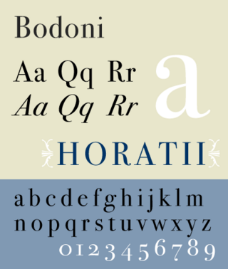
Bodoni is the name given to the serif typefaces first designed by Giambattista Bodoni (1740–1813) in the late eighteenth century and frequently revived since. Bodoni's typefaces are classified as Didone or modern. Bodoni followed the ideas of John Baskerville, as found in the printing type Baskerville—increased stroke contrast reflecting developing printing technology and a more vertical axis—but he took them to a more extreme conclusion. Bodoni had a long career and his designs changed and varied, ending with a typeface of a slightly condensed underlying structure with flat, unbracketed serifs, extreme contrast between thick and thin strokes, and an overall geometric construction.
In typography, the point is the smallest unit of measure. It is used for measuring font size, leading, and other items on a printed page. The size of the point has varied throughout printing's history. Since the 18th century, the size of a point has been between 0.18 and 0.4 millimeters. Following the advent of desktop publishing in the 1980s and 1990s, digital printing has largely supplanted the letterpress printing and has established the desktop publishing (DTP) point as the de facto standard. The DTP point is defined as 1⁄72 of an international inch (1/72 × 25.4 mm ≈ 0.353 mm) and, as with earlier American point sizes, is considered to be 1⁄12 of a pica.

Caslon is the name given to serif typefaces designed by William Caslon I (c. 1692–1766) in London, or inspired by his work.

Pierre-Simon Fournier was a French mid-18th century punch-cutter, typefounder and typographic theoretician. He was both a collector and originator of types. Fournier's contributions to printing were his creation of initials and ornaments, his design of letters, and his standardization of type sizes. He worked in the rococo form, and designed typefaces including Fournier and Narcissus. He was known for incorporating ‘decorative typographic ornaments’ into his typefaces. Fournier's main accomplishment is that he ‘created a standardized measuring system that would revolutionize the typography industry forever’.
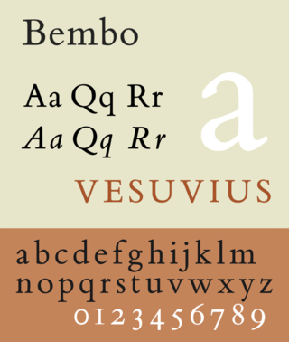
Bembo is a serif typeface created by the British branch of the Monotype Corporation in 1928–1929 and most commonly used for body text. It is a member of the "old-style" of serif fonts, with its regular or roman style based on a design cut around 1495 by Francesco Griffo for Venetian printer Aldus Manutius, sometimes generically called the "Aldine roman". Bembo is named for Manutius's first publication with it, a small 1496 book by the poet and cleric Pietro Bembo. The italic is based on work by Giovanni Antonio Tagliente, a calligrapher who worked as a printer in the 1520s, after the time of Manutius and Griffo.

Clarendon is the name of a slab serif typeface that was released in 1845 by Thorowgood and Co. of London, a letter foundry often known as the Fann Street Foundry. The original Clarendon design is credited to Robert Besley, a partner in the foundry, and was originally engraved by punchcutter Benjamin Fox, who may also have contributed to its design. Many copies, adaptations and revivals have been released, becoming almost an entire genre of type design.

Janson is the name given to a set of old-style serif typefaces from the Dutch Baroque period, and modern revivals from the twentieth century. Janson is a crisp, relatively high-contrast serif design, most popular for body text.

Baskerville is a serif typeface designed in the 1750s by John Baskerville (1706–1775) in Birmingham, England, and cut into metal by punchcutter John Handy. Baskerville is classified as a transitional typeface, intended as a refinement of what are now called old-style typefaces of the period, especially those of his most eminent contemporary, William Caslon.

News Gothic is a sans-serif typeface designed by Morris Fuller Benton, and was released in 1908 by his employer American Type Founders (ATF). The typeface is similar in proportion and structure to Franklin Gothic, also designed by Benton, but lighter.

Centaur is a serif typeface by book and typeface designer Bruce Rogers, based on the Renaissance-period printing of Nicolas Jenson around 1470. He used it for his design of the Oxford Lectern Bible. It was given widespread release by the British branch of Monotype, paired with an italic designed by calligrapher Frederic Warde and based on the slightly later work of calligrapher and printer Ludovico Vicentino degli Arrighi. The italic has sometimes been named separately as the "Arrighi" italic.

Bitstream Charter is a serif typeface designed by Matthew Carter in 1987 for Bitstream Inc. Charter is based on Pierre-Simon Fournier’s characters, originating from the 18th century. Classified by Bitstream as a transitional-serif typeface, it also has features of a slab-serif typeface and is often classified as such.
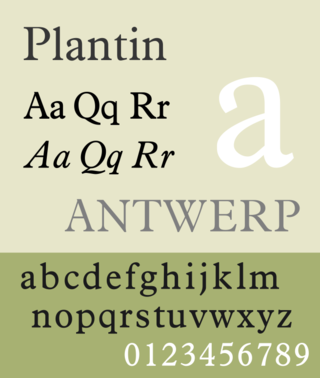
Plantin is an old-style serif typeface. It was created in 1913 by the British Monotype Corporation for their hot metal typesetting system and is named after the sixteenth-century printer Christophe Plantin. It is loosely based on a Gros Cicero roman type cut in the 16th century by Robert Granjon held in the collection of the Plantin–Moretus Museum, Antwerp.

Ehrhardt is an old-style serif typeface released by the British branch of the Monotype Corporation in 1938. Ehrhardt is a modern adaptation of printing types of "stout Dutch character" from the Dutch Baroque tradition sold by the Ehrhardt foundry in Leipzig. These were cut by the Hungarian-Transylvanian pastor and punchcutter Miklós (Nicholas) Tótfalusi Kis while in Amsterdam in the period from 1680 to 1689.
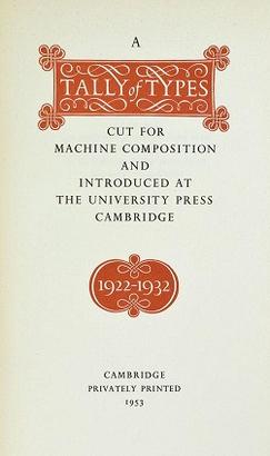
A Tally of Types is a book on typography authored by the type designer Stanley Morison. It was first published in 1953, and showcases significant typeface designs produced during Morison's tenure at the Lanston Monotype Corporation for their hot-metal typesetting machines during the 1920s and 1930s in England.

Walbaum is the name given to serif typefaces in the "Didone" or modern style that are, or revive the work of early nineteenth-century punchcutter Justus Erich Walbaum, based in Goslar and then in Weimar.

Unica or Haas Unica is a neo-grotesque sans-serif typeface developed at Haas Type Foundry in the late 1970s and originally released in 1980. Initiated as a project that sought to combine the strengths of both Helvetica and Univers, it had the misfortune of being released for phototypesetting just as the technology was being made obsolete by desktop publishing, and subsequent corporate mergers and a copyright dispute kept a digital version off the market. In 2015, two digital revivals were released: one by the rights holders, and the other with the blessing of the team that originally developed it.
References
- ↑ Paul A. Winckler (April 1983). Reader in the History of Books and Printing. Greenwood Publishing Group. pp. 85–6. ISBN 978-0-313-24038-6.
- ↑ Neil Macmillan (2006). An A-Z of Type Designers. Yale University Press. pp. 84–5. ISBN 0-300-11151-7.
- ↑ "Fournier™ - Desktop font « MyFonts".
- ↑ Typefaces. "Pierre-Simon Fournier".
- ↑ "Fournier™ - Webfont & Desktop font « MyFonts".
- ↑ Tranter, John. "Digital Fournier, almost". John Tranter (blog). Retrieved 8 October 2016.