
Typography is the art and technique of arranging type to make written language legible, readable and appealing when displayed. The arrangement of type involves selecting typefaces, point sizes, line lengths, line spacing, letter spacing, and spaces between pairs of letters. The term typography is also applied to the style, arrangement, and appearance of the letters, numbers, and symbols created by the process. Type design is a closely related craft, sometimes considered part of typography; most typographers do not design typefaces, and some type designers do not consider themselves typographers. Typography also may be used as an ornamental and decorative device, unrelated to the communication of information.

Helvetica, also known by its original name Neue Haas Grotesk, is a widely used sans-serif typeface developed in 1957 by Swiss typeface designer Max Miedinger and Eduard Hoffmann.

Frutiger is a series of typefaces named after its Swiss designer, Adrian Frutiger. Frutiger is a humanist sans-serif typeface, intended to be clear and highly legible at a distance or at small text sizes. A popular design worldwide, type designer Steve Matteson described its structure as "the best choice for legibility in pretty much any situation" at small text sizes, while Erik Spiekermann named it as "the best general typeface ever".

Courier is a monospaced slab serif typeface. Courier was created by IBM in the mid-1950s, and was designed by Howard "Bud" Kettler (1919–1999). The Courier name and typeface concept are in the public domain. Courier has been adapted for use as a computer font, and versions of it are installed on most desktop computers.

Comic Sans MS is a sans-serif typeface designed by Vincent Connare and released in 1994 by Microsoft Corporation. It is a non-connecting script inspired by comic book lettering, intended for use in cartoon speech bubbles, as well as in other casual environments, such as informal documents and children's materials.
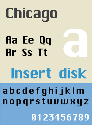
Chicago is a sans-serif typeface designed by Susan Kare for Apple Computer. It was used in the Macintosh operating system user interface between 1984 and 1997 and was an important part of Apple’s brand identity. It is also used in early versions of the iPod user interface. Chicago was initially a bitmap font; as the Apple OS’s capabilities improved, Apple commissioned the type foundry Bigelow & Holmes to create a vector-based TrueType version. The typeface is named after the U.S. city of Chicago, following the theme of original Macintosh fonts being named after major world cities.

Apple Inc. uses a large variety of typefaces in its marketing, operating systems, and industrial design with each product cycle. These change throughout the years with Apple's change of style in their products. This is evident in the design and marketing of the company. The current logo is a white apple with a bite out of it, which was first utilized in 2013.

Myriad is a humanist sans-serif typeface designed by Robert Slimbach and Carol Twombly for Adobe Systems. Myriad was intended as a neutral, general-purpose typeface that could fulfill a range of uses and have a form easily expandable by computer-aided design to a large range of weights and widths.

Roboto is a neo-grotesque sans-serif typeface family developed by Google as the system font for its mobile operating system Android, and released in 2011 for Android 4.0 "Ice Cream Sandwich".

Clearview, also known as Clearview Hwy, is the name of a humanist sans-serif typeface family for guide signs used on roads in the United States, Canada, Indonesia, the Philippines, Israel, Brazil and Sri Lanka. It was developed by independent researchers with the help of the Texas Transportation Institute and the Pennsylvania Transportation Institute, under the supervision of the Federal Highway Administration (FHWA). It was once expected to replace the FHWA typefaces in many applications, although newer studies of its effectiveness have called its benefits into question.
Segoe is a typeface, or family of fonts, that is best known for its use by Microsoft. The company uses Segoe in its online and printed marketing materials, including recent logos for a number of products. Additionally, the Segoe UI font sub-family is used by numerous Microsoft applications, and may be installed by applications. It was adopted as Microsoft's default operating system font beginning with Windows Vista, and is also used on Outlook.com, Microsoft's web-based email service. In August 2012, Microsoft unveiled its new corporate logo typeset in Segoe, replacing the logo it had used for the previous 25 years.
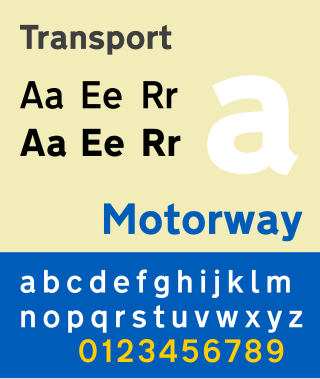
Transport is a sans serif typeface first designed for road signs in the United Kingdom. It was created between 1957 and 1963 by Jock Kinneir and Margaret Calvert as part of their work as designers for the Department of Transport's Anderson and Worboys committees.

DIN 1451 is a sans-serif typeface that is widely used for traffic, administrative and technical applications.

Sabon is an old-style serif typeface designed by the German-born typographer and designer Jan Tschichold (1902–1974) in the period 1964–1967. It was released jointly by the Linotype, Monotype, and Stempel type foundries in 1967. The design of the roman is based on types by Claude Garamond, particularly a specimen printed by the Frankfurt printer Konrad Berner. Berner had married the widow of a fellow printer Jacques Sabon, the source of the face's name, who had bought some of Garamond's type after his death. The italics are based on types designed by a contemporary of Garamond's, Robert Granjon. It is effectively a Garamond revival, though a different name was chosen as many other modern typefaces already carry this name.

Minion is a serif typeface released in 1990 by Adobe Systems. Designed by Robert Slimbach, it is inspired by late Renaissance-era type and intended for body text and extended reading. Minion's name comes from the traditional naming system for type sizes, in which minion is between nonpareil and brevier, with the type body 7pt in height. As the historically rooted name indicates, Minion was designed for body text in a classic style, although slightly condensed and with large apertures to increase legibility. Slimbach described the design as having "a simplified structure and moderate proportions." The design is slightly condensed, although Slimbach has said that this was intended not for commercial reasons so much as to achieve a good balance of the size of letters relative to the ascenders and descenders.
A mobile operating system is an operating system for smartphones, tablets, smartwatches, smartglasses, or other non-laptop personal mobile computing devices. While computers such as typical/mobile laptops are "mobile", the operating systems used on them are generally not considered mobile ones, as they were originally designed for desktop computers that historically did not have or need specific mobile features. This line distinguishing mobile and other forms has become blurred in recent years, due to the fact that newer devices have become smaller and more mobile unlike hardware of the past. Key notabilities blurring this line are the introduction of tablet computers and light-weight laptops and the hybridization of the two in 2-in-1 PCs.

Droid is a font family first released in 2007 and created by Ascender Corporation for use by the Open Handset Alliance platform Android and licensed under the Apache License. The fonts are intended for use on the small screens of mobile handsets and were designed by Steve Matteson of Ascender Corporation. The name was derived from the Open Handset Alliance platform named Android.

Open Sans is an open source humanist sans-serif typeface that was designed by Steve Matteson under commission from Google. It was released in 2011 and is based on his earlier design called Droid Sans, which was specifically created for Android mobile devices but with slight modifications to its width.
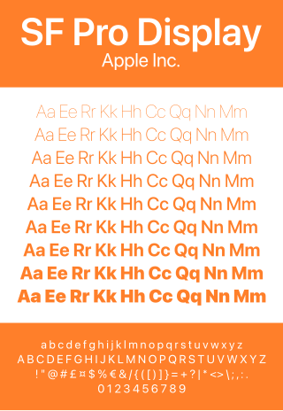
San Francisco is a neo-grotesque typeface made by Apple Inc. It was first released to developers on November 18, 2014. It is the first new typeface designed at Apple in nearly twenty years and has been inspired by Helvetica and DIN.
