
Times New Roman is a serif typeface designed for legibility in body text. It was commissioned by the British newspaper The Times in 1931 and conceived by Stanley Morison, the artistic advisor to the British branch of the printing equipment company Monotype, in collaboration with Victor Lardent, a lettering artist in the Times' advertising department. Although no longer used by The Times, Times New Roman is still very common in book and general printing. It has become one of the most popular and influential typefaces in history and a standard typeface on most desktop computers.

Garamond is a group of many old-style serif typefaces, named for sixteenth-century Parisian engraver Claude Garamond. Garamond-style typefaces are popular and often used, particularly for printing body text and books.

Frutiger is a series of typefaces named after its Swiss designer, Adrian Frutiger. Frutiger is a humanist sans-serif typeface, intended to be clear and highly legible at a distance or at small text sizes. A very popular design worldwide, type designer Steve Matteson described its structure as "the best choice for legibility in pretty much any situation" at small text sizes, while Erik Spiekermann named it as "the best general typeface ever".
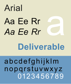
Arial, sometimes marketed or displayed in software as Arial MT, is a sans-serif typeface and set of computer fonts. Fonts from the Arial family are packaged with all versions of Microsoft Windows from Windows 3.1 onwards, some other Microsoft software applications, Apple Mac OS X and many PostScript 3 computer printers. The typeface was designed in 1982 by Robin Nicholas and Patricia Saunders, for Monotype Typography. It was created to be metrically identical to the popular typeface Helvetica, with all character widths identical, so that a document designed in Helvetica could be displayed and printed correctly without having to pay for a Helvetica license.

Univers is the name of a large sans-serif typeface family designed by Adrian Frutiger and released by his employer Deberny & Peignot in 1957. Classified as a neo-grotesque sans-serif, one based on the model of nineteenth-century German typefaces such as Akzidenz-Grotesk, it was notable for its availability from the moment of its launch in a comprehensive range of weights and widths. The original marketing for Univers deliberately referenced the periodic table to emphasise its scope.

Monotype Imaging Holdings, Inc. is a Delaware corporation based in Woburn, Massachusetts. It specialises in digital typesetting and typeface design as well as text and imaging solutions for use with consumer electronics devices. Monotype Imaging Holdings and its predecessors and subsidiaries have been responsible for many developments in printing technology—in particular the Monotype machine, which was the first fully mechanical typesetter, and the Linotype machine—and the design and production of typefaces in the 19th and 20th centuries. Monotype developed many of the most widely used typeface designs, including Times New Roman, Gill Sans, Arial, Bembo and Albertus.
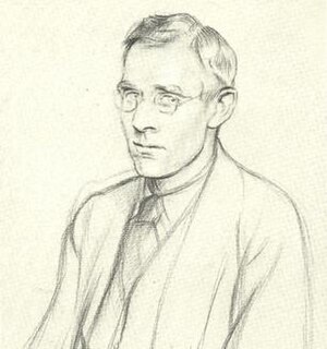
Stanley Morison was an influential British typographer, printing executive and historian of printing. Largely self-educated, he promoted higher standards in printing and an awareness of the best printing and typefaces of the past.
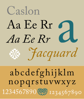
Caslon is the name given to serif typefaces designed by William Caslon I in London, or inspired by his work.

Cooper Black is an ultra-bold serif typeface intended for display use that was designed by Oswald Bruce Cooper and released by the Barnhart Brothers & Spindler type foundry in 1922. The typeface was drawn as an extra-bold weight of Cooper's "Cooper Old Style" family. It rapidly became a standard typeface and was licensed by American Type Founders and also copied by many other manufacturers of printing systems.

Bembo is a serif typeface created by the British branch of the Monotype Corporation in 1928-9 and most commonly used for body text. It is a member of the "old-style" of serif fonts, with its regular or roman style based on a design cut around 1495 by Francesco Griffo for Venetian printer Aldus Manutius, sometimes generically called the "Aldine roman". Bembo is named for Manutius's first publication with it, a small 1496 book by the poet and cleric Pietro Bembo. The italic is based on work by Giovanni Antonio Tagliente, a calligrapher who worked as a printer in the 1520s, after the time of Manutius and Griffo.

Bookman or Bookman Old Style, is a serif typeface. A wide, legible design that is slightly bolder than most body text faces, Bookman has been used for both display typography and for printing at small sizes such as in trade printing, and less commonly for body text. In advertising use it is particularly associated with the graphic design of the 1960s and 1970s, when revivals of it were very popular.

Janson is the name given to a set of old-style serif typefaces from the Dutch Baroque period, and modern revivals from the twentieth century. Janson is a crisp, relatively high-contrast serif design, most popular for body text.
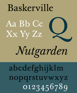
Baskerville is a serif typeface designed in the 1750s by John Baskerville (1706–1775) in Birmingham, England, and cut into metal by punchcutter John Handy. Baskerville is classified as a transitional typeface, intended as a refinement of what are now called old-style typefaces of the period, especially those of his most eminent contemporary, William Caslon.

Cheltenham is a typeface for display use designed in 1896 by architect Bertram Goodhue and Ingalls Kimball, director of the Cheltenham Press. The original drawings were known as Boston Old Style and were made about 14" high. These drawings were then turned over to Morris Fuller Benton at American Type Founders (ATF) who developed it into a final design. Trial cuttings were made as early as 1899 but the face was not complete until 1902. The face was patented by Kimball in 1904. Later the basic face was spun out into an extensive type family by Morris Fuller Benton.
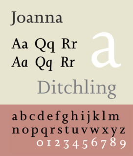
Joanna is a serif typeface designed by Eric Gill (1882–1940) in the period 1930–31, and named for one of his daughters. Gill chose Joanna for setting An Essay on Typography, a book by Gill on his thoughts on typography, typesetting, and page design. He described it as "a book face free from all fancy business."

Centaur is a serif typeface by book and typeface designer Bruce Rogers, based on the Renaissance-period printing of Nicolas Jenson around 1470. He used it for his design of the Oxford Lectern Bible. It was given widespread release by the British branch of Monotype, paired with an italic designed by calligrapher Frederic Warde and based on the slightly later work of calligrapher and printer Ludovico Vicentino degli Arrighi. The italic has sometimes been named separately as the "Arrighi" italic.
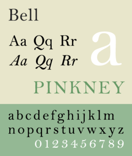
Bell is the name given to a serif typeface designed and cut in 1788 by the punchcutter Richard Austin for the British Letter Foundry, operated by publisher John Bell, and revived several times since.

Plantin is an old-style serif typeface named after the sixteenth-century printer Christophe Plantin. It was created in 1913 by the British Monotype Corporation for their hot metal typesetting system, and is loosely based on a Gros Cicero face cut in the 16th century by Robert Granjon and held in the collection of the Plantin-Moretus Museum of Antwerp.
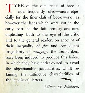
Old Style or Modernised Old Style was the name given to a series of serif typefaces cut from the mid-nineteenth century and sold by the type foundry Miller & Richard, of Edinburgh in Scotland, as well as many derivatives and copies.


