Related Research Articles
In typography, a serif is a small line or stroke regularly attached to the end of a larger stroke in a letter or symbol within a particular font or family of fonts. A typeface or "font family" making use of serifs is called a serif typeface, and a typeface that does not include them is sans-serif. Some typography sources refer to sans-serif typefaces as "grotesque" or "Gothic", and serif typefaces as "roman".
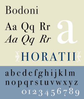
Bodoni is the name given to the serif typefaces first designed by Giambattista Bodoni (1740–1813) in the late eighteenth century and frequently revived since. Bodoni's typefaces are classified as Didone or modern. Bodoni followed the ideas of John Baskerville, as found in the printing type Baskerville—increased stroke contrast reflecting developing printing technology and a more vertical axis—but he took them to a more extreme conclusion. Bodoni had a long career and his designs changed and varied, ending with a typeface of a slightly condensed underlying structure with flat, unbracketed serifs, extreme contrast between thick and thin strokes, and an overall geometric construction.

In typography, italic type is a cursive font based on a stylised form of calligraphic handwriting. Owing to the influence from calligraphy, italics normally slant slightly to the right. Italics are a way to emphasise key points in a printed text, to identify many types of creative works, to cite foreign words or phrases, or, when quoting a speaker, a way to show which words they stressed. One manual of English usage described italics as "the print equivalent of underlining"; in other words, underscore in a manuscript directs a typesetter to use italic.

Bembo is a serif typeface created by the British branch of the Monotype Corporation in 1928–1929 and most commonly used for body text. It is a member of the "old-style" of serif fonts, with its regular or roman style based on a design cut around 1495 by Francesco Griffo for Venetian printer Aldus Manutius, sometimes generically called the "Aldine roman". Bembo is named for Manutius's first publication with it, a small 1496 book by the poet and cleric Pietro Bembo. The italic is based on work by Giovanni Antonio Tagliente, a calligrapher who worked as a printer in the 1520s, after the time of Manutius and Griffo.
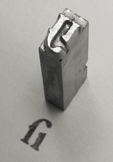
Francesco Griffo (1450–1518), also called Francesco da Bologna, was a fifteenth-century Italian punchcutter. He worked for Aldus Manutius, designing the printer's more important humanist typefaces, including the first italic type. He cut Roman, Greek, Hebrew and first italic type. Aldus gives Griffo credit in the introduction of the Virgil of 1501. However, as Manutius had achieved a monopoly on italic printing and Greek publishing with the permission of the Venetian government, he had a falling-out with Griffo. Griffo then went to work for Gershom Soncino, whose family were Hebrew printers. It was with Soncino that Griffo's second italic type was cut in 1503. In 1516 he returned to Bologna where he began print publishing. In 1518 Griffo was charged with the murder of his son-in-law, who had been beaten to death with an iron bar. This is his last appearance in the historical record. He is presumed to have been executed.

Didone is a genre of serif typeface that emerged in the late 18th century and was the standard style of general-purpose printing during the nineteenth. It is characterized by:
Frederic Warde was a printer, type designer, and typographic designer. One of the great book designers of the twentieth century, Will Ransom described him as "a curious blend of romantic idealism and meticulous practicality." In describing his own work, Warde stated, "The innermost soul of any literary creation can never be seen in all its clarity and truth until one views it through the medium of the printed page, in which there must be absolutely nothing to divide the attention, interrupt the thought, or to offend one's sense of form."

Perpetua is a serif typeface that was designed by English sculptor and stonemason Eric Gill for the British Monotype Corporation. Perpetua was commissioned at the request of Stanley Morison, an influential historian of printing and adviser to Monotype around 1925, at a time when Gill's reputation as a leading artist-craftsman was high. Perpetua was intended as a crisp, contemporary design not following any specific historic model, with a structure influenced by Gill's experience of carving lettering for monuments and memorials. Perpetua is commonly used for covers and headings and also sometimes for body text; it has been particularly popular in fine book printing. Perpetua was released with characters for the Greek alphabet and a matching set of titling capitals for headings.
Modern typographers view typography as a craft with a very long history tracing its origins back to the first punches and dies used to make seals and coinage currency in ancient times. The basic elements of typography are at least as old as civilization and the earliest writing systems—a series of key developments that were eventually drawn together into one systematic craft. While woodblock printing and movable type had precedents in East Asia, typography in the Western world developed after the invention of the printing press by Johannes Gutenberg in the mid-15th century. The initial spread of printing throughout Germany and Italy led to the enduring legacy and continued use of blackletter, Roman and italic types.
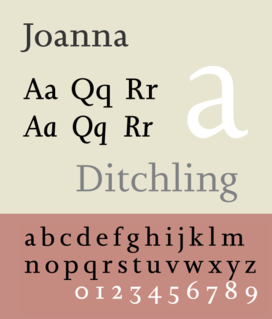
Joanna is a serif typeface designed by Eric Gill (1882–1940) in the period 1930–31, and named for one of his daughters. Gill chose Joanna for setting An Essay on Typography, a book by Gill on his thoughts on typography, typesetting, and page design. He described it as "a book face free from all fancy business."
The International Typeface Corporation (ITC) was a type manufacturer founded in New York in 1970 by Aaron Burns, Herb Lubalin and Edward Rondthaler. The company was one of the world's first type foundries to have no history in the production of metal type. It is now a wholly owned brand or subsidiary of Monotype Imaging.

Centaur is a serif typeface by book and typeface designer Bruce Rogers, based on the Renaissance-period printing of Nicolas Jenson around 1470. He used it for his design of the Oxford Lectern Bible. It was given widespread release by the British branch of Monotype, paired with an italic designed by calligrapher Frederic Warde and based on the slightly later work of calligrapher and printer Ludovico Vicentino degli Arrighi. The italic has sometimes been named separately as the "Arrighi" italic.
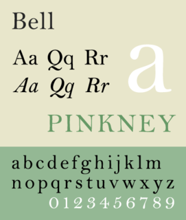
Bell is the name given to a serif typeface designed and cut in 1788 by the punchcutter Richard Austin for the British Letter Foundry, operated by publisher John Bell, and revived several times since.
The Officina Bodoni was a private press operated by Giovanni Mardersteig from 1922. It was named after the great eighteenth-century Italian typographer Giambattista Bodoni. The Officina Bodoni is known for printing books of the very highest quality and the finest craftsmanship.

Century is a family of serif type faces particularly intended for body text. The family originates from a first design, Century Roman cut by American Type Founders designer Linn Boyd Benton in 1894 for master printer Theodore Low De Vinne, for use in The Century Magazine. ATF rapidly expanded it into a very large family, first by Linn Boyd and later by his son Morris.
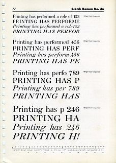
Scotch Roman is a class of typefaces popular in the early nineteenth century, particularly in the United States and to a lesser extent the United Kingdom. These typefaces were modeled on a design known as Pica No. 2 from the Edinburgh foundry of William Miller. Some accounts suggest that Miller's type, the oldest surviving specimen of which dates to 1813, was cut by Richard Austin, who had previously produced the Bell types for the British Letter Foundry.

Galliard is the name of a serif typeface designed by Matthew Carter and issued in 1978 by the Mergenthaler Linotype Company.
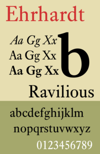
Ehrhardt is an old-style serif typeface released by the British branch of the Monotype Corporation in 1938. Ehrhardt is a modern adaptation of printing types of "stout Dutch character" from the Dutch Baroque tradition sold by the Ehrhardt foundry in Leipzig. These were cut by the Hungarian-Transylvanian pastor and punchcutter Miklós (Nicholas) Tótfalusi Kis while in Amsterdam in the period from 1680 to 1689.
References
- ↑ Bigelow, Charles; Seybold, Jonathan (1981). "Technology and the aesthetics of type". The Seybold Report. 10 (24): 3–16. ISSN 0364-5517.
- 1 2 Lawson, Alexander (1990). Anatomy of a Typeface . Godine. pp. 98–109.
- 1 2 3 Dreyfus, John (1989). Bigelow, Charles (ed.). "The Dante Types". Fine Print on Type. Bedford Arts. pp. 98–100.
- 1 2 "Font Designer – Giovanni Mardersteig". Linotype.com. Monotype. Retrieved 2020-05-25.
Monotype typefaces | |
|---|---|
| 1900s |
|
| 1910s |
|
| 1920s |
|
| 1930s |
|
| 1940s |
|
| 1950s |
|
| 1960s |
|
| 1970s |
|
| 1980s | |
| 1990s |
|
| 2000s |
|
| 2010s |
|