Related Research Articles

Jan Tschichold was a German calligrapher, typographer and book designer. He played a significant role in the development of graphic design in the 20th century – first, by developing and promoting principles of typographic modernism, and subsequently idealizing conservative typographic structures. His direction of the visual identity of Penguin Books in the decade following World War II served as a model for the burgeoning design practice of planning corporate identity programs. He also designed the typeface Sabon.
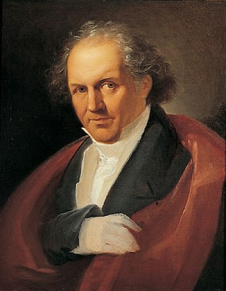
Giambattista Bodoni was an Italian typographer, type-designer, compositor, printer, and publisher in Parma.
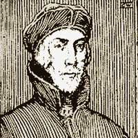
Nicholas Jenson was a French engraver, pioneer, printer and type designer who carried out most of his work in Venice, Italy. Jenson acted as Master of the French Royal Mint at Tours and is credited with being the creator of one of the finest early Roman typefaces. Nicholas Jenson has been something of an iconic figure among students of early printing since the nineteenth century when the artist William Morris praised the beauty and perfection of his roman font. Jenson is an important figure in the early history of printing and a pivotal force in the emergence of Venice as one of the first great centers of the printing press.

In typography, the point is the smallest unit of measure. It is used for measuring font size, leading, and other items on a printed page. The size of the point has varied throughout printing's history. Since the 18th century, the size of a point has been between 0.18 and 0.4 millimeters. Following the advent of desktop publishing in the 1980s and 1990s, digital printing has largely supplanted the letterpress printing and has established the DTP point as the de facto standard. The DTP point is defined as 1⁄72 of an international inch and, as with earlier American point sizes, is considered to be 1⁄12 of a pica.

Montagnola is a small Swiss village in Collina d'Oro municipality. Located in the Italian-speaking canton of Ticino, it is close to the border between Switzerland and Italy. It looks over Lake Lugano and the city of Lugano upon it. It falls within the local parish of Sant'Abbondio Gentilino.
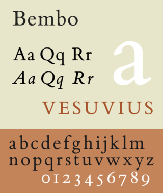
Bembo is a serif typeface created by the British branch of the Monotype Corporation in 1928–1929 and most commonly used for body text. It is a member of the "old-style" of serif fonts, with its regular or roman style based on a design cut around 1495 by Francesco Griffo for Venetian printer Aldus Manutius, sometimes generically called the "Aldine roman". Bembo is named for Manutius's first publication with it, a small 1496 book by the poet and cleric Pietro Bembo. The italic is based on work by Giovanni Antonio Tagliente, a calligrapher who worked as a printer in the 1520s, after the time of Manutius and Griffo.
Frederic Warde was a book designer, editor, and typography designer. One of the great book designers of the twentieth century, Will Ransom described him as "a curious blend of romantic idealism and meticulous practicality." In describing his own work, Warde stated, "The innermost soul of any literary creation can never be seen in all its clarity and truth until one views it through the medium of the printed page, in which there must be absolutely nothing to divide the attention, interrupt the thought, or to offend one's sense of form."

Modern typographers view typography as a craft with a very long history tracing its origins back to the first punches and dies used to make seals and coinage currency in ancient times. The basic elements of typography are at least as old as civilization and the earliest writing systems—a series of key developments that were eventually drawn together into one systematic craft. While woodblock printing and movable type had precedents in East Asia, typography in the Western world developed after the invention of the printing press by Johannes Gutenberg in the mid-15th century. The initial spread of printing throughout Germany and Italy led to the enduring legacy and continued use of blackletter, roman, and italic types.
The International Typeface Corporation (ITC) was a type manufacturer founded in New York in 1970 by Aaron Burns, Herb Lubalin and Edward Rondthaler. The company was one of the world's first type foundries to have no history in the production of metal type. It is now a wholly owned brand or subsidiary of Monotype Imaging.
Bruce Rogers was an American typographer and type designer, acclaimed by some as among the greatest book designers of the twentieth century. Rogers was known for his "allusive" typography, rejecting modernism, seldom using asymmetrical arrangements, rarely using sans serif type faces, often favoring faces such as Bell, Caslon, his own Montaigne, a Jensonian precursor to his masterpiece of type design Centaur. His books can fetch high sums at auction.
Kirti Narayan Chaudhuri is a historian, author, writer, graphic artist, and lately, a film-maker. He is the second son of the Indian writer Nirad C. Chaudhuri. Chaudhuri has spent most of his adult life travelling and working in the Middle East, North Africa, South America, and Europe. He is a member of the British Academy and the Academia Europaea. Chaudhuri was ranked Number 58 on The Daily Telegraph's list of the "Top 100 Living Geniuses".
Jack Werner Stauffacher was an American printer, typographer, educator, and fine book publisher. He owned and operated Greenwood Press, a small book printing press based in the San Francisco Bay Area.

Sumner Stone is a typeface designer and graphic artist. He notably designed ITC Stone while working for Adobe. A specimen of ITC Stone is shown at his personal website.

Francesco Torniello da Novara was a Milanese typographer, writer and Franciscan friar who became known for applying geometric specifications to Latin capital letters fonts.
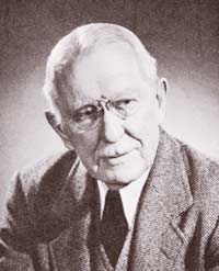
Giovanni Mardersteig was a German-born printer and typographer, making much of his career in Italy. He is particularly known for founding and running Officina Bodoni, a small press producing high-quality editions, and his typeface Dante.
Dante is a mid-20th-century old-style serif typeface designed by Giovanni Mardersteig, originally for use by the Officina Bodoni for books. The original type was cut by Charles Malin. The type is a serif face influenced by the types cut by Francesco Griffo between 1449 and 1516. Mardersteig had become acquainted with Griffo's type in the design of his previous typeface, called Griffo. One of the primary objectives in designing Dante was in keeping a visual balance between the roman and italics.
Richard Price Rummonds, one of the foremost handpress printers of the late twentieth century, is also an author, publisher, typographer, and historian of printing. His two books on nineteenth-century printing, Printing on the Iron Handpress and Nineteenth-Century Printing Practices and the Iron Handpress, comprehensively describe the history, operation and merits of the iron handpress.
Monika Beisner is a German artist and book illustrator.

Hans Peter Schmoller was a German and British graphic designer who worked as Head of Typography and Design at Penguin Books from 1949 to 1976. During his Penguin years he played a crucial role in postwar British typography, and has been described as one of the most influential typographers of the last century.
Master printmakers or master printers are specialized technicians who hand-print editions of an artist's or printmaker's print-based artwork. Master printmakers often own and/or operate their own printmaking studio or print shop. Business activities of a Master printshop may include: publishing and printing services, educational workshops or classes, mentorship of artists, and artist residencies.
References
- ↑ Walker, Thomas D. “The Cover Design.” The Library Quarterly: Information, Community, Policy 61, no. 4, 1991, pp. 444–45.