Bell (typeface)

Last updated
BellMT.png
Category Serif
Classification Transitional [1]
Designer(s) Richard Austin
Foundry British Letter Foundry

Bell is the name given to a serif typeface designed and cut in 1788 by the punchcutter Richard Austin for the British Letter Foundry, operated by publisher John Bell, and revived several times since. [2] [3]

Contents

The Bell typeface has a precise appearance that features stylish contrasts between thick and thin strokes and ball terminals on many letters; it was influenced by the radical Didone styles of type becoming popular on the continent, in particular the work of the Didot family. However, it is less severe in design, somewhat similar to the earlier Baskerville and slightly later Bulmer typefaces. [4] [5] [6] The figures are distinctive for being at fixed height, or lining, at approximately three-quarter the height of the capitals, in contrast to earlier numerals of variable height. [lower-alpha 1] The figures have a number of elaborate details reminiscent of the steely calligraphy of the period, and the slight inclination of some of them led Walter Tracy to suggest that Austin was following a written example. [7] In italic, like Baskerville, several letters have flourishes. [lower-alpha 2]

After a short initial period of popularity, the face fell into disuse in Britain and Austin's later typefaces are quite different in style, although copies in the United States became popular around the early twentieth century with artisan printers. Its history was studied by the historian Stanley Morison in the late 1920s and early 1930s, whose employer, the Monotype Corporation, created a 1931 revival, particularly popular for printing on high-quality paper. Morison praised Austin for his "exceptional technical gift" and described his Bell typeface as "surpassing all previous English and continental type-cutting in precision [and maintaining] independence equally against Bodoni and Baskerville". [8]

Besides the digitisation of the Bell face by Monotype, an alternative professional adaptation of the Austin face in optical sizes by Paul Barnes and others under the name of "Austin" is available sold by Commercial Type. [9] As of 2017, it is used by The Daily Telegraph among others. [10] [11] [12] Austin's original matrices came into the possession of Stephenson Blake, and are now in the Type Museum collection in London.

History

The innovative book and newspaper publisher John Bell, impressed by the sophistication and contrast found in contemporary French typefaces cut for Firmin Didot, commissioned Austin to produce a new typeface to be sold by his British Letter Foundry. [13] Austin was a former cutter of engraved letters who would develop a career as a punchcutter. Bell wanted a crisply serifed face, like Didot in its crisp contrast of thick and thin strokes. The design is however, more traditional in style: Mosley writes that "the serifs, though sharply cut, are not the severe unbracketed strokes of the French type...a fusion of the new French style of roman with a flowing, cursive italic in the manner established by Baskerville". [3]

The result was later described by Stanley Morison as the first typeface developed in England to show effective harmony between the roman, or regular style and the italic. It achieved popularity in newspaper and magazine printing. It featured two innovations of the period which would become universal, the general abolition of the "long s" and lining figures that were all the same height. Austin's biographer Alastair Johnston has written that his typeface began "a glorious but short-lived" period for type design in England "of harmonious types that had the larger-on-the-body proportions of the Romain du Roi , with the modelling of Baskerville but more colour and fine serifs". [1] [lower-alpha 3] He has suggested that the Bell type's development was influenced by the greater quality possible in printing by more general use of hot-pressing of paper, which previously had only been used in Baskerville's elite printing, and the growth of fine book printing in London in the period. [1] Historian James Mosley has also written in that in this period "the use of wove paper, hot-pressed [and] the cult of a simpler, more open page made the appearance of the type itself a more prominent feature of an edition, and one to which its promoters tended increasingly to draw attention." [1] Besides body text faces, the foundry sold ornamented and inline letters, some based on French examples. [1]

The initial success of the face was short lived however, both due to business problems with the British Letter Foundry, which led first to Bell leaving it and then its sale in 1797, and later by 1808 a dramatic change in tastes in printing towards darker typefaces with greater extremes of thick and thin strokes. (Austin found the change distasteful, writing in 1819 that "a transition was made from one extreme to its opposite: thus instead of having letters somewhat too clumsy [in the eighteenth century], we now have them with hair lines so extremely thin as to render it impossible for them to preserve their delicacy... how can it be expected that types cut nearly as thin as the edge of a razor can retain their form for any reasonable length of time[?]". [14] ) While Austin went on to a successful career running his own foundry and selling punches to other companies, his later typefaces are different in style, some more "modern" in appearance. Some may have influenced the "Scotch Modern" style popular in the United States. [15] From the early nineteenth century onwards, the Bell typeface remained in the collection of various companies and finally Stephenson Blake, generally overlooked and little used.

An 1808 share certificate for the Kennet and Avon Canal, using the Bell type or one similar to it. Kennet and Avon Canal Navigation 1808.jpg
An 1808 share certificate for the Kennet and Avon Canal, using the Bell type or one similar to it.

While Bell's type was seldom seen after 1800 in England, it went on to become a favourite in the United States. When the Boston publisher Henry Houghton went to Europe to purchase type for his Riverside Press in 1864 he purchased the Bell from its then-owners the Fann Street Foundry, who were at the time offering it for sale under the name "Old Face". [lower-alpha 4] Back in Boston the face was called copperplate and copied by electrotyping. [16] [lower-alpha 5] In 1900, when Bruce Rogers found the face at the Riverside Press, he used it for book work under the name "Brimmer". Daniel Berkeley Updike used another font of this type at his Merrymount Press where it was called "Mountjoye". [18] Morison, who corresponded extensively with Updike, was impressed with the typefaces' quality and after researching their history arranged for Monotype to develop a revival for Monotype's hot metal typesetting system, in collaboration with Stephenson Blake who held the original. The Monotype revival included a wide range of Austin's character variants, including swash versions of the italic A, J, N, Q, T, V, and Y. [lower-alpha 6] The designer Jan Tschichold favored the typeface Bell in much of his book design, and mentioned it in his book Typographische Gestaltung.

Foundry type

Digital versions

Monotype's digital version was developed under the supervision of Robin Nicholas, and is based on the larger display style of Monotype's metal version. Another digital version, believed to be based on a smaller cut of the same metal type, is available from URW++. [20]

Related Research Articles

<span class="mw-page-title-main">Times New Roman</span> Serif typeface

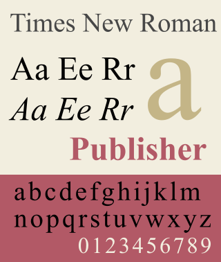
Times New Roman is a serif typeface. It was commissioned by the British newspaper The Times in 1931 and conceived by Stanley Morison, the artistic adviser to the British branch of the printing equipment company Monotype, in collaboration with Victor Lardent, a lettering artist in The Times's advertising department. It has become one of the most popular typefaces of all time and is installed on most personal computers.

In typography, a serif is a small line or stroke regularly attached to the end of a larger stroke in a letter or symbol within a particular font or family of fonts. A typeface or "font family" making use of serifs is called a serif typeface, and a typeface that does not include them is sans-serif. Some typography sources refer to sans-serif typefaces as "grotesque" or "Gothic", and serif typefaces as "roman".

<span class="mw-page-title-main">Garamond</span> Typeface family

Garamond is a group of many serif typefaces, named for sixteenth-century Parisian engraver Claude Garamond, generally spelled as Garamont in his lifetime. Garamond-style typefaces are popular and particularly often used for book printing and body text.

<span class="mw-page-title-main">Bodoni</span> Typeface

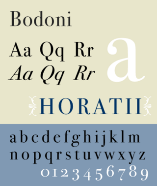
Bodoni is the name given to the serif typefaces first designed by Giambattista Bodoni (1740–1813) in the late eighteenth century and frequently revived since. Bodoni's typefaces are classified as Didone or modern. Bodoni followed the ideas of John Baskerville, as found in the printing type Baskerville—increased stroke contrast reflecting developing printing technology and a more vertical axis—but he took them to a more extreme conclusion. Bodoni had a long career and his designs changed and varied, ending with a typeface of a slightly condensed underlying structure with flat, unbracketed serifs, extreme contrast between thick and thin strokes, and an overall geometric construction.

<span class="mw-page-title-main">Gill Sans</span> Humanist sans-serif typeface family developed by Monotype

Gill Sans is a humanist sans-serif typeface designed by Eric Gill and released by the British branch of Monotype from 1928 onwards.

<span class="mw-page-title-main">Stanley Morison</span> British typographer (1889–1967)

Stanley Arthur Morison was a British typographer, printing executive and historian of printing. Largely self-educated, he promoted higher standards in printing and an awareness of the best printing and typefaces of the past.

<span class="mw-page-title-main">Caslon</span> Typeface with serifs

Caslon is the name given to serif typefaces designed by William Caslon I (c. 1692–1766) in London, or inspired by his work.

<span class="mw-page-title-main">Bembo</span> Serif typeface in 1495 Venetian style

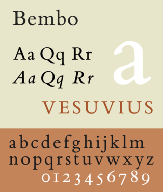
Bembo is a serif typeface created by the British branch of the Monotype Corporation in 1928–1929 and most commonly used for body text. It is a member of the "old-style" of serif fonts, with its regular or roman style based on a design cut around 1495 by Francesco Griffo for Venetian printer Aldus Manutius, sometimes generically called the "Aldine roman". Bembo is named for Manutius's first publication with it, a small 1496 book by the poet and cleric Pietro Bembo. The italic is based on work by Giovanni Antonio Tagliente, a calligrapher who worked as a printer in the 1520s, after the time of Manutius and Griffo.

<span class="mw-page-title-main">Didone (typography)</span> Classification of serif typefaces

Didone is a genre of serif typeface that emerged in the late 18th century and was the standard style of general-purpose printing during the 19th century. It is characterized by:

<span class="mw-page-title-main">Bookman (typeface)</span> 1869 serif typeface

Bookman, or Bookman Old Style, is a serif typeface. A wide, legible design that is slightly bolder than most body text faces, Bookman has been used for both display typography, for trade printing such as advertising, and less commonly for body text. In advertising use it is particularly associated with the graphic design of the 1960s and 1970s, when revivals of it were very popular. It is also used as the official font of Indonesian laws since 2011.

<span class="mw-page-title-main">Baskerville</span> Transitional serif typeface designed in the 1750s

Baskerville is a serif typeface designed in the 1750s by John Baskerville (1706–1775) in Birmingham, England, and cut into metal by punchcutter John Handy. Baskerville is classified as a transitional typeface, intended as a refinement of what are now called old-style typefaces of the period, especially those of his most eminent contemporary, William Caslon.

<span class="mw-page-title-main">Perpetua (typeface)</span> Serif typeface

Perpetua is a serif typeface that was designed by the English sculptor and stonemason Eric Gill for the British Monotype Corporation. Perpetua was commissioned at the request of Stanley Morison, an influential historian of printing and adviser to Monotype around 1925, when Gill's reputation as a leading artist-craftsman was high. Perpetua was intended as a crisp, contemporary design that did not follow any specific historic model, with a structure influenced by Gill's experience of carving lettering for monuments and memorials. Perpetua is commonly used for covers and headings and also sometimes for body text and has been particularly popular in fine book printing. Perpetua was released with characters for the Greek alphabet and a matching set of titling capitals for headings.

<span class="mw-page-title-main">Bulmer (typeface)</span> Typeface

Bulmer is the name given to a serif typeface originally designed by punchcutter William Martin around 1790 for the Shakespeare Press, run by William Bulmer (1757–1830). The types were used for printing the Boydell Shakespeare folio edition.

<span class="mw-page-title-main">Plantin (typeface)</span> Typeface

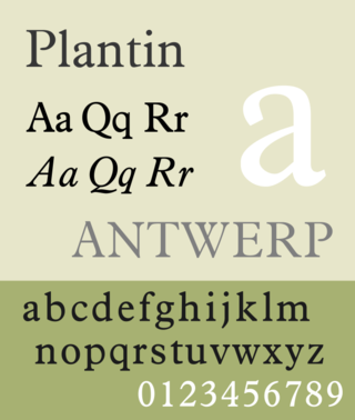
Plantin is an old-style serif typeface. It was created in 1913 by the British Monotype Corporation for their hot metal typesetting system and is named after the sixteenth-century printer Christophe Plantin. It is loosely based on a Gros Cicero roman type cut in the 16th century by Robert Granjon held in the collection of the Plantin–Moretus Museum, Antwerp.

<span class="mw-page-title-main">Ehrhardt (typeface)</span> Font

Ehrhardt is an old-style serif typeface released by the British branch of the Monotype Corporation in 1938. Ehrhardt is a modern adaptation of printing types of "stout Dutch character" from the Dutch Baroque tradition sold by the Ehrhardt foundry in Leipzig. These were cut by the Hungarian-Transylvanian pastor and punchcutter Miklós (Nicholas) Tótfalusi Kis while in Amsterdam in the period from 1680 to 1689.

<span class="mw-page-title-main">Miller & Richard</span>

Miller & Richard was a type foundry based in Edinburgh that designed and manufactured metal type. It operated from 1809 to 1952.

<span class="mw-page-title-main">Old Style (Miller & Richard)</span>

Old Style or Modernised Old Style was the name given to a series of serif typefaces cut from the mid-nineteenth century and sold by the type foundry Miller & Richard, of Edinburgh in Scotland. It was a standard typeface in Britain for literary and prestigious printing in the second half of the nineteenth century and the early twentieth century, with many derivatives and copies released.

<span class="mw-page-title-main">Fat face</span> Style of display typeface and lettering

In typography, a fat face letterform is a serif typeface or piece of lettering in the Didone or modern style with an extremely bold design. Fat face typefaces appeared in London around 1805–1810 and became widely popular; John Lewis describes the fat face as "the first real display typeface."

<span class="mw-page-title-main">Caslon Type Foundry</span> English type foundry, founded c. 1720

The Caslon type foundry was a type foundry in London which cast and sold metal type. It was founded by the punchcutter and typefounder William Caslon I, probably in 1720. For most of its history it was based at Chiswell Street, Islington, was the oldest type foundry in London, and the most prestigious.

References

  1. 1 2 3 4 5 6 7 Johnston, Alastair (2014). Transitional Faces: The Lives & Work of Richard Austin, type-cutter, and Richard Turner Austin, wood-engraver. Berkeley: Poltroon Press. ISBN   978-0918395320 . Retrieved 8 February 2017.
  2. Kalman A. Burnim; Philip H. Highfill (1998). John Bell, Patron of British Theatrical Portraiture: A Catalog of the Theatrical Portraits in His Editions of Bell's Shakespeare and Bell's British Theatre. SIU Press. p. 5. ISBN   978-0-8093-2123-0.
  3. 1 2 3 Mosley, James (1796). A Specimen of Printing Types & Various Ornaments 1796: Reproduced Together with the Sale Catalogue of the British Letter-Foundry 1797. Printing Historical Society. pp.  5–12. ISBN   9780900003103.
  4. Johnson, Alfred F. (1930). "The Evolution of the Modern-Face Roman". The Library. s4-XI (3): 353–377. doi:10.1093/library/s4-XI.3.353.
  5. Neil Macmillan (2006). An A-Z of Type Designers. Yale University Press. pp. 38–9. ISBN   0-300-11151-7.
  6. Stanley Morison (1 October 2009). The English Newspaper, 1622-1932: An Account of the Physical Development of Journals Printed in London. Cambridge University Press. pp. 185–201. ISBN   978-0-521-12269-6.
  7. Tracy, Walter. Letters of Credit. p. 67.
  8. Stanley Morison (19 November 2009). John Bell, 1745-1831: A Memoir. Cambridge University Press. pp. 15–25. ISBN   978-0-521-14314-1.
  9. "Austin". Commercial Type. Retrieved 13 July 2015.
  10. Barnes, Paul. "New typefaces for The Daily Telegraph". Commercial Type. Retrieved 8 February 2017.
  11. Barnes, Paul. "New release: Austin News by Paul Barnes". Commercial Type. Retrieved 8 February 2017.
  12. Schwartz, Christian. "Austin". Schwartzco. Retrieved 8 February 2017.
  13. Barker, Hannah (2004). "Bell, John (1745–1831), printer and bookseller". Oxford Dictionary of National Biography (online ed.). Oxford University Press. doi:10.1093/ref:odnb/2014.(Subscription or UK public library membership required.)
  14. Mosley, James; Austin, Richard. "Richard Austin's Address to Printers, 1819". Type Foundry (blog). Retrieved 8 February 2017.
  15. Mosley, James. "Scotch Roman". Type Foundry (blog). Retrieved 3 September 2016.
  16. Provan, Archie, and Alexander S. Lawson, 100 Type Histories (volume 1), National Composition Association, Arlington, Virginia, 1983, p. 22.
  17. Mosley, James. "John Baskerville". Oxford Dictionary of National Biography . Archived from the original on 11 February 2017. Retrieved 10 February 2017.
  18. 1 2 McGrew, Mac, American Metal Typefaces of the Twentieth Century, Oak Knoll Books, New Castle Delaware, 1993, ISBN   0-938768-34-4, p. 29.
  19. Macmillsn, Niel.An A-Z of Type Designers. Yale University Press, 2006 (pg. 38-39)
  20. Mosley, Professor James. "Two versions of Bell (comments on Typophile thread)". Typophile (archived). Archived from the original on May 15, 2013. Retrieved 13 July 2015.
  1. Austin's biographer Alastair Johnston describes these as "a profound innovation…perfectly to scale with the rest of the font" and cites William Caslon's large display "proscription letters" of the 1770s as the influence." [1]
  2. Monotype has offered stylistic alternate capitals with and without swashes. The version bundled with Microsoft Office excludes these, for instance on the 'N', but they are included in professional releases.
  3. The Romain du Roi was a custom typeface of new design created in the seventeenth century by the French government. Its advanced design moved on from conservative styles of typefounding in the style developed by Claude Garamond and others in the sixteenth century, which dominated printing styles until the mid-to-late eighteenth.
  4. The Bell typeface is not what is now called an "old face" or "old-style" serif font.
  5. "Copperplate" is a reference to copperplate engraving. During the eighteenth century, at a time when type design was relatively conservative, different styles of letter were favoured by copperplate engravers who performed custom lettering, creating a divergence in style between print and lettering which Austin's work bridged. [17]
  6. Nonetheless, Johnston endorses Morison's biographer Barker's view that the Monotype revival is "not a perfect rendering" of the original design due to a rushed production schedule, so it could be used in Morison's book on the history of English newspapers. [1]