Jean Jannon

Last updated

The matrices of Jannon's Imprimerie nationale type. Jannon Romain de l'Universite matrices.jpg
The matrices of Jannon's Imprimerie nationale type.

Jean Jannon (died 20 December 1658) [1] was a French Protestant printer, type designer, punchcutter and typefounder active in Sedan in the seventeenth century. He was a reasonably prolific printer by contemporary standards, printing several hundred books. [2] [3]

Contents

Career

Jannon began his career as a printer, first attested in Paris, where he apparently worked for the Estienne family in his early career, and then in Sedan. He mentions in one preface of hearing of the early history of printing in Mainz, so possibly he served an apprenticeship in Germany. [2]

Jannon may have left Paris due to lack of work there or personal conflicts: his friend at the time, diarist Pierre de L'Estoile, recorded in his diary that he met with disapproval with Huguenot authorities for taking on the job of printing a piece of Catholic propaganda. According to d'Estoile the response of formal approbation from local Huguenot authorities "upset him badly", and he commented that they would be worse than Jesuits if given the chance. [3] [2] [4]

Jannon married first Anne de Quingé, who died in 1618. Two years later he married Marie Demangin, who had had left her husband. A report from the Council of the Reformed Church of Mainz confirming that the remarriage was acceptable described as her former husband's conduct as a proven series of "adulteries, polygamies and debaucheries". [2] [5]

After working in Paris Jannon established a career as printer for the Protestant Academy of Sedan in what is now north-eastern France. Sedan at the time enjoyed an unstable independence as a principality at a time when the French government had conceded through the Edict of Nantes to allowing a complicated system of restricted liberties for Protestants. [6] He also established a second career as a punchcutter, in his thirties by his report. [2] [7] In 1640 he left Sedan and returned to Paris. [2] Despite his religious views, the royal printing office of France bought matrices, moulds used to cast metal type, from him in 1641 for three large size of type. These matrices survive and remain in the government collection. He was otherwise particularly respected for his engraving of an extremely small size of type, known as Sédanoise, which was popular. [8] [9]

In 1640, Jannon left Sedan for Paris to take over the press of his son, who had recently died. [10] Four years later, his printing office in Caen was raided by authorities concerned that he may have been publishing banned material. While not imprisoned, Jannon ultimately returned to Sedan and spent the rest of his life there. [10] [11]

Following his death, the printing-office at Sedan continued in operation; his family gave up his type foundry in 1664. It was reported to been taken over by Langlois in Paris, although Abraham van Dijck in the 1670s said he intended to buy matrices from Sedan so (if his information was not out of date) some materials might have remained there. [12]

Types

Jannon engraved decorative material, signed with an II monogram. [2] He took up engraving metal type-quite late in life by the standards of the period, in his thirties by his report. Jannon wrote in his 1621 specimen that:

Seeing that for some time many persons have had to do with the art [of printing] who have greatly lowered it…the desire came upon me to try if I might imitate, after some fashion, some one among those who honourably busied themselves with the art, [men whose deaths] I hear regretted every day [Jannon mentions some eminent printers of the previous century]…and inasmuch as I could not accomplish this design for lack of types which I needed…[some typefounders] would not, and others could not furnish me with what I lacked [so] I resolved, about six years ago, to turn my hand in good earnest to the making of punches, matrices and moulds for all sorts of characters, for the accommodation both of the public and of myself. [13]

Jannon was one of the few punchcutters active in early seventeenth century France. This is perhaps owing to an economic decline over the previous century and due to pre-existing typefaces made during the mid-sixteenth century saturating the market. [14]

Jannon's typefaces are based on the style of the previous century, especially the roman. Some differences in the roman are his characteristic 'a' with a curved bowl and the top left serifs of letters such as 'm' and 'p', with a distinctive scooped-out form. [lower-alpha 1] His italics are more distinctive and eccentric, being steeply slanted and with very obviously variable angle of slant on the capitals. Opinions on the aesthetic quality of his type has varied: Warde thought it "so technically brilliant as to be decadent...of slight value as a book face", H. D. L. Vervliet described it as "famous not so much for the quality of the design but as for the long-term confusion it created" and Hugh Williamson considered his type to lack the "perfection of clarity and grace" of the sixteenth century, although many reproductions of his work were certainly popular in printing in the twentieth century. [16] [13]

Garamond misattribution

An excerpt from Jannon's specimen of 1621. Jannon Gros Canon specimen.gif
An excerpt from Jannon's specimen of 1621.

Despite a distinguished career as a printer, Jannon is perhaps most famous for a long-lasting historical misattribution. In 1641, the Imprimerie royale, or royal printing office, purchased matrices, the moulds used to cast metal type, from him. [lower-alpha 2] By the mid-nineteenth century, Jannon's matrices formed the only substantial collection of printing materials in the Latin alphabet left in Paris from before the eighteenth century. [20] The matrices came to be attributed to Claude Garamond (d. 1561), a revered punchcutter of the sixteenth century who was known to have made punches for the government in the Greek alphabet, albeit a century before the Imprimerie was established. [7] [13] [21] [22] The attribution came to be considered certain by the Imprimerie's director Arthur Christian. Doubt began to be raised by historian Jean Paillard in 1914, but he died in the First World War soon after publishing his conclusions and his work remained little-read. [7] [18] [23] [24]

Several early revivals of Jannon's type were made under the name of 'Garamond'. [18] 'Garamond' fonts actually based on Jannon's work include American Type Founders' Garamond, later reissued by Linotype as Garamond No. 3, Monotype Garamond, the version included with Microsoft Office, and Frederic Goudy's Garamont (following the most common spelling of Garamond's name in his lifetime). The mistake was finally disproved in 1926 by Beatrice Warde (writing under the pseudonym of "Paul Beaujon"), based on the work of Paillard and her discovery of material printed by Jannon himself in London and Paris libraries. [lower-alpha 3] A former librarian at American Type Founders, she had been privately told by the company's archivist Henry Lewis Bullen (perhaps aware of Paillard's work) that he doubted his company's "Garamond" was really from the sixteenth century, noting that he could not find it used in a book from the period. [22]

František Štorm's 2010 revival, Jannon Pro, is one of the few modern revivals of Jannon's work released under his name. [27] [28] [29] [30]

Caractères de l'Université

Jannon's type from an Imprimerie nationale specimen. The 'J' is a later addition. Jean Jannon Imprimerie specimen.jpg
Jannon's type from an Imprimerie nationale specimen. The 'J' is a later addition.

By the nineteenth century, Jannon's matrices had come to be known as the Caractères de l'Université (Characters of the University). [7] [19] [20] The origin of this name is uncertain. It has sometimes been claimed that this term was an official name designated for the Jannon type by Cardinal Richelieu, [31] while Warde in 1926 more plausibly suggested it might be a garbled recollection of Jannon's work with the Sedan Academy, which operated much like a university despite not using the name. Carter in the 1970s followed this conclusion. [17] Mosley, however, concludes that no report of the term (or much use of Jannon's type at all) exists before the nineteenth century, and it may originate from a generic term of the previous century simply meaning older or more conservative typeface designs, perhaps those preferred in academic publishing. [20]

Jannon's specimen survives in a single copy at the Bibliothèque Mazarine in Paris. [lower-alpha 4] Warde, again under the pseudonym of Beaujon, published a facsimile reprint in 1927. [32]

Notes

  1. Vervliet provides an eight-way comparison of Jannon's type with seven typefaces of the previous century. [15]
  2. The contract is actually made for one 'Nicholas Jannon', which historians have assumed to be a mistake. [17] Despite the purchase, it is not clear that the office ever much used Jannon's type: historian James Mosley has reported being unable to find books printed by the Imprimerie that use more than a few specific sizes of italic, although "it is not easy to prove a negative". [18] [19]
  3. Warde's persona of 'Paul Beaujon' was intended to gain her more respect in a masculine industry; Warde later said she imagined him to have "[a] long grey beard, four grandchildren, a great interest in antique furniture and a rather vague address in Montparesse." [25] Typifying her sense of humour, she reported her conclusions to her editor Stanley Morison, a convert to Catholicism, with a telegram beginning "JANNON SPECIMEN SIMPLY GORGEOUS SHOWS ALL SIZES HIS TYPES WERE APPROPRIATED BY RAPACIOUS PAPIST GOVERNMENT..." [26] (Warde at the time believed that the raid in Caen had been the source of the Imprimerie's types, since at the time the purchase order was not known.) She noted in later life that her readers were surprised to see an article supposedly by a Frenchman quoting The Hunting of the Snark . [25]
  4. Mosley notes that J.B. Brincourt, Jannons's main French biographer, wrote a description of his specimen that does not match the known copy, but if he had seen "another and a more complete copy of the specimen" its location is not known. [19]

Related Research Articles

<span class="mw-page-title-main">Garamond</span> Typeface family

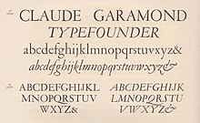
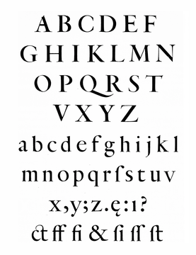
Garamond is a group of many serif typefaces, named for sixteenth-century Parisian engraver Claude Garamond, generally spelled as Garamont in his lifetime. Garamond-style typefaces are popular and particularly often used for book printing and body text.

<span class="mw-page-title-main">Italic type</span> Font style characterised by cursive typeface and slanted design

In typography, italic type is a cursive font based on a stylised form of calligraphic handwriting. Along with blackletter and roman type, it served as one of the major typefaces in the history of Western typography.

<span class="mw-page-title-main">Caslon</span> Typeface with serifs

Caslon is the name given to serif typefaces designed by William Caslon I (c. 1692–1766) in London, or inspired by his work.

<span class="mw-page-title-main">Bembo</span> Serif typeface in 1495 Venetian style

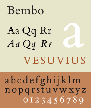
Bembo is a serif typeface created by the British branch of the Monotype Corporation in 1928–1929 and most commonly used for body text. It is a member of the "old-style" of serif fonts, with its regular or roman style based on a design cut around 1495 by Francesco Griffo for Venetian printer Aldus Manutius, sometimes generically called the "Aldine roman". Bembo is named for Manutius's first publication with it, a small 1496 book by the poet and cleric Pietro Bembo. The italic is based on work by Giovanni Antonio Tagliente, a calligrapher who worked as a printer in the 1520s, after the time of Manutius and Griffo.

<span class="mw-page-title-main">Punchcutting</span> Craft used in traditional typography

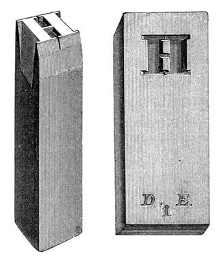
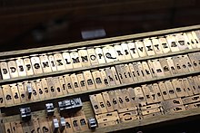
Punchcutting is a craft used in traditional typography to cut letter punches in steel as the first stage of making metal type. Steel punches in the shape of the letter would be used to stamp matrices into copper, which were locked into a mould shape to cast type. Cutting punches and casting type was the first step of traditional typesetting. The cutting of letter punches was a highly skilled craft requiring much patience and practice. Often the designer of the type would not be personally involved in the cutting.

<span class="mw-page-title-main">Claude Garamond</span> French publisher and type designer

Claude Garamont, known commonly as Claude Garamond, was a French type designer, publisher and punch-cutter based in Paris. Garamond worked as an engraver of punches, the masters used to stamp matrices, the moulds used to cast metal type. He worked in the tradition now called old-style serif design, which produced letters with a relatively organic structure resembling handwriting with a pen but with a slightly more structured and upright design. Considered one of the leading type designers of all time, he is recognised to this day for the elegance of his typefaces. Many old-style serif typefaces are collectively known as Garamond, named after the designer.

<span class="mw-page-title-main">Plantin–Moretus Museum</span> Printing museum in Antwerp, Belgium

The Plantin–Moretus Museum is a printing museum in Antwerp, Belgium which focuses on the work of the 16th-century printers Christophe Plantin and Jan Moretus. It is located in their former residence and printing establishment, the Plantin Press, at the Vrijdagmarkt in Antwerp, and has been a UNESCO World Heritage Site since 2005.

<span class="mw-page-title-main">Janson</span> Typeface

Janson is the name given to a set of old-style serif typefaces from the Dutch Baroque period, and modern revivals from the twentieth century. Janson is a crisp, relatively high-contrast serif design, most popular for body text.

<span class="mw-page-title-main">Beatrice Warde</span> American art historian

Beatrice Lamberton Warde was a twentieth-century writer and scholar of typography. As a marketing manager for the British Monotype Corporation, she was influential in the development of printing tastes in Britain and elsewhere in the mid-twentieth century and was recognized at the time as "[o]ne of the few women typographers in the world". Her writing advocated higher standards in printing, and championed intelligent use of historic typefaces from the past, which Monotype specialised in reviving, and the work of contemporary typeface designers.

<span class="mw-page-title-main">Bell (typeface)</span> Typeface

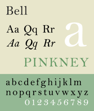
Bell is the name given to a serif typeface designed and cut in 1788 by the punchcutter Richard Austin for the British Letter Foundry, operated by publisher John Bell, and revived several times since.

<span class="mw-page-title-main">Granjon</span> Typeface

Granjon is an old-style serif typeface designed by George W. Jones around 1924 for the British branch of the Linotype company, and based on the Garamond typeface that was used in a book printed by the Parisian Jean Poupy in 1592. The roman design was from Claude Garamond and the italic version was from Robert Granjon. Because several other Garamonds were on the market in the 1920s, Jones decided to name his type Granjon. Jones, a master printer based in London, had been engaged by Linotype to improve the quality of their typeface range through the development of revivals of notable type designs of the past.

<span class="mw-page-title-main">Plantin (typeface)</span> Typeface

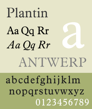
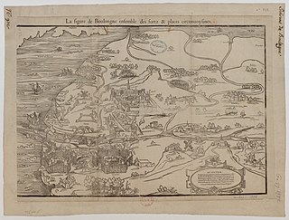
Plantin is an old-style serif typeface. It was created in 1913 by the British Monotype Corporation for their hot metal typesetting system and is named after the sixteenth-century printer Christophe Plantin. It is loosely based on a Gros Cicero roman type cut in the 16th century by Robert Granjon held in the collection of the Plantin–Moretus Museum, Antwerp.

<span class="mw-page-title-main">Robert Granjon</span> French type designer and printer

Robert Granjon was a French punchcutter, a designer and creator of metal type, and printer. He worked in Paris, Lyon, Antwerp, and Rome. He is best known for having introduced the typeface style Civilité, for his many italic types and his fleuron designs, although he worked across all genres of typeface and alphabet across his long career.
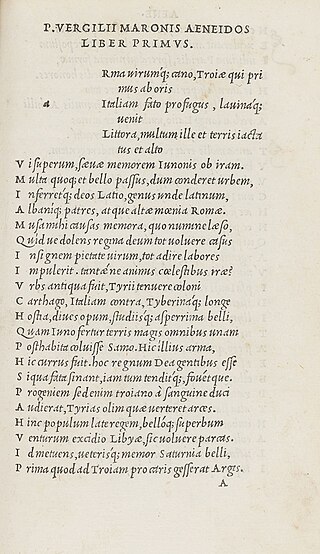
<i>Grecs du roi</i> Greek typeface by Claude Garamond

Les grecs du roi are a celebrated and influential Greek alphabet typeface in the Greek minuscule style which was cut by the French punchcutter Claude Garamond between 1541 and 1550. Arthur Tilley calls the books printed from them "among the most finished specimens of typography that exist".

<span class="mw-page-title-main">Henry Lewis Bullen</span> American printer and archivist

Henry Lewis Bullen was an American printer and typographic archivist.

<span class="mw-page-title-main">Christoffel van Dijck</span> Dutch type designer

Christoffel van Dijck was a German-born Dutch punchcutter and typefounder, who cut punches and operated a foundry for casting metal type. Van Dijck's type was widely used at a time when Amsterdam had become a major centre of world printing.

<span class="mw-page-title-main">H. D. L. Vervliet</span> Belgian librarian and historian (1923–2020)

Hendrik Désiré Louis 'Dis' Vervliet was a Belgian librarian and historian of books and printing.

<span class="mw-page-title-main">Hendrik van den Keere</span> 16th-century punchcutter

Hendrik van den Keere was a punchcutter, or cutter of punches to make metal type, who lived in Ghent in modern Belgium.

<span class="mw-page-title-main">Pierre Haultin</span> French printer and publisher

Pierre Haultin was a French printer, publisher, punchcutter and typefounder.

<span class="mw-page-title-main">Caslon Type Foundry</span> English type foundry, founded c. 1720

The Caslon type foundry was a type foundry in London which cast and sold metal type. It was founded by the punchcutter and typefounder William Caslon I, probably in 1720. For most of its history it was based at Chiswell Street, Islington, was the oldest type foundry in London, and the most prestigious.

References

  1. "Jean Jannon (1580–1658)". data.bnf.fr. Bibliothèque nationale de France . Retrieved 17 December 2019.
  2. 1 2 3 4 5 6 7 Williamson, Hugh (1987–1988). "Jean Jannon of Sedan (series of articles)". Bulletin of the Printing Historical Society.
  3. 1 2 Tom Hamilton (13 April 2017). Pierre de L'Estoile and his World in the Wars of Religion. OUP Oxford. p. 186. ISBN   978-0-19-252047-0.
  4. de L'Estoile, Pierre (1825). Collection complète des Mémoires relatifs à l'histoire de France: depuis le règne de Philippe-Auguste, jusqu'au commencement du dix-septième siècle. Foucault. p. 356.
  5. Brincourt, J.B. (1894). "Jean Jannon, ses fils, leurs oeuvres". Revue d'Ardenne et d'Argonne: 97–122. Retrieved 3 October 2017.
  6. Maag, Karin (2002). "The Huguenot academies: an uncertain future". In Mentzer, Raymond; Spicer, Andrew (eds.). Society and culture in the Huguenot world : 1559–1685. Cambridge: Cambridge University Press. pp. 139–156. ISBN   9780521773249 . Retrieved 31 January 2016.
  7. 1 2 3 4 Mosley, James. "Garamond or Garamont". Type Foundry blog. Retrieved 3 December 2015.
  8. Thomas Hartwell Horne (1814). An Introduction to the Study of Bibliography; to which is Prefixed a Memoir on the Public Libraries of the Ancients. G. Woodfall. p. 81.
  9. Bouillot, Jean Baptiste Joseph (1830). Biographie ardennaise, ou Histoire des Ardennais (in French). Vol. 2. pp. 56–61.
  10. 1 2 Malcolm, Noel (2002). Aspects of Hobbes. Oxford: Clarendon Press. pp. 267–8. ISBN   9780191529986 . Retrieved 31 January 2016.
  11. Shalev, Zur (2012). "Samuel Bochart's Protestant Geography". Sacred words and worlds: geography, religion, and scholarship, 1550–1700. Leiden: Brill. pp. 141, 164. ISBN   9789004209350 . Retrieved 31 January 2016.
  12. Lane, John A. (1996). "From the Grecs du Roi to the Homer Greek: Two Centuries of Greek Printing Types in the Wake of Garamond". In Macrakis, Michael S. (ed.). Greek Letters: From Tablets to Pixels (PDF). Oak Knoll Press. p. 116. ISBN   9781884718274.
  13. 1 2 3 4 5 Warde, Beatrice (1926). "The 'Garamond' Types". The Fleuron: 131–179.
  14. Vervliet, Hendrik D.L. (2010). French Renaissance Printing Types: a Conspectus. New Castle, Del.: Oak Knoll Press. pp. 23–32. ISBN   978-1584562719.
  15. Hendrik D. L. Vervliet (2008). The Palaeotypography of the French Renaissance: Selected Papers on Sixteenth-century Typefaces. BRILL. pp. 157–160. ISBN   978-90-04-16982-1.
  16. Alexander Nesbitt (1998). The History and Technique of Lettering. Courier Corporation. pp. 126–7. ISBN   978-0-486-40281-9.
  17. 1 2 Morison, Stanley; Carter, Harry (1973). Carter, Harry (ed.). A Tally of Types . Cambridge University Press. p.  129. ISBN   9780521200431 . Retrieved 31 January 2016.
  18. 1 2 3 Mosley, James (2006). "Garamond, Griffo and Others: The Price of Celebrity". Bibiologia: 17–41. Retrieved 3 December 2015.
  19. 1 2 3 Mosley, James. "The types of Jean Jannon at the Imprimerie royale" . Retrieved 3 December 2015.
  20. 1 2 3 Mosley, James. "Caractères de l'Université". Type Foundry. Retrieved 3 December 2015.
  21. "Jannon". French Ministry of Culture.
  22. 1 2 Haley, Allan (1992). Typographic milestones ([Nachdr.]. ed.). Hoboken, NJ: John Wiley & Sons. pp. 125–127. ISBN   978-0-471-28894-7.
  23. Morison, Stanley; Carter, Harry (1973). A tally of types (New ed. with additions by several hands ed.). Cambridge: Cambridge University Press. pp. 129–130. ISBN   978-0-521-09786-4.
  24. Paillard, Jean (1914). Claude Garamont, graveur et fondeur de lettres. Paris: Ollière. Retrieved 31 January 2016.
  25. 1 2 De Bondt, Sara. "Beatrice Warde: Manners and type". Eye Magazine. Retrieved 3 December 2015.
  26. Haley, Allan (15 September 1992). Typographic Milestones. John Wiley. p. 126. ISBN   9780471288947 . Retrieved 8 March 2016.
  27. Paul Shaw (April 2017). Revival Type: Digital Typefaces Inspired by the Past. Yale University Press. pp. 65–69. ISBN   978-0-300-21929-6.
  28. "Jannon Pro". MyFonts. Storm Type. Retrieved 11 December 2015.
  29. Storm, František. "Storm Jannon specimen". Storm Type. Retrieved 11 December 2015.
  30. Storm, František. "Jannon Sans". Storm Type. Retrieved 11 December 2015.
  31. Loxley, Simon (31 March 2006). Type. pp. 41–2. ISBN   978-0-85773-017-6.
  32. Warde, Beatrice (1927). The 1621 Specimen of Jean Jannon, Paris and Sedan, Designer and Engraver of the "Caractères de L'Université" Now Owned by the "Imprimerie Nationale", Paris, Edited in Facsimile with an Introduction.