Goudy Old Style

Last updated
Goudy Old Style
GoudyOSPecimen.svg
Category Serif
Classification Old-style
Designer(s) Frederic W. Goudy
Foundry American Type Founders
Date released1915
Re-issuing foundries Lanston Monotype
Intertype
Ludlow

Goudy Old Style (also known as just Goudy) is an old-style serif typeface originally created by Frederic W. Goudy for American Type Founders (ATF) in 1915.

Contents

Suitable for text and display applications, Goudy Old Style matches the historicist trend of American printing in the early twentieth century, taking inspiration from the printing of the Italian Renaissance without a specific historical model. [1] [2] Eccentricities include the upward-curved ear on the g and the diamond shape of the dots of the i, j, and the points found in the period, colon and exclamation point, and the sharply canted hyphen. The design is relatively light in colour. [3]

History

The set of fonts in the Goudy 'family' in ATF's 1923 specimen book: the Goudy Old Style, Goudy Catalogue and Goudy Handtooled subfamilies. Goudy Cursive is effectively Goudy Old Style with swashes. Goudy Type Family.jpg
The set of fonts in the Goudy 'family' in ATF's 1923 specimen book: the Goudy Old Style, Goudy Catalogue and Goudy Handtooled subfamilies. Goudy Cursive is effectively Goudy Old Style with swashes.

In Goudy's autobiography, he described the italic based on study of sixteenth-century italics: "I studied many of the older italics and came to the conclusion that...some of the outstanding italics of the sixteenth century had little or no inclination and yet preserved their italic character". [4]

Several variants, designed by several designers, were released in the ensuing years (all faces ATF unless otherwise specified). [5] By Goudy:

By Morris Fuller Benton:

By others:

The face was an instant best seller, prompting ATF to issue a special 124-page specimen book of the series in 1927. The descenders of Goudy Old Style were kept short at ATF's insistence to allow tight line setting on their common line system, to Goudy's irritation. [7] In addition, he sold the design to ATF for $1500 and received no royalty, causing his relationship with the foundry to deteriorate.

Hot metal copies

Goudy ATF specimen.jpg
"Goudy Cursive", ATF's expansion of the design with additional swash characters. Goudy Cursive cropped.jpg
"Goudy Cursive", ATF's expansion of the design with additional swash characters.

The face was immediately licensed to Lanston Monotype and some of the weights were issued by Intertype as well. Ludlow called its 1924 knock-off the Number Eleven series. [8] Monotype's designer F.H. Pierpont, better known for Rockwell and Monotype Grotesque, designed a similar face named Horley Old Style, adding a distinct influence of Caslon designs. [9]

Cold type copies

As the face was a "classic" almost from the day of its issue, producers of cold type offered their own versions of Goudy Old Style under the following names: [10]

Digital copies

A sample of Goudy Old Style in original metal type. Goudy Old Style sample metal.jpg
A sample of Goudy Old Style in original metal type.

Commercial releases have been made by Monotype, Fontsite, DTP Types, Electric Typographer, Lanston Type, Bitstream, URW++ (bundled with Microsoft Office), Adobe, and Linotype. As many early digitisations were sublicensed, several of these may represent the same digitisation marketed by different rights-holders, possibly upgraded with modern features such as contextual ligature substitution and small caps. LTC's digitisation includes the calligraphic and swash alternate characters, as well as small caps. [11] Goudy Catalog has been copied by Scangraphic, Bitstream, URW++, and Elsner+Flake. A version called Goudy Schoolbook also exists, with single-story versions of the letters a and g, but it is not for sale to the general public. (The digitisation bundled with Microsoft Office lacks all these features; it does include ligatures, but they must be inserted manually.)

'Sorts Mill Goudy' is an open-source revival created by Barry Schwartz as part of the League of Movable Type project, which contains small capitals and other OpenType features. [12] Bhikkhu Pesala expanded this under the name 'Sukhumala', adding bold, bold italic and handtooled styles. [13]

ATF's other related fonts, Goudy Handtooled and Goudy Catalog, have also been digitised, again with a variety of companies holding some rights although only LTC's release includes Handtooled Italic. [14] [15] [16] Goudy Title has not been digitised under that name.

Usage

Goudy Old Style is the text typeface used in Harper's Magazine .[ citation needed ] It is also the typeface used for headings in The Spectator . [17] It is the official typeface of Emory University in Atlanta, Georgia, Lewis & Clark College in Portland, Oregon, Moravian College in Bethlehem, Pennsylvania, Northwestern University in Evanston, Illinois, Clemson University in Clemson, South Carolina, and Hamilton College in Clinton, New York. It is also used by the National University of Colombia. [18] It is also the standard body text font for Key Club publications.[ citation needed ] The bold italic weight is used for the wordmark of Whittard's.[ citation needed ]

See also

Related Research Articles

<span class="mw-page-title-main">Futura (typeface)</span> Geometric sans-serif typeface

Futura is a geometric sans-serif typeface designed by Paul Renner and released in 1927. It was designed as a contribution on the New Frankfurt-project. It is based on geometric shapes, especially the circle, similar in spirit to the Bauhaus design style of the period. It was developed as a typeface by the Bauer Type Foundry, in competition with Ludwig & Mayer's seminal Erbar typeface of 1926.

<span class="mw-page-title-main">Frederic Goudy</span> American printer and type designer (1865–1947)

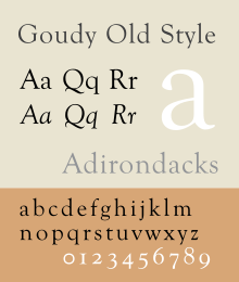
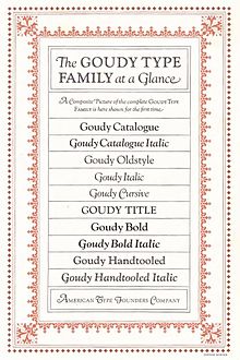
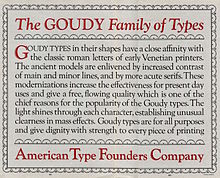
Frederic William Goudy was an American printer, artist and type designer whose typefaces include Copperplate Gothic, Goudy Old Style and Kennerley. He was one of the most prolific of American type designers and his self-named type continues to be one of the most popular in America.

<span class="mw-page-title-main">Caslon</span> Typeface with serifs

Caslon is the name given to serif typefaces designed by William Caslon I (c. 1692–1766) in London, or inspired by his work.

<span class="mw-page-title-main">Bookman (typeface)</span> 1869 serif typeface

Bookman, or Bookman Old Style, is a serif typeface. A wide, legible design that is slightly bolder than most body text faces, Bookman has been used for both display typography, for trade printing such as advertising, and less commonly for body text. In advertising use it is particularly associated with the graphic design of the 1960s and 1970s, when revivals of it were very popular. It is also used as the official font of Indonesian laws since 2011.

<span class="mw-page-title-main">Albertus (typeface)</span> Typeface

Albertus is a glyphic serif display typeface designed by Berthold Wolpe in the period 1932 to 1940 for the British branch of the printing company Monotype. Wolpe named the font after Albertus Magnus, the thirteenth-century German philosopher and theologian.

<span class="mw-page-title-main">News Gothic</span> Grotesque sans-serif typeface

News Gothic is a sans-serif typeface designed by Morris Fuller Benton, and was released in 1908 by his employer American Type Founders (ATF). The typeface is similar in proportion and structure to Franklin Gothic, also designed by Benton, but lighter.

<span class="mw-page-title-main">Twentieth Century (typeface)</span> Geometric sans-serif typeface

Twentieth Century is a geometric sans-serif typeface designed by Sol Hess for Lanston Monotype in 1937. It was created as a competitor to the successful Futura typeface for Monotype's hot metal typesetting system. Like Futura it has a single-story 'ɑ' and a straight 'j' with no bend.

<span class="mw-page-title-main">Centaur (typeface)</span>

Centaur is a serif typeface by book and typeface designer Bruce Rogers, based on the Renaissance-period printing of Nicolas Jenson around 1470. He used it for his design of the Oxford Lectern Bible. It was given widespread release by the British branch of Monotype, paired with an italic designed by calligrapher Frederic Warde and based on the slightly later work of calligrapher and printer Ludovico Vicentino degli Arrighi. The italic has sometimes been named separately as the "Arrighi" italic.

<span class="mw-page-title-main">Clearface</span>

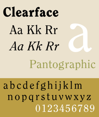
Clearface is a serif typeface designed by Morris Fuller Benton with the collaboration of his father Linn Boyd Benton, produced at American Type Founders in 1907.

Robert Wiebking (1870–1927) was a German-American engraver typeface designer who was known for cutting type matrices for Frederic Goudy from 1911 to 1926.

Sol Hess was an American typeface designer. After a three-year scholarship course at Pennsylvania Museum School of Industrial Design, he began at Lanston Monotype in 1902, rising to typographic manager in 1922. He was a close friend and collaborator with Monotype art director Frederic Goudy, succeeding him in that position in 1940. Hess was particularly adept at expanding type faces into whole families, allowing him to complete 85 faces for Monotype, making him America's fourth most prolific type designer. While he was with Monotype, Hess worked on commissions for many prominent users of type, including, Crowell-Collier, Sears Roebuck, Montgomery Ward, Yale University Press, World Publishing Company, and Curtis Publishing for whom he re-designed the typography of their Saturday Evening Post.

<span class="mw-page-title-main">Century type family</span>

Century is a family of serif type faces particularly intended for body text. The family originates from a first design, Century Roman, cut by American Type Founders designer Linn Boyd Benton in 1894 for master printer Theodore Low De Vinne, for use in The Century Magazine. ATF rapidly expanded it into a very large family, first by Linn Boyd, and later by his son Morris.

<span class="mw-page-title-main">University of California Old Style</span> 1938 serif typeface by Frederic Goudy

University of California Old Style is a serif typeface designed by Frederic Goudy and created for the University of California Press from 1936–8. It is one of Goudy's most popular serif typefaces. It is also known as Berkeley Old Style and Californian.

<span class="mw-page-title-main">Kennerley Old Style</span>

Kennerley Old Style is a serif typeface designed by Frederic Goudy. Kennerley is an "old-style" serif design, loosely influenced by Italian and Dutch printing traditions of the Renaissance and early modern period. It was named for New York publisher Mitchell Kennerley, who advanced Goudy money to complete the design. While Goudy had already designed 18 other typefaces, it was one of Goudy's most successful early designs in his own style. The regular or roman style was designed in 1911, the italic in 1918; bold styles followed in 1924.

<span class="mw-page-title-main">Deepdene (typeface)</span> Serif typeface

Deepdene is a serif typeface designed by Frederic Goudy from 1927–1933. It belongs to the "old-style" of serif font design, with low contrast between strokes and an oblique axis. However, Deepdene has crisp serifs and a nearly upright italic, with much less of a slant than is normal for this style.

<span class="mw-page-title-main">Cloister (typeface)</span> Serif typeface

Cloister is a serif typeface that was designed by Morris Fuller Benton and published by American Type Founders from around 1913. It is loosely based on the printing of Nicolas Jenson in Venice in the 1470s, in what is now called the "old style" of serif fonts. American Type Founders presented it as an attractive but highly usable serif typeface, suitable both for body text and display use.

<span class="mw-page-title-main">Cochin (typeface)</span> Serif typeface

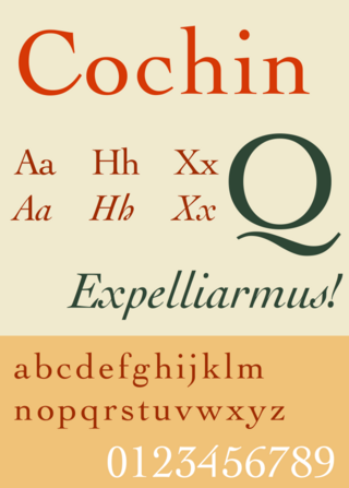
Cochin is a serif typeface. It was originally produced in 1912 by Georges Peignot for the Paris foundry G. Peignot et Fils and was based on the copperplate engravings of 18th century French artist Charles-Nicolas Cochin, from which the typeface also takes its name. The font has a small x-height with long ascenders. Georges Peignot also created the design 'Nicolas-Cochin' as a looser variation in the same style.

References

  1. Shinn, Nick. "The Golden Age of Hand Lettering in American Advertising". Type Culture. Retrieved 1 April 2017.
  2. Shinn, Nick. "Lacunae" (PDF). Codex. Retrieved 1 July 2015.
  3. Tracy, Walter (1986). Letters of Credit. pp. 137–8.
  4. Goudy, Frederic (1946). A Half-Century of Type Design and Typography: 1895-1945, Volume 1. New York: The Typophiles. p.  92 . Retrieved 18 November 2015. I had at some time or other copied a few letters of classic form from a portrait painting - I have always said "by Hans Holbein" but later search has never brought these particular pattern letters to light...I studied many of the older italics and came to the conclusion that...some of the outstanding italics of the sixteenth century had little or no inclination and yet preserved their italic character... Taking the Aldine italic as a starting point [I] succeeded in producing an original letter which, I believe, constituted the first distinctive italic in modern times.
  5. MacGrew, Mac, "American Metal Typefaces of the Twentieth Century," Oak Knoll Books, New Castle Delaware, 1993, pp. 160-161, ISBN   0-938768-34-4.
  6. "LTC Goudy Old Style Cursive". MyFonts. LTC. Retrieved 27 August 2015.
  7. Shaw, Paul. "Flawed Typefaces". Print magazine. Retrieved 30 June 2015.
  8. MacGrew, "American Metal Typefaces of the Twentieth Century," pp. 160-161.
  9. "Horley Old Style". MyFonts. Monotype. Retrieved 14 June 2015.
  10. Lawson, Alexander, Archie Provan, and Frank Romano, "Primer Metal Typeface Identification," National Composition Association, Arlington, Virginia, 1976, pp. 34 - 35.
  11. "LTC Goudy Oldstyle". MyFonts. Monotype. Retrieved 2 July 2015.
  12. Schwartz, Barry. "Sorts Mill Goudy". League of Movable Type. Retrieved 2 July 2015.
  13. Pesala, Bhikkhu. "Fonts". Softer Views. Retrieved 4 September 2015.
  14. "LTC Goudy Handtooled". MyFonts. LTC. Retrieved 27 August 2015.
  15. "Goudy Catalog MT". MyFonts. Monotype. Retrieved 31 August 2015.
  16. "Goudy Fontsite releases". Fontspring. Fontsite. Retrieved 31 August 2015.
  17. "Spectator Style Guide" . Retrieved 6 February 2024.
  18. Resolución No. 001008, Agosto 14 de 2003 Archived 2012-03-05 at the Wayback Machine , Universidad Nacional de Colombia, 14 August 2003