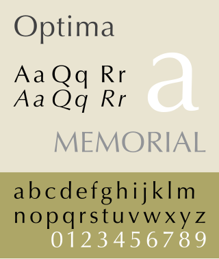
Optima is a humanist sans-serif typeface designed by Hermann Zapf and released by the D. Stempel AG foundry, Frankfurt, West Germany in 1958.

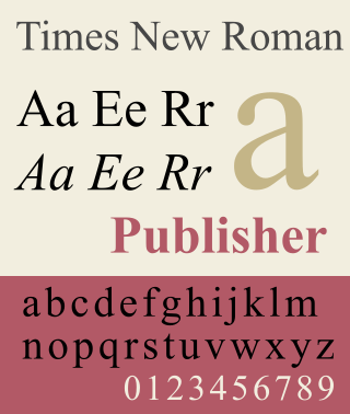
Times New Roman is a serif typeface commissioned for use by the British newspaper The Times in 1931. It has become one of the most popular typefaces of all time and is installed on most personal computers. The typeface was conceived by Stanley Morison, the artistic adviser to the British branch of the printing equipment company Monotype, in collaboration with Victor Lardent, a lettering artist in The Times's advertising department.

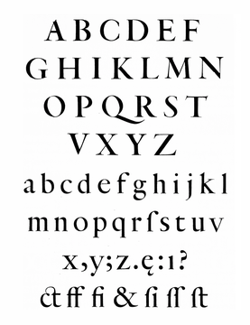
Garamond is a group of many serif typefaces, named for sixteenth-century Parisian engraver Claude Garamond, generally spelled as Garamont in his lifetime. Garamond-style typefaces are popular to this day and often used for book printing and body text.

Matthew Carter is a British type designer. A 2005 New Yorker profile described him as 'the most widely read man in the world' by considering the amount of text set in his commonly used typefaces.

Frutiger is a series of typefaces named after its Swiss designer, Adrian Frutiger. Frutiger is a humanist sans-serif typeface, intended to be clear and highly legible at a distance or at small text sizes. A popular design worldwide, type designer Steve Matteson described its structure as "the best choice for legibility in pretty much any situation" at small text sizes, while Erik Spiekermann named it as "the best general typeface ever".

Bodoni is the name given to the serif typefaces first designed by Giambattista Bodoni (1740–1813) in the late eighteenth century and frequently revived since. Bodoni's typefaces are classified as Didone or modern. Bodoni followed the ideas of John Baskerville, as found in the printing type Baskerville—increased stroke contrast reflecting developing printing technology and a more vertical axis—but he took them to a more extreme conclusion. Bodoni had a long career and his designs changed and varied, ending with a typeface of a slightly condensed underlying structure with flat, unbracketed serifs, extreme contrast between thick and thin strokes, and an overall geometric construction.

Caslon is the name given to serif typefaces designed by William Caslon I in London, or inspired by his work.

Claude Garamont, known commonly as Claude Garamond, was a French type designer, publisher and punch-cutter based in Paris. Garamond worked as an engraver of punches, the masters used to stamp matrices, the moulds used to cast metal type. He worked in the tradition now called old-style serif design, which produced letters with a relatively organic structure resembling handwriting with a pen but with a slightly more structured and upright design. Considered one of the leading type designers of all time, he is recognised to this day for the elegance of his typefaces. Many old-style serif typefaces are collectively known as Garamond, named after the designer.

The Plantin–Moretus Museum is a printing museum in Antwerp, Belgium which focuses on the work of the 16th-century printers Christophe Plantin and Jan Moretus. It is located in their former residence and printing establishment, the Plantin Press, at the Vrijdagmarkt in Antwerp, and has been a UNESCO World Heritage Site since 2005.

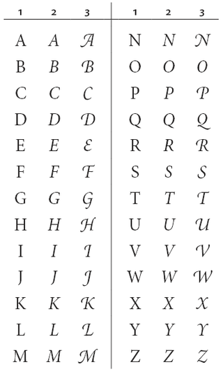
A swash is a typographical flourish, such as an exaggerated serif, terminal, tail, entry stroke, etc., on a glyph. The use of swash characters dates back to at least the 16th century, as they can be seen in Ludovico Vicentino degli Arrighi's La Operina, which is dated 1522. As with italic type in general, they were inspired by the conventions of period handwriting. Arrighi's designs influenced designers in Italy and particularly in France.

Sabon is an old-style serif typeface designed by the German-born typographer and designer Jan Tschichold (1902–1974) in the period 1964–1967. It was released jointly by the Linotype, Monotype, and Stempel type foundries in 1967. The design of the roman is based on types by Claude Garamond, particularly a specimen printed by the Frankfurt printer Konrad Berner. Berner had married the widow of a fellow printer Jacques Sabon, the source of the face's name, who had bought some of Garamond's type after his death. The italics are based on types designed by a contemporary of Garamond's, Robert Granjon. It is effectively a Garamond revival, though a different name was chosen as many other modern typefaces already carry this name.

Granjon is an old-style serif typeface designed by George W. Jones around 1924 for the British branch of the Linotype company, and based on the Garamond typeface that was used in a book printed by the Parisian Jean Poupy in 1592. The roman design was from Claude Garamond and the italic version was from Robert Granjon. Because several other Garamonds were on the market in the 1920s, Jones decided to name his type Granjon. Jones, a master printer based in London, had been engaged by Linotype to improve the quality of their typeface range through the development of revivals of notable type designs of the past.

ITC Avant Garde Gothic is a geometric sans serif font family based on the logo font used in the Avant Garde magazine. Herb Lubalin devised the logo concept and its companion headline typeface, and then he and Tom Carnase, a partner in Lubalin's design firm, worked together to transform the idea into a full-fledged typeface.

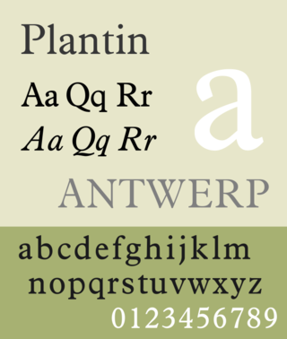
Plantin is an old-style serif typeface. It was created in 1913 by the British Monotype Corporation for their hot metal typesetting system and is named after the sixteenth-century printer Christophe Plantin. It is loosely based on a Gros Cicero roman type cut in the 16th century by Robert Granjon held in the collection of the Plantin–Moretus Museum, Antwerp.

Robert Granjon was a French punchcutter, a designer and creator of metal type, and printer. He worked in Paris, Lyon, Antwerp, and Rome. He is best known for having introduced the typeface style Civilité, for his many italic types and his fleuron designs, although he worked across all genres of typeface and alphabet across his long career.

Century is a family of serif type faces particularly intended for body text. The family originates from a first design, Century Roman, cut by American Type Founders designer Linn Boyd Benton in 1894 for master printer Theodore Low De Vinne, for use in The Century Magazine. ATF rapidly expanded it into a very large family, first by Linn Boyd, and later by his son Morris. With ATF no longer operating, a wide variety of variants and revivals with varying features and quality are available.
Mike Russell Parker was a British-born American typographer and type designer.

Les Grecs du roi are a celebrated and influential Greek alphabet typeface in the Greek minuscule style which was cut by the French punchcutter Claude Garamond between 1541 and 1550. Arthur Tilley calls the books printed from them "among the most finished specimens of typography that exist".

Hendrik van den Keere was a punchcutter, or cutter of punches to make metal type, who lived in Ghent in modern Belgium.


