Yale (typeface)

Last updated
Yale
Yale University logo.svg
Category Serif
Classification Old style serif
Designer(s) Matthew Carter
Commissioned by Yale University
Foundry Carter & Cone
Date released2004

Yale is an old style serif typeface designed by Matthew Carter and first released in 2004. It was commissioned by Yale University for use in all of its signage, promotional and internal material.

Contents

In 2010, Yale was named one of the "Ten Typefaces of the Decade" by Print magazine. [1] It is influenced by Bembo, a popular book typeface by Monotype, and is also similar to Carter's previous ITC Galliard. [2] [3]

Design

Carter, who has taught at the Yale School of Art since 1976, currently holding the rank of Senior Critic, [4] was asked to design a universal typeface for Yale University by John Gambell, the University Printer [5] Yale was first designed for signage on all Yale University buildings. Carter's first priority was therefore readability, as well as a balance between dignity and uniqueness. [6] Carter has said that this was the first time in designing a typeface that he focused more on capital than lowercase letters, since he knew that on the building signs the lettering would be in capitals. [5] Carter describes:

The signs, whether free-standing or attached to walls, reminded me of inscriptions, and this led me to think about the inscriptional origins of Roman caps and the everlasting problem of reconciling capitals with lowercase. For me, the moment when the first true synthesis occurred was in the type of De Aetna. This led me in turn to the Beinecke Library to pore over their copy of the book and its type—the archetype of Roman type for me. [5]

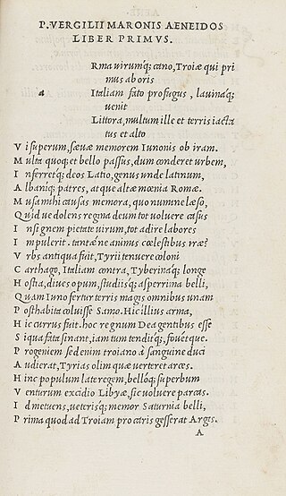
The late 15th century De Aetna typeface, cut by Francesco Griffo for Aldus Manutius, served as a basis for Yale, with elements of one of Carter's earlier typefaces, Galliard. [7] Some of Yale's unique characteristics are its curved leg of the "h", its flat-topped "A", its open apertures of the "c" and "e", and the bent tops of its lowercase ascenders. [8]

Variants

Although originally developed for use in signage, several variants have been added to the Yale family for use in print and on the web: [7]

In 2013, Matthew Carter [7] was commissioned by Yale to compile OpenType versions of the print faces, renamed to prevent confusion—“YaleNew.” These fonts were delivered in July 2014. They have replaced the earlier version of the typeface, described above, in the download package available to the Yale community. In addition to converting the typeface to the OpenType format, Carter reorganized the family and supplemented its fonts with additional accented characters, floating accents, a complete set of f-ligatures, true fractions, lowercase Greek characters, and manicules (fists). Carter developed these from hands found in a woodcut illustration in the Hypnerotomachia Polifili, published in 1499 by Aldus Manutius. All YaleNew fonts include the Yale logo, the Yale Shield, and the words “University” and “College” as single glyphs adjusted to visually coordinate with the Yale logo.

Usage

Yale is the primary typeface used in all of the university’s signs and promotional materials. The Yale Daily News notes that “Even leaving aside the signs and brochures, the typeface is everywhere: from business cards to displays at the Yale University Art Gallery, from cocktail napkins to Economics problem sets.” [6] In 2007 the Yale logo was redesigned with the new Yale typeface. Yale University Press began using the new Yale logo in 2009, replacing the distinctive, modern, circular logo designed by Paul Rand and first used in 1985. [11]

In 2008, the Yale typeface became available for free download to all Yale employees and students. [12]

Similar typefaces

Bembo has itself been digitised, first as Bembo and then in a second (generally considered superior) version as Bembo Book, with a caps-only display font Bembo Titling sold separately. [13] [14] [15] [16] A looser interpretation praised by Carter is Iowan Old Style, designed by John Downer and published by Carter's company Bitstream. With a large x-height and influences of signpainting, it was intended to be particularly readable, especially in book text and (in the bolder weights) on signage. [17] [18] It is a default font in Apple's iBooks application and OS X. [19] [20] [21] Cardo is a loose open-source adaptation of Bembo intended for signage. None of these designs has optical sizes intended for different sizes of text, as Yale has.

See also

Related Research Articles

<span class="mw-page-title-main">Optima</span> Humanist sans-serif typeface by Hermann Zapf

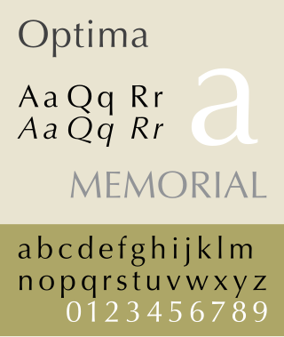
Optima is a humanist sans-serif typeface designed by Hermann Zapf and released by the D. Stempel AG foundry, Frankfurt, West Germany in 1958.
<span class="mw-page-title-main">Bitstream Inc.</span> Typeface foundry

Bitstream Inc. was an American type foundry that produced digital typefaces. It was founded in 1981 by Matthew Carter, Mike Parker, Cherie Cone, and Rob Friedman, all former employees of the Mergenthaler Linotype Company. It was located in Marlborough, Massachusetts. The font business, including MyFonts, was acquired by Monotype Imaging in March 2012. The remainder of the business, responsible for Pageflex and Bolt Browser, was spun off to a new entity named Marlborough Software Development Holdings Inc. It was later renamed Pageflex, Inc following a successful management buyout in December 2013.

<span class="mw-page-title-main">Helvetica</span> Neo-grotesque sans-serif typeface

Helvetica, also known by its original name Neue Haas Grotesk, is a widely used sans-serif typeface developed in 1957 by Swiss typeface designer Max Miedinger and Eduard Hoffmann.

<span class="mw-page-title-main">Matthew Carter</span> British type designer (born 1937)

Matthew Carter is a British type designer. A 2005 New Yorker profile described him as 'the most widely read man in the world' by considering the amount of text set in his commonly used typefaces.

<span class="mw-page-title-main">Frutiger (typeface)</span> Humanist sans-serif typeface

Frutiger is a series of typefaces named after its Swiss designer, Adrian Frutiger. Frutiger is a humanist sans-serif typeface, intended to be clear and highly legible at a distance or at small text sizes. A popular design worldwide, type designer Steve Matteson described its structure as "the best choice for legibility in pretty much any situation" at small text sizes, while Erik Spiekermann named it as "the best general typeface ever".
<span class="mw-page-title-main">Italic type</span> Font style with cursive typeface and slanted design

In typography, italic type is a cursive font based on a stylised form of calligraphic handwriting. Along with blackletter and roman type, it served as one of the major typefaces in the history of Western typography.

<span class="mw-page-title-main">Gill Sans</span> Humanist sans-serif typeface family

Gill Sans is a humanist sans-serif typeface designed by Eric Gill and released by the British branch of Monotype from 1928 onwards.
<span class="mw-page-title-main">Text figures</span> Numerals typeset with varying heights

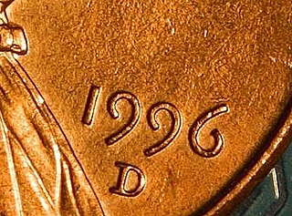
Text figures are numerals designed with varying heights in a fashion that resembles a typical line of running text, hence the name. They are contrasted with lining figures, which are the same height as upper-case letters. Georgia is an example of a popular typeface that employs text figures by default.
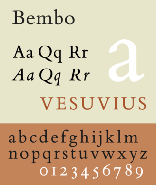
<span class="mw-page-title-main">Bembo</span> Serif typeface in 1495 Venetian style

Bembo is a serif typeface created by the British branch of the Monotype Corporation in 1928–1929 and most commonly used for body text. It is a member of the "old-style" of serif fonts, with its regular or roman style based on a design cut around 1495 by Francesco Griffo for Venetian printer Aldus Manutius, sometimes generically called the "Aldine roman". Bembo is named for Manutius's first publication with it, a small 1496 book by the poet and cleric Pietro Bembo. The italic is based on work by Giovanni Antonio Tagliente, a calligrapher who worked as a printer in the 1520s, after the time of Manutius and Griffo.

Francesco Griffo (1450–1518), also called Francesco da Bologna, was a fifteenth-century Italian punchcutter. He worked for Aldus Manutius, designing the printer's more important humanist typefaces, including the first italic type. He cut Roman, Greek, Hebrew and the first italic type. Aldus gives Griffo credit in the introduction of the Virgil of 1501. However, as Manutius had achieved a monopoly on italic printing and Greek publishing with the permission of the Venetian government, he had a falling-out with Griffo. Griffo then went to work for Gershom Soncino, whose family were Hebrew printers. It was with Soncino that Griffo's second italic type was cut in 1503. In 1516 he returned to Bologna where he began print publishing. In 1518 Griffo was charged with the murder of his son-in-law, who had been beaten to death with an iron bar. This is his last appearance in the historical record. He is presumed to have been executed.

<span class="mw-page-title-main">Font</span> Particular size, weight and style of a typeface

In metal typesetting, a font or fount is a particular size, weight and style of a typeface. Each font is a matched set of type, with a piece for each glyph. A typeface consists of various fonts that share an overall design.

<span class="mw-page-title-main">Albertus (typeface)</span> Typeface

Albertus is a glyphic serif display typeface designed by Berthold Wolpe in the period 1932 to 1940 for the British branch of the printing company Monotype. Wolpe named the font after Albertus Magnus, the thirteenth-century German philosopher and theologian.

<span class="mw-page-title-main">Rotis</span> Typeface family

Rotis is a typeface developed in 1988 by Otl Aicher, a German graphic designer and typographer. In Rotis, Aicher explores an attempt at maximum legibility through a highly unified yet varied typeface family that ranges from full serif, glyphic, and sans-serif. The four basic Rotis variants are:

<span class="mw-page-title-main">Syntax (typeface)</span> Typeface family

Syntax comprises a family of fonts designed by Swiss typeface designer Hans Eduard Meier. Originally just a sans-serif font, it was extended with additional serif designs.

<span class="mw-page-title-main">Minion (typeface)</span> Serif typeface

Minion is a serif typeface released in 1990 by Adobe Systems. Designed by Robert Slimbach, it is inspired by late Renaissance-era type and intended for body text and extended reading. Minion's name comes from the traditional naming system for type sizes, in which minion is between nonpareil and brevier, with the type body 7pt in height. As the historically rooted name indicates, Minion was designed for body text in a classic style, although slightly condensed and with large apertures to increase legibility. Slimbach described the design as having "a simplified structure and moderate proportions." The design is slightly condensed, although Slimbach has said that this was intended not for commercial reasons so much as to achieve a good balance of the size of letters relative to the ascenders and descenders.

<span class="mw-page-title-main">Centaur (typeface)</span> Serif typeface

Centaur is a serif typeface by book and typeface designer Bruce Rogers, based on the Renaissance-period printing of Nicolas Jenson around 1470. He used it for his design of the Oxford Lectern Bible. It was given widespread release by the British branch of Monotype, paired with an italic designed by calligrapher Frederic Warde and based on the slightly later work of calligrapher and printer Ludovico Vicentino degli Arrighi. The italic has sometimes been named separately as the "Arrighi" italic.

<span class="mw-page-title-main">Interstate (typeface)</span> Sans-serif typeface

Interstate is a digital typeface designed by Tobias Frere-Jones in the period 1993–1999, and licensed by Font Bureau. The typeface is based on Style Type E of the FHWA series of fonts, a signage alphabet drawn for the United States Federal Highway Administration by Dr. Theodore W. Forbes in 1949.
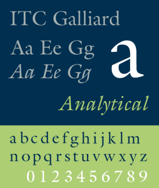
<span class="mw-page-title-main">Galliard (typeface)</span> Serif typeface

ITC Galliard is the name of a serif typeface designed by Matthew Carter and issued in 1978 by the Mergenthaler Linotype Company.
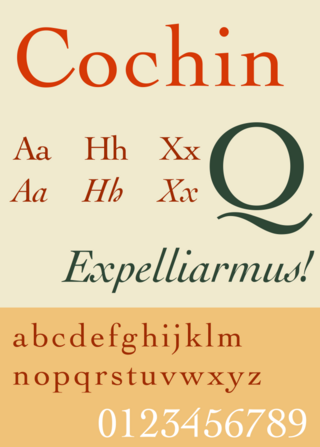
<span class="mw-page-title-main">Cochin (typeface)</span> Serif typeface

Cochin is a serif typeface. It was originally produced in 1912 by Georges Peignot for the Paris foundry G. Peignot et Fils and was based on the copperplate engravings of 18th century French artist Charles-Nicolas Cochin, from which the typeface also takes its name. The font has a small x-height with long ascenders. Georges Peignot also created the design 'Nicolas-Cochin' as a looser variation in the same style.
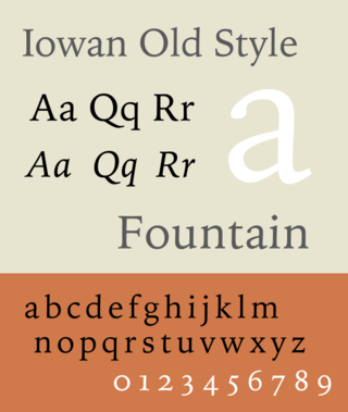
<span class="mw-page-title-main">Iowan Old Style</span> Typeface

Iowan Old Style is a digital serif typeface designed by John Downer and released by Bitstream in 1991.

References

  1. Shaw, Paul (August 3, 2010). "Ten Typefaces of the Decade". Print . Retrieved January 25, 2013.
  2. Jackson, Brandon. "The Yale Type". The New Journal. Yale University. Retrieved 30 June 2015.
  3. "A brief history of the Yale typeface". Yale Printer. Retrieved 16 August 2015.
  4. "Matthew Carter, Type Designer". Yale School of Art . Retrieved January 25, 2013.
  5. 1 2 3 4 Shaw, Paul (March 2, 2011). "An Interview With Matthew Carter". Print . Retrieved January 25, 2013.
  6. 1 2 Needham, Paul (April 15, 2008). "What's in a (Yale) Typeface?". Yale Daily News . Retrieved January 25, 2013.
  7. 1 2 3 "Introducing the Yale Typeface: The History". Yale University . Retrieved January 25, 2013.
  8. Reibstein, Reed (April 15, 2008). "What's in a (Yale) Typeface?". Typophile . Retrieved January 25, 2013.
  9. 1 2 3 "Introducing the Yale Typeface: The Typeface". Yale University . Retrieved January 25, 2013.
  10. "Introducing the Yale Typeface: The Typeface Features of Yale Design Roman". Yale University . Retrieved January 25, 2013.
  11. Henderson, Drew (September 30, 2009). "Yale Press drops distinctive logo". Yale Daily News . Retrieved January 25, 2013.
  12. "Introducing the Yale Typeface: Font Download". Yale University . Retrieved January 25, 2013.
  13. "Bembo Book". FontHaus. Retrieved 16 August 2015.
  14. "Bembo". MyFonts. Retrieved 19 April 2015.
  15. "Bembo Book". Monotype. Retrieved 19 April 2015.
  16. "Bembo Titling". MyFonts. Monotype. Retrieved 19 April 2015.
  17. Berry & Downer. "Text on the pages of iBooks" . Retrieved 16 August 2015.
  18. Peters, Yves. "Version 1.5 Improves Typography in iBooks on iPad and iPhone". FontFeed. Retrieved 16 August 2015.
  19. "Iowan Old Style". Identifont. Retrieved 2 August 2015.
  20. Butterick, Matthew. "Iowan Old Style". Typography for Lawyers. Retrieved 2 August 2015.
  21. Berry, John. "An American Typeface Comes of Age". dot creative. Retrieved 2 August 2015.