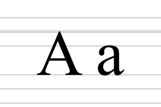
A, or a, is the first letter and the first vowel letter of the Latin alphabet, used in the modern English alphabet, and others worldwide. Its name in English is a, plural aes.

The Cyrillic script, Slavonic script or simply Slavic script is a writing system used for various languages across Eurasia. It is the designated national script in various Slavic, Turkic, Mongolic, Uralic, Caucasian and Iranic-speaking countries in Southeastern Europe, Eastern Europe, the Caucasus, Central Asia, North Asia, and East Asia, and used by many other minority languages.

Penmanship is the technique of writing with the hand using a writing instrument. Today, this is most commonly done with a pen, or pencil, but throughout history has included many different implements. The various generic and formal historical styles of writing are called "hands" while an individual's style of penmanship is referred to as "handwriting".
Although people in many parts of the world share common alphabets and numeral systems, styles of handwritten letterforms vary between individuals, and sometimes also vary systematically between regions.

Fraktur is a calligraphic hand of the Latin alphabet and any of several blackletter typefaces derived from this hand. It is designed such that the beginnings and ends of the individual strokes that make up each letter will be clearly visible, and often emphasized; in this way it is often contrasted with the curves of the Antiqua (common) typefaces where the letters are designed to flow and strokes connect together in a continuous fashion. The word "Fraktur" derives from Latin frāctūra, built from frāctus, passive participle of frangere, which is also the root for the English word "fracture". In non-professional contexts, the term "Fraktur" is sometimes misused to refer to all blackletter typefaces – while Fraktur typefaces do fall under that category, not all blackletter typefaces exhibit the Fraktur characteristics described above.

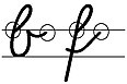
In writing and typography, a ligature occurs where two or more graphemes or letters are joined to form a single glyph. Examples are the characters ⟨æ⟩ and ⟨œ⟩ used in English and French, in which the letters ⟨a⟩ and ⟨e⟩ are joined for the first ligature and the letters ⟨o⟩ and ⟨e⟩ are joined for the second ligature. For stylistic and legibility reasons, ⟨f⟩ and ⟨i⟩ are often merged to create ⟨fi⟩ ; the same is true of ⟨s⟩ and ⟨t⟩ to create ⟨st⟩. The common ampersand, ⟨&⟩, developed from a ligature in which the handwritten Latin letters ⟨e⟩ and ⟨t⟩ were combined.
Cursive is any style of penmanship in which characters are written joined in a flowing manner, generally for the purpose of making writing faster, in contrast to block letters. It varies in functionality and modern-day usage across languages and regions; being used both publicly in artistic and formal documents as well as in private communication. Formal cursive is generally joined, but casual cursive is a combination of joins and pen lifts. The writing style can be further divided as "looped", "italic", or "connected".
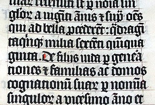
Blackletter, also known as Gothic script, Gothic minuscule or Gothic type, was a script used throughout Western Europe from approximately 1150 until the 17th century. It continued to be commonly used for Danish, Norwegian, and Swedish until the 1870s, Finnish until the turn of the 20th century, Latvian until the 1930s, and for the German language until the 1940s, when Hitler officially discontinued it in 1941. Fraktur is a notable script of this type, and sometimes the entire group of blackletter faces is referred to as Fraktur. Blackletter is sometimes referred to as Old English, but it is not to be confused with the Old English language, which predates blackletter by many centuries and was written in the insular script or in Futhorc. Along with Italic type and Roman type, blackletter served as one of the major typefaces in the history of Western typography.

Letter case is the distinction between the letters that are in larger uppercase or capitals and smaller lowercase in the written representation of certain languages. The writing systems that distinguish between the upper- and lowercase have two parallel sets of letters: each in the majuscule set has a counterpart in the minuscule set. Some counterpart letters have the same shape, and differ only in size, but for others the shapes are different. The two case variants are alternative representations of the same letter: they have the same name and pronunciation and are typically treated identically when sorting in alphabetical order.

The Ol Chiki script, also known as Ol Chemetʼ, Ol Ciki, Ol, and sometimes as the Santali alphabet is the official writing system for Santali, an Austroasiatic language recognized as an official regional language in India. It was invented by Pandit Raghunath Murmu in 1925. It has 30 letters, the design of which is intended to evoke natural shapes. The script is written from left to right, and has two styles. Unicode does not maintain a distinction between these two, as is typical for print and cursive variants of a script. In both styles, the script is unicameral.
The shapes of the letters are not arbitrary, but reflect the names for the letters, which are words, usually the names of objects or actions representing conventionalized form in the pictorial shape of the characters.
The Greek alphabet has been used to write the Greek language since the late 9th or early 8th century BC. It was derived from the earlier Phoenician alphabet, and is the earliest known alphabetic script to have developed distinct letters for vowels as well as consonants. In Archaic and early Classical times, the Greek alphabet existed in many local variants, but, by the end of the 4th century BC, the Ionic-based Euclidean alphabet, with 24 letters, ordered from alpha to omega, had become standard throughout the Greek-speaking world and is the version that is still used for Greek writing today.
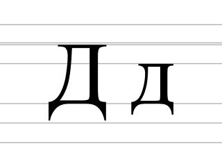
De is a letter of the Cyrillic script. It commonly represents the voiced dental stop, like the pronunciation of ⟨d⟩ in "door", except closer to the teeth. De is usually Romanized using the Latin letter D.

Roman cursive is a form of handwriting used in ancient Rome and to some extent into the Middle Ages. It is customarily divided into old cursive and new cursive.

Kurrent is an old form of German-language handwriting based on late medieval cursive writing, also known as Kurrentschrift, deutsche Schrift, and German cursive. Over the history of its use into the first part of the 20th century, many individual letters acquired variant forms.

Getty-Dubay Italic is a modern teaching script for handwriting based on Latin script, developed in 1976 in Portland, Oregon, by Barbara Getty and Inga Dubay with the aim of allowing learners to make an easier transition from print writing to cursive.

Russian cursive is a variant of the Russian alphabet used for writing by hand. It is typically referred to as (ру́сский) рукопи́сный шрифт (rússky) rukopísny shrift, "(Russian) handwritten font". It is the handwritten form of the modern Russian Cyrillic script, used instead of the block letters seen in printed material. In addition, Russian italics for lowercase letters are often based on Russian cursive. Most handwritten Russian, especially in personal letters and schoolwork, uses the cursive alphabet. In Russian schools most children are taught from first grade how to write with this script.

Grundschrift is a simplified form of handwriting adopted by Hamburg schools, and it is currently endorsed by the German National Primary Schoolteachers' Union.
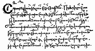
Skoropis is a type of Cyrillic handwriting script that developed from semi-ustav in the second half of the 14th century and was used in particular in offices and private office work, from which a modern Russian cursive handwriting developed in the 19th century.
A teaching script is a sample script that serves as a visual orientation for learning to write by hand. In the sense of a guideline or a prototype, it supports the demanding process of developing handwriting skills and abilities in a visual and illustrative way.

The Zaner-Bloser is a teaching script for handwriting based on Latin script as well as a system of penmanship instruction, which originated around 1904 at the Zanerian College of Penmanship in Columbus, Ohio. Charles P. Zaner (1864–1918) and Elmer W. Bloser (1865–1929), originally a Spencerian Method instructor, developed their teaching script with the aim of allowing learners an easier transition from print writing to cursive. The Zaner-Bloser Method first teaches block letters and then cursive in order to enable written expression as quickly as possible and thus develop the ability to write. Material relating to the method of instruction practiced by Zaner and Bloser is still being published by the Zaner-Bloser Company, a subsidiary of Highlights for Children.