Related Research Articles

Helvetica, also known by its original name Neue Haas Grotesk, is a widely-used sans-serif typeface developed in 1957 by Swiss typeface designer Max Miedinger and Eduard Hoffmann.

Matthew Carter is a British type designer. A 2005 New Yorker profile described him as 'the most widely read man in the world' by considering the amount of text set in his commonly used typefaces.
Emigre, Inc., doing business as Emigre Fonts, is a digital type foundry based in Berkeley, California, that was founded in 1985 by husband-and-wife team Rudy VanderLans and Zuzana Licko. The type foundry grew out of Emigre magazine, a publication founded by VanderLans and two Dutch friends who met in San Francisco, CA in 1984. Note that unlike the word émigré, Emigre is officially spelled without accents.

Gill Sans is a humanist sans-serif typeface designed by Eric Gill and released by the British branch of Monotype from 1928 onwards.
Zuzana Licko is a Slovak-born American type designer and visual artist known for co-founding Emigre Fonts, a digital type foundry in Berkeley, CA. She has designed and produced numerous digital typefaces including the popular Mrs Eaves, Modula, Filosofia, and Matrix. As a corresponding interest she also creates ceramic sculptures and jacquard weavings.

Stanley Arthur Morison was a British typographer, printing executive and historian of printing. Largely self-educated, he promoted higher standards in printing and an awareness of the best printing and typefaces of the past.

A type foundry is a company that designs or distributes typefaces. Before digital typography, type foundries manufactured and sold metal and wood typefaces for hand typesetting, and matrices for line-casting machines like the Linotype and Monotype, for letterpress printers. Today's digital type foundries accumulate and distribute typefaces created by type designers, who may either be freelancers operating their own independent foundry, or employed by a foundry. Type foundries may also provide custom type design services.

Willem Hendrik "Wim" Crouwel was a Dutch graphic designer, type designer, and typographer.

Jonathan Hoefler is an American type designer. Hoefler founded the Hoefler Type Foundry in 1989, a type foundry in New York.

Bookman, or Bookman Old Style, is a serif typeface. A wide, legible design that is slightly bolder than most body text faces, Bookman has been used for both display typography, for trade printing such as advertising, and less commonly for body text. In advertising use it is particularly associated with the graphic design of the 1960s and 1970s, when revivals of it were very popular.
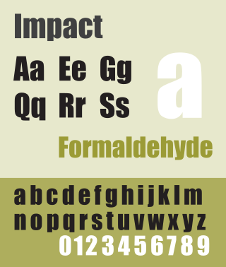
Impact is a sans-serif typeface in the industrial or grotesque style designed by Geoffrey Lee in 1965 and released by the Stephenson Blake foundry of Sheffield. It is well known for having been included in the core fonts for the Web package and distributed with Microsoft Windows since Windows 98. In the 2010s, it gained popularity for its use in image macros and other internet memes.
The International Typeface Corporation (ITC) was a type manufacturer founded in New York in 1970 by Aaron Burns, Herb Lubalin and Edward Rondthaler. The company was one of the world's first type foundries to have no history in the production of metal type. It is now a wholly owned brand or subsidiary of Monotype Imaging.

Gudrun Zapf von Hesse was a German book-binder, calligrapher and typographer.

Architype van der Leck is a geometric sans-serif typeface, based upon the 1941 typeface designed by Bart van der Leck for the Dutch magazine Flax, a journal of the De Stijl art movement.

Stephenson Blake is an engineering company based in Sheffield, England. The company was active from the early 19th century as a type founder, remaining until the 1990s as the last active type foundry in Britain, since when it has diversified into specialist engineering.
Walter Valentine Tracy RDI was an English type designer, typographer and writer.
Martin Majoor is a Dutch type designer and graphic designer. As of 2006, he had worked since 1997 in both Arnhem, Netherlands, and Warsaw, Poland.

URW Type Foundry GmbH is a type foundry based in Hamburg, Germany. The foundry has its own library with more than 500 font families. The company specializes in customized corporate typefaces and the development of non-Latin fonts. It has been owned by Monotype Imaging since May 2020.

The Stephenson Blake Grotesque fonts are a series of sans-serif typefaces created by the type foundry Stephenson Blake of Sheffield, England, mostly around the beginning of the twentieth century.

Joshua Darden is an American typeface designer. He published his first typeface at the age of 15, becoming according to Fonts In Use the first known African-American typeface designer.
References
- ↑ "A Celebration of the life of Freda Ann Slack".
- 1 2 3 Faces from Letraset: The story of the Letraset collection. eLexicons Limited. 2016.
- ↑ "Freda Sack obituary, Alphabettes".
- ↑ "Freda Sack, The Foundry Types".
- ↑ "Freda Sack Obituary, The Guardian".
- ↑ The Elements of Typographic Style. Hartley & Marks. 1996.
- ↑ "Freda Sack 1951–2019". Typographic. 71: 52 (insert). 2019.
| International | |
|---|---|
| National | |