Related Research Articles
Type design is the art and process of designing typefaces. This involves drawing each letterform using a consistent style. The basic concepts and design variables are described below.

In typography and lettering, a sans-serif, sans serif, gothic, or simply sans letterform is one that does not have extending features called "serifs" at the end of strokes. Sans-serif typefaces tend to have less stroke width variation than serif typefaces. They are often used to convey simplicity and modernity or minimalism.

A typeface is the design of lettering that can include variations in size, weight, slope, width, and so on. Each of these variations of the typeface is a font.

Helvetica or Neue Haas Grotesk is a widely used sans-serif typeface developed in 1957 by Swiss typeface designer Max Miedinger and Eduard Hoffmann.

Rockwell is a slab serif typeface designed by the Monotype Corporation and released in 1934. The project was supervised by Monotype's engineering manager Frank Hinman Pierpont. This typeface is distinguished by a serif at the apex of the uppercase A, while the lowercase a has two storeys. Because of its monoweighted stroke, Rockwell is used primarily for display or at small sizes rather than as a body text. Rockwell is based on an earlier, more condensed slab serif design cast by the Inland Type Foundry called Litho Antique.
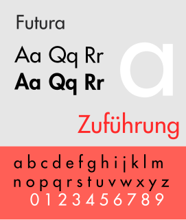
Futura is a geometric sans-serif typeface designed by Paul Renner and released in 1927. It was designed as a contribution on the New Frankfurt-project. It is based on geometric shapes, especially the circle, similar in spirit to the Bauhaus design style of the period. It was developed as a typeface by the Bauer Type Foundry, in competition with Ludwig & Mayer's seminal Erbar typeface of 1926.

Univers is the name of a large sans-serif typeface family designed by Adrian Frutiger and released by his employer Deberny & Peignot in 1957. Classified as a neo-grotesque sans-serif, one based on the model of nineteenth-century German typefaces such as Akzidenz-Grotesk, it was notable for its availability from the moment of its launch in a comprehensive range of weights and widths. The original marketing for Univers deliberately referenced the periodic table to emphasise its scope.
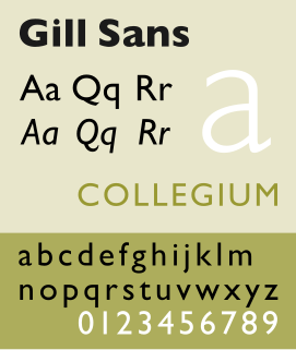
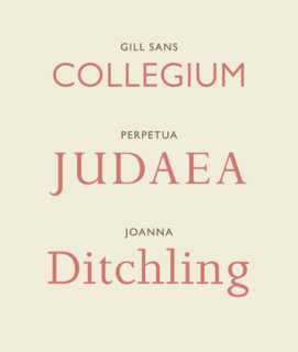
Gill Sans is a humanist sans-serif typeface designed by Eric Gill and released by the British branch of Monotype from 1928 onwards.
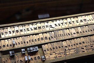
In the manufacture of metal type used in letterpress printing, a matrix is the mould used to cast a letter, known as a sort. Matrices for printing types were made of copper.
Aldo Novarese was an Italian type designer who lived and worked mostly in Turin.

Eurostile is a geometric sans-serif typeface designed by Aldo Novarese in 1962. Novarese created Eurostile for one of the best-known Italian foundries, Nebiolo, in Turin.

In metal typesetting, a font is a particular size, weight and style of a typeface. Each font is a matched set of type, with a piece for each glyph. A typeface consists of a range of such fonts that shared an overall design.
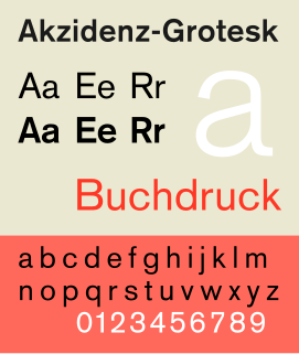
Akzidenz-Grotesk is a sans-serif typeface family originally released by the Berthold Type Foundry of Berlin. "Akzidenz" indicates its intended use as a typeface for commercial print runs such as publicity, tickets and forms, as opposed to fine printing, and "grotesque" was a standard name for sans-serif typefaces at the time.
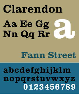
Clarendon is the name of a slab-serif typeface that was released in 1845 by Thorowgood and Co. of London, a letter foundry often known as the Fann Street Foundry. The original Clarendon design is credited to Robert Besley, a partner in the foundry, and was originally engraved by punchcutter Benjamin Fox, who may also have contributed to its design. Many copies, adaptations and revivals have been released, becoming almost an entire genre of type design.

Peter Biľak is a Slovak graphic and typeface designer, based in The Hague, The Netherlands. He works in the field of editorial, graphic, and type design, teaches typeface design at the postgraduate course Type&Media at the KABK, Royal Academy of Art. He started Typotheque in 1999, Dot Dot Dot in 2000, Indian Type Foundry in 2009, Works That Work magazine in 2012, and Fontstand, in 2015. He is a member of AGI and lectures on his work internationally. He is a writer for numerous design magazines and frequently contributes writing and design to books and publications that include Print, Emigre, Eye (magazine), Items, tipoGrafica, Idea (magazine), Abitare and Page.
Fodor is a geometrical typeface designed by Dutch graphic designer and type designer Wim Crouwel, around 1973.
The Fonderia Nebiolo was a manufacturer of printing presses and paper and formerly a type foundry. Nebiolo & Co. was created in 1878 when Giovanni Nebiolo bought out the type foundry of G. Narizzano in Turin, Italy, in 1852. In 1908 the company merged with the Urania Company and operated under the name Augustea and began to buy out many smaller foundries. In 1916 it was again renamed Società Nebiolo. In 1976 in occasion of the renovation of the Company that naturally would have come to an end that year, Fiat entered into the press manufacturing business and the Studio Artistico was closed up. In 1992 it became Nebiolo Printech S.p.A. and continues to manufacture presses under that name today.

A reverse-contrast or reverse-stress letterform is a design in which the stress is reversed from the norm: a typeface or custom lettering where the horizontal lines are the thickest. This is the reverse of the vertical lines being the same width or thicker than horizontals, which is normal in Latin-alphabet writing and especially printing. The result is a dramatic effect, in which the letters seem to have been printed the wrong way round. The style invented in the early nineteenth century as attention-grabbing novelty display designs. Modern font designer Peter Biľak, who has created a design in the genre, has described them as "a dirty trick to create freakish letterforms that stood out."

Semplicità is a sans-serif typeface of the geometric style. It was published by the Nebiolo type foundry of Turin, Italy from around 1928.

In typography, a fat face letterform is a serif typeface or piece of lettering in the Didone or modern style with an extremely bold design. Fat face typefaces appeared in London around 1805-10 and became widely popular; John Lewis describes the fat face as "the first real display typeface."
References
- ↑ Maletto, Luigi (2003). L'enciclopedia[The Encyclopaedia] (in Italian). La biblioteca di Repubblica.
- ↑ Ricky De Franchesi (2 March 2017). "Veltro, the greyhound's chase". c-a-s-t.
- ↑ "Razionale". Tipoteca (in Italian). Retrieved 2 May 2018.
| General | |
|---|---|
| National libraries | |
| | This biographical article about a graphic designer is a stub. You can help Wikipedia by expanding it. |
| | This typography-related article is a stub. You can help Wikipedia by expanding it. |