William Caslon I, also known as William Caslon the Elder, was an English typefounder. The distinction and legibility of his type secured him the patronage of the leading printers of the day in England and on the continent. His typefaces transformed English type design and first established an English national typographic style.

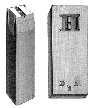
In the manufacture of metal type used in letterpress printing, a matrix is the mould used to cast a letter, known as a sort. Matrices for printing types were made of copper.

American Type Founders (ATF) Co. was a business trust created in 1892 by the merger of 23 type foundries, representing about 85 percent of all type manufactured in the United States at the time. The new company, consisting of a consolidation of firms from throughout the United States, was incorporated in New Jersey.

Monotype Imaging Holdings Inc., founded as Lanston Monotype Machine Company in 1887 in Philadelphia by Tolbert Lanston, is an American company that specializes in digital typesetting and typeface design for use with consumer electronics devices. Based in Woburn, Massachusetts, the company has been responsible for many developments in printing technology—in particular the Monotype machine, which was a fully mechanical hot metal typesetter, that produced texts automatically, all single type. Monotype was involved in the design and production of many typefaces in the 20th century. Monotype developed many of the most widely used typeface designs, including Times New Roman, Gill Sans, Arial, Bembo and Albertus.

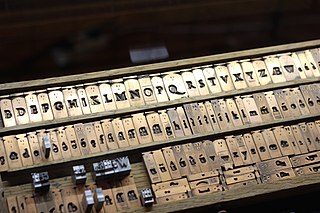
A type foundry is a company that designs or distributes typefaces. Before digital typography, type foundries manufactured and sold metal and wood typefaces for hand typesetting, and matrices for line-casting machines like the Linotype and Monotype, for letterpress printers. Today's digital type foundries accumulate and distribute typefaces created by type designers, who may either be freelancers operating their own independent foundry, or employed by a foundry. Type foundries may also provide custom type design services.

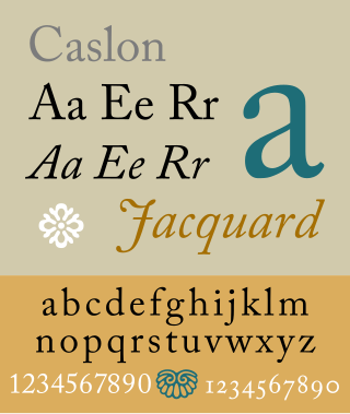
Caslon is the name given to serif typefaces designed by William Caslon I in London, or inspired by his work.

Punchcutting is a craft used in traditional typography to cut letter punches in steel as the first stage of making metal type. Steel punches in the shape of the letter would be used to stamp matrices into copper, which were locked into a mould shape to cast type. Cutting punches and casting type was the first step of traditional typesetting. The cutting of letter punches was a highly skilled craft requiring much patience and practice. Often the designer of the type would not be personally involved in the cutting.

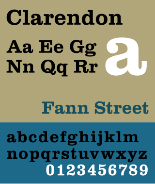
Clarendon is the name of a slab serif typeface that was released in 1845 by Thorowgood and Co. of London, a letter foundry often known as the Fann Street Foundry. The original Clarendon design is credited to Robert Besley, a partner in the foundry, and was originally engraved by punchcutter Benjamin Fox, who may also have contributed to its design. Many copies, adaptations and revivals have been released, becoming almost an entire genre of type design.

The Type Archive was a collection of artefacts representing the legacy of type founding in England, whose famous type foundries and composing systems supplied the world with type in over 300 languages. The Archive was founded in 1992 by Susan Shaw in Stockwell, South London. The Archive announced in mid-2022 that it would relinquish its building and return portions of its collections to other institutions.
Gerald Giampa was a printer, typographer and author.

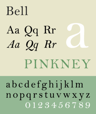
Bell is the name given to a serif typeface designed and cut in 1788 by the punchcutter Richard Austin for the British Letter Foundry, operated by publisher John Bell, and revived several times since.

Stephenson Blake is an engineering company based in Sheffield, England. The company was active from the early 19th century as a type founder, remaining until the 1990s as the last active type foundry in Britain, since when it has diversified into specialist engineering.

The Grabhorn Institute is a nonprofit organization formed in October 2000 for the purpose of preserving and continuing the operation of one of the last integrated facilities for typefounding, letterpress printing, and bookbinding in the fine press tradition, as a living museum and educational and cultural center. It is named in honor of the brothers Edwin and Robert Grabhorn, who established the Grabhorn Press in San Francisco in 1920. The press was "one of the foremost producers of finely printed books in twentieth-century America." The Grabhorn Press Building is listed on the National Register of Historic Places in San Francisco, California.

Linn Boyd Benton was an American typeface designer and inventor of technology for producing metal type.
Richard Wagener is an American wood engraver known for his prints and fine press books. His work has been collected by over one hundred and thirty public institutions. His first livre d'artiste, Zebra Noise with a Flatted Seventh, was included in Artists' Books in the Modern Era, 1870–2000 at the Legion of Honor, Fine Arts Museums of San Francisco. Victoria Dailey has called Wagener the first California artist since Paul Landacre to achieve prominence in the art of wood engraving.
Fundición Tipográfica Neufville or the Neufville Typefoundry is a type foundry in Barcelona and the most important supplier of the printing industry in Spain during the 20th century.

Dan Carr was an American poet, type designer, typographer, printer, teacher, punchcutter, environmentalist, human rights activist and New Hampshire State Representative. He co-founded Golgonooza Letter Foundry & Press*, Trois Fontaines,* Four Zoas Night House** and was an editor for the Four Zoas Press, all literary presses.

The Fann Street Foundry was a type foundry located on Fann Street, City of London.

The Caslon type foundry was a type foundry in London which cast and sold metal type. It was founded by the punchcutter and typefounder William Caslon I, probably in 1720. For most of its history it was based at Chiswell Street, Islington, was the oldest type foundry in London, and the most prestigious.

In letterpress printing, wood type is movable type made out of wood. First used in China for printing body text, wood type became popular during the nineteenth century for making large display typefaces for printing posters, because it was lighter and cheaper than large sizes of metal type.


