The King James Version (KJV), also known as the King James Bible (KJB) or simply the Authorized Version (AV), is an English translation of the Christian Bible for the Church of England, begun in 1604 and completed as well as published in 1611 under the sponsorship of James VI and I. The books of the King James Version include the 39 books of the Old Testament, an intertestamental section containing 14 books of the Apocrypha, and the 27 books of the New Testament. The translation is noted for its "majesty of style", and has been described as one of the most important books in English culture and a driving force in the shaping of the English-speaking world.

Typography is the art and technique of arranging type to make written language legible, readable, and appealing when displayed. The arrangement of type involves selecting typefaces, point sizes, line lengths, line-spacing (leading), and letter-spacing (tracking), and adjusting the space between pairs of letters (kerning). The term typography is also applied to the style, arrangement, and appearance of the letters, numbers, and symbols created by the process. Type design is a closely related craft, sometimes considered part of typography; most typographers do not design typefaces, and some type designers do not consider themselves typographers. Typography also may be used as a decorative device, unrelated to communication of information.
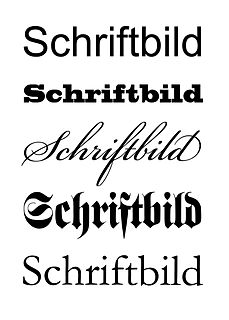
In typography, a serif is a small line or stroke regularly attached to the end of a larger stroke in a letter or symbol within a particular font or family of fonts. A typeface or "font family" making use of serifs is called a serif typeface, and a typeface that does not include them is a sans-serif one. Some typography sources refer to sans-serif typefaces as "grotesque" or "Gothic", and serif typefaces as "roman".

In typography, a typeface is a set of one or more fonts each composed of glyphs that share common design features. Each font of a typeface has a specific weight, style, condensation, width, slant, italicization, ornamentation, and designer or foundry. For example, "ITC Garamond Bold Condensed Italic" means the bold, condensed-width, italic version of ITC Garamond. It is a different font from "ITC Garamond Condensed Italic" and "ITC Garamond Bold Condensed", but all are fonts within the same typeface, "ITC Garamond". ITC Garamond is a different typeface from "Adobe Garamond" or "Monotype Garamond". There are thousands of different typefaces in existence, with new ones being developed constantly.

The Great Bible of 1539 was the first authorized edition of the Bible in English, authorized by King Henry VIII of England to be read aloud in the church services of the Church of England. The Great Bible was prepared by Myles Coverdale, working under commission of Thomas, Lord Cromwell, Secretary to Henry VIII and Vicar General. In 1538, Cromwell directed the clergy to provide "one book of the bible of the largest volume in English, and the same set up in some convenient place within the said church that ye have care of, whereas your parishioners may most commodiously resort to the same and read it."

Garamond is a group of many old-style serif typefaces, named for sixteenth-century Parisian engraver Claude Garamond. Garamond-style typefaces are popular and often used, particularly for printing body text and books.
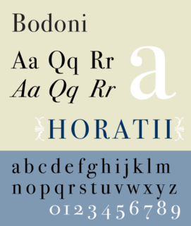
Bodoni is the name given to the serif typefaces first designed by Giambattista Bodoni (1740–1813) in the late eighteenth century and frequently revived since. Bodoni's typefaces are classified as Didone or modern. Bodoni followed the ideas of John Baskerville, as found in the printing type Baskerville—increased stroke contrast reflecting developing printing technology and a more vertical axis—but he took them to a more extreme conclusion. Bodoni had a long career and his designs changed and varied, ending with a typeface of a slightly condensed underlying structure with flat, unbracketed serifs, extreme contrast between thick and thin strokes, and an overall geometric construction.
In typography, leading refers to the distance between adjacent lines of type; however, the exact definition has become confused. In the days of hand-typesetting, it referred to the thin strips of lead that were inserted into the forms to increase the vertical distance between lines of type; in this case, the leading would be defined as the difference between 2 quantities: the size of the type and the distance from one baseline to the next. For instance, given a type size of 10 points and a distance between baselines of 12 points, the leading would be 2 points; put another way, a leading of 2 points means there is a distance of 2 points from the bottom of the high line of type to the top of the low line of type. In modern times, though, there seems to be widespread use of "leading" to refer instead to just the distance from one baseline to the next, probably because modern layout software tracks that quantity instead of a virtual strip of lead.
Early Modern English Bible translations are those translations of the Bible which were made between about 1500 and 1800, the period of Early Modern English. This was the first major period of Bible translation into the English language including the King James Version and Douai Bibles. The Reformation and Counter-Reformation led to the need for Bibles in the vernacular with competing groups each producing their own versions.
The pica is a typographic unit of measure corresponding to approximately 1⁄6 of an inch, or 1⁄72 of a foot. One pica is further divided into 12 points.
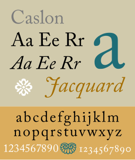
Caslon is the name given to serif typefaces designed by William Caslon I in London, or inspired by his work.

Bembo is a serif typeface created by the British branch of the Monotype Corporation in 1928-9 and most commonly used for body text. It is a member of the "old-style" of serif fonts, with its regular or roman style based on a design cut around 1495 by Francesco Griffo for Venetian printer Aldus Manutius, sometimes generically called the "Aldine roman". Bembo is named for Manutius's first publication with it, a small 1496 book by the poet and cleric Pietro Bembo. The italic is based on work by Giovanni Antonio Tagliente, a calligrapher who worked as a printer in the 1520s, after the time of Manutius and Griffo.

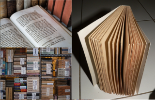
Large-print refers to the formatting of a book or other text document in which the typeface, and sometimes the medium, are considerably larger than usual, to accommodate people who have poor vision. Often public special-needs libraries will stock large-print versions of books, along with versions written in Braille.
In metal typesetting, a font was a particular size, weight and style of a typeface. Each font was a matched set of type, one piece for each glyph, and a typeface consisting of a range of fonts that shared an overall design.

Bookman or Bookman Old Style, is a serif typeface. A wide, legible design that is slightly bolder than most body text faces, Bookman has been used for both display typography and for printing at small sizes such as in trade printing, and less commonly for body text. In advertising use it is particularly associated with the graphic design of the 1960s and 1970s, when revivals of it were very popular.
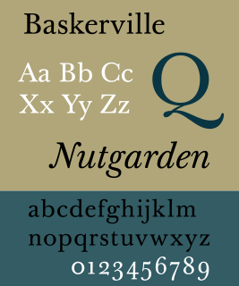
Baskerville is a serif typeface designed in the 1750s by John Baskerville (1706–1775) in Birmingham, England, and cut into metal by punchcutter John Handy. Baskerville is classified as a transitional typeface, intended as a refinement of what are now called old-style typefaces of the period, especially those of his most eminent contemporary, William Caslon.
Cartographic labeling is a form of typography and strongly deals with form, style, weight and size of type on a map. Essentially, labeling denotes the correct way to label features.
An agate (US) or ruby (UK) is a unit of typographical measure. It is 5.5 typographical points, or about 1⁄14 inch. It can refer to either the height of a line of type or to a font that is 5.5 points. An agate font is commonly used to display statistical data or legal notices in newspapers. It is considered to be the smallest point size that can be printed on newsprint and remain legible.

A display typeface is a typeface that is intended for use at large sizes for headings, rather than for extended passages of body text.