
Typography is the art and technique of arranging type to make written language legible, readable and appealing when displayed. The arrangement of type involves selecting typefaces, point sizes, line lengths, line-spacing (leading), and letter-spacing (tracking), as well as adjusting the space between pairs of letters (kerning). The term typography is also applied to the style, arrangement, and appearance of the letters, numbers, and symbols created by the process. Type design is a closely related craft, sometimes considered part of typography; most typographers do not design typefaces, and some type designers do not consider themselves typographers. Typography also may be used as an ornamental and decorative device, unrelated to the communication of information.
In typography, a serif is a small line or stroke regularly attached to the end of a larger stroke in a letter or symbol within a particular font or family of fonts. A typeface or "font family" making use of serifs is called a serif typeface, and a typeface that does not include them is sans-serif. Some typography sources refer to sans-serif typefaces as "grotesque" or "Gothic", and serif typefaces as "roman".

Emigre, Inc., doing business as Emigre Fonts, is a digital type foundry based in Berkeley, California, that was founded in 1985 by husband-and-wife team Rudy VanderLans and Zuzana Licko. The type foundry grew out of Emigre magazine, a publication founded by VanderLans and two Dutch friends who met in San Francisco, CA in 1984. Note that unlike the word émigré, Emigre is officially spelled without accents.
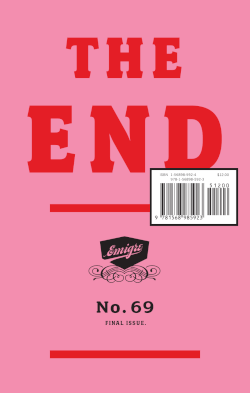
Emigre was a (mostly) quarterly magazine published from 1984 until 2005 in Berkeley, California, dedicated to visual communication, graphic design, typography, and design criticism. Produced by Rudy VanderLans and Zuzana Licko, Emigre was known for creating some of the very first digital layouts and typeface designs. Exposure to Licko's typefaces through the magazine lead to the creation of Emigre Fonts in 1985.
Zuzana Licko is a Slovak-born American type designer and visual artist known for co-founding Emigre Fonts, a digital type foundry in Berkeley, CA. She has designed and produced numerous digital typefaces including the popular Mrs Eaves, Modula, Filosofia, and Matrix. As a corresponding interest she also creates ceramic sculptures, textile prints and jacquard weavings.

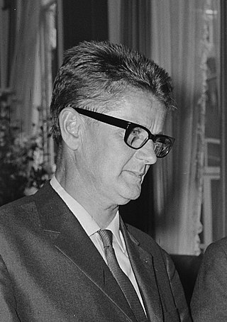
Willem Hendrik"Wim" Crouwel was a Dutch graphic designer, type designer, and typographer.
Rudy VanderLans is a Dutch graphic designer, photographer, and the co-founder of Emigre Fonts with his wife Zuzana Licko. Emigre Fonts is an independent type foundry in Berkeley, CA. He was also the art director and editor of Emigre magazine, the legendary journal devoted to visual communications from 1984 to 2005. Since arriving in California in 1981, he has been photographing his adoptive Golden State as an ongoing side project. He has authored a total of 11 photo books on the topic, and staged two solo exhibits at Gallery 16 in San Francisco.

Irma Boom is a Dutch graphic designer who specializes in bookmaking. Boom has been described as The Queen of Books, having created over 300 books and is well reputed for her artistic autonomy within her field. Her bold experimental approach to her projects often challenges the convention of traditional books in both physical design and printed content.

Gerard Unger was a Dutch graphic and type designer. He studied at the Gerrit Rietveld Academie in Amsterdam from 1963 to 1967, and subsequently worked at Total Design, Prad and Joh. Enschedé. In 1975, he established himself as an independent developer. A long-time guest lecturer at the University of Reading, he mentored many modern typeface designers. He lived and worked in Bussum, Netherlands.

Peter Biľak is a Slovak graphic and typeface designer based in The Hague, The Netherlands. He works in the field of editorial, graphic, and type design. He teaches typeface design at the postgraduate course Type&Media at the KABK, Royal Academy of Art. He started Typotheque in 1999, Dot Dot Dot in 2000, Indian Type Foundry in 2009, Works That Work magazine in 2012, and Fontstand in 2015. He is a member of AGI and lectures on his work internationally. He is a writer for numerous design magazines and frequently contributes writing and designs to publications including Print, Emigre, Eye (magazine), Items, tipoGrafica, Idea (magazine), Abitare, and Page.
Martin Majoor is a Dutch type designer and graphic designer. As of 2006, he had worked since 1997 in both Arnhem, Netherlands, and Warsaw, Poland.

Modern typography was a reaction against the perceived decadence of typography and design of the late 19th century. It is mostly associated with the works of Jan Tschichold and Bauhaus typographers Herbert Bayer, László Moholy-Nagy, El Lissitzky and others.
Fodor is a geometrical typeface designed by Dutch graphic designer and type designer Wim Crouwel, around 1973.

Edwin van Gelder is a Dutch graphic designer and art director based in Amsterdam. He graduated from the graphic design department at the Utrecht School of the Arts in 2004. In 2005 Van Gelder founded graphic design studio Mainstudio.

Gail Anderson is an American graphic designer, writer, and educator- known for her typographic skill, hand-lettering and poster design.
Ineke Hans is Dutch industrial designer.
Petr van Blokland is a Dutch graphic designer, software author and typeface designer who lives in Delft.
Casparus Bernardus Oorthuys, known as Cas Oorthuys, was a Dutch photographer and designer active from the 1930s until the 1970s.
Hansje is a Dutch feminine given name. It is a short form and diminutive of Johanna and Hans.
Piet Gerards is a Dutch graphic designer and publisher.

