Related Research Articles

Palatino is the name of an old-style serif typeface designed by Hermann Zapf, initially released in 1949 by the Stempel foundry and later by other companies, most notably the Mergenthaler Linotype Company.

Optima is a humanist sans-serif typeface designed by Hermann Zapf and released by the D. Stempel AG foundry, Frankfurt, West Germany in 1958.
Hermann Zapf was a German type designer and calligrapher who lived in Darmstadt, Germany. He was married to the calligrapher and typeface designer Gudrun Zapf-von Hesse. Typefaces he designed include Palatino, Optima, and Zapfino. He is considered one of the greatest type designers of all time.
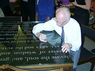
Calligraphy is a visual art related to writing and is the design and execution of lettering with a pen, ink brush, or other writing instrument. Contemporary calligraphic practice can be defined as "the art of giving form to signs in an expressive, harmonious, and skillful manner".

In typography and lettering, a sans-serif, sans serif, gothic, or simply sans letterform is one that does not have extending features called "serifs" at the end of strokes. Sans-serif typefaces tend to have less stroke width variation than serif typefaces. They are often used to convey simplicity and modernity or minimalism.

Antiqua is a style of typeface used to mimic styles of handwriting or calligraphy common during the 15th and 16th centuries. Letters are designed to flow and strokes connect together in a continuous fashion; in this way it is often contrasted with Fraktur-style typefaces where the individual strokes are broken apart. The two typefaces were used alongside each other in the germanophone world, with the Antiqua–Fraktur dispute often dividing along ideological or political lines. After the mid-20th century, Fraktur fell out of favor and Antiqua-based typefaces became the official standard.

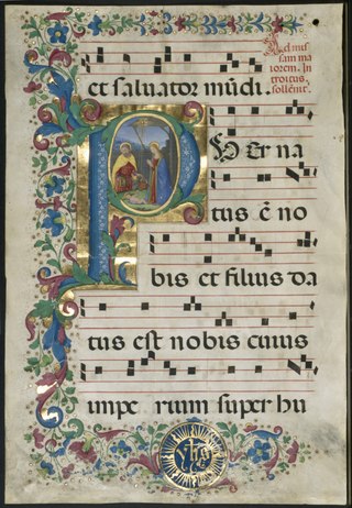
Western calligraphy is the art of writing and penmanship as practiced in the Western world, especially using the Latin alphabet.
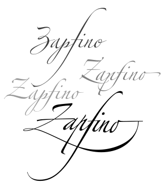
Zapfino is a calligraphic typeface designed for Linotype by typeface designer Hermann Zapf in 1998. It is based on an alphabet Zapf originally penned in 1944. As a font, it makes extensive use of ligatures and character variations.

Lettering is an umbrella term that covers the art of drawing letters, instead of simply writing them. Lettering is considered an art form, where each letter in a phrase or quote acts as an illustration. Each letter is created with attention to detail and has a unique role within a composition. Lettering is created as an image, with letters that are meant to be used in a unique configuration. Lettering words do not always translate into alphabets that can later be used in a typeface, since they are created with a specific word in mind.

Kris Holmes is an American typeface designer, calligrapher, type design educator and animator. She, with Charles Bigelow, is the co-creator of the Lucida and Wingdings font families, among many other typeface designs. She is President of Bigelow & Holmes Inc., a typeface design studio.

Rudolf Koch was a German type designer, professor, and a master of lettering, calligraphy, typography and illustration. Commonly known for his typefaces created for the Klingspor Type Foundry, his most widely used typefaces include Neuland and Kabel.

Trajan is a serif typeface designed in 1989 by Carol Twombly for Adobe.
The International Typeface Corporation (ITC) was a type manufacturer founded in New York in 1970 by Aaron Burns, Herb Lubalin and Edward Rondthaler. The company was one of the world's first type foundries to have no history in the production of metal type. It is now a wholly owned brand or subsidiary of Monotype Imaging.

Gudrun Zapf-von Hesse was a German book-binder, calligrapher and typographer.
Sumner Stone is a typeface designer and graphic artist. He notably designed ITC Stone while working for Adobe. A specimen of ITC Stone is shown at his personal website.
Rick Cusick is an American lettering artist, calligrapher, type designer and book designer.
Professor R K Joshi was an academic type designer and calligrapher. He designed the core Indian fonts used in Microsoft Windows.
Jim Parkinson is an American type designer in Oakland, California.
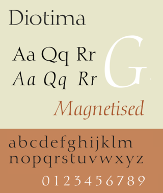
Diotima is a serif typeface designed by Gudrun Zapf-von Hesse and published by Stempel.
The Frederic W. Goudy Award & Lecture were established in 1969 by funds donated to Rochester Institute of Technology (RIT) by the Mary Flagler Cary Charitable Trust in memory of her late husband, Melbert B. Cary, Jr., a typographer, type importer, fine printer, book collector, and president of AIGA. The award was named after illustrious American type designer Frederic W. Goudy, a friend and business associate of Melbert Cary.
References
- ↑ "Pens poised for Letters of Joy". Edmonds Beacon. Mukilteo, Washington. 6 April 2006. p. 12.
- ↑ "Letterforum calendar" . Retrieved 27 February 2013.
- ↑ National Geographic. National Geographic Society. 1999.
- ↑ "Capital Edition Classic - Julian Waters, Calligrapher". WUSA (news station). 24 September 1989. Archived from the original on 12 December 2021.
- 1 2 John D. (ed.). Berry (2002). Language Culture Type: International Type Design in the Age of Unicode. ATypI. p. 354. ISBN 978-1-932026-01-6.
- ↑ Bill McAllister (25 August 1989). "BILL OF RIGHTS DONE BRIGHT". The Washington Post . Washington, D.C. ISSN 0190-8286. OCLC 1330888409.
- ↑ "New Presidential Libraries Stamp Dedicated at Kennedy Library - JFK Library". www.jfklibrary.org.
- ↑ Columnist, RICHARD CARR Stamp. "STATIONERY ITEMS, DEFINITIVES WILL MEET THE HIGHER POSTAGE RATES". Sun-Sentinel.com.
- ↑ George Amick (1 January 2001). Linns United States Stamp Yearbook 1999. Linn's Stamp News. ISBN 978-0-940403-89-5.
- ↑ Jerry Kelly; Alice Koeth; American Institute of Graphic Arts; Society of Scribes (2000). Artist & Alphabet: Twentieth Century Calligraphy and Letter Art in America. David R. Godine Publisher. p. 131. ISBN 978-1-56792-137-3.
- 1 2 Metropolis. Bellerophon Publications. July 1989.
- ↑ "Calligraphy, lettering and typeface design". Washington Calligrapher's Guild. Retrieved 27 February 2013.
- ↑ Elliott, Marianne. "The Art of Calligraphy" (PDF). Cape Library.