
In typography and lettering, a sans-serif, sans serif, gothic, or simply sans letterform is one that does not have extending features called "serifs" at the end of strokes. Sans-serif fonts tend to have less stroke width variation than serif fonts. They are often used to convey simplicity and modernity or minimalism.

A typeface is the overall design of lettering; the design can include variations, such as extra bold, bold, regular, light, italic, condensed, extended, etc. Each of these variations of the typeface is a font.

Rockwell is a slab serif typeface designed by the Monotype Corporation and released in 1934. The project was supervised by Monotype's engineering manager Frank Hinman Pierpont. This typeface is distinguished by a serif at the apex of the uppercase A, while the lowercase a has two storeys. Because of its monoweighted stroke, Rockwell is used primarily for display or at small sizes rather than as a body text. Rockwell is based on an earlier, more condensed slab serif design cast by the Inland Type Foundry called Litho Antique.
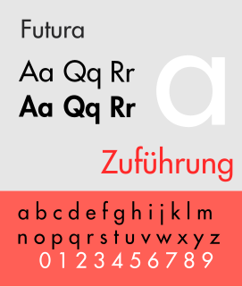
Futura is a geometric sans-serif typeface designed by Paul Renner and released in 1927. It was designed as a contribution on the New Frankfurt-project. It is based on geometric shapes, especially the circle, similar in spirit to the Bauhaus design style of the period. It was developed as a typeface by the Bauer Type Foundry, in competition with Ludwig & Mayer's seminal Erbar typeface of 1926.

In typography, a slab serif typeface is a type of serif typeface characterized by thick, block-like serifs. Serif terminals may be either blunt and angular (Rockwell), or rounded (Courier). Slab serifs were invented in and most popular during the nineteenth century.

Didone is a genre of serif typeface that emerged in the late 18th century and was the standard style of general-purpose printing during the nineteenth. It is characterized by:
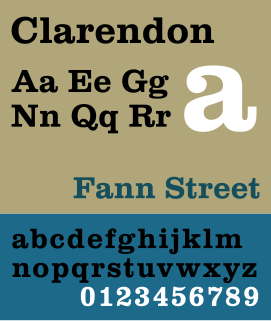
Clarendon is the name of a slab-serif typeface that was released in 1845 by Thorowgood and Co. of London, a letter foundry often known as the Fann Street Foundry. The original Clarendon design is credited to Robert Besley, a partner in the foundry, and was originally engraved by punchcutter Benjamin Fox, who may also have contributed to its design. Many copies, adaptations and revivals have been released, becoming almost an entire genre of type design.
A swash is a typographical flourish, such as an exaggerated serif, terminal, tail, entry stroke, etc., on a glyph. The use of swash characters dates back to at least the 16th century, as they can be seen in Ludovico Vicentino degli Arrighi's La Operina, which is dated 1522. As with italic type in general, they were inspired by the conventions of period handwriting. Arrighi's designs influenced designers in Italy and particularly in France.

Bank Gothic is a rectilinear geometric sans-serif typeface designed by Morris Fuller Benton for American Type Founders and released from 1930. The design has become popular from the late twentieth century to suggest a science-fiction, military, corporate or sports aesthetic.
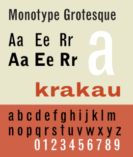
Monotype Grotesque is a family of sans-serif typefaces released by the Monotype Corporation for its hot metal typesetting system. It belongs to the grotesque or realist genre of early sans-serif designs. Like many early sans-serifs, it forms a sprawling family designed at different times.
Neutraface is a geometric sans-serif typeface designed by Christian Schwartz for House Industries, an American digital type foundry. It was influenced by the work of architect Richard Neutra and was developed with the assistance of Neutra's son and former partner, Dion Neutra.
Memphis is a slab-serif typeface designed by Dr. Rudolf Wolf and released in 1929 by the Stempel Type Foundry.

Tempo is a 1930 sans-serif typeface designed by R. Hunter Middleton for the Ludlow Typograph company. Tempo is a geometric sans-serif design, closely copying German typefaces in this style, above all Futura, which had attracted considerable attention in the United States. Unlike Futura, however, it has a "dynamic" true italic, with foot serifs suggesting handwriting and optional swash capitals.

Beton is a slab-serif typeface designed by Heinrich Jost and released originally by the Bauer Type Foundry from 1929 onwards, with most major styles released by 1931. "Beton" is German for concrete, a choice of name suggesting its industrial aesthetic.

A reverse-contrast letterform is a typeface or custom lettering in which the stress is reversed from the norm: instead of the vertical lines being the same width or thicker than horizontals, which is normal in Latin-alphabet writing and especially printing, the horizontal lines are the thickest. The result is a dramatic effect, in which the letters seem to have been printed the wrong way round. Originally invented in the early nineteenth century as attention-grabbing novelty display designs, modern font designer Peter Biľak, who has created a design in the genre, has described them as "a dirty trick to create freakish letterforms that stood out."

A display typeface is a typeface that is intended for use at large sizes for headings, rather than for extended passages of body text.

Metro is a sans-serif typeface family created by William Addison Dwiggins and released by the American Mergenthaler Linotype Company from 1929 onwards.

National Trust is a humanist sans-serif typeface designed by Paul Barnes for the National Trust of England, Wales and Northern Ireland. It is a corporate font family and not available for licensing.

The Two Lines English Egyptian typeface is a font created by the Caslon foundry of Salisbury Square, London around or probably slightly before 1816, that is the first general-purpose sans-serif typeface in the Latin alphabet known to have been created.
