Large-print

Last updated

Large-print (also large-type or large-font) refers to the formatting of a book or other text document in which the typeface (or font) are considerably larger than usual to accommodate people who have low vision. Frequently the medium is also increased in size to accommodate the larger text. Special-needs libraries and many public libraries will stock large-print versions of books, along with versions written in Braille.

Contents

The font size for large print is typically at least 18 points in size, equivalent to 24px for a web CSS font size. Different sizes are made to suit different visual needs, with a common rule of thumb to be at least twice the minimum acuity size. [1]

Large print books Large Print books.jpg
Large print books

Publishing standards

The American National Association for Visually Handicapped (NAVH) provides the NAVH Seal of Approval to commercial publishers in the US, for books that meet their large print standards. [2] (Lighthouse International acquired NAVH in 2010.) [3]

The standards [4] call for:

Additional guidelines

The American Printing House for the Blind defines font sizes as:

In addition to enlarging type size, page layout and font characteristics can have a positive effect on readability. Fonts designed for legibility make it easier to distinguish one character from another. Some characteristics of such fonts are: [6]

Here are the primary things to think about when selecting a font for use by persons with low vision:

Examples of more-easily read fonts are Antique Olive, Tahoma, Tiresias, and Verdana.

Ratios

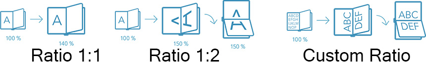
Companies offering the large-print formatting uses diverse formats (also called ratios) to support the larger font size. [7] Among these ratios, we find:

Large Print Ratios.jpg

History

Among the first large print book publishers, the Clear Type Publishing Company published a collection of books in 36 point type, c.1910. [8] The Ohio-based company specialized in large print, publishing books in 36pt and 24pt. [9]

In 1914 Robert Irwin produced a series of textbooks in 36 point, for low-vision children in Cleveland, Ohio schools. This type proved to be too large and was soon abandoned for the more popular 24 point. Research sponsored by Irwin in 1919 indicated 24 point type to be the most readable of the sizes evaluated. Further research by others in 1952 and 1959 supported 18 point or 24 point type. [10]

In the UK in 1964, Frederick Thorpe began publishing standard print titles with type approximately twice the size of the original printing. The books were given plain dust jackets, color-coded to indicate categories like mysteries (black), general fiction (red), romances (blue), Westerns (orange), etc. These physically large editions were reported to be difficult for some readers to handle.

In 1969, Thorpe's company, Ulverscroft, began producing the books in 16 point type and normal-sized bindings, which the company claims increased the acceptance of large print in public libraries. 16 point type is smaller than the minimum recommended by the American Council of the Blind, [11] which recommends 20 point, with 18 point as a suggested minimum. [12]

In 2008 the W3.org released the WCAG 2.0 web accessibility standards, which define large text as 18pt, which is 24px in CSS. [13] Further, the standard specifies that users must be able to increase the font size 200% without breaking content. [14]

Today large print editions of some current books are published simultaneously with regular print editions by their publishers and usually feature the same full-color jackets and jacket design. Public libraries often have large print sections, and many bookstores carry some large print editions.

Recent developments

Since 2005, some companies have begun offering a variety of font sizes for large print books.

See also

Related Research Articles

<span class="mw-page-title-main">Braille</span> Tactile writing system for blind and visually impaired people

Braille is a tactile writing system used by people who are visually impaired. It can be read either on embossed paper or by using refreshable braille displays that connect to computers and smartphone devices. Braille can be written using a slate and stylus, a braille writer, an electronic braille notetaker or with the use of a computer connected to a braille embosser.

<span class="mw-page-title-main">PDF</span> Portable Document Format, a digital file format

Portable Document Format (PDF), standardized as ISO 32000, is a file format developed by Adobe in 1992 to present documents, including text formatting and images, in a manner independent of application software, hardware, and operating systems. Based on the PostScript language, each PDF file encapsulates a complete description of a fixed-layout flat document, including the text, fonts, vector graphics, raster images and other information needed to display it. PDF has its roots in "The Camelot Project" initiated by Adobe co-founder John Warnock in 1991. PDF was standardized as ISO 32000 in 2008. The last edition as ISO 32000-2:2020 was published in December 2020.

<span class="mw-page-title-main">Optical character recognition</span> Computer recognition of visual text

Optical character recognition or optical character reader (OCR) is the electronic or mechanical conversion of images of typed, handwritten or printed text into machine-encoded text, whether from a scanned document, a photo of a document, a scene photo or from subtitle text superimposed on an image.

Web colors are colors used in displaying web pages on the World Wide Web; they can be described by way of three methods: a color may be specified as an RGB triplet, in hexadecimal format or according to its common English name in some cases. A color tool or other graphics software is often used to generate color values. In some uses, hexadecimal color codes are specified with notation using a leading number sign (#). A color is specified according to the intensity of its red, green and blue components, each represented by eight bits. Thus, there are 24 bits used to specify a web color within the sRGB gamut, and 16,777,216 colors that may be so specified.

In typography, leading is the space between adjacent lines of type; the exact definition varies.

CTA-708 is the standard for closed captioning for ATSC digital television (DTV) streams in the United States and Canada. It was developed by the Consumer Electronics sector of the Electronic Industries Alliance, which later became the standalone organization Consumer Technology Association.

<span class="mw-page-title-main">Small caps</span> Lowercase characters that resemble uppercase letters except smaller in height

In typography, small caps are characters typeset with glyphs that resemble uppercase letters (capitals) but reduced in height and weight close to the surrounding lowercase letters or text figures. This is technically not a case-transformation, but a substitution of glyphs, although the effect is often approximated by case-transformation and scaling. Small caps are used in running text as a form of emphasis that is less dominant than all uppercase text, and as a method of emphasis or distinctiveness for text alongside or instead of italics, or when boldface is inappropriate. For example, the text "Text in small caps" appears as Text in small caps in small caps. Small caps can be used to draw attention to the opening phrase or line of a new section of text, or to provide an additional style in a dictionary entry where many parts must be typographically differentiated.

<span class="mw-page-title-main">Page layout</span> Part of graphic design that deals in the arrangement of visual elements on a page

In graphic design, page layout is the arrangement of visual elements on a page. It generally involves organizational principles of composition to achieve specific communication objectives.

<span class="mw-page-title-main">Digital Accessible Information System</span> Technical standard for digital audiobooks, periodicals and computerized text

Digital accessible information system (DAISY) is a technical standard for digital audiobooks, periodicals, and computerized text. DAISY is designed to be a complete audio substitute for print material and is specifically designed for use by people with "print disabilities", including blindness, impaired vision, and dyslexia. Based on the MP3 and XML formats, the DAISY format has advanced features in addition to those of a traditional audio book. Users can search, place bookmarks, precisely navigate line by line, and regulate the speaking speed without distortion. DAISY also provides aurally accessible tables, references, and additional information. As a result, DAISY allows visually impaired listeners to navigate something as complex as an encyclopedia or textbook, otherwise impossible using conventional audio recordings.

<span class="mw-page-title-main">Line length</span> In typography, width of a block of typeset text

In typography, line length is the width of a block of typeset text, usually measured in units of length like inches or points or in characters per line. A block of text or paragraph has a maximum line length that fits a determined design. If the lines are too short then the text becomes disjointed; if they are too long, the content loses rhythm as the reader searches for the start of each line.

<span class="mw-page-title-main">Block quotation</span> Specially typeset quotation in document

A block quotation is a quotation in a written document that is set off from the main text as a paragraph, or block of text, and typically distinguished visually using indentation and a different typeface or smaller size font. This is in contrast to setting it off with quotation marks in a run-in quote. Block quotations are used for long quotations. The Chicago Manual of Style recommends using a block quotation when extracted text is 100 words or more, or approximately six to eight lines in a typical manuscript.

The term "ADA Signs" has come into common use in the architectural, construction and signage industries with the advent of the Americans With Disabilities Act, or ADA. The Americans with Disabilities Act regulates accessibility; and includes requirements for signage that is conveniently located and easy to read both visually and through tactile touch.

<span class="mw-page-title-main">Column (typography)</span>

In typography, a column is one or more vertical blocks of content positioned on a page, separated by gutters or rules. Columns are most commonly used to break up large bodies of text that cannot fit in a single block of text on a page. Additionally, columns are used to improve page composition and readability. Newspapers very frequently use complex multi-column layouts to break up different stories and longer bodies of texts within a story. Column can also more generally refer to the vertical delineations created by a typographic grid system which type and image may be positioned. In page layout, the whitespace on the outside of the page are known as margins; the gap between two facing pages is also considered a gutter, since there are columns on both sides.

<span class="mw-page-title-main">Page numbering</span> Numbering of a book or document

Page numbering is the process of applying a sequence of numbers to the pages of a book or other document. The number itself, which may appear in various places on the page, can be referred to as a page number or as a folio. Like other numbering schemes such as chapter numbering, page numbers allow the citation of a particular page of the numbered document and facilitates to the reader to find specific parts of the document and to know the size of the complete text.

<span class="mw-page-title-main">Accessible publishing</span> Approach to publishing and book design

Accessible publishing is an approach to publishing and book design whereby books and other texts are made available in alternative formats designed to aid or replace the reading process. It is particularly relevant for people who are blind, visually impaired or otherwise print disabled.

<span class="mw-page-title-main">EPUB</span> E-book file format

EPUB is an e-book file format that uses the ".epub" file extension. The term is short for electronic publication and is sometimes styled ePub. EPUB is supported by many e-readers, and compatible software is available for most smartphones, tablets, and computers. EPUB is a technical standard published by the International Digital Publishing Forum (IDPF). It became an official standard of the IDPF in September 2007, superseding the older Open eBook (OEB) standard.

A sighted child who is reading at a basic level should be able to understand common words and answer simple questions about the information presented. They should also have enough fluency to get through the material in a timely manner. Over the course of a child's education, these foundations are built on to teach higher levels of math, science, and comprehension skills. Children who are blind not only have the education disadvantage of not being able to see: they also miss out on the very fundamental parts of early and advanced education if not provided with the necessary tools.

Modified Stave Notation (MSN) is an alternative way of notating music that was developed in the UK where it is widely used. MSN is intended to be used by people who cannot easily read ordinary musical stave notation (or staff notation), even if it is enlarged, or for some people reduced in size. Such users include those with visual impairments and those who are dyslexic.

Alternative formats include audio, braille, electronic or large print versions of standard print such as educational material, textbooks, information leaflets, and even people's personal bills and letters. Alternative formats are created to help people who are blind or visually impaired to gain access to information either by sight, by hearing (audio) or by touch (braille).

<i>Matilda Ziegler Magazine for the Blind</i> Magazine printed in New York City

Matilda Ziegler Magazine for the Blind was a general-interest magazine for the blind and visually impaired, printed in New York City, New York, US. Founded in March 1907 by Electa Matilda Ziegler, it ended publication in 2014.

References

  1. "Writing with large type". visionaware.org. Retrieved 5 January 2021.
  2. "National Association for Visually Handicapped - NAVH". U.S. Department of Health & Human Services. Archived from the original on 11 March 2012.
  3. "Lighthouse International Acquires National Association for Visually Handicapped (NAVH)". Vision Monday. Retrieved 29 April 2017.
  4. "NAVH Standards & Criteria for Large Print Publications" (PDF). National Association for Visually Handicapped. 2006. Archived from the original (PDF) on 4 March 2016. Retrieved 20 February 2012.
  5. "NLS Reference Guide". Library of Congress. Retrieved 10 July 2019.
  6. Kitchel, J. Elaine. "APH Guidelines for Print Document Design". American Publishing House for the Blind. Retrieved 5 January 2021.
  7. "Large Print Strategies". Jymico. Archived from the original on 25 May 2018. Retrieved 29 April 2017.
  8. The Unseen Minority: A Social History of Blindness in the United States "Google Books"
  9. Books for the Tired Eyes: A List of Books in Large Print "Google Books"
  10. The Visually Handicapped Child in School "Google Books"
  11. American Council of the Blind "Large Print Guidelines"
  12. "Our History". Ulverscroft Foundation. 29 January 2020. Retrieved 29 January 2020.
  13. "Understanding Text". WCAG 2.0. World Wide Wen Consortium. Retrieved 5 January 2021.
  14. "Understanding Resize Text". WCAG 2.0. World Wide Web Consortium. Retrieved 5 January 2021.