
Typographic units are the units of measurement used in typography or typesetting. Traditional typometry units are different from familiar metric units because they were established in the early days of printing. Though most printing is digital now, the old terms and units have persisted.

Garamond is a group of many serif typefaces, named for sixteenth-century Parisian engraver Claude Garamond, generally spelled as Garamont in his lifetime. Garamond-style typefaces are popular and particularly often used for book printing and body text.

Matthew Carter is a British type designer. A 2005 New Yorker profile described him as 'the most widely read man in the world' by considering the amount of text set in his commonly used fonts.

Futura is a geometric sans-serif typeface designed by Paul Renner and released in 1927. It was designed as a contribution on the New Frankfurt-project. It is based on geometric shapes, especially the circle, similar in spirit to the Bauhaus design style of the period. It was developed as a typeface by the Bauer Type Foundry, in competition with Ludwig & Mayer's seminal Erbar typeface of 1926.

American Type Founders (ATF) Co. was a business trust created in 1892 by the merger of 23 type foundries, representing about 85 percent of all type manufactured in the United States at the time. The new company, consisting of a consolidation of firms from throughout the United States, was incorporated in New Jersey.

Monotype Imaging Holdings Inc., founded as Lanston Monotype Machine Company in 1887 in Philadelphia by Tolbert Lanston, is an American company that specializes in digital typesetting and typeface design for use with consumer electronics devices. Incorporated in Delaware and headquartered in Woburn, Massachusetts, the company has been responsible for many developments in printing technology—in particular the Monotype machine, which was a fully mechanical hotmetal typesetter, that produced texts automatically, all single type. Monotype was involved in the design and production of many typefaces in the 20th century. Monotype developed many of the most widely used typeface designs, including Times New Roman, Gill Sans, Arial, Bembo and Albertus.

A type foundry is a company that designs or distributes typefaces. Before digital typography, type foundries manufactured and sold metal and wood typefaces for hand typesetting, and matrices for line-casting machines like the Linotype and Monotype, for letterpress printers. Today's digital type foundries accumulate and distribute typefaces created by type designers, who may either be freelancers operating their own independent foundry, or employed by a foundry. Type foundries may also provide custom type design services.

Caslon is the name given to serif typefaces designed by William Caslon I (c. 1692–1766) in London, or inspired by his work.

Bookman, or Bookman Old Style, is a serif typeface. A wide, legible design that is slightly bolder than most body text faces, Bookman has been used for both display typography, for trade printing such as advertising, and less commonly for body text. In advertising use it is particularly associated with the graphic design of the 1960s and 1970s, when revivals of it were very popular. It is also used as the official font of Indonesian laws since 2011.

Clarendon is the name of a slab serif typeface that was released in 1845 by Thorowgood and Co. of London, a letter foundry often known as the Fann Street Foundry. The original Clarendon design is credited to Robert Besley, a partner in the foundry, and was originally engraved by punchcutter Benjamin Fox, who may also have contributed to its design. Many copies, adaptations and revivals have been released, becoming almost an entire genre of type design.

Baskerville is a serif typeface designed in the 1750s by John Baskerville (1706–1775) in Birmingham, England, and cut into metal by punchcutter John Handy. Baskerville is classified as a transitional typeface, intended as a refinement of what are now called old-style typefaces of the period, especially those of his most eminent contemporary, William Caslon.
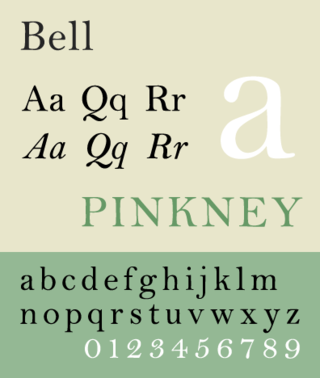
Bell is the name given to a serif typeface designed and cut in 1788 by the punchcutter Richard Austin for the British Letter Foundry, operated by publisher John Bell, and revived several times since.

Bulmer is the name given to a serif typeface originally designed by punchcutter William Martin around 1790 for the Shakespeare Press, run by William Bulmer (1757–1830). The types were used for printing the Boydell Shakespeare folio edition.
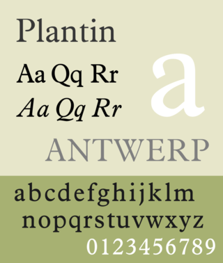
Plantin is an old-style serif typeface. It was created in 1913 by the British Monotype Corporation for their hot metal typesetting system and is named after the sixteenth-century printer Christophe Plantin. It is loosely based on a Gros Cicero roman type cut in the 16th century by Robert Granjon held in the collection of the Plantin–Moretus Museum, Antwerp.
Binny & Ronaldson established the first permanent type foundry in the United States. Founded in Philadelphia in 1796 by the Scot Archibald Binny (1762/3–1838) and James Ronaldson (1769–1841).

Miller is a serif typeface, released in 1997 by the Font Bureau, a U.S.-based digital type foundry. It was designed by Matthew Carter and is of the 'transitional' style from around 1800, based on the "Scotch Roman" type which originates from types sold by Scottish type foundries that later became popular in the United States. It is named for William Miller, founder of the long-lasting Miller & Richard type foundry of Edinburgh.
The Papers of Thomas Jefferson is a multi-volume scholarly edition devoted to the publication of the public and private papers of Thomas Jefferson, the third President of the United States. The project, established at Princeton University, is the definitive edition of documents written by or to Jefferson. Work on the series began in 1944 and was undertaken solely at Princeton until 1998, when responsibility for editing documents from Jefferson's post-presidential retirement years, 1809 until 1826, shifted to the Thomas Jefferson Foundation at Monticello. This enabled work to progress simultaneously on two different periods of Jefferson's life and thereby doubled the production of volumes without compromising the high standards set for the project.

Old Style or Modernised Old Style was the name given to a series of serif typefaces cut from the mid-nineteenth century and sold by the type foundry Miller & Richard, of Edinburgh in Scotland. It was a standard typeface in Britain for literary and prestigious printing in the second half of the nineteenth century and the early twentieth century, with many derivatives and copies released.

In typography, a fat face letterform is a serif typeface or piece of lettering in the Didone or modern style with an extremely bold design. Fat face typefaces appeared in London around 1805–1810 and became widely popular; John Lewis describes the fat face as "the first real display typeface."
East Asian typography is the application of typography to the writing systems of Chinese, Japanese, and Korean languagesand Vietnamese languages. Scripts used in East Asian typography include Chinese characters, hiragana, katakana, hangul, and Chữ Nôm.