Related Research Articles
Blackboard bold is a typeface style that is often used for certain symbols in mathematical texts, in which certain lines of the symbol are doubled. The symbols usually denote number sets. One way of producing blackboard bold is to double-strike a character with a small offset on a typewriter. Thus they are also referred to as double struck.

A monospaced font, also called a fixed-pitch, fixed-width, or non-proportional font, is a font whose letters and characters each occupy the same amount of horizontal space. This contrasts with variable-width fonts, where the letters and spacings have different widths.

A typeface is the design of lettering that can include variations in size, weight, slope, width, and so on. Each of these variations of the typeface is a font.

Fraktur is a calligraphic hand of the Latin alphabet and any of several blackletter typefaces derived from this hand. The blackletter lines are broken up; that is, their forms contain many angles when compared to the curves of the Antiqua (common) typefaces modeled after antique Roman square capitals and Carolingian minuscule. From this, Fraktur is sometimes contrasted with the "Latin alphabet" in northern European texts, which is sometimes called the "German alphabet", simply being a typeface of the Latin alphabet. Similarly, the term "Fraktur" or "Gothic" is sometimes applied to all of the blackletter typefaces.
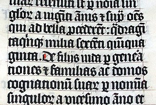
Blackletter, also known as Gothic script, Gothic minuscule, or Textura, was a script used throughout Western Europe from approximately 1150 until the 17th century. It continued to be commonly used for the Danish language until 1875, and for German, Estonian and Latvian until the 1940s. Fraktur is a notable script of this type, and sometimes the entire group of blackletter faces is incorrectly referred to as Fraktur. Blackletter is sometimes referred to as Old English, but it is not to be confused with the Old English language, which predates blackletter by many centuries and was written in the insular script or in Futhorc. Along with Italic type and Roman type, it served as one of the major typefaces in the history of Western typography.
Wingdings is a series of dingbat fonts that render letters as a variety of symbols. They were originally developed in 1990 by Microsoft by combining glyphs from Lucida Icons, Arrows, and Stars licensed from Charles Bigelow and Kris Holmes. Certain versions of the font's copyright string include an attribution to Type Solutions, Inc., the maker of a tool used to hint the font.
Bitstream Cyberbit is a commercial serif Unicode font designed by Bitstream Inc. It is freeware for non-commercial uses. It was one of the first widely available fonts to support a large portion of the Unicode repertoire.

Monospace is a monospaced Unicode font, developed by George Williams. It is based on the typeface Courier. This font contains 2860 glyphs. It includes characters in the following unicode ranges: Basic Latin, Latin-1 Supplement, Latin Extended-A, Latin Extended-B, IPA Extensions, Spacing Modifier Letters, Combining Diacritical Marks, Greek, Cyrillic, Hebrew, Latin Extended Additional, Greek Extended, General Punctuation, Superscripts and Subscripts, Currency Symbols, Combining Diacritical Marks for Symbols, Letterlike Symbols, Number Forms, Arrows, Mathematical Operators, Miscellaneous Technical, Control Pictures, Enclosed Alphanumerics, Box Drawing, Block Elements, Geometric Shapes, Miscellaneous Symbols, Alphabetic Presentation Forms, Halfwidth and Fullwidth Forms.

GNU FreeFont is a family of free OpenType, TrueType and WOFF vector fonts, implementing as much of the Universal Character Set (UCS) as possible, aside from the very large CJK Asian character set. The project was initiated in 2002 by Primož Peterlin and is now maintained by Steve White.

Bank Gothic is a rectilinear geometric sans-serif typeface designed by Morris Fuller Benton for American Type Founders and released in 1930. The design has become popular from the late twentieth century to suggest a science-fiction, military, corporate, or sports aesthetic.

Bitstream Charter is a serif typeface designed by Matthew Carter in 1987 for Bitstream Inc. Charter is based on Pierre-Simon Fournier’s characters, originating from the 18th century. Classified by Bitstream as a transitional-serif typeface, it also has features of a slab-serif typeface and is often classified as such.
A numeral is a character that denotes a number. Decimal is used widely in various writing systems throughout the world, however the graphemes representing the decimal digits differ widely, therefore Unicode includes 22 different sets of graphemes for the decimal digits, and also various decimal points, thousands separators, negative signs, etc. Unicode also includes several non-Decimal numerals such as Aegean numerals, Roman numerals, counting rod numerals, Cuneiform numerals and ancient Greek numerals. There is also a large number of typographical variations of the Western Arabic numerals provided for specialized mathematical use and for compatibility with earlier character sets, such as ² or ②, and composite characters such as ½.
Code2000 is a serif and pan-Unicode digital font, which includes characters and symbols from a very large range of writing systems. As of the current final version 1.171 released in 2008, Code2000 is designed and implemented by James Kass to include as much of the Unicode 5.2 standard as practical, and to support OpenType digital typography features. Code2000 supports the Basic Multilingual Plane. Code2001 and Code2002, related beta fonts created by James Kass, support characters in higher Unicode planes.

A subscript or superscript is a character that is set slightly below or above the normal line of type, respectively. It is usually smaller than the rest of the text. Subscripts appear at or below the baseline, while superscripts are above. Subscripts and superscripts are perhaps most often used in formulas, mathematical expressions, and specifications of chemical compounds and isotopes, but have many other uses as well.

The Aster typeface, which originated in Italy, was designed in 1958 by Francesco Simoncini for Simoncini SA to be used in newspapers and books. This typeface is fairly wide with detailed, delicate serifs; it also has short ascenders and descenders for economy of space. The New Aster font family offers a few distinguishing marks, like the spurs of capitals A, N, V and W.
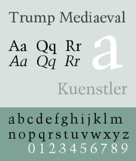
Trump Mediaeval is an old-style serif typeface designed by Georg Trump. It was released in 1954 both by the C. E. Weber foundry as metal type and Linotype for hot metal typesetting. Despite a common association with blackletter typefaces, the mediaeval name refers to the German typographical term for roman typefaces dark in color like the old style Venetian typefaces.
Lineto is a Swiss type foundry founded by Cornel Windlin and Stephan Müller in 1993. In 1998, Lineto launched a website to distribute their fonts digitally. In 2007, Jürg Lehni joined the venture.
Georg Trump was a German graphics, typeface and postage stamp designer, known for designs such as the book typeface Trump Mediaeval (1954), the slab serif City and the condensed, industrial Schadow.
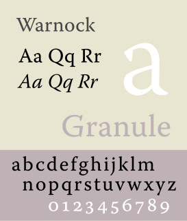
Warnock is an old-style typeface commissioned by Chris Warnock in honor of his father, John Warnock, in 1997. It was designed by Robert Slimbach and first published in 2000 as Warnock Pro.
References
- ↑ "Typedia: Learn: Typeface Classifications". typedia.com.