Related Research Articles

Jan Tschichold was a calligrapher, typographer and book designer. He played a significant role in the development of graphic design in the 20th century – first, by developing and promoting principles of typographic modernism, and subsequently idealizing conservative typographic structures. His direction of the visual identity of Penguin Books in the decade following World War II served as a model for the burgeoning design practice of planning corporate identity programs. He also designed the much-admired typeface Sabon.

Helvetica or Neue Haas Grotesk is a widely used sans-serif typeface developed in 1957 by Swiss typeface designer Max Miedinger with input from Eduard Hoffmann.

Emigre Fonts is a digital type foundry based in Berkeley, California, that was founded in 1985 by husband-and-wife team Rudy VanderLans and Zuzana Licko. The type foundry grew out of Emigre magazine, a publication founded by VanderLans and two Dutch friends who met in San Francisco, CA in 1984. Note that unlike the word émigré, Emigre is officially spelled without accents.

Armin Hofmann (HonRDI) was a Swiss graphic designer.

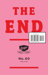
Emigre was an award-wining (mostly) quarterly magazine published from 1984 until 2005 in Berkeley, California dedicated to visual communication, graphic design, typography, and design criticism. Produced by Rudy VanderLans and Zuzana Licko, Emigre was known for creating some of the very first digital layouts and typeface designs. Exposure to Licko's typefaces through the magazine lead to the creation of Emigre Fonts in 1985.
Zuzana Licko is a Slovak-born American type designer and visual artist known for co-founding Emigre Fonts, a digital type foundry in Berkeley, CA. She has designed and produced numerous digital typefaces including the popular Mrs Eaves, Modula, Filosofia, and Matrix. As a corresponding interest she also creates ceramic sculptures, textile prints and jacquard weavings.
Josef Müller-Brockmann was a Swiss graphic designer, author, and educator, he was a Principal at Muller-Brockmann & Co. design firm. He was a pioneer of the International Typographic Style. Müller-Brockmann is recognized for his simple designs and his clean use of typography, shapes and colors which inspire many graphic designers in the 21st century.
Rudy VanderLans is a Dutch graphic designer, photographer, and the co-founder of Emigre Fonts with his wife Zuzana Licko. Emigre Fonts is an independent type foundry in Berkeley, CA. He was also the art director and editor of Emigre magazine, the legendary journal devoted to visual communications from 1984–2005. Since arriving in California in 1981, he has been photographing his adoptive Golden State as an ongoing side project. He has authored a total of 11 photo books on the topic, and staged two solo exhibits at Gallery 16 in San Francisco.
Margaret Vivienne Calvert is a British typographer and graphic designer who, with colleague Jock Kinneir, designed many of the road signs used throughout the United Kingdom, Crown Dependencies, and British Overseas Territories, as well as the Transport font used on road signs, the Rail Alphabet font used on the British railway system, and an early version of the signs used in airports. The typeface developed by Kinneir and Calvert was further developed into New Transport and used for the single domain GOV.UK website in the United Kingdom.

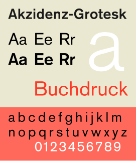
Akzidenz-Grotesk is a sans-serif typeface family originally released by the Berthold Type Foundry of Berlin. "Akzidenz" indicates its intended use as a typeface for commercial print runs such as publicity, tickets and forms, as opposed to fine printing, and "grotesque" was a standard name for sans-serif typefaces at the time.

Rudolf Koch was a German type designer, professor, and a master of lettering, calligraphy, typography and illustration. Commonly known for his typefaces created for the Klingspor Type Foundry, his most widely used typefaces include Neuland and Kabel.

The International Typographic Style, also known as the Swiss Style, is a graphic design style that emerged in Russia, the Netherlands, and Germany in the 1920s and was further developed by designers in Switzerland during the 1950s. The International Typographic Style has had profound influence on graphic design as a part of the modernist movement, impacting many design-related fields including architecture and art. It emphasizes cleanness, readability, and objectivity. Hallmarks of the style are asymmetric layouts, use of a grid, sans-serif typefaces like Akzidenz Grotesk, and flush left, ragged right text. The style is also associated with a preference for photography in place of illustrations or drawings. Many of the early International Typographic Style works featured typography as a primary design element in addition to its use in text, and it is for this that the style is named. The influences of this graphic movement can still be seen in design strategy and theory to this day.

DIN 1451 is a sans-serif typeface that is widely used for traffic, administrative and technical applications.
Emil Ruder (1914–1970) was a Swiss typographer and graphic designer, who with Armin Hofmann joined the faculty of the Schule für Gestaltung Basel.

Peter Biľak is a Slovak graphic and typeface designer, based in The Hague, The Netherlands. He works in the field of editorial, graphic, and type design, teaches typeface design at the postgraduate course Type&Media at the KABK, Royal Academy of Art. He started Typotheque in 1999, Dot Dot Dot in 2000, Indian Type Foundry in 2009, Works That Work magazine in 2012, and Fontstand, in 2015. He is a member of AGI and lectures on his work internationally. He is a writer for numerous design magazines and frequently contributes writing and design to books and publications that include Print, Emigre, Eye (magazine), Items, tipoGrafica, Idea (magazine), Abitare and Page.
Wolfgang Weingart is an internationally known graphic designer and typographer. His work is categorized as Swiss typography and he is credited as "the father" of New Wave or Swiss Punk typography.

The Museum of Design, Zürich is a museum for industrial design, visual communication, architecture, and craft in Zurich, Switzerland.
Lineto is a Swiss type foundry founded by Cornel Windlin and Stephan Müller in 1993. In 1998, Lineto launched a website to distribute their fonts digitally. In 2007, Jürg Lehni joined the venture.

Ralph Schraivogel is a Swiss graphic designer and lecturer.
References
- 1 2 "Norm - its not complicated". Museum fur Gestaltung Zurich. Retrieved 28 December 2020.
- ↑ "Norm Graphic Designers". Design Museum - Internet Archive.
- ↑ "Norm fonts". Norm. Retrieved 28 December 2020.
- ↑ "Brown Graphic". Lineto. Retrieved 28 December 2020.