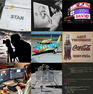
Graphic design is a profession, academic discipline and applied art whose activity consists in projecting visual communications intended to transmit specific messages to social groups, with specific objectives. Graphic design is an interdisciplinary branch of design and of the fine arts. Its practice involves creativity, innovation and lateral thinking using manual or digital tools, where it is usual to use text and graphics to communicate visually.

A logo is a graphic mark, emblem, or symbol used to aid and promote public identification and recognition. It may be of an abstract or figurative design or to include the text of the name that it represents as in a wordmark.

Jan Tschichold, also known as Iwan Tschichold or Ivan Tschichold, was a German calligrapher, typographer and book designer. He played a significant role in the development of graphic design in the 20th century – first, by developing and promoting principles of typographic modernism, and subsequently idealizing conservative typographic structures. His direction of the visual identity of Penguin Books in the decade following World War II served as a model for the burgeoning design practice of planning corporate identity programs. He also designed the typeface Sabon.

Paul Rand was an American art director and graphic designer. He was best known for his corporate logo designs, including the logos for IBM, UPS, Enron, Morningstar, Inc., Westinghouse, ABC, and NeXT. He was one of the first American commercial artists to embrace and practice the Swiss Style of graphic design.

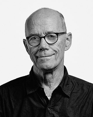
Erik Spiekermann is a German typographer, designer and writer. He is an honorary professor at the University of the Arts Bremen and ArtCenter College of Design.

The National Bus Company (NBC) was a nationalised bus company that operated in England and Wales between 1969 and 1988. NBC did not run buses itself, but was the owner of a number of regional subsidiary bus operating companies.
Graphic design careers include creative director, art director, art production manager, brand identity developer, illustrator and layout artist.

Rotis is a typeface developed in 1988 by Otl Aicher, a German graphic designer and typographer. In Rotis, Aicher explores an attempt at maximum legibility through a highly unified yet varied typeface family that ranges from full serif, glyphic, and sans-serif. The four basic Rotis variants are:
Józef Mroszczak was a Polish graphic designer.

Henry Steiner FCSD is an Austrian graphic designer, known as the “Father of Hong Kong Design” – a moniker gained for his graphic designs that have shaped Hong Kong’s visual landscape. Best known for creating branding for many renowned Hong Kong based companies, most notably the iconic HSBC logo. Henry has also designed identities for various institutions, ranging from hospitality groups to media outlets. These include Standard Chartered, Unilever, Hongkong Land, Dairy Farm, IBM, and The Hong Kong Jockey Club – many still in use today.

Gary Dean Anderson is an American graphic designer and architect. He is best known as the designer of the recycling symbol, one of the most readily recognizable logos in the world.

Sagi Haviv is an Israeli-American graphic designer and a partner in the design firm Chermayeff & Geismar & Haviv. Called a "logo prodigy" by The New Yorker, and a "wunderkind" by Out magazine, he is best known for having designed the trademarks and visual identities for brands and institutions such as Discovery, Inc.'s online streaming service Discovery+, the United States Olympic & Paralympic Museum, the US Open tennis tournament, Conservation International, Harvard University Press, and L.A. Reid's Hitco Entertainment, and tech and electric car company Togg.

The International Society of Typographic Designers (ISTD) is a professional body run by and for typographers, graphic designers, and educators. The society has an international membership and its aims are to establish and maintain standards of typography and to provide a forum for debate.
John David Lloyd is a British graphic designer who in 1975 co-founded the international design consultancy Lloyd Northover. He has worked in all fields of graphic design but has specialised in corporate identity.

Michel Bouvet is a French designer and poster artist. He is professor of visual culture at ESAG Penninghen (Paris).

George Tscherny was a Hungarian-born American graphic designer and educator. Tscherny received the highest honors among graphic designers. He was awarded the AIGA Medal in 1988, celebrated in the annual Masters Series in 1992 at the School of Visual Arts, and inducted into the Art Directors Club Hall of Fame in 1997. He worked in a number of areas ranging from U.S. postage to identity programs for large corporations and institutions.
Catherine Zask is a French graphic designer, typographer and artist.
Stuart Ash is a Canadian designer who gained international fame in the late 1960s. He is recognized for designing strategic visual identities within Gottschalk + Ash, which he founded in partnership with Fritz Gottschalk in Montreal. He is considered one of the pioneers of international graphic design in Canada.

The British Rail Double Arrow is a logo that was created for British Rail (BR), the then state-owned operator of Britain's railway network, in 1965. It has remained in use as part of the National Rail brand used for Britain's passenger rail services after the disbanding of British Rail, having been officially renamed as the National Rail Double Arrow and more recently being updated and reworked for continued use under the name Rail Symbol 2.

Péter Pócs is a Hungarian graphic designer and poster artist.


