Petr van Blokland (born 1956, Gouda) is a Dutch graphic designer, software author and typeface designer who lives in Delft.

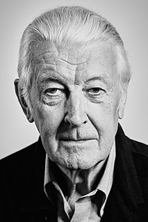
Petr van Blokland (born 1956, Gouda) is a Dutch graphic designer, software author and typeface designer who lives in Delft.
He has made numerous important contributions to the adoption of software in typeface design. He was a co-author of Ikarus M, the first typeface design software for Macintosh computers. Alongside his brother Erik van Blokland and Just Van Rossum, he created RoboFOG, [2] a system for writing scripts to streamline typeface design work in then market-dominating type design software Fontographer. RoboFOG (and its successor RoboFAB [3] ) spearheaded a technological revolution in type design revolving around the core technologies of RoboFOG, that is Python programming, the programming assets created with the software, and the ethos that the small group evangelised, "build your own tools". [4] A technological movement began around this, revolving around the Type and Media masters course that the three all teach at. Petr co-founded TypeNetwork, an online typeface marketplace, with Font Bureau, David Berlow, Roger Black and others, with the intention of creating a new model for type design, development and licensing. [4] [5]
Blokland has authored a number of typefaces, the most notable being the influential Proforma and its sibling Productus. Proforma, an oldstyle-serif typeface, started out as a commissioned typeface for Danish digital typesetting company Purup Electronics. FontShop International, while creating its 100 best typefaces of all time list [6] described it as "groundbreaking at the time for the way that it combined economy of space with good readability". The impact of the Proforma design was such that in 1988 Petr received the infrequently-awarded Prix Charles Peignot for distinguished typographic achievement by a designer under 35. [7] [8] The companion sans-serif typeface, Productus, was published by Font Bureau in 2000.

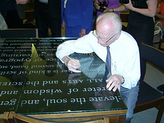
Hermann Zapf was a German type designer and calligrapher who lived in Darmstadt, Germany. He was married to the calligrapher and typeface designer Gudrun Zapf-von Hesse. Typefaces he designed include Palatino, Optima, and Zapfino.

In typography and lettering, a sans-serif, sans serif, gothic, or simply sans letterform is one that does not have extending features called "serifs" at the end of strokes. Sans-serif typefaces tend to have less stroke width variation than serif typefaces. They are often used to convey simplicity and modernity or minimalism.

A typeface is the design of lettering that can include variations in size, weight, slope, width, and so on. Each of these variations of the typeface is a font.

Matthew Carter is a British type designer. A 2005 New Yorker profile described him as 'the most widely read man in the world' by considering the amount of text set in his commonly used fonts.

Frutiger is a series of typefaces named after its Swiss designer, Adrian Frutiger. Frutiger is a humanist sans-serif typeface, intended to be clear and highly legible at a distance or at small text sizes. A very popular design worldwide, type designer Steve Matteson described its structure as "the best choice for legibility in pretty much any situation" at small text sizes, while Erik Spiekermann named it as "the best general typeface ever".

Univers is the name of a large sans-serif typeface family designed by Adrian Frutiger and released by his employer Deberny & Peignot in 1957. Classified as a neo-grotesque sans-serif, one based on the model of nineteenth-century German typefaces such as Akzidenz-Grotesk, it was notable for its availability from the moment of its launch in a comprehensive range of weights and widths. The original marketing for Univers deliberately referenced the periodic table to emphasise its scope.

Adrian Johann Frutiger was a Swiss typeface designer who influenced the direction of type design in the second half of the 20th century. His career spanned the hot metal, phototypesetting and digital typesetting eras. Until his death, he lived in Bremgarten bei Bern.

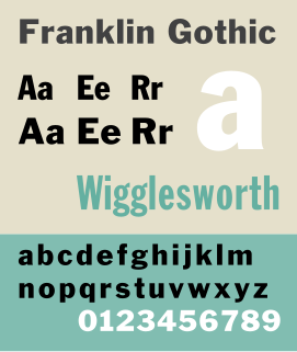
Franklin Gothic and its related faces are a large family of sans-serif typefaces in the industrial or grotesque style developed in the early years of the 20th century by the type foundry American Type Founders (ATF) and credited to its head designer Morris Fuller Benton. “Gothic” was a contemporary term meaning sans-serif.
Oblique type is a form of type that slants slightly to the right, used for the same purposes as italic type. Unlike italic type, however, it does not use different glyph shapes; it uses the same glyphs as roman type, except slanted. Oblique and italic type are technical terms to distinguish between the two ways of creating slanted font styles; oblique designs may be labelled italic by companies selling fonts or by computer programs. Oblique designs may also be called slanted or sloped roman styles. Oblique fonts, as supplied by a font designer, may be simply slanted, but this is often not the case: many have slight corrections made to them to give curves more consistent widths, so they retain the proportions of counters and the thick-and-thin quality of strokes from the regular design.
The ATypI or Association Typographique Internationale is an international non-profit organisation dedicated to typography and type design. The primary activity of the association is an annual fall conference, held in a different global city each year.

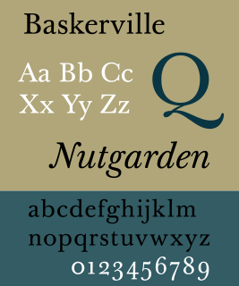
Baskerville is a serif typeface designed in the 1750s by John Baskerville (1706–1775) in Birmingham, England, and cut into metal by punchcutter John Handy. Baskerville is classified as a transitional typeface, intended as a refinement of what are now called old-style typefaces of the period, especially those of his most eminent contemporary, William Caslon.

The International Typographic Style, also known as the Swiss Style, is a graphic design style that emerged in Russia, the Netherlands, and Germany in the 1920s and was further developed by designers in Switzerland during the 1950s. The International Typographic Style has had profound influence on graphic design as a part of the modernist movement, impacting many design-related fields including architecture and art. It emphasizes cleanness, readability, and objectivity. Hallmarks of the style are asymmetric layouts, use of a grid, sans-serif typefaces like Akzidenz Grotesk, and flush left, ragged right text. The style is also associated with a preference for photography in place of illustrations or drawings. Many of the early International Typographic Style works featured typography as a primary design element in addition to its use in text, and it is for this that the style is named. The influences of this graphic movement can still be seen in design strategy and theory to this day.

DIN 1451 is a sans-serif typeface that is widely used for traffic, administrative and technical applications.

Syntax comprises a family of fonts designed by Swiss typeface designer Hans Eduard Meier. Originally just a sans-serif font, it was extended with additional serif designs.
The Prix Charles Peignot is a major award in typeface design, given "to a designer under the age of 35 who has made an outstanding contribution to type design". It is awarded irregularly, typically every three to five years, by the Association Typographique Internationale. It was first given in 1982.

George Auriol, born Jean-Georges Huyot, was a French poet, songwriter, graphic designer, type designer, and Art Nouveau artist. He worked in many media and created illustrations for the covers of magazines, books, and sheet music, as well as other types of work such as monograms and trademarks.
FontShop International was an international manufacturer of digital typefaces (fonts), based in Berlin. It was one of the largest digital type foundries.

Erik van Blokland is a Dutch typeface designer, educator and computer programmer. He is the head of the Type Media Master of Design program in Typeface Design at the Royal Academy of Art, The Hague in the Netherlands.

A display typeface is a typeface that is intended for use at large sizes for headings, rather than for extended passages of body text.
Dutch Type Library is a digital font foundry based in 's-Hertogenbosch, Netherlands, established in 1990 by Frank E. Blokland. DTL designs digital fonts and develops font software. Alongside original designs such as the Documenta and Caspari families, DTL has published work inspired by the work of Dutch type designers of the past, including revivals of the work of Hendrik van den Keere, Christoffel van Dijck, Joan Michaël Fleischman and Jan van Krimpen. Blokland received a doctorate on the spacing and proportions of early metal type from Leiden University in 2016.